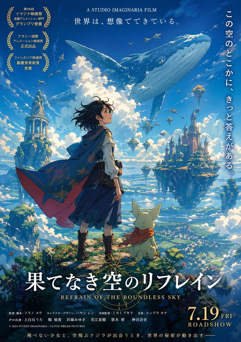
Anime Film Poster Generator
Editorial / Poster
Read full prompt
Create a poster for a {argument name="genre" default="fictional"} anime movie using GPT image2.
THE LIBRARY
Browse images and open the prompts behind them.
Editorial / Poster
Create a poster for a {argument name="genre" default="fictional"} anime movie using GPT image2.
Editorial / Poster
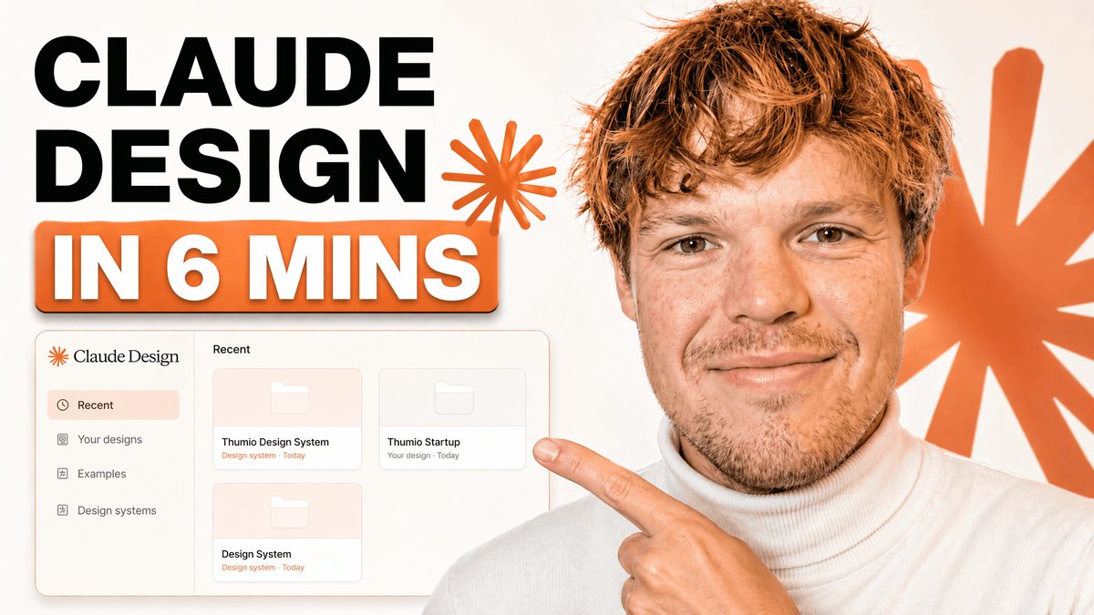
A clean modern YouTube thumbnail on a bright white background, split visually between bold text on the left and a cropped presenter on the right. On the left, place a massive stacked headline in heavy black sans-serif uppercase reading {argument name="headline text" default="CLAUDE DESIGN"}, aligned top-left across two lines. Below it, add a large rounded rectangular orange banner with a subtle drop shadow containing bold white uppercase text with an orange outline that reads {argument name="subheadline text" default="IN 6 MINS"}. Near the headline, include 2 orange starburst spark shapes, one small beside the text and one much larger in the far right background. In the lower-left quadrant, show a floating app interface mockup for a design tool dashboard with a soft off-white panel, thin borders, rounded corners, and a faint shadow. The interface should have a left sidebar with 4 menu items labeled exactly: "Recent", "Your designs", "Examples", and "Design systems". The main panel header should say "Recent" and contain 3 project cards arranged in a grid, labeled exactly: "Thumio Design System", "Thumio Startup", and "Design System". On the right half, show a cropped photorealistic young adult man from chest up wearing a white turtleneck sweater, with messy light brown hair and light facial hair, positioned close to camera. His face is intentionally obscured by a solid tan rectangle placeholder covering most of the face area. He points with one hand toward the interface panel on the left, finger extended. Use a warm orange and white brand palette, high contrast, minimal clutter, polished creator-economy thumbnail styling, subtle shadows, and a composition designed for tech tutorial content.
Editorial / Poster
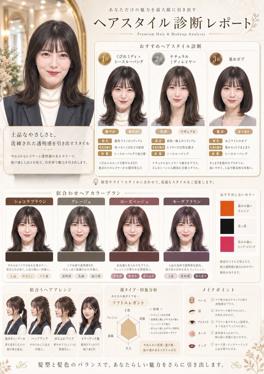
Using the provided reference image, turn it into a refined Japanese beauty-salon hairstyle diagnosis poster. Keep the same person, outfit, hair color, and realistic studio-photo look, but place her portrait as the main before-style image in an elegant cream-and-gold editorial layout. Add Japanese headline text at the top reading "ヘアスタイル診断レポート" with a small English subtitle "Premium Hair & Makeup Analysis" and supporting Japanese copy above it. Create 4 ranked hairstyle recommendation panels under the title: 1) "くびれミディ×シースルーバング", 2) "ナチュラルミディレイヤー", 3) "重めボブ", plus the large original/main portrait panel at left with explanatory Japanese text. In each recommendation panel, generate a realistic edited version of the same woman with the suggested haircut, using circular rank badges and multiple small trait tags. Add a color recommendation section titled "似合わせヘアカラープラン" with 4 color cards showing the same woman recolored in these shades: "ショコラブラウン", "グレージュ", "ローズベージュ", "モーヴブラウン". Also add 1 slim side panel titled "おすすめしないカラー" with 3 stacked swatches and labels: "黄みの強いオレンジ", "真っ黒", "青みの強いピンク・ビビッド". At the bottom, add 3 additional sections: "似合うヘアアレンジ" with 4 hairstyle arrangement examples of the same woman, "顔タイプ・印象分析" with a radar chart and Japanese notes, and "メイクポイント" with 5 makeup item rows labeled "ベース", "眉", "アイメイク", "チーク", "リップ". Use soft luxury salon branding, thin gold borders, rounded white panels, subtle floral corner ornaments, and a clean premium magazine-like composition.
Editorial / Interface
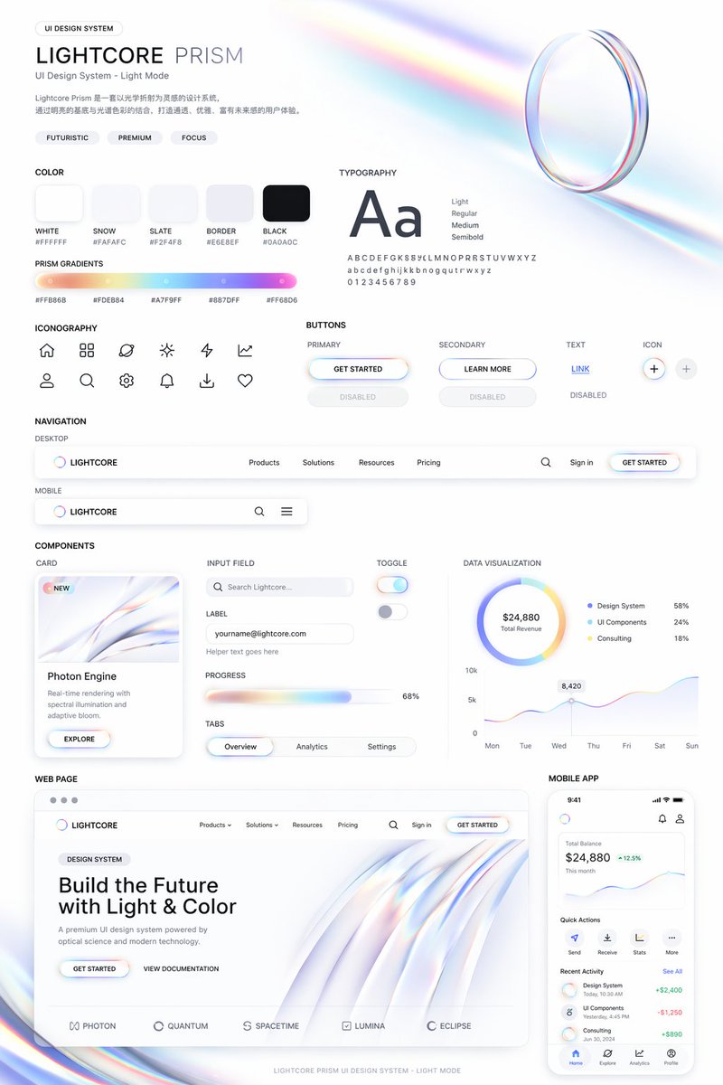
Use this style to help me generate a set of {argument name="theme" default="UI design system"}, including {argument name="components" default="web, mobile, cards, controls, buttons, and others"}. Use this visual style as a reference to generate a web page.
Editorial / Poster
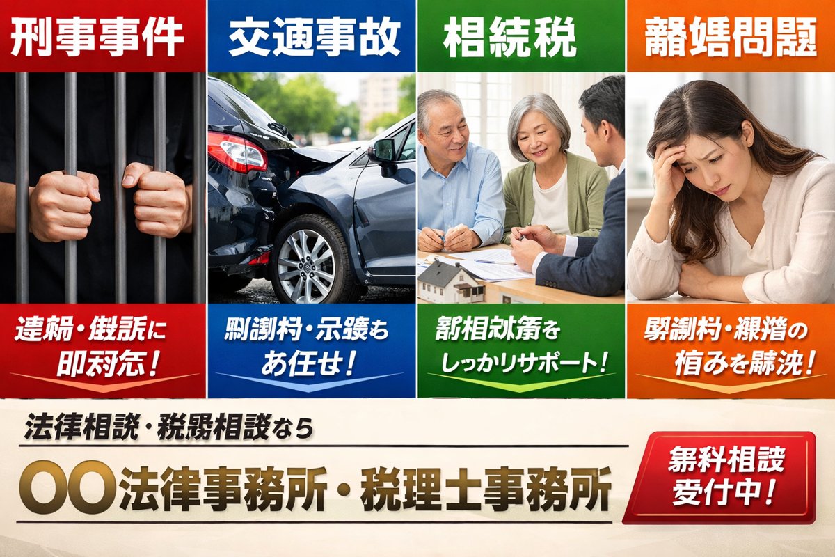
A Japanese listing-ad style landing page hero banner for a fictional law office and tax accountant office, designed like a bold web advertisement with four equal vertical panels across the top and a strong call-to-action area across the bottom. The top row contains exactly 4 service panels, each with a colored header bar, a photo-realistic stock-photo image, and a colored caption bar at the bottom. Panel 1 is red and labeled 「刑事事件」 at the top, showing a close-up of two hands gripping dark prison bars against a black background; the bottom red caption reads 「逮捕・訴訟に即対応!」 in large bold white Japanese text. Panel 2 is blue and labeled 「交通事故」 at the top, showing a realistic rear-end car crash with two damaged dark-colored sedans on a city street in daylight; the bottom blue caption reads 「慰謝料・示談もお任せ!」 in large bold white Japanese text. Panel 3 is green and labeled 「相続税」 at the top, showing an elderly couple seated at a table consulting with a suited professional, with papers and a small house model visible; the bottom green caption reads 「税相続対策をしっかりサポート!」 in large bold white Japanese text. Panel 4 is orange and labeled 「離婚問題」 at the top, showing a distressed woman sitting indoors with her head resting on one hand; the bottom orange caption reads 「慰謝料・親権の悩みを解決!」 in large bold white Japanese text. Make the four panels touch edge-to-edge with clean white dividers, each panel occupying the same width, and use highly saturated primary colors with glossy ad-design styling. Beneath the four panels, create a cream or light beige background footer area. On the left side, place a smaller black subheadline in Japanese: 「法律相談・税務相談なら」. Centered below it, place the large main office name in metallic gold gradient bold Japanese lettering with a slight bevel effect: 「{argument name="office name" default="〇〇法律事務所・税理士事務所"}」. Add thin black horizontal divider lines above and below the main office name. On the lower right, place a large glossy red rounded rectangular button with a bright gradient and white bold Japanese text reading 「{argument name="button text" default="無料相談受付中!"}」. The overall style should feel like a Japanese legal and tax services LP main visual from a listing ad: corporate, urgent, trustworthy, commercial, photo-based, clean grid layout, bold typography, high contrast, and realistic brochure-quality compositing.
Editorial / Poster
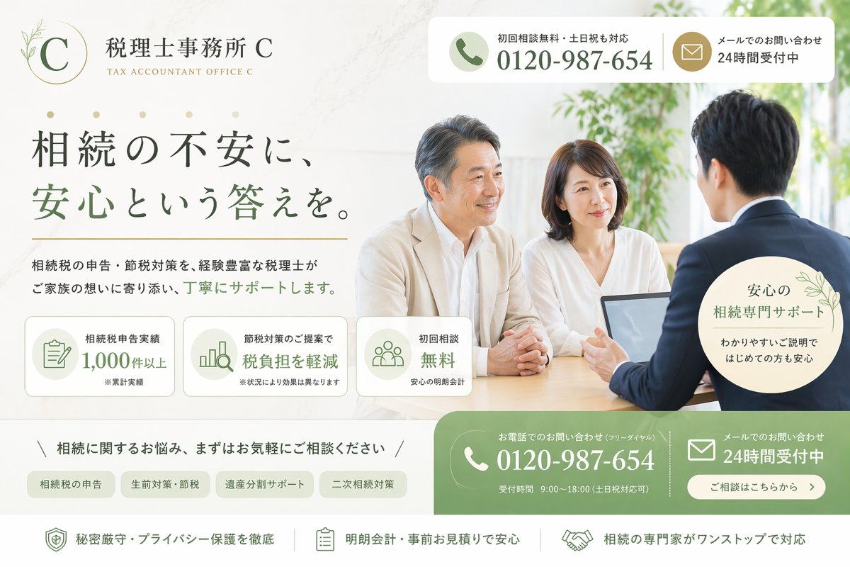
Create a clean, premium Japanese landing page hero image for a fictional tax accountant office specializing in inheritance tax consultation. The design should look like a modern listing-ad LP first view, wide desktop format, with a soft ivory and warm white background, muted sage green and gold accent colors, elegant serif Japanese typography for the headline, and a calm trustworthy atmosphere. On the left upper area, place a refined circular logo with a thin gold ring, a large serif letter C, and a small botanical line illustration, followed by the office name 税理士事務所 {argument name="office name" default="C"} and the English subtitle TAX ACCOUNTANT OFFICE {argument name="office name" default="C"}. In the top right, add a rounded white contact bar split into 2 blocks: a phone block with a green circular phone icon, the small text 初回相談無料・土日祝も対応, and the large number {argument name="phone number" default="0120-987-654"}; and a mail block with a gold circular mail icon and the text メールでのお問い合わせ 24時間受付中. The main headline on the left should be large Japanese text reading 相続の不安に、安心という答えを。, with the key phrase 安心という答えを。 in sage green. Beneath it, add a supporting sentence in smaller Japanese text: 相続税の申告・節税対策を、経験豊富な税理士がご家族の想いに寄り添い、丁寧にサポートします。 Below that, place 3 rounded rectangular feature cards in a row with pale backgrounds and green line icons: card 1 shows a document icon and the text 相続税申告実績 1,000件以上 with a tiny note ※累計実績; card 2 shows a bar chart icon and the text 節税対策のご提案で 税負担を軽減 with a tiny note ※状況により効果は異なります; card 3 shows a group icon and the text 初回相談 無料 with a tiny note 安心の明朗会計. On the right half, show a bright consultation scene photo-style image: 3 Japanese adults around a desk in a sunlit office with greenery in the background, consisting of 1 male advisor in a navy suit seen from behind on the right, and 2 clients facing him, a middle-aged man in a light beige jacket and a woman in a white blouse. Place an open laptop on the table. Their expressions should feel calm and attentive. Overlay a pale circular badge near the lower right of the photo with delicate leaf decoration and the text 安心の 相続専門サポート わかりやすいご説明ではじめての方も安心. Across the lower middle, add a slim consultation invitation line reading 相続に関するお悩み、まずはお気軽にご相談ください, framed by diagonal slash marks. Under it, place 4 rounded category tabs in a row: 相続税の申告, 生前対策・節税, 遺産分割サポート, 二次相続対策. At the bottom right, add a large green rounded contact CTA area split into 2 main columns: the left column with a white phone icon, the small text お電話でのお問い合わせ(フリーダイヤル), the large number {argument name="phone number" default="0120-987-654"}, and the small line 受付時間 9:00〜18:00(土日祝対応可); the right column with a white mail icon, the text メールでのお問い合わせ 24時間受付中, and a rounded white button reading ご相談はこちらから. Along the very bottom, create a white reassurance strip with 3 horizontally arranged items separated by thin vertical dividers: 1) shield icon and 秘密厳守・プライバシー保護を徹底, 2) clipboard icon and 明朗会計・事前お見積りで安心, 3) handshake icon and 相続の専門家がワンストップで対応. Use subtle shadows, rounded corners, soft natural light, polished commercial web design, and a highly believable Japanese legal-tax service advertisement aesthetic.
Editorial / Poster
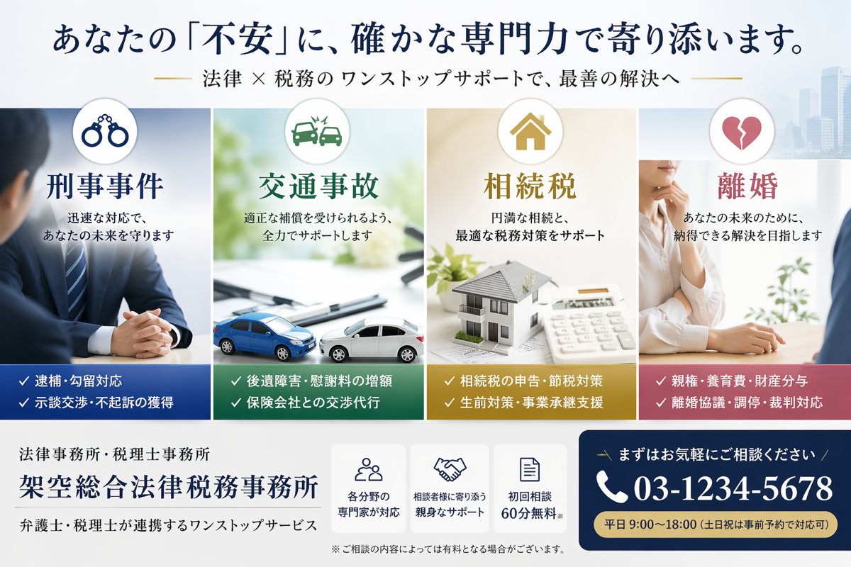
Create a polished Japanese landing-page hero banner for a fictional combined law firm and tax accountant office, with a clean corporate style, high trust, soft daylight, and a white background with faint modern city buildings on the far right. Use a wide horizontal web header layout. At the very top, place a large navy Japanese headline reading {argument name="headline text" default="あなたの『不安』に、確かな専門力で寄り添います。"}, and beneath it a smaller gold-accented Japanese subheadline reading {argument name="subheadline text" default="法律 × 税務のワンストップサポートで、最善の解決へ"}. Below the headline, arrange 4 equal vertical service cards side by side across the center. Card 1 is for criminal defense, with a circular icon showing handcuffs at the top, a cool blue color scheme, the large title "刑事事件", supporting copy "迅速な対応で、あなたの未来を守ります", a photo of a suited male professional seated with hands clasped across a desk, and a dark blue bottom band listing exactly 2 bullet lines with checkmarks: "逮捕・勾留対応" and "示談交渉・不起訴の獲得". Card 2 is for traffic accidents, with a circular icon showing a car crash at the top, a green color scheme, the title "交通事故", supporting copy "適正な補償を受けられるよう、全力でサポートします", a bright desk scene with 2 miniature cars colliding on documents, and a dark green bottom band listing exactly 2 bullet lines: "後遺障害・慰謝料の増額" and "保険会社との交渉代行". Card 3 is for inheritance tax, with a circular icon showing a house at the top, a warm gold color scheme, the title "相続税", supporting copy "円満な相続と、最適な税務対策をサポート", a tabletop scene with a model house, papers, and a calculator, and a mustard-gold bottom band listing exactly 2 bullet lines: "相続税の申告・節税対策" and "生前対策・事業承継支援". Card 4 is for divorce, with a circular icon showing a broken heart at the top, a rose-pink color scheme, the title "離婚", supporting copy "あなたの未来のために、納得できる解決を目指します", a soft professional consultation scene with a woman in a white blouse resting her hand near her chin while speaking across a desk, and a dusty-rose bottom band listing exactly 2 bullet lines: "親権・養育費・財産分与" and "離婚協議・調停・裁判対応". In the bottom area, add the firm identity on the left in Japanese: a small line "法律事務所・税理士事務所", a large firm name {argument name="firm name" default="架空総合法律税務事務所"}, and a smaller line "弁護士・税理士が連携するワンストップサービス". In the lower center, place 3 compact white feature boxes with navy line icons and short Japanese text: box 1 shows a group-of-people icon and says "各分野の専門家が対応", box 2 shows a handshake icon and says "相談者様に寄り添う親身なサポート", box 3 shows a document icon and says "初回相談60分無料". Add a small disclaimer beneath them: "※ご相談の内容によっては有料となる場合がございます。" On the lower right, create a prominent navy call-to-action panel with rounded corners. Include a small Japanese line "まずはお気軽にご相談ください", a large white phone number with phone icon {argument name="phone number" default="03-1234-5678"}, and a gold pill-shaped strip at the bottom reading {argument name="business hours" default="平日 9:00〜18:00(土日祝は事前予約で対応可)"}. Use refined Japanese Mincho-style typography for major headings, crisp spacing, balanced margins, subtle shadows, and premium legal-professional branding.
Editorial / Poster
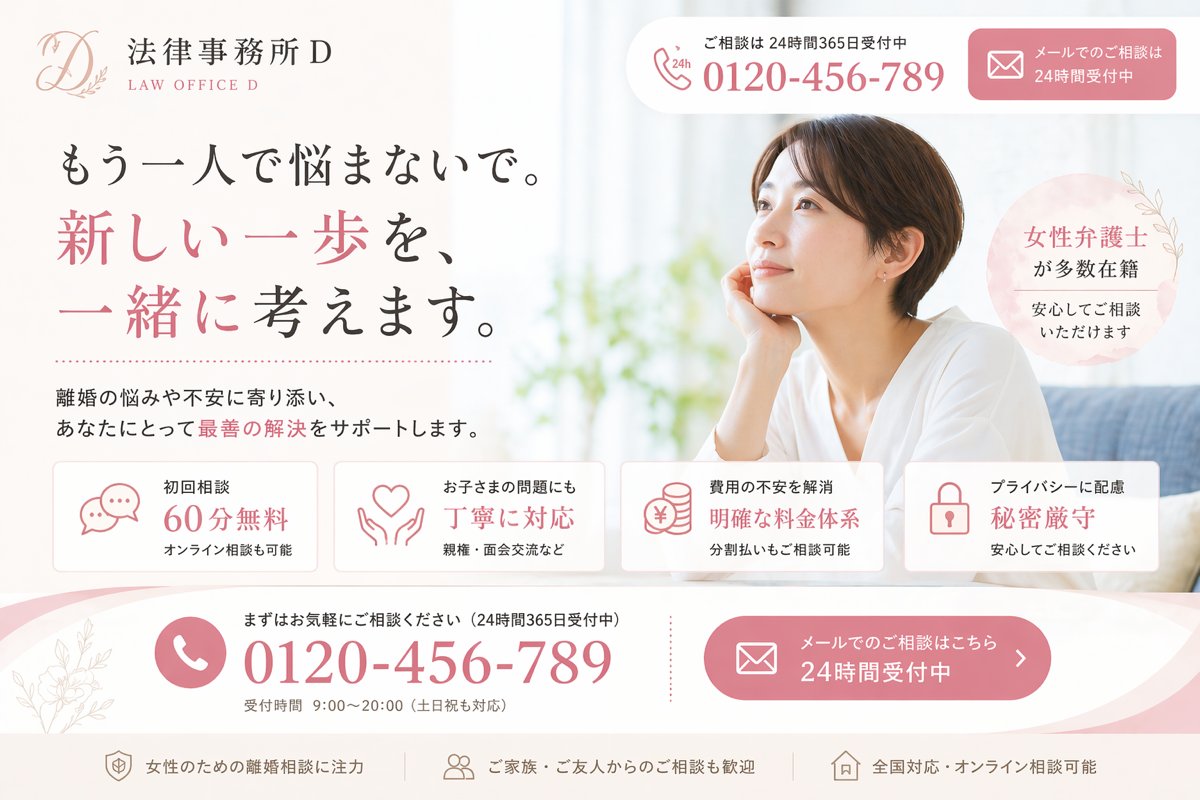
Create a polished Japanese landing page hero image for a fictional divorce-law firm, designed like a high-conversion listing ad LP. Use a soft, elegant, feminine legal-brand aesthetic with a white background, blush pink accents, light gray dividers, and subtle botanical line art. The layout is a single wide desktop web hero split into two main columns: text-heavy content on the left and a lifestyle photo on the right. In the upper left, place the law firm logo and name: a delicate scripted monogram “D” with leaf ornament, followed by the Japanese office name and small English subtitle, shown as {argument name="firm name" default="法律事務所D"} and “LAW OFFICE D”. At the top right, include 2 rounded contact boxes: the first is a white phone box with a small phone icon and “24h”, short Japanese support text above, and the large phone number {argument name="phone number" default="0120-456-789"}; the second is a pink email consultation button with an envelope icon and Japanese text indicating 24-hour reception. The main headline on the left is a large Japanese serif/mincho-style statement in 3 lines: “もう一人で悩まないで。” then “新しい一歩を、” in pink, then “一緒に考えます。” mixing black and pink emphasis. Below it, add a short supporting paragraph in Japanese about supporting clients with divorce-related worries and helping find the best solution, with one phrase highlighted in pink. On the right side, show a bright, airy photo of a Japanese woman in her 30s with short dark brown hair, wearing a loose white top, seated indoors on a sofa by a window, resting her face lightly on one hand and looking thoughtful; her face is obscured by a large rectangular blur block for privacy. Near her shoulder, place a pale pink circular badge with Japanese text saying that many female lawyers are on staff and consultations can be made with peace of mind. Across the lower middle, place 4 evenly spaced rounded white feature cards with thin borders and pink line icons. Card 1 shows a speech-bubble icon and text for “初回相談 60分無料” with a smaller line saying online consultation is also available. Card 2 shows a heart-in-hands icon and text about handling children’s issues carefully, with a smaller line mentioning custody and visitation. Card 3 shows stacked coins with a yen symbol and text about relieving anxiety over fees with a clear pricing structure, plus a smaller line about installment consultation. Card 4 shows a padlock icon and text about privacy protection and strict confidentiality, with a smaller line encouraging safe consultation. At the bottom, add a large curved pink-and-white call-to-action band spanning the width. On the left side of this band, include a circular phone icon, small Japanese text encouraging casual consultation and 24/365 reception, then the large repeated phone number {argument name="phone number" default="0120-456-789"}, and beneath it smaller reception hours text. On the right side of the band, place a large pink rounded email button with envelope icon and Japanese text saying email consultation is available 24 hours. Along the very bottom, place 3 slim footer-style trust points separated horizontally: one about focusing on divorce consultation for women, one about consultations from family and friends also welcome, and one about nationwide and online consultations. Use refined Japanese typography, spacious layout, soft shadows, premium legal-advertising design, and realistic web-LP composition. Keep all visible text in Japanese except the small English subtitle “LAW OFFICE D”.
Editorial / Poster
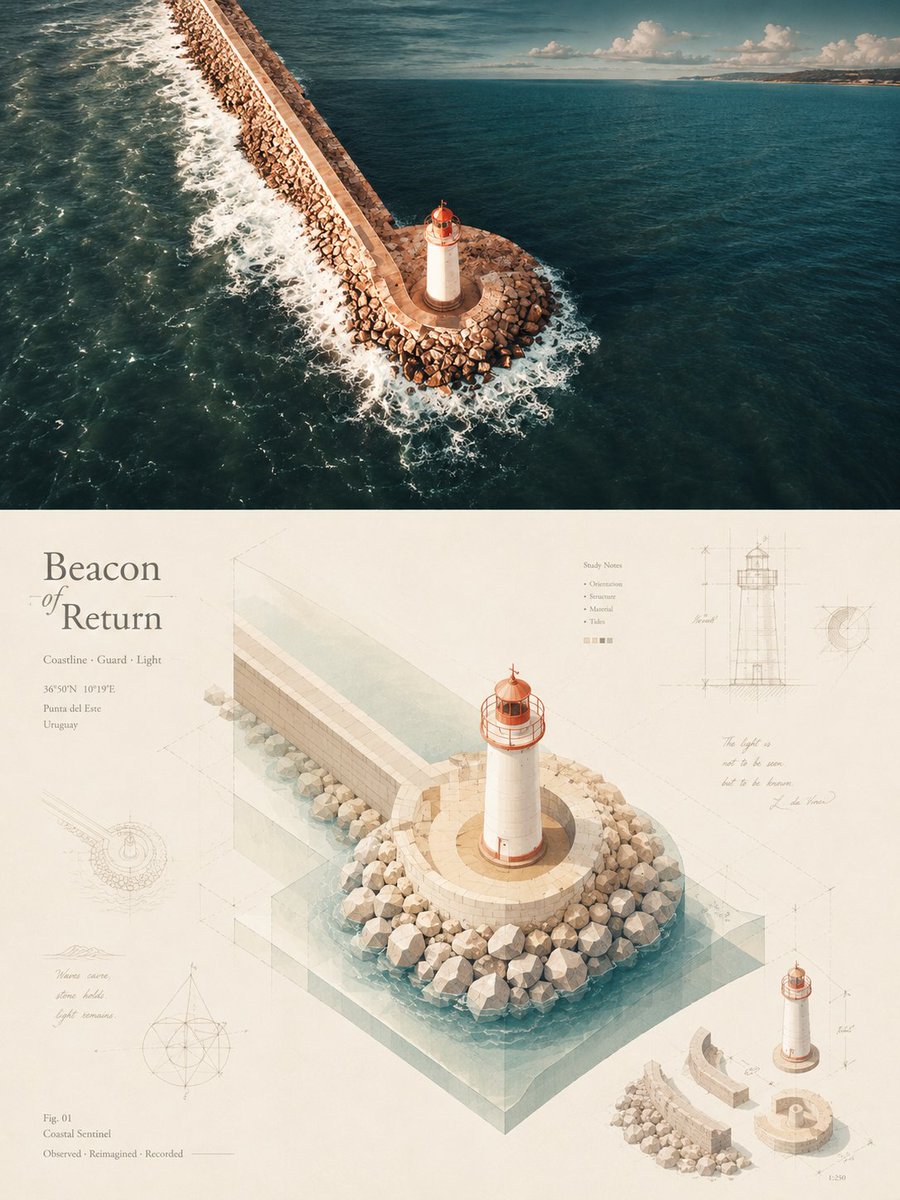
Please turn each uploaded photo into a standalone high-end design poster. Use a 3:4 vertical composition, split 1:1 between top and bottom halves. The upper half preserves the original photo with artistic color grading. The lower half extracts the subject's structure and reconstructs it using isometric spatial logic, blending architectural modeling with editorial illustration. Incorporate a {argument name="theme image" default="symbolic concept"} that is geometrized and integrated into the composition. Use high-brightness, soft Japanese-style colors and matte textures. Add Da Vinci-style manuscript research traces like sketches, structural lines, and annotations around the subject. Feature a short English title arranged along the isometric axes. The result combines thematic metaphor, isometric order, and refined editorial design.
Editorial / Poster
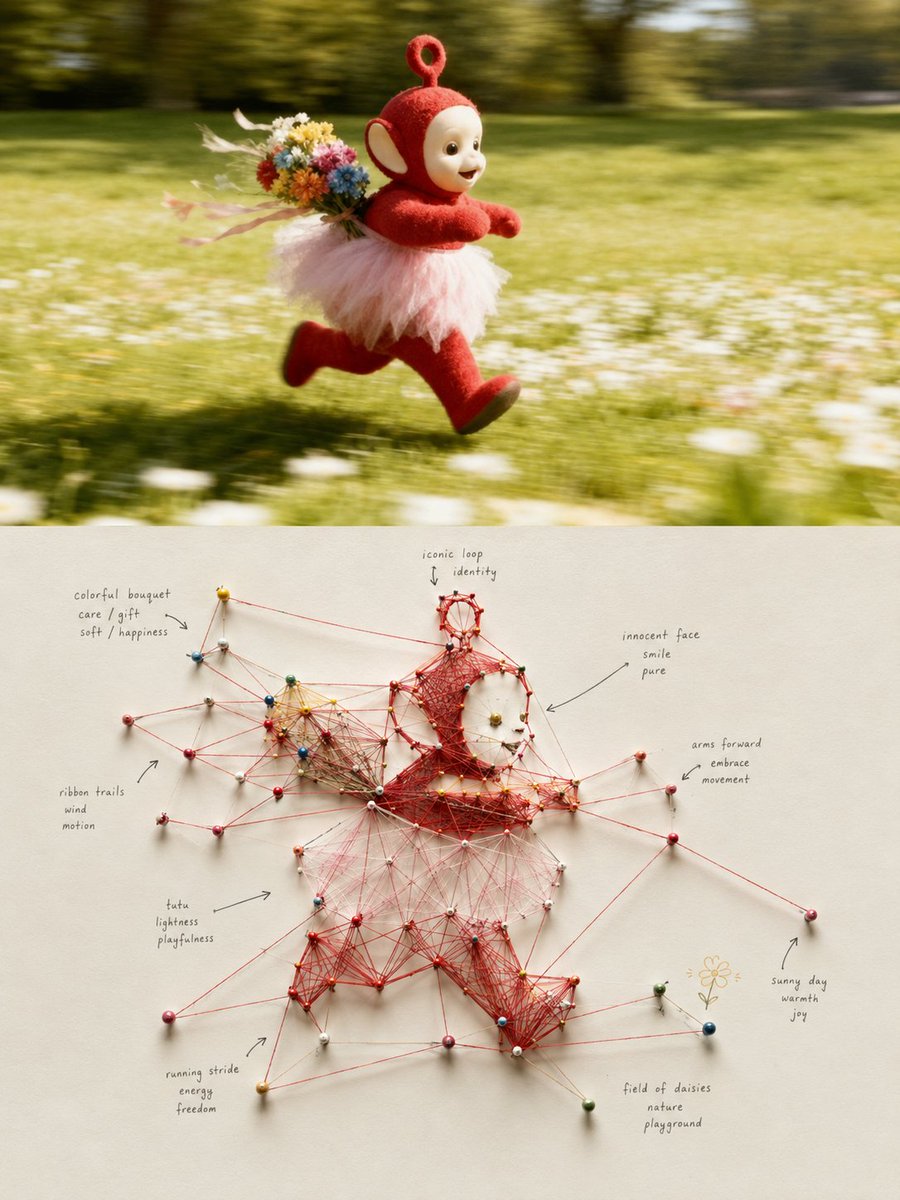
☺️🥸🤠 Please make each photo I upload into an independent high-end design poster, no multi-image stitching, each photo output separately. Overall, use a {argument name="ratio" default="3:4 vertical"} composition, the top and bottom areas are strictly 1:1, each occupying 50% of the frame. The top half retains the original photo, maintaining the subject's identity, structure, posture, real texture, natural light and shadow, and original color atmosphere, with only slight high-end color grading to give it the texture of an art magazine, independent publication, or exhibition image. To fit the frame, the environmental background can be naturally extended, but the subject must not be stretched, distorted, or changed. The bottom half extracts the most recognizable **subject, outline, structure, posture, and narrative relationship** of the photo, translating it into a real, touchable **{argument name="style" default="Physical String-based Systems Map / Tangible Node-link Visualization"}**. Do not depict the original object directly, but disassemble the subject into a small number of meaningful nodes and relationships: key outlines, structural turns, movement directions, spatial positions, or environmental clues become pushpin-style Nodes, and real strings are used as Edges / Links between them, so that the visual relationships of the original photo manifest again in a physical network, and the identity and structure of the original subject can still be vaguely recognized. The composition uses a clear **core node or core relationship** as the visual pivot, and the other nodes naturally unfold around the subject's structure. The strings are not randomly wound but should establish relationships according to the direction, proportion, distance, connection, and narrative logic of the original image; some nodes form radial, convergent, triangular, polygonal, and cross-regional connections, causing a large number of simple relationships to naturally produce **emergent geometry**. The whole is complex yet orderly, with denser central relationships and gradually sparser outer areas, retaining plenty of negative space to avoid filling the entire layout. The material must have a real physical installation feel: use small pushpins, stitches, cotton thread or twine, paper labels, handwritten marks, and a real cardboard surface, retaining slight string tension differences, node heights, cross-shading, stitch shadows, and manual errors. The whole is like an art-directed research wall, system design experiment, or information art installation, not a computer-drawn network diagram, nor cyber UI, digital glowing lines, or cheap detective board effects. The string uses a **sharp but restrained {argument name="line color" default="vermilion, coral red, or warm red"}** as the primary relationship color, creating visual tension against a large number of natural white, warm white, light grey, or very light backgrounds coordinated with the color temperature of the photo above; pushpins, paper tags, and a few markers can extract local characteristic colors from the photo above for low-area echo. The overall color is clean, modern, and vibrant, avoiding dark brown, dirty old, bloody red horror feel, and excessive retro aging. Text intervenes freely as **Hand-lettered Annotation** in the system, without presetting fixed titles, locations, years, or menu-style information. Based on the subject, action, position, emotion, relationship, or metaphor in the photo, freely generate a few keywords, short sentences, arrows, circled notes, or tiny explanations, and write them directly near nodes, at string intersections, or in blank areas. The font uses a **small, relaxed, slightly research-note-like handwritten annotation font with writing deviations**, making the text look like thoughts naturally left during the observation process, while maintaining the restraint and readability of high-end editorial design. The overall presentation is a high-end experimental visual composed of **physical nodes, red strings, relationship mapping, emergent geometry, handwritten annotations, and plenty of white space**. Whether the subject is a person, animal, plant, building, object, vehicle, natural landscape, or complex scene, it should translate "what it is" further into "how its parts relate," forming a physical information visualization with research feel, artistic feel, systematicity, and manual warmth. Avoid random red lines, meaningless nodes, full-page chaos, horror crime boards, digital network UI, cartoon pushpins, templated mind maps, and ordinary flowcharts. 😌🥲😘
Editorial / Poster
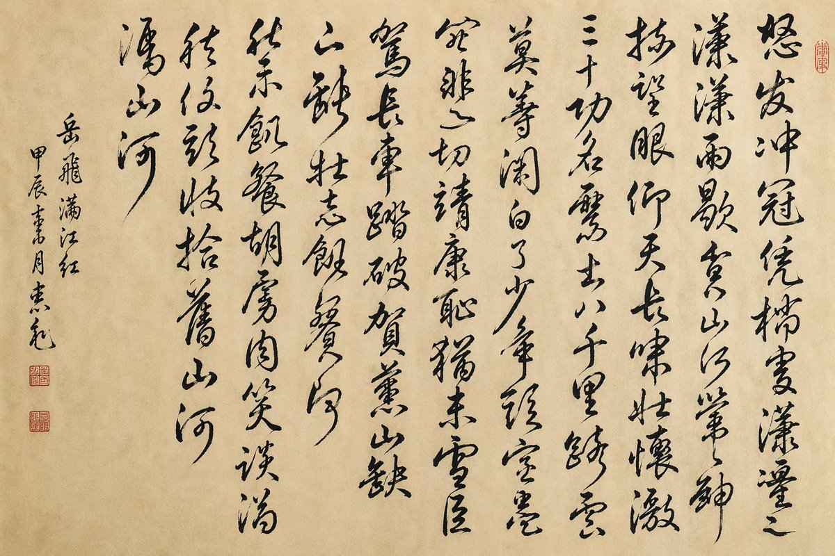
A traditional Chinese ink calligraphy artwork on aged beige xuan paper, presented as a clean flat scan or photograph of a single hanging scroll page with no frame. The composition is entirely vertical Chinese cursive script, bold expressive grass-script brushwork in deep black ink with dynamic stroke variation, flying-white texture, dry-brush breaks, and elegant rhythm. Write the full poem {argument name="poem text" default="怒发冲冠,凭栏处、潇潇雨歇。抬望眼,仰天长啸,壮怀激烈。三十功名尘与土,八千里路云和月。莫等闲,白了少年头,空悲切。\n靖康耻,犹未雪;臣子恨,何时灭!驾长车,踏破贺兰山缺。壮志饥餐胡虏肉,笑谈渴饮匈奴血。待从头,收拾旧山河,朝天阙。"} in large vertical columns arranged right to left, about 8 main poem columns across the page, each column flowing freely with slight variations in spacing and tilt. Leave a wide left margin containing a smaller vertical inscription with 3 narrow columns: the title and attribution reading {argument name="inscription text" default="岳飞 满江红 甲辰書月 某元"}, written in a more restrained but still cursive hand. Add exactly 3 small red seal stamps: 2 stacked square seals in the lower-left margin beneath the inscription, and 1 small oval seal near the upper-right edge beside the first main column. The paper should have subtle warm tan mottling, soft fibers, faint age marks, and natural uneven tone. Overall mood is heroic, scholarly, and museum-quality, with authentic Song-inspired Chinese calligraphy aesthetics, minimal background, high detail, and faithful brush texture.
Editorial / Poster
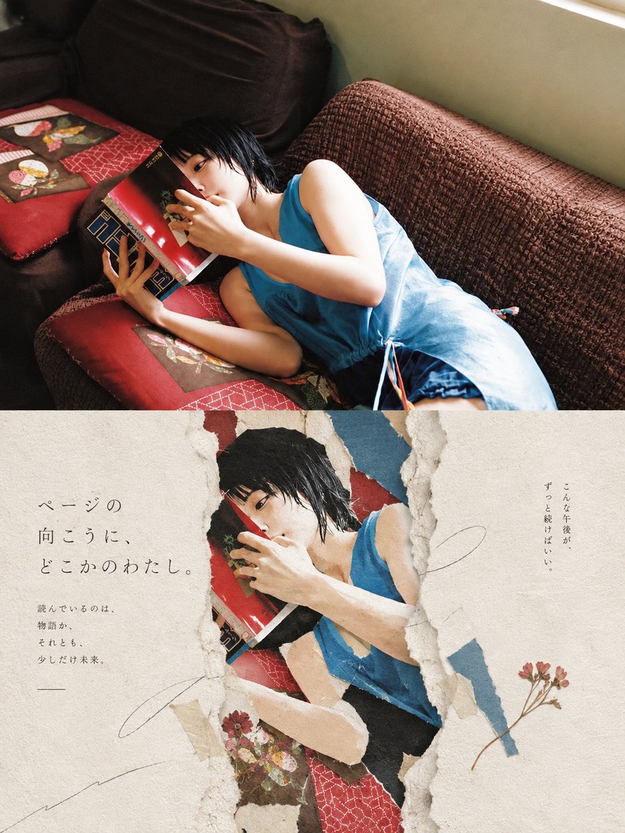
Goal: Create a vertical editorial poster combining a warm cinematic lifestyle photograph with a torn-paper collage aesthetic, centered on {argument name="subject" default="a young woman with short wet black hair reading a red book while lying on a brown sofa"}. Canvas: Vertical 3:4 poster, about 900 x 1200 px. Split the composition horizontally into 2 distinct sections: the top half is a full-bleed realistic photograph, and the bottom half is a cream handmade-paper design with a large torn opening revealing the same photograph underneath. Top section: Show the subject reclining diagonally on a textured brown couch near a window, wearing {argument name="outfit" default="a loose sleeveless sky-blue dress with thin side ties"}. She is lying on red patterned cushions with small floral fabric patches, holding a glossy red book close to her face so it partly hides her mouth and nose. Her expression is quiet and absorbed, eyes visible over the book. Use soft afternoon window light from the upper right, warm shadows, natural film photography grain, intimate indoor atmosphere, slightly high camera angle. Bottom section: Create an aged off-white paper background with subtle fiber texture, stains, deckled edges, and handmade stationery feeling. In the center, make 1 large irregular vertical ripped crack/opening with rough layered paper edges, exposing a cropped duplicate of the woman reading beneath it. Add 4 torn colored-paper fragments around the opening: one red fragment near the top, one muted blue fragment at the upper right, one beige fragment along the lower left edge, and one dark fragment near the lower center. The exposed image should look slightly flatter and more printed, like a magazine photo embedded under torn paper. Text content: Add Japanese editorial typography in thin, elegant Mincho-style characters. On the left side of the bottom paper, large vertical/stacked text reads {argument name="main Japanese copy" default="ページの\n向こうに、\nどこかのわたし。"}. Below it, smaller text reads {argument name="small Japanese copy" default="読んでいるのは、\n物語か、\nそれとも、\n少しだけ未来。"}. On the right side, add a small vertical Japanese note reading {argument name="right Japanese note" default="こんな午後が、\nずっと続けばいい。"}. Keep the text sparse and airy, with generous margins. Decorative details: Include exactly 2 pressed dried flower sprigs: one small reddish flower cluster near the lower center-left of the torn opening, and one longer thin-stem flower sprig near the lower right. Add 3 faint pencil-like curved scribble lines across the paper: one large loose curve on the right, one short underline-like stroke below the left text, and one long sweeping line from the lower left toward the center. No logos, no watermarks, no extra text. Visual style: Japanese magazine cover, poetic paper collage, tactile torn paper, wabi-sabi stationery design, warm nostalgic color grading, realistic photography mixed with handcrafted paper texture, calm literary mood.
Editorial / Poster
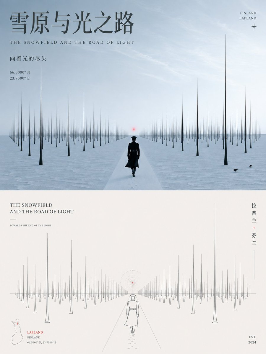
Create a high-resolution 3:4 poster based on the {argument name="theme" default="city"}. The poster uses a 1:1 split layout. The top half is a realistic scene capturing the core atmosphere of the theme (cityscape, street life, culture). The bottom half extracts the subject's structure and silhouette, reconstructing it as a minimalist geometric line art graphic with thin lines, clear perspective, and restrained negative space. Includes an integrated typography system for titles, coordinates, and years. Colors should be custom-tailored to the theme's specific mood rather than using generic templates. The final result should be clear, modern, and aesthetically sophisticated.
Editorial / Poster
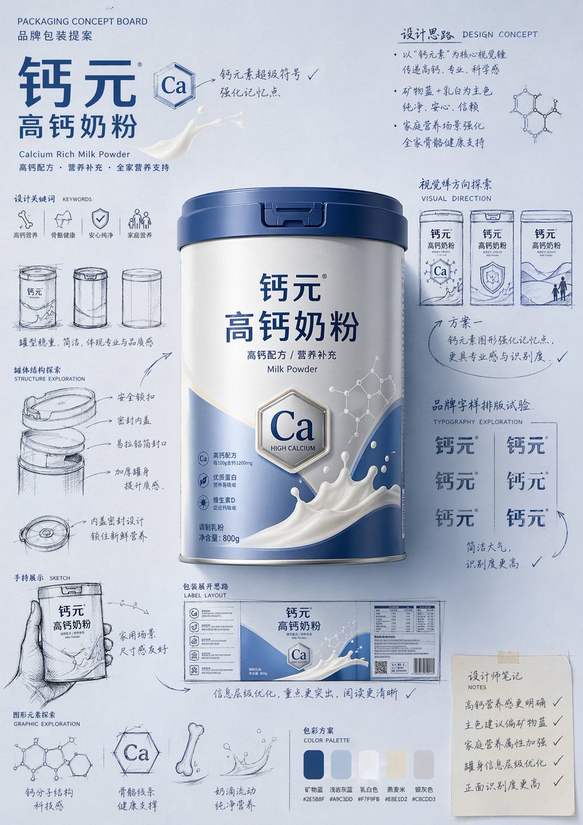
Please generate a "hand-drawn packaging proposal board style" product introduction poster for {argument name="product name" default="milk powder"}. If I provide a product image, please use it as the main reference, retaining the core visual characteristics, packaging form, colors, materials, brand identity, and overall temperament of the product. Prioritize the main color tone and color relationships from the product image for the design. If I do not provide a product image, please automatically generate a product appearance and packaging design that fits the positioning of {argument name="product name" default="milk powder"}, and automatically match natural and reasonable main, auxiliary, and background colors based on the product attributes, category characteristics, and temperament. Overall poster style requirements: This is not a standard e-commerce detail page or a simple studio-shot poster, but a creative proposal board that integrates "product finished image + packaging design sketches + brand concept development process." The overall presentation is a high-aesthetic, high-completion brand design display image, as if a designer is presenting a packaging concept proposal. Visual requirements: - Vertical composition - Use a unified background with a brand feel; the background color should be naturally determined by the product itself and not fixed to any one color. - Color schemes should coordinate with product attributes: if there is a reference image, prioritize inheriting its main and brand colors; if not, automatically generate a reasonable color scheme based on the product name. - Place the most complete and eye-catching product main visual in the center, with realistic textures, 3D lighting, and commercial finish effects. - Surround the product with multiple auxiliary visual elements: packaging sketches from different angles, structural sketches, local form explorations, hand-held display drafts, packaging unfolding ideas, and brand lettering layout experiments. - Add natural and casual black or dark hand-drawn line art, arrows, circles, symbols, and handwritten Chinese annotations to give the image a strong sense of "design process" and "creative proposal." - The finished product image should be relatively refined and realistic, while the sketch parts should be relatively casual and dynamic, creating a contrast between the "finished product + design sketches." - The layout should look relaxed and free, but overall it must have order, rhythm, and a visual center, reflecting a high-end graphic design feel. - Small graphics, symbols, or interesting elements related to the product can be added appropriately to enhance brand memory points. - The final effect should have a sense of branding, creativity, process, and visual impact. Color principles: - Do not fix a yellow background. - Automatically select the main color tone based on product type, material, use, consumer experience, and brand temperament. - The background color, product color, text color, and sketch line art color should coordinate with each other. - High-saturation monochromatic backgrounds or soft, unified color schemes can be used, as long as the overall image has a brand feel and visual impact. - Colors should naturally serve the product rather than overshadow it. Style keywords: Packaging design proposal board, brand concept development, hand-drawn sketches, design process feel, moodboard, creative review draft, product finished rendering, visual experimentation, commercial design poster. Special notes: - If there is a reference product image, prioritize following it and do not deviate from the product itself. - If there is no reference image, automatically generate reasonable product appearance, packaging, and color schemes based on the product name, maintaining overall style consistency. - The focus of the image is "product introduction + creative design process display." - Do not make it look like a common e-commerce detail page, a promotional poster, or overly neat and stiff; do not lack sketches and handwritten annotations; avoid a cheap feel or an immature cartoon style.
Editorial / Poster
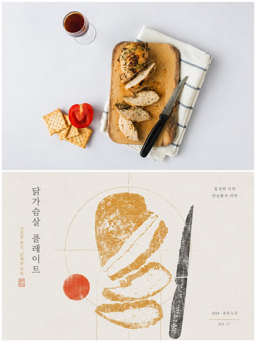
Please turn each photo I upload into a separate high-end design poster, avoiding multi-photo stitching, and output each photo individually. Use a 3:4 vertical composition overall, where the top and bottom sections are strictly 1:1 in height, each occupying 50% of the frame. The upper part retains the original photo, preserving its main structure, realistic texture, natural light/shadow, and original color atmosphere, with only slight high-end photographic color grading for an art publication and exhibition quality. To fit the frame, the sky, ground, or environment may be naturally extended, but the subject must not be stretched, distorted, or altered. The lower part extracts the most recognizable **subject, silhouette, posture, and narrative relationship** from the photo. First, interpret its core meaning, cultural attributes, or emotional connection, then reconstruct it into a graphic image with the aesthetic of folk catalogs, ancient artifact rubbings, and modern graphic design. Do not translate photo elements literally, and avoid generic traditional patterns; retain only **one core visual motif and a few truly narrative auxiliary forms**. Through silhouettes, negative shapes, local zooming, merging of forms, and symbolic translation, ensure the graphics both reflect the original object and convey its underlying meaning. The composition is built on a rigorous **geometric skeleton and proportion system**. Based on the subject's structure, extract circles, squares, triangles, curves, axes, or repeating proportions as the 'geometric matrix.' All subjects, auxiliary graphics, text, and negative space should then interact with this matrix through alignment, tangency, co-axiality, nesting, mirroring, proportional progression, or boundary cropping. The layout can be free-form, off-center, boundary-crossing, or asymmetric, but it must share the same structural logic, creating a clear visual focus, hierarchy, rhythm, and negative space. The order should be clear from a distance, while traditional imprints and detailed variations are visible up close, avoiding random scattering and decorative clutter. The color scheme extracts the most recognizable and vital colors from the photo, summarizing them into a clean and restrained print color palette. Use a bright, light paper base to create 'breathing room,' a dark color for the visual skeleton, and 1–2 theme colors from the original image for the subject and minor accents. Establish layers through area ratios, overprinting, and value relationships; colors should be clean and spirited, avoiding muddy aging, fixed folk palettes, and cluttered multi-colors. The texture uses a mix of **woodcut rubbing, dry-brush screen printing, and old-style catalog printing**. Ink gaps, scratches, and uneven ink distribution should primarily occur within the graphics, while geometric boundaries, key outlines, and the overall layout remain sharp and precise, creating a contrast of 'raw materiality × rigorous geometric order.' Text serves only as auxiliary information. Extract minimal titles and micro-annotations based on the photo's theme, meaning, or cultural attributes. These can be arranged along geometric axes, negative shapes, or graphic boundaries, aligning with or nesting within the subject without competing for the visual center. The overall presentation is **meaning-led, graphically restrained, geometrically rigorous, with raw rubbings, clear white space, and a coexistence of traditional culture and modern design order**. Every graphic element must have a source, a meaning, and a structural purpose. Remove decorative elements that do not enhance thematic understanding, avoiding material collages, random traditional symbols, uniform layouts, realistic illustrations, and a templated look.
Editorial / Poster
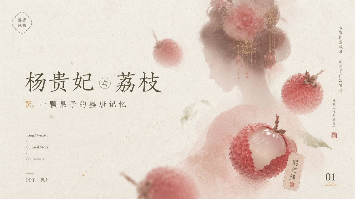
Goal: Create an elegant Tang-dynasty inspired courseware/PPT cover slide about {argument name="main title" default="杨贵妃 与 荔枝"}, with a poetic Chinese historical aesthetic centered on lychees and a veiled court beauty. Canvas: 16:9 horizontal presentation cover, warm ivory handmade-rice-paper background with subtle fibers, stains, faint scratches, and ink-wash aging. Overall palette is muted cream, dusty rose, pale peach, faded red, olive gray, and ink gray. Layout: Place the main title large on the left-center in refined Chinese calligraphy-style serif lettering. Put the small subtitle directly underneath with a decorative gold flourish at the far left. Keep generous negative space on the left and lower middle. On the right half, show a soft translucent back-view silhouette of a Tang-dynasty noblewoman with bare shoulders, high rounded hair buns, ornate gold dangling hair jewelry, and large pink-red peony flowers in her hair; her face area is intentionally covered by a plain pale beige rectangular privacy block. Add floating lychees around her and foreground depth blur. Text content: Include exactly these visible text areas: 1) top-left small cloud-shaped seal containing “盛唐 / 风物”; 2) main title “杨贵妃 与 荔枝”; 3) subtitle “一颗果子的盛唐记忆”; 4) lower-left English stack “Tang Dynasty / Cultural Story / Courseware”; 5) lower-left Chinese label “PPT · 课件”; 6) right-side vertical poem text “长安回望绣堆,山顶千门次第开。——杜牧《过华清宫》”; 7) small tag near the peeled lychee reading “贵妃鲜” with a red seal mark; 8) bottom-right page number “01” with a small gold ornamental underline. Subject details: Include exactly 4 visible lychee elements: one small blurred whole lychee floating near the upper center, one sharp whole lychee on the right side, one large peeled lychee in the lower-right center with translucent white flesh exposed and red bumpy skin opened around it, and one large heavily blurred partial lychee in the lower foreground. Add a few pale green lychee leaves connected to the peeled fruit. Make the lychees painterly but realistic, with bumpy red shells and soft natural highlights. Visual style: Minimal luxury Chinese editorial design, museum-courseware cover, soft ink wash, translucent layering, shallow depth of field, delicate gold accents, understated red stamp marks, balanced asymmetrical composition, no modern UI elements. Constraints: Keep the page clean and airy, maintain the exact count of 4 lychee elements, keep all typography readable, use no extra text beyond the specified labels, no watermark, no photorealistic harsh lighting.
Editorial / Poster
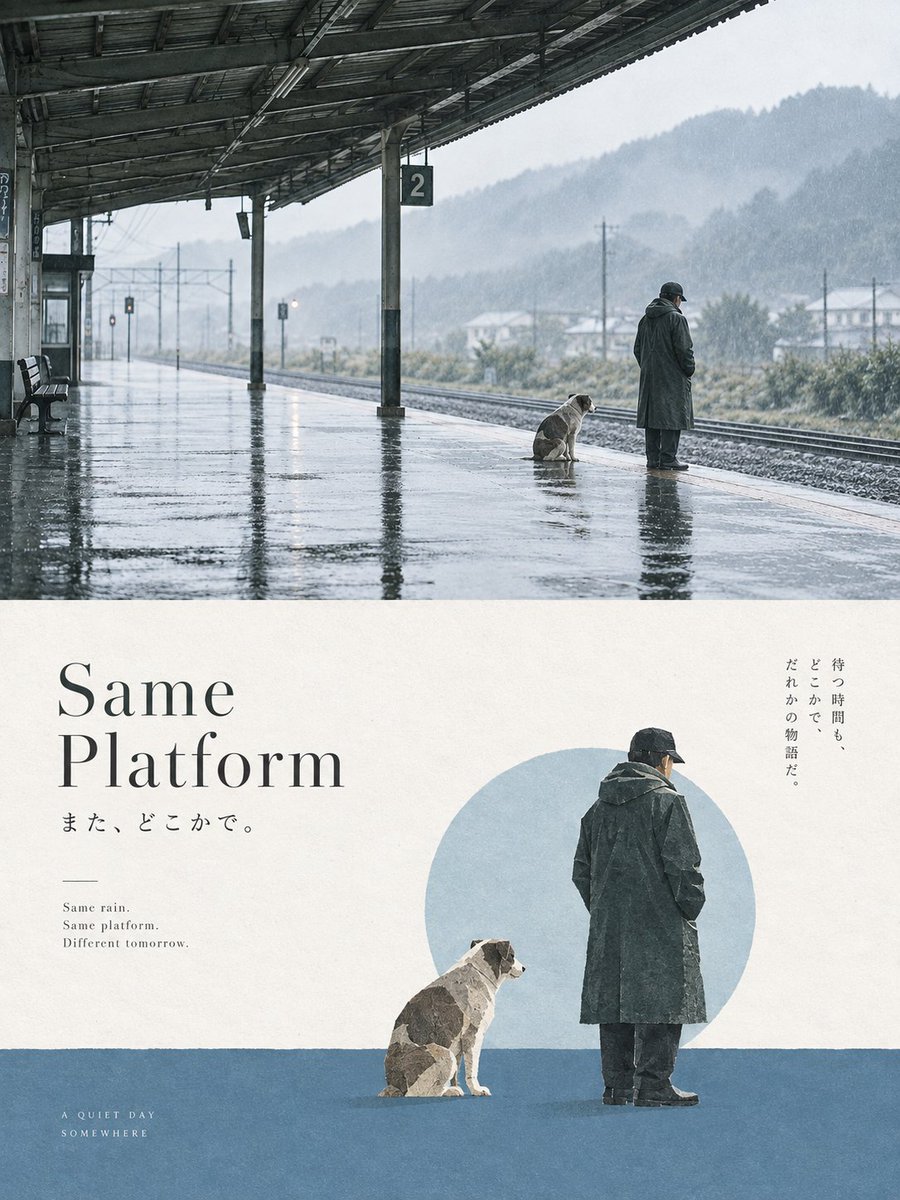
Goal: Create a minimalist editorial poster combining a cinematic rainy train-platform photograph with a quiet graphic-design reconstruction below, themed around waiting, loneliness, and companionship. Canvas: Vertical poster in a 3:4 aspect ratio, split horizontally into 2 equal-feeling sections: the upper half is a realistic rainy photograph, the lower half is a cream-paper minimalist layout with typography and cutout figures. Upper section: Show a deserted rural railway platform in heavy rain, viewed from a wide diagonal perspective under a dark metal station roof. The wet concrete platform reflects the roof beams, pillars, and sky like a mirror. Include exactly 1 elderly man in a long dark raincoat and black cap standing near the platform edge, facing away to the right, and exactly 1 medium-sized dog sitting beside him, also facing the tracks. Include exactly 1 empty bench on the far left, exactly 1 square platform sign with the number “2” hanging from a pillar, and exactly 2 visible railway tracks running into the misty distance. Background: pale gray rainy mountains, faint houses, utility poles, and soft haze. Mood is quiet, cold, melancholic, cinematic, with muted blue-gray tones. Lower section layout: Use an off-white textured paper background. On the left, place a large elegant serif headline reading {argument name="headline text" default="Same Platform"}, stacked on two lines, dark charcoal, with generous letter spacing and magazine-poster refinement. Beneath it place Japanese subtext: {argument name="Japanese subtitle" default="また、どこかで。"}. Below that, add a short thin horizontal line, then a tiny English poem in small serif text: “Same rain. / Same platform. / Different tomorrow.” In the bottom-left corner add small spaced uppercase text: “A QUIET DAY / SOMEWHERE”. Lower section illustration: On the right half, place cutout-style figures of the same elderly man and dog from the upper photo, simplified into a collage aesthetic. The man stands with his back turned, wearing a long dark raincoat, dark pants, black cap, and black shoes. The dog sits to his left. Behind them is exactly 1 large pale blue circle like a moon or memory. Across the bottom third, add exactly 1 horizontal muted blue ground block spanning the width. On the upper-right, add vertical Japanese text: {argument name="vertical Japanese quote" default="待つ時間も、どこかで、だれかの物語だ。"}. Visual style: Japanese minimalist editorial design, quiet literary poster, soft grain, matte paper texture, restrained negative space, muted blue-gray and cream palette, realistic top image contrasted with simplified collage bottom image. Keep the composition refined and calm, with no extra characters, no vehicles, no crowds, no bright colors, and no watermark.
Editorial / Poster
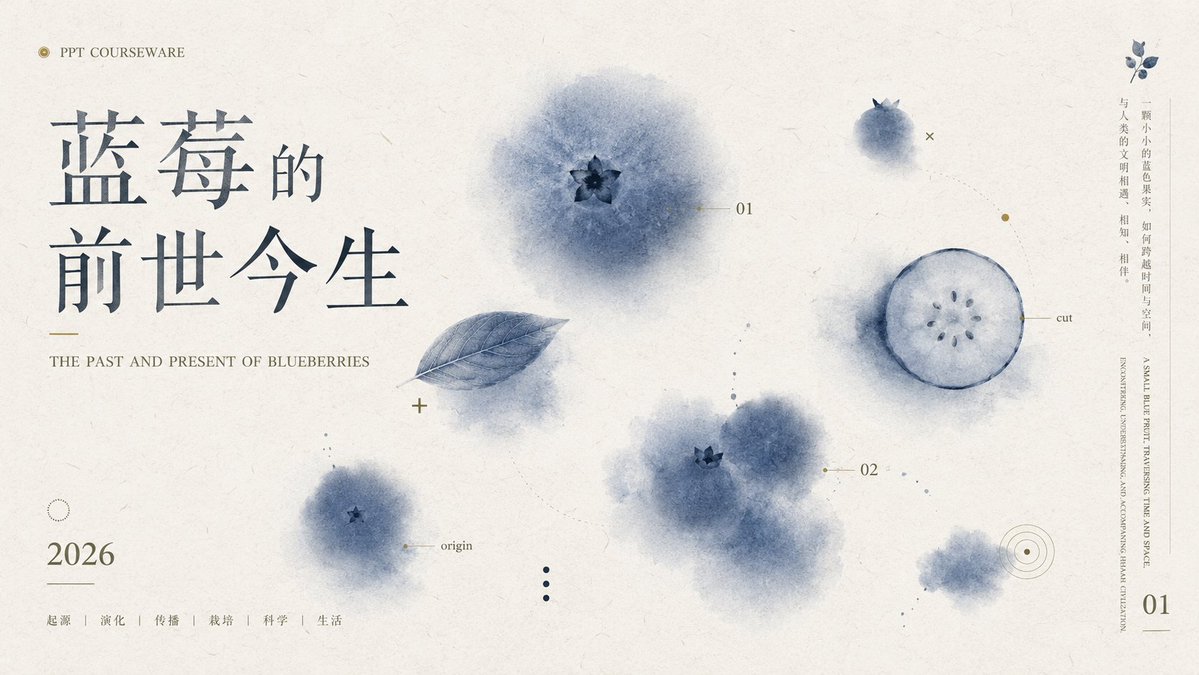
Goal: Create an elegant widescreen PPT courseware cover slide about {argument name="topic" default="the past and present of blueberries"}, blending Chinese editorial typography with soft watercolor botanical illustration. Canvas: 16:9 landscape presentation slide, warm off-white handmade paper texture background with subtle fibers, faint stains, and minimal ink speckles. Layout: Left third is dominated by a large Chinese title in dark blue-gray: {argument name="Chinese title" default="蓝莓的\n前世今生"}. Place the title in two stacked lines with generous spacing, using a refined Song/Ming-style serif font. Above it, small uppercase text reads “PPT COURSEWARE” preceded by a tiny gold circular icon. Under the title, add a short thin gold line and the English subtitle in small serif capitals: {argument name="English subtitle" default="THE PAST AND PRESENT OF BLUEBERRIES"}. Bottom left shows the year {argument name="year" default="2026"} in large serif numerals, with a thin horizontal line beneath, then five small Chinese category labels separated by vertical dividers: “起源 | 演化 | 传播 | 栽培 | 科学 | 生活”. Main imagery: Use exactly 6 visible blueberry-related watercolor elements across the slide: 1 large soft blue blueberry bloom near the upper center with a dark star-shaped calyx, 1 translucent blue leaf angled diagonally below-left of it, 1 small blueberry bloom near lower left labeled “origin”, 1 clustered pair of blurry blueberries near lower middle-right with one visible calyx, 1 circular blueberry cross-section on the right labeled “cut” with pale pulp and small seed dots, and 1 small fuzzy blueberry wash near the lower right. Keep all fruit elements desaturated indigo, smoky blue, and gray-blue, with feathered watercolor edges. Technical annotation details: Add fine gold and blue-gray diagram marks: tiny crosses, dotted guide lines, small circles, target rings, and thin leader lines. Include exactly 3 small numeric labels: “01” near the upper-center blueberry, “02” near the middle-right cluster, and “01” as a page number at the bottom right. Add the labels “origin” and “cut” in very small serif text. Right margin: Add a narrow vertical text column on the far right with small Chinese copy: {argument name="vertical quote" default="一颗小小的蓝色果实,如何跨越时间与空间,与人类的文明相遇、相知、相伴。"}. Beside or below it, add very small vertical English text in uppercase, decorative and partially editorial, about blueberries traversing time and space. Visual style: Minimal premium academic presentation design, Chinese new-literati aesthetic, botanical science notes, high negative space, soft ink-wash watercolor, muted navy-blue and gray palette with restrained antique-gold accents, crisp typography but organic painted fruit. No people, no photorealistic fruit, no bright colors, no watermark.
Editorial / Poster
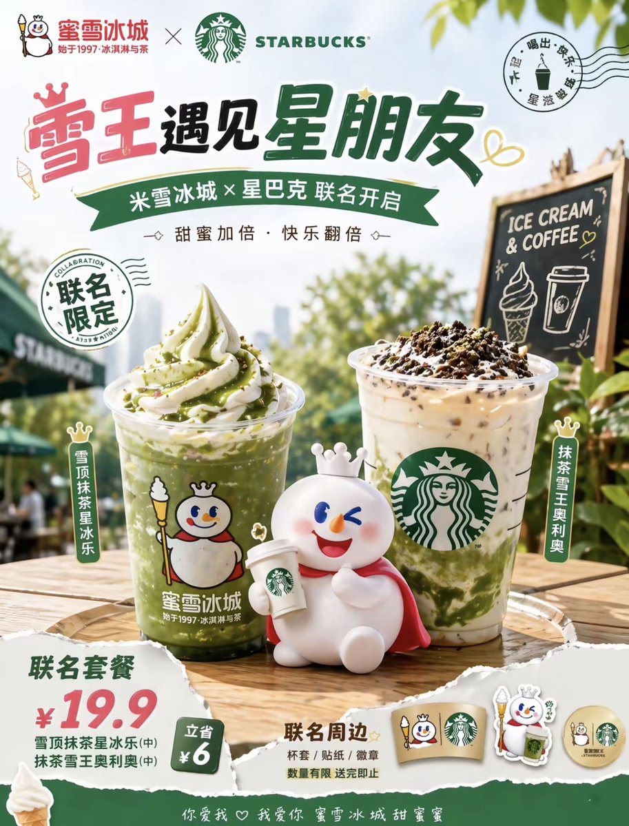
A bright, cheerful summer co-branded beverage poster in a clean Chinese commercial advertising style, showing a collaboration between {argument name="brand one" default="蜜雪冰城"} and {argument name="brand two" default="STARBUCKS"}. Vertical poster layout with a soft blue sky background, sunlit greenery, and an outdoor cafe atmosphere. At the top, place both brand logos side by side with a large bold Chinese headline in playful hand-drawn display lettering: {argument name="headline text" default="雪王遇见星朋友"}. Beneath it, add a green ribbon banner with Chinese subheadline text: {argument name="subheadline text" default="米雪冰城 × 星巴克 联名开启"}, and a smaller line reading "甜蜜加倍·快乐翻倍". Include 2 circular stamp-style graphics: one on the left reading "联名限定", and one on the upper right like a postmark with Chinese text around a small drink icon. In the center foreground on a wooden outdoor table, display 2 iced drinks: on the left, a tall clear cup of vivid green matcha slush topped with a tall swirl of vanilla soft serve and green matcha drizzle, with visible ice texture and a cute snowman mascot logo on the cup; on the right, a tall clear Starbucks-style iced latte with milk and green matcha swirls at the bottom, topped with whipped cream and dark cookie crumbs, with the green siren logo on the cup. In front of the drinks, place 1 cute white snowman mascot figurine with a tiny crown, round body, rosy cheeks, red cape, and a happy wink, sitting and holding a small takeaway coffee cup. Add 2 vertical product name tags beside the drinks: left tag "雪顶抹茶星冰乐", right tag "抹茶雪王奥利奥". On the right midground, place 1 small black chalkboard sign on a wooden easel reading "ICE CREAM & COFFEE" with chalk drawings of an ice cream cone and a takeaway cup. In the lower left, create a torn-paper price block showing a combo offer with large red numbers "¥19.9", green supporting text, and a small green badge reading "立省 ¥6". In the lower center-right, add a "联名周边" area displaying exactly 4 merchandise items: 1 cup sleeve, 1 character keychain or acrylic charm, 1 round badge, and 1 small sticker or token, all using the snowman mascot and coffee collaboration theme. Use warm sunlight, glossy drink photography, shallow depth of field, soft bokeh trees, high contrast product retouching, crisp packaging details, and an upbeat youthful retail-promo aesthetic. Include scattered doodle hearts and playful decorative accents around the typography. Keep all visible text in Chinese except the Starbucks wordmark and the chalkboard text.
Editorial / Poster
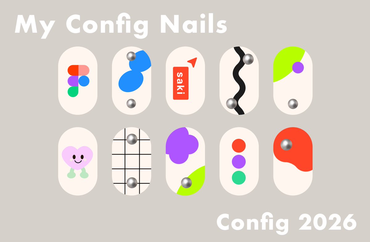
Goal: Create a cute presentation board for custom event nail art inspired by {argument name="event name" default="Config 2026"}, with playful Figma-like shapes and soft 3D metallic nail gems. Canvas: Horizontal 16:9 layout, warm taupe-gray background, clean minimal poster composition. Text content: Large bold rounded white title at the upper left: “My Config Nails”. Large bold rounded white event label at the lower right: “{argument name="event label" default="Config 2026"}”. Use a heavy friendly sans-serif font with soft rounded corners. Layout: Arrange exactly 10 press-on nail designs in two centered rows of five. Each nail is a vertical rounded capsule shape, ivory/off-white, evenly spaced, with subtle flat graphic decoration. Keep the nails large and isolated, like a Figma design mockup. Nail designs, exactly 10: 1. Top row, first nail: Figma logo made from five rounded colored blobs in red-orange, coral, purple, blue, and green. 2. Top row, second nail: abstract bright blue stacked bean shapes with two chrome silver spherical studs, one near the upper left and one near the bottom. 3. Top row, third nail: red vertical rounded rectangle label with white text “saki”, plus a small red paper-plane or cursor triangle near the upper right. 4. Top row, fourth nail: thick black wavy vertical stripe down the center with two chrome silver spherical studs, one near the upper right and one near the lower left. 5. Top row, fifth nail: neon lime green curved corner shape sweeping in from the upper left, purple circle near the right side, and one chrome silver stud near the lower center. 6. Bottom row, first nail: cute pastel pink heart character with black oval eyes, smiling mouth, and mint green little legs/feet. 7. Bottom row, second nail: black grid lines over the ivory nail, with two chrome silver studs aligned vertically, one upper center and one lower center. 8. Bottom row, third nail: large purple flower/blob cluster at upper left, neon lime green curved patch at lower right, and one chrome silver stud near the lower center. 9. Bottom row, fourth nail: three vertically stacked circles in red-orange, purple, and green, centered on the nail. 10. Bottom row, fifth nail: large red-orange organic blob covering the upper portion, with one chrome silver stud near the upper left of the blob. Visual style: Modern cute flat vector nail-art mockup, Figma conference aesthetic, soft cream nails, saturated accent colors, simple geometric shapes, subtle shadows only on chrome studs for a 3D metallic look. Keep everything crisp, clean, and poster-like. Constraints: Use exactly 10 nail capsules and exactly 10 chrome silver studs total. Do not add hands, fingers, bottles, extra decorations, watermarks, or additional text.
Editorial / Interface
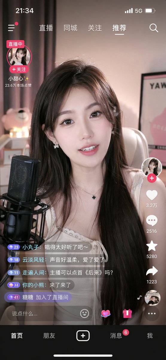
{ "type": "mobile live streaming app interface mockup", "subject": "young Asian woman streamer, long dark hair, white top, smiling, speaking into a black studio microphone", "background": "cozy room, soft pink lighting, teddy bear, framed poster", "ui_elements": { "status_bar": "time 21:34, cellular, 5G, battery icons", "top_navigation": ["直播", "同城", "关注", "{argument name=\"active tab\" default=\"推荐\"}", "search icon"], "streamer_info": { "name": "{argument name=\"streamer name\" default=\"小甜心✨\"}", "status": "直播中", "likes": "23.6万本场点赞" }, "right_action_buttons": { "count": 6, "items": ["profile with plus", "heart with 3.2万", "speech bubble with 2516", "star with 5280", "share arrow with 1223", "spinning record album"] }, "chat_overlay": { "count": 5, "messages": [ "小丸子: {argument name=\"chat message 1\" default=\"唱得太好听了吧~\"}", "云淡风轻: {argument name=\"chat message 2\" default=\"声音好温柔,爱了爱了\"}", "走遍人间: 主播可以点首《后来》吗?", "你的小熊: 来了来了", "糖糖 加入了直播间" ] }, "bottom_input": "text field saying {argument name=\"input placeholder\" default=\"说点什么...\"}, emoji, heart, gift, menu icons", "bottom_navigation": { "count": 5, "tabs": ["首页", "朋友", "plus button", "消息", "我"] } } }
Editorial / Poster
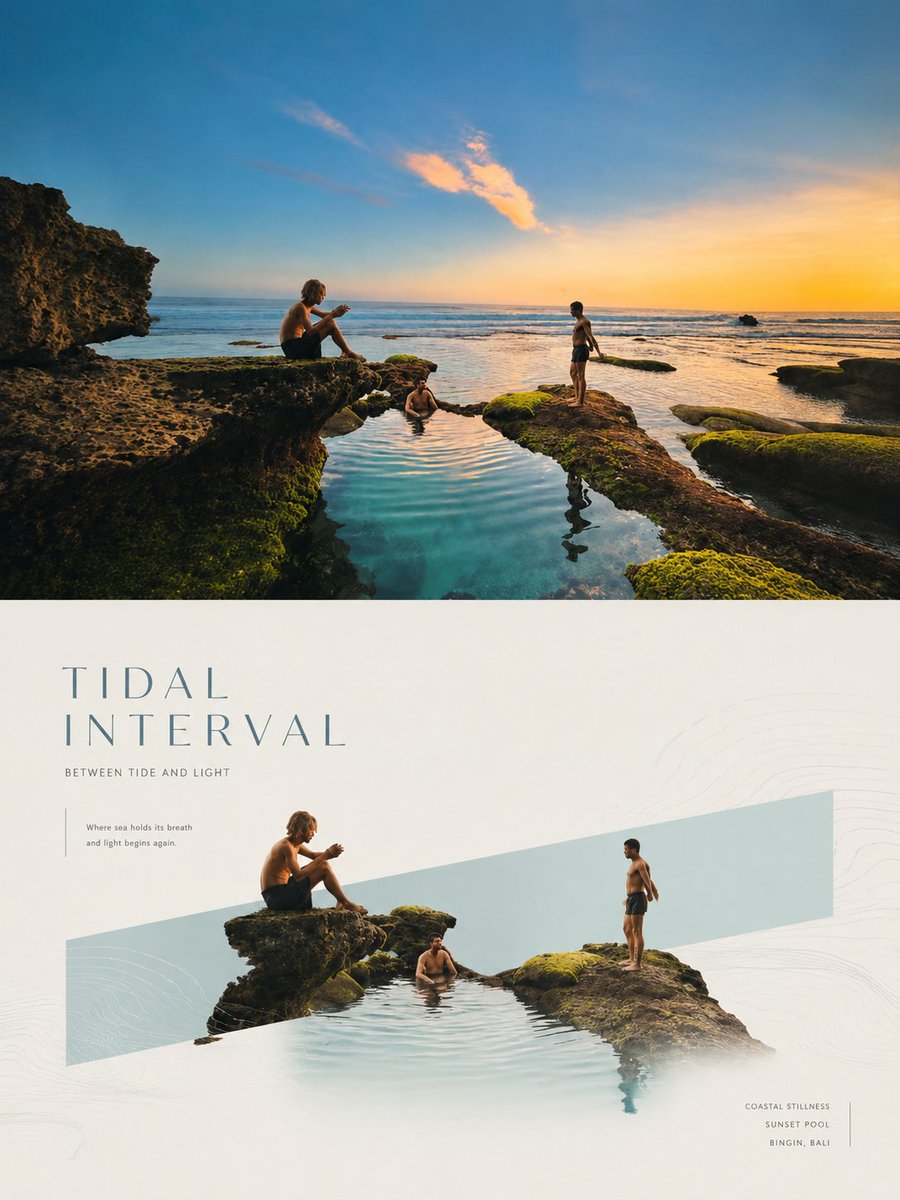
Please make each photo I upload into an independent high-end design poster, no multi-photo splicing, each photo output separately. The overall composition is 3:4 vertical, with the top and bottom regions strictly 1:1, each occupying 50% of the screen. The top half preserves the original photo, maintaining the subject structure, real texture, natural lighting, and original color atmosphere, with only slight high-end photography color grading to give it the exquisite texture of high-end brand advertising, art magazines, and exhibition visuals. To adapt to the frame, the sky, ground, or environmental background can be naturally extended, while the subject itself remains unchanged. The bottom half extracts the most recognizable **subject, outline, posture, and narrative relationship** of the photo, reconstructing it into a minimalist visual poster with high-end commercial aesthetics. The core language is **'real objects crossing geometric emotional windows'**: a narrow, restrained, low-saturation geometric color block is set in the screen as a visual anchor and spatial container. **The direction of the color block is not fixed, it can be horizontal, vertical, or diagonal**, naturally determined according to the center of gravity of the subject, the direction of movement, the trend of the outline, and the rhythm of the layout. The subject enters the color block in a real photographic or exquisite realistic way, and partially crosses the border, breaks the frame, extends or passes through the boundary, forming a sense of natural growth, spatial penetration, and white space breathing. The composition remains minimalist, clear, and balanced, establishing order through geometric color blocks, subject boundary-crossing relationships, and large areas of white space. The subject can be centered, off-center, growing vertically, or stretching horizontally, but always maintains a single focus. The background is mainly white, light gray, or very light warm colors, and very slight cultural patterns, linear graphics, topographic lines, water wave lines, lighting outlines, or abstract symbols can be added as faint auxiliary levels. The color matching extracts the most recognizable and energetic color relationships from the top photo, transforming them into a high-end system of **light-colored geometric windows + real subject colors + a minimal amount of neutral color typography**. The color of the color block can be softened into mist blue, light cyan, cream white, pale pink, warm gray, light gold, or other light tones consistent with the temperament of the original image, making the overall look light, clean, modern, and exquisite. Text naturally intervenes as part of the layout structure. A short English title can be extracted from the subject, emotion, action, state, or symbolic meaning of the photo, accompanied by a small number of subtitles, locations, status words, or micro-notes. The title can be arranged horizontally, vertically, or along the relationship between the color block and the subject. Auxiliary information is neatly arranged in small font size, thin font weight, and stretched letter spacing, making it present a high-end editorial feel like high-end real estate, luxury goods, aesthetic magazines, or seasonal solar term visuals. The overall temperament emphasizes **Eastern white space, modern order, natural vitality, and high-end commercial beauty**. Whether the subject is a person, animal, plant, building, utensil, food, vehicle, or natural landscape, it should maintain a clear, elegant, and transferable visual echo between real photography and geometric emotional windows. Please make each photo I upload into an independent high-end design poster, no multi-photo splicing, each photo output separately. The overall composition is 3:4 vertical, with the top and bottom regions strictly 1:1, each occupying 50% of the screen. The top half preserves the original photo, maintaining the subject structure, real texture, natural lighting, and original color atmosphere, with only slight high-end photography color grading to give it the exquisite texture of high-end brand advertising, art magazines, and exhibition visuals. To adapt to the frame, the sky, ground, or environmental background can be naturally extended, while the subject itself remains unchanged. The bottom half extracts the most recognizable **subject, outline, posture, and narrative relationship** of the photo, reconstructing it into a minimalist visual poster with high-end commercial aesthetics. The core language is **'real objects crossing geometric emotional windows'**: a narrow, restrained, low-saturation geometric color block is set in the screen as a visual anchor and spatial container. **The direction of the color block is not fixed, it can be horizontal, vertical, or diagonal**, naturally determined according to the center of gravity of the subject, the direction of movement, the trend of the outline, and the rhythm of the layout. The subject enters the color block in a real photographic or exquisite realistic way, and partially crosses the border, breaks the frame, extends or passes through the boundary, forming a sense of natural growth, spatial penetration, and white space breathing. The composition remains minimalist, clear, and balanced, establishing order through geometric color blocks, subject boundary-crossing relationships, and large areas of white space. The subject can be centered, off-center, growing vertically, or stretching horizontally, but always maintains a single focus. The background is mainly white, light gray, or very light warm colors, and very slight cultural patterns, linear graphics, topographic lines, water wave lines, lighting outlines, or abstract symbols can be added as faint auxiliary levels. The color matching extracts the most recognizable and energetic color relationships from the top photo, transforming them into a high-end system of **light-colored geometric windows + real subject colors + a minimal amount of neutral color typography**. The color of the color block can be softened into mist blue, light cyan, cream white, pale pink, warm gray, light gold, or other light tones consistent with the temperament of the original image, making the overall look light, clean, modern, and exquisite. Text naturally intervenes as part of the layout structure. A short English title can be extracted from the subject, emotion, action, state, or symbolic meaning of the photo, accompanied by a small number of subtitles, locations, status words, or micro-notes. The title can be arranged horizontally, vertically, or along the relationship between the color block and the subject. Auxiliary information is neatly arranged in small font size, thin font weight, and stretched letter spacing, making it present a high-end editorial feel like high-end real estate, luxury goods, aesthetic magazines, or seasonal solar term visuals. The overall temperament emphasizes **Eastern white space, modern order, natural vitality, and high-end commercial beauty**. Whether the subject is a person, animal, plant, building, utensil, food, vehicle, or natural landscape, it should maintain a clear, elegant, and transferable visual echo between real photography and geometric emotional windows.
Editorial / Interface
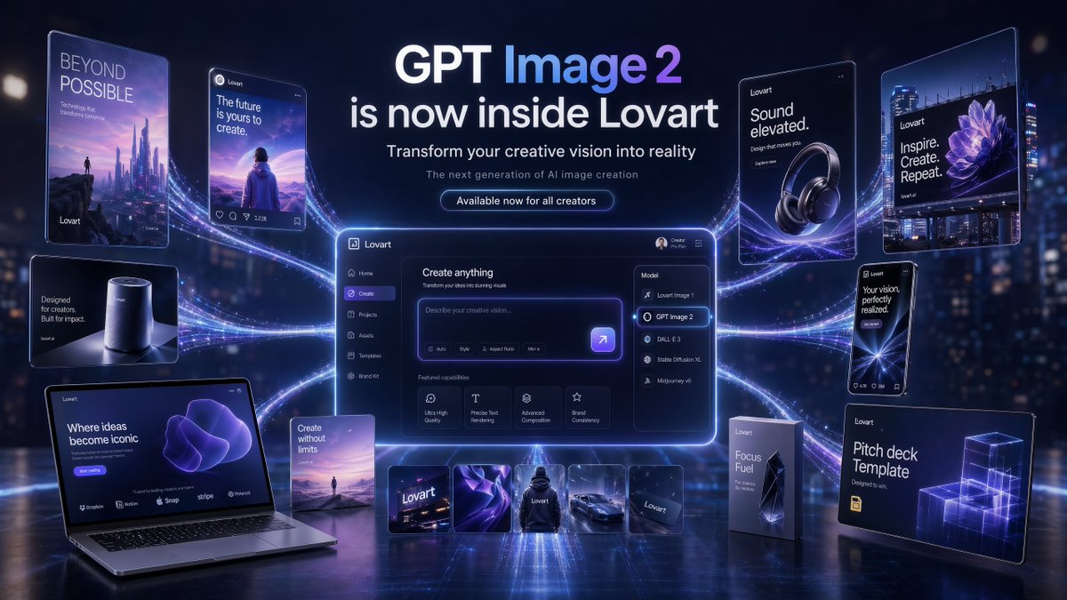
{"type":"futuristic AI product launch campaign hero banner","style":"high-end 3D advertising composite with cinematic neon lighting, polished UI mockups, floating product cards, and glossy tech presentation aesthetics","theme":{"primary colors":["deep navy","electric violet","indigo","white"],"mood":"innovative, premium, futuristic, campaign-ready","lighting":"dramatic blue-violet glow, rim lighting, luminous particle trails, soft bloom, reflective floor"},"canvas":{"aspect_ratio":"16:9","background":"dark futuristic city-at-night bokeh with subtle skyscraper lights and atmospheric haze"},"headline_block":{"position":"top center","count":4,"lines":["GPT Image 2","is now inside Lovart","Transform your creative vision into reality","The next generation of AI image creation"],"cta":"Available now for all creators","typography":"clean modern sans-serif, bold white headline, smaller white and pale gray subtext, glowing rounded button"},"layout":{"centerpiece":"large glowing desktop app interface floating in the center with purple edge lighting and curved energy trails connecting all surrounding assets","sections":[{"title":"left floating posters and devices","position":"left side","count":5,"labels":["BEYOND POSSIBLE vertical sci-fi poster with futuristic skyline and tiny figure","social-style card reading 'The future is yours to create.' with a person facing a surreal landscape","small smart speaker product card reading 'Designed for creators. Built for impact.'","open laptop mockup reading 'Where ideas become iconic' with a purple abstract form on screen","small vertical card reading 'Create without limits' with a tiny landscape scene"]},{"title":"center application UI","position":"middle","count":1,"labels":["Lovart create interface with prompt box and model dropdown opened"]},{"title":"model menu items","position":"center-right inside UI","count":5,"labels":["Lovart Image 1","GPT Image 2","DALL·E 3","Stable Diffusion XL","Midjourney v6"]},{"title":"featured capability cards","position":"lower middle inside UI","count":4,"labels":["Ultra High Quality","Precise Text Rendering","Advanced Composition","Brand Consistency"]},{"title":"bottom asset strip","position":"bottom center","count":5,"labels":["Lovart logo card","abstract purple fabric-like visual","black hoodie mockup","sports car render","dark Lovart card"]},{"title":"right floating posters and packages","position":"right side","count":5,"labels":["headphone ad reading 'Sound elevated.'","large billboard-style poster reading 'Inspire. Create. Repeat.' with a purple flower image","phone-style card reading 'Your vision, perfectly realized.'","tall product box reading 'Focus Fuel'","presentation board reading 'Pitch deck Template' with glowing wireframe cubes"]}]},"ui_details":{"app_brand":"Lovart","main_panel_title":"Create anything","prompt_placeholder":"Describe your creative vision...","left_sidebar_count":6,"left_sidebar_labels":["Lovart","Home","Create","Projects","Assets","Templates"],"top_right_user_label":"Creator Pro Plan"},"composition":"symmetrical campaign composition, central software dashboard larger than all other elements, connected to surrounding posters and product mockups by multiple flowing luminous ribbons, reflective ground plane beneath all objects, crisp readable text, premium launch announcement aesthetic","quality":"ultra-detailed, sharp typography, realistic reflections, clean interface design, commercial-grade product visualization"}
Editorial / Poster
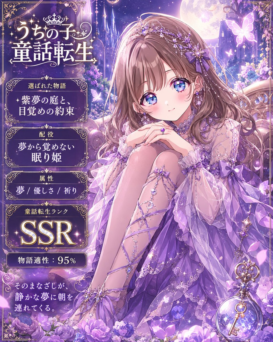
Goal: Create a vertical fantasy anime story-card poster that transforms {argument name="character name" default="うちの子"} into a personalized fairy-tale heroine, with an ornate gothic-luxury interface panel on the left and a detailed character illustration on the right. Canvas: Portrait 4:5 composition, high-resolution, dark midnight blue and silver palette, luminous moonlit atmosphere, sparkling magical particles, ornate gold filigree borders, elegant Japanese fantasy gacha-card design. Layout: Split composition with two main zones. Left third is an information panel framed by thin gold ornamental lines and curling Art Nouveau flourishes. Right two-thirds is a full-body/three-quarter anime illustration set in a moonlit palace garden balcony. Add a large full moon near the top center, starry sky, crystal columns, hanging jewels, blue flowers, glowing petals, and deep perspective into a magical castle courtyard. Text content: Use Japanese typography in glowing ivory-gold serif style. Top title inside the left panel reads 「うちの子」 above large 「童話転生」. Below it, create exactly 5 stacked information sections with small gold-framed label plaques and centered values: 1) label 「選ばれた物語」, value 「月影の庭と、黒猫の約束」; 2) label 「配役」, value 「月夜に現れる 黒猫姫」; 3) label 「属性」, value 「月光 / 神秘 / 尊き」; 4) label 「童話転生ランク」, value 「SSR」 in very large glowing letters; 5) label 「物語適性」, value 「95%」 in large numerals. At the bottom, add a separate ornate caption box containing 「そのまなざしが、迷いかけた物語に 月明かりを灯す。」 with a small crescent-moon jewel charm hanging from the frame. Subject details: The main character is an elegant anime cat princess with {argument name="hair color" default="glossy black hair"}, long layered hair, black cat ears, a jeweled silver tiara, crystal hair ornaments, dangling chains, blue gemstones, and a mysterious refined expression; leave the face area optionally unobstructed unless the user requests privacy masking. She wears a black and dark violet off-shoulder gothic-lolita evening dress with lace, translucent sleeves, layered ruffles, ribbons, silver embroidery, floral appliqués, and many sapphire-like jewels. She holds a delicate crescent-moon wand in one hand. Include a glossy black cat companion with bright blue eyes and a jeweled collar sitting near her side. Include a fluffy black cat tail behind the heroine. Visual style: Ultra-detailed Japanese anime illustration, romantic fairy-tale reincarnation theme, luxurious gacha SSR card aesthetic, moonlight rim lighting, blue-white sparkles, ornate gold linework, luminous flowers, soft bloom, intricate jewelry, elegant melancholy mood, highly polished digital painting. Constraints: Countable elements must remain exact: 1 main heroine, 1 black cat companion, 1 crescent wand, 1 large moon, 5 information sections, 1 bottom quote box. Do not add extra UI panels, extra animals, logos, watermarks, or modern objects. Keep all visible text crisp and placed only in the left panel and bottom caption box.
Editorial / Poster
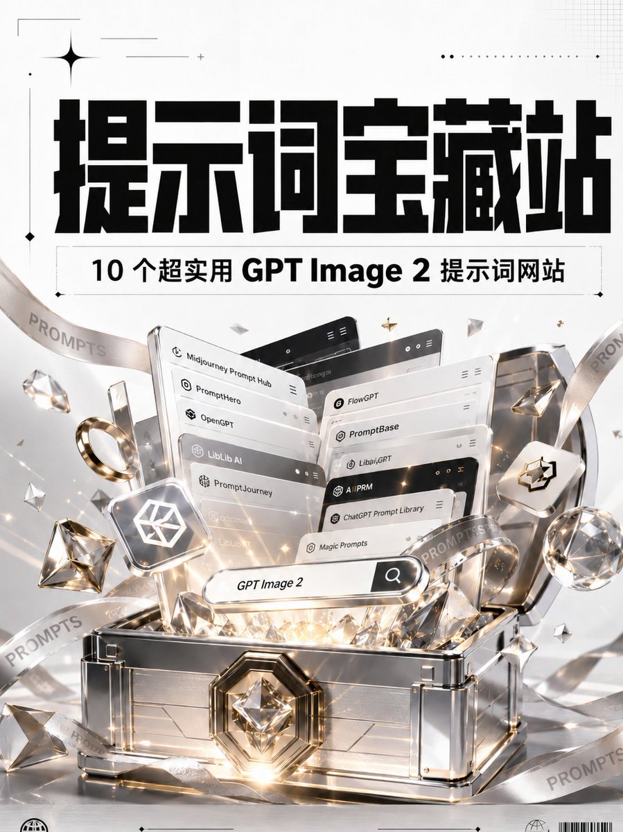
Goal: Create a luxurious vertical poster announcing a collection of useful GPT Image 2 prompt websites, styled like a premium treasure discovery. Canvas: Portrait 3:4 poster, bright white and light silver background, high-resolution commercial 3D render mixed with bold graphic typography. Use a clean editorial layout with subtle grid marks, thin crop lines, dotted ornaments, small sparkle icons, and bottom micro-print details. Top typography: Place a huge, heavy, blocky black Chinese headline centered near the top reading {argument name="main headline" default="提示词宝藏站"}. Above and around it add minimal black decorative marks: one large four-point star at upper left, thin horizontal lines, a dotted line near upper right, and tiny diamond markers. Subtitle bar: Directly under the headline, add a thin outlined rectangular label containing bold black text reading {argument name="subtitle text" default="10 个超实用 GPT Image 2 提示词网站"}. Keep the subtitle centered with generous letter spacing and a crisp print-design feel. Main subject: In the lower two-thirds, show an open futuristic silver treasure chest with polished metal panels, transparent glass-like edges, chrome trim, gold accents, and a large faceted diamond emblem on the front lock. The chest is overflowing with glowing prompt-library interface cards, gems, diamonds, and warm golden light beams. Add white, gold, and crystal reflections, lens flares, and sparkling particles. Website cards: Show exactly 10 stacked floating UI cards emerging from the chest, arranged in layered perspective like browser panels. Each card should have rounded corners, small app icons, minimal menu dots, and one visible label. The 10 visible labels are: 1) Midjourney Prompt Hub, 2) Prompthero, 3) OpenGPT, 4) LibLib AI, 5) PromptJourney, 6) FlowGPT, 7) PromptBase, 8) Libai.GPT, 9) ChatGPT Prompt Library, 10) Magic Prompts. Use a mix of white, silver, and black card headers. Search element: In front of the cards, place a pill-shaped search bar angled slightly upward, glowing softly, with the text {argument name="search query" default="GPT Image 2"} and a black search icon button on the right. Decorative objects: Include exactly 2 translucent ribbon bands looping diagonally through the composition, both printed repeatedly with the word {argument name="ribbon word" default="PROMPTS"}. Add exactly 1 gold ring on the left, exactly 2 large faceted diamonds near the left and right sides, exactly 1 small floating rounded-square tile with a white geometric cube logo on the left, and exactly 1 matching rounded-square tile with a black cube logo on the right. Scatter smaller crystal shards and gold star particles around the chest. Visual style: Premium tech treasure aesthetic, glossy 3D rendering, white/silver/gold palette, cinematic reflections, realistic glass and metal materials, sharp typography, high contrast black headline, elegant minimal infographic poster styling. Constraints: Keep the design vertically centered and symmetrical, preserve the exact count of 10 website cards, avoid adding extra website names, avoid people or characters, no watermark, no social media UI, no QR code.
Editorial / Interface
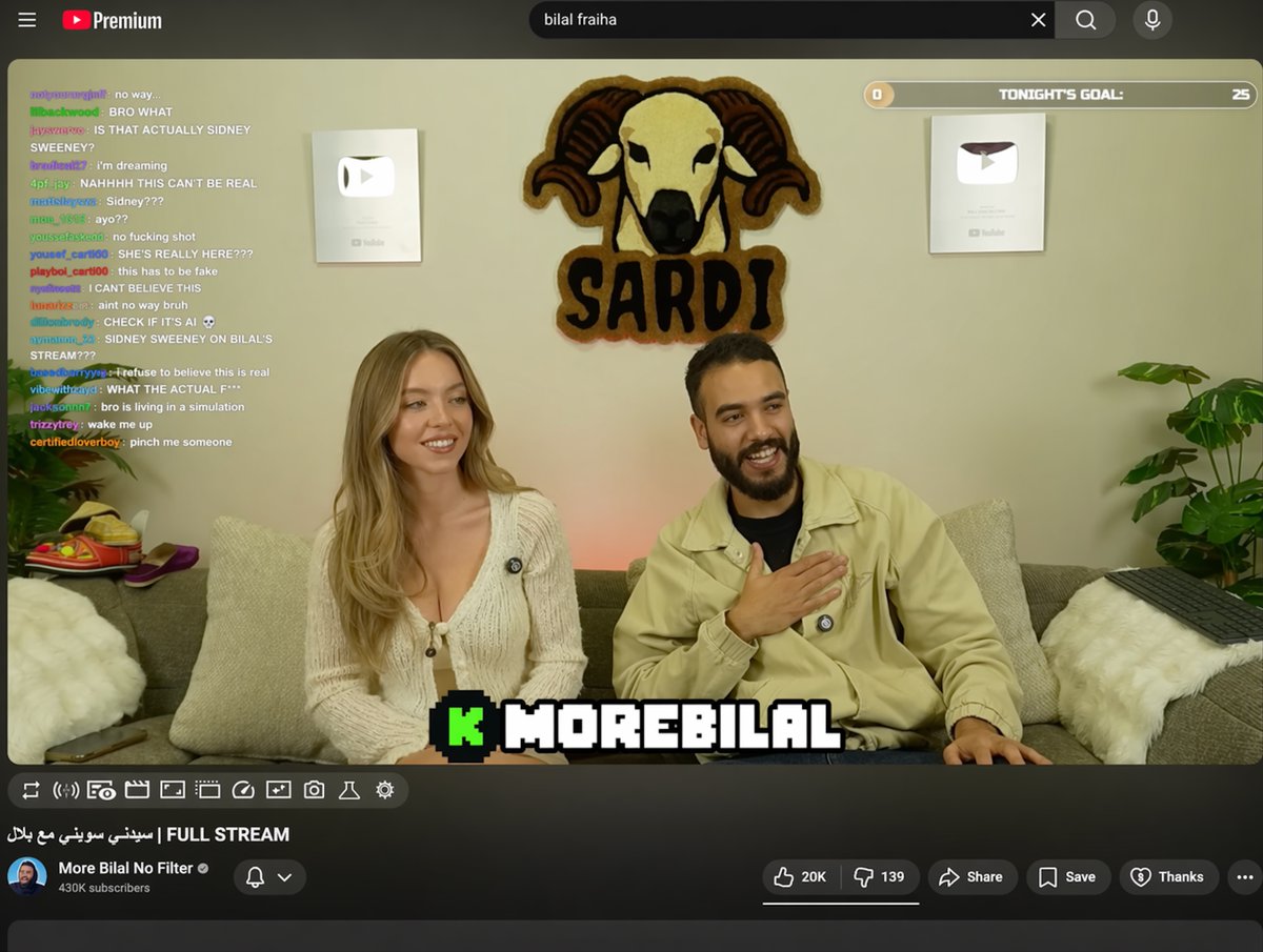
{ "type": "YouTube livestream UI", "top_nav": { "logo": "YouTube Premium", "search": "{argument name=\"search query\" default=\"bilal fraiha\"}", "icons": 3 }, "player": { "subjects": [ "{argument name=\"female guest\" default=\"Sydney Sweeney\"} in white cardigan", "bearded man in beige jacket laughing" ], "bg": "couch, 2 silver play buttons, ram logo 'SARDI'", "overlays": { "chat": {"pos": "left", "count": 15, "desc": "colored usernames, white text"}, "goal": {"pos": "top right", "text": "TONIGHT'S GOAL: 0 to 25"}, "banner": {"pos": "bottom center", "text": "K {argument name=\"streamer name\" default=\"MOREBILAL\"}"} }, "controls": {"count": 10} }, "details": { "title": "{argument name=\"video title\" default=\"FULL STREAM | سيدني سويني مع بلال\"}", "channel": "{argument name=\"channel name\" default=\"More Bilal No Filter\"}", "buttons": 5 } }
Editorial / Poster
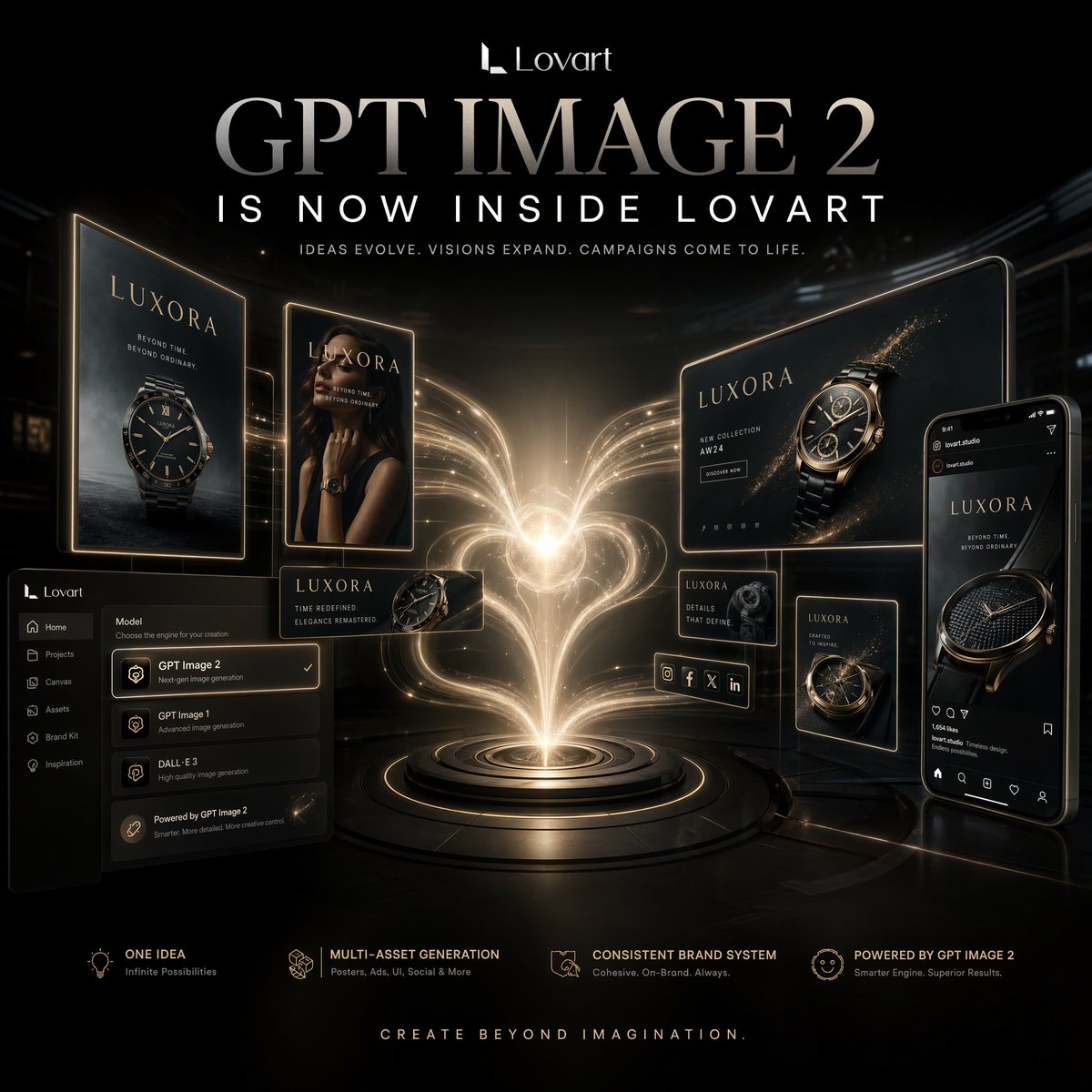
{"type":"luxury AI creative platform promotional poster","style":"cinematic premium tech advertising, glossy black and gold color palette, high contrast, futuristic luxury branding, photoreal 3D compositing with elegant UI mockup elements","format":"square social campaign poster","background":{"color":"deep black","environment":"dark futuristic studio space with subtle architectural shadows and reflective floor","lighting":"dramatic central glow with warm gold volumetric light trails and rim lighting around all floating screens"},"branding":{"logo_text":"Lovart","headline":"{argument name=\"headline text\" default=\"GPT IMAGE 2\"}","subheadline":"{argument name=\"subheadline text\" default=\"IS NOW INSIDE LOVART\"}","tagline":"IDEAS EVOLVE. VISIONS EXPAND. CAMPAIGNS COME TO LIFE.","footer_tagline":"CREATE BEYOND IMAGINATION."},"centerpiece":{"description":"a brilliant glowing heart-shaped energy plume erupting from a circular platform, made of flowing golden light strands, like a fountain of creativity or generative power","position":"center","base":"concentric metallic pedestal rings with illuminated edges"},"product_brand":{"name":"{argument name=\"brand name\" default=\"LUXORA\"}","category":"luxury wristwatch campaign visuals"},"floating_assets":{"count":8,"items":[{"type":"vertical poster billboard","position":"far left","content":"luxury watch hero shot with brand title and dark oceanic backdrop"},{"type":"vertical fashion poster","position":"left center","content":"female model in black styling wearing a luxury watch, face partially obscured by composition"},{"type":"small horizontal product card","position":"lower left center","content":"watch close-up with short campaign copy"},{"type":"large horizontal billboard","position":"upper right","content":"hero watch render with sparkling gold particles and campaign layout"},{"type":"small square info card","position":"mid right","content":"watch detail close-up and short descriptive text"},{"type":"small vertical poster","position":"lower right center","content":"secondary watch campaign image"},{"type":"social media story or feed mockup","position":"far right","content":"smartphone-style interface showing a luxury watch ad post"},{"type":"creative app UI panel","position":"bottom left","content":"dark software sidebar and model selector with GPT Image 2 highlighted, plus other image model options"}]},"ui_panel":{"position":"bottom left","components":{"count":8,"labels":["Lovart","Home","Projects","Canvas","Assets","Brand Kit","Inspiration","GPT Image 2"]}},"feature_row":{"position":"bottom","count":4,"items":[{"title":"ONE IDEA","subtitle":"Infinite Possibilities"},{"title":"MULTI-ASSET GENERATION","subtitle":"Posters, Ads, UI, Social & More"},{"title":"CONSISTENT BRAND SYSTEM","subtitle":"Cohesive, On-Brand, Always"},{"title":"POWERED BY GPT IMAGE 2","subtitle":"Smarter Engine, Superior Results."}]},"composition":"symmetrical but slightly dynamic layout, central energy source surrounded by floating campaign outputs, all screens angled inward toward the glow to suggest one idea expanding into a full brand system","materials":"black glass, brushed metal, gold neon edges, glossy screens, subtle particle sparkles","mood":"innovative, aspirational, premium, magical, campaign-launch energy","quality":"ultra-detailed, crisp typography, polished brand presentation, high-end product visualization, studio-grade advertising render"}
Editorial / Poster
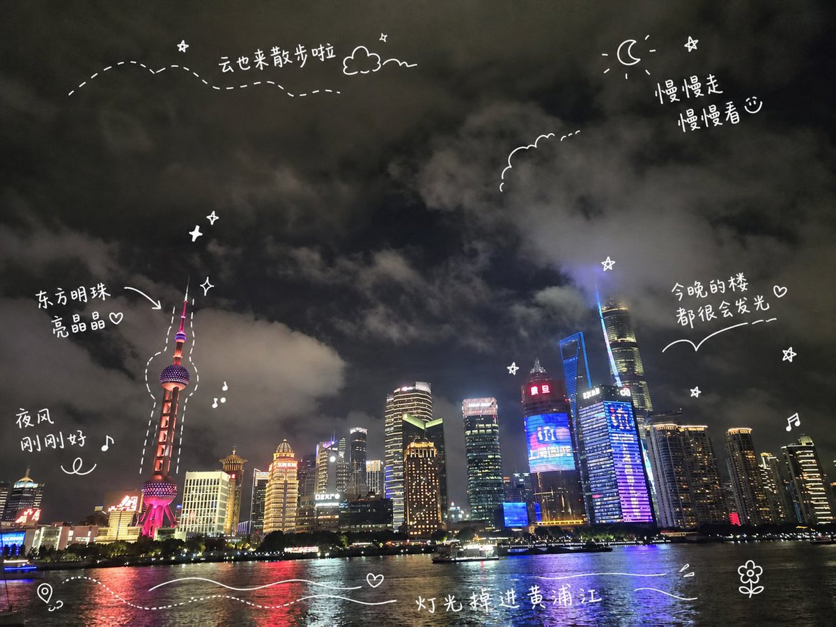
Create a travel-journal style night cityscape poster of {argument name="city skyline" default="Shanghai Pudong skyline along the Huangpu River"}. Use a wide 4:3 canvas showing a realistic nighttime waterfront photo look: dark cloudy sky filling the top two thirds, illuminated skyscrapers along the horizon, the Oriental Pearl Tower on the left glowing pink-red, Shanghai Tower and other high-rises on the right with blue, purple, gold, and white lights, and reflective river water across the bottom with a small sightseeing boat. Add playful white hand-drawn diary doodles and handwritten Chinese annotations directly over the scene, like a social media travel note. Include exactly 6 handwritten text notes: “云也来散步啦” near the upper left with a dotted wandering path and small cloud, “慢慢走 慢慢看♡” near the upper right beside a crescent moon and star, “东方明珠 亮晶晶♡” pointing with an arrow to the Oriental Pearl Tower, “夜风 刚刚好♪” on the left above the river, “今晚的楼 都很会发光♡” on the right above the skyline with a curved underline, and “灯光掉进黄浦江” centered near the bottom over the water. Include exactly 15 white doodle elements: a dotted flight path across the upper left, one small outlined cloud near the top, one crescent moon at the upper right, one scalloped cloud outline near the upper center-right, one arrow pointing to the Oriental Pearl Tower, one dashed outline tracing around the Oriental Pearl Tower, three small sparkle/star icons, two music-note icons, one map-pin icon at the bottom left, two flowing wave lines across the bottom water, and one small flower doodle at the bottom right. Keep all doodles thin, casual, hand-drawn, slightly imperfect, and bright white, with no borders or watermark. The mood should be dreamy, cozy, romantic, and spontaneous, like a handwritten travel memory shared on social media.