THE LIBRARY

Editorial image prompts.

Browse images and open the prompts behind them.

Bitter Melon Lemon Soda Poster

Bitter Melon Lemon Soda Poster

Editorial / Poster

Read full prompt

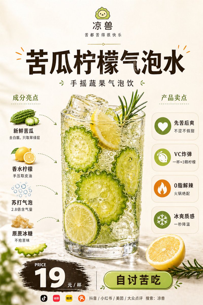
Goal: Create a vertical Chinese beverage launch poster for a restaurant drink, centered on a highly realistic glass of {argument name="drink name" default="苦瓜柠檬气泡水"} with fresh ingredients, sales points, price, and ordering call-to-action. Canvas: Portrait 3:4 food advertising poster, warm off-white/beige background, clean premium restaurant menu style, high-resolution commercial photography mixed with neat infographic labels. Use soft sunlight, dewy freshness, crisp bubbles, and appetizing realism. Top brand area: At the very top center place a small cute green lion mascot logo, then the brand name “凉兽”, and the slogan “苦都苦得很快乐”. Add a thin decorative divider underneath. Main headline: Large bold dark-brown Chinese title centered: “苦瓜柠檬气泡水”. Add small orange decorative burst marks near the title. Under it place the subtitle “手摇蔬果气泡饮” with small green leaf ornaments on both sides. Central product hero: Place one tall transparent glass in the center, filled with sparkling pale yellow-green soda, many visible carbonation bubbles, large ice cubes, sliced bitter melon rounds, lemon slices, and a rosemary sprig sticking out of the top. The glass should look cold, wet, and refreshing with condensation and reflections. Add loose droplets on the tabletop. Left ingredient section: Title “成分亮点”. Show exactly 4 ingredient items stacked vertically with small photoreal ingredient illustrations and dotted curved arrows pointing toward the glass: 1) bitter melon illustration labeled “新鲜苦瓜” with subtext “去白瓤,只取翠绿层”; 2) lemon illustration labeled “香水柠檬” with subtext “手压取皮油”; 3) bubble icon labeled “苏打气泡” with subtext “2.8倍含气量”; 4) rock sugar illustration labeled “原蔗冰糖” with subtext “不抢苦味”. Right selling-points section: Title “产品卖点”. Show exactly 4 rounded white cards stacked vertically, each with a circular icon on the left and Chinese text on the right: 1) green heart icon, “先苦后爽” / “不涩不假甜”; 2) green lemon icon, “VC炸弹” / “一杯≈3颗柠檬”; 3) orange flame icon, “0脂解辣” / “火锅绝配”; 4) green snowflake icon, “冰爽质感” / “一秒降温”. Bottom price and CTA: At bottom left, use a black brush-stroke price badge with small English “PRICE”, huge white “{argument name="price" default="19"}”, and “元 / 杯”. At bottom right, add a large rounded green button with dark text “自讨苦吃”. Separate price and button with a thin vertical line. Add a halved lemon and rosemary sprig near the bottom right foreground. Include subtle blurred green leaves at the bottom left foreground for depth. Footer: Along the very bottom add small app/platform icons and text: “抖音 / 小红书 / 美团 / 大众点评 搜索:凉兽”. Visual style: Fresh lemon-green and dark-brown palette, premium Chinese food poster layout, realistic food textures, sharp condensation, sparkling soda bubbles, clean typography, balanced negative space, no watermark, no extra products, no people.
Pop Art Street Style Conversion

Pop Art Street Style Conversion

Editorial / Poster

Read full prompt

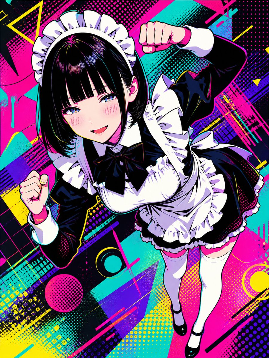
Please transform this illustration into a {argument name="style" default="style based on modern anime and manga influences, blending pop art and street art"}. Express it colorfully with sharp, clean line art and flat shading as the main elements. Create a stylish atmosphere including complex geometric patterns. Incorporate Ben-Day dots for gradients and textures. Use {argument name="color scheme" default="a vibrant and high-contrast color scheme centered on neon colors"} to achieve a graphical and stylish look. However, do not include any text. Maintain the original illustration's composition and character.

Editorial Caricature Redraw

Editorial Caricature Redraw

Editorial / Poster

Read full prompt

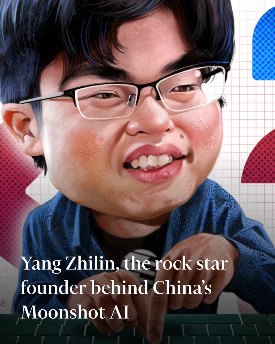
Using the provided reference image, redraw it as a polished exaggerated editorial caricature while preserving the original Financial Times-style composition and all key elements. Keep the same seated-at-keyboard pose, the hands reaching toward the keyboard, the white grid-paper background, the red/pink dotted side shapes, the blue dotted rounded rectangle in the upper right, and the same lower-left headline text: {argument name="headline text" default="Yang Zhilin, the rock star founder behind China’s Moonshot AI"}. Transform the portrait into a glossy, high-detail digital caricature with an oversized head, fuller cheeks, slightly comical smile, enlarged glasses, stylized black hair, painterly skin texture, and a more satirical magazine-illustration look. Keep the crop tight and vertical, with the face much larger in frame than the reference and the text overlay still readable in large white serif type across the lower third. Maintain the keyboard along the bottom edge and do not add any new objects, logos, watermarks, or extra text.

Chinese Sour Fish Restaurant Poster

Chinese Sour Fish Restaurant Poster

Editorial / Poster

Read full prompt

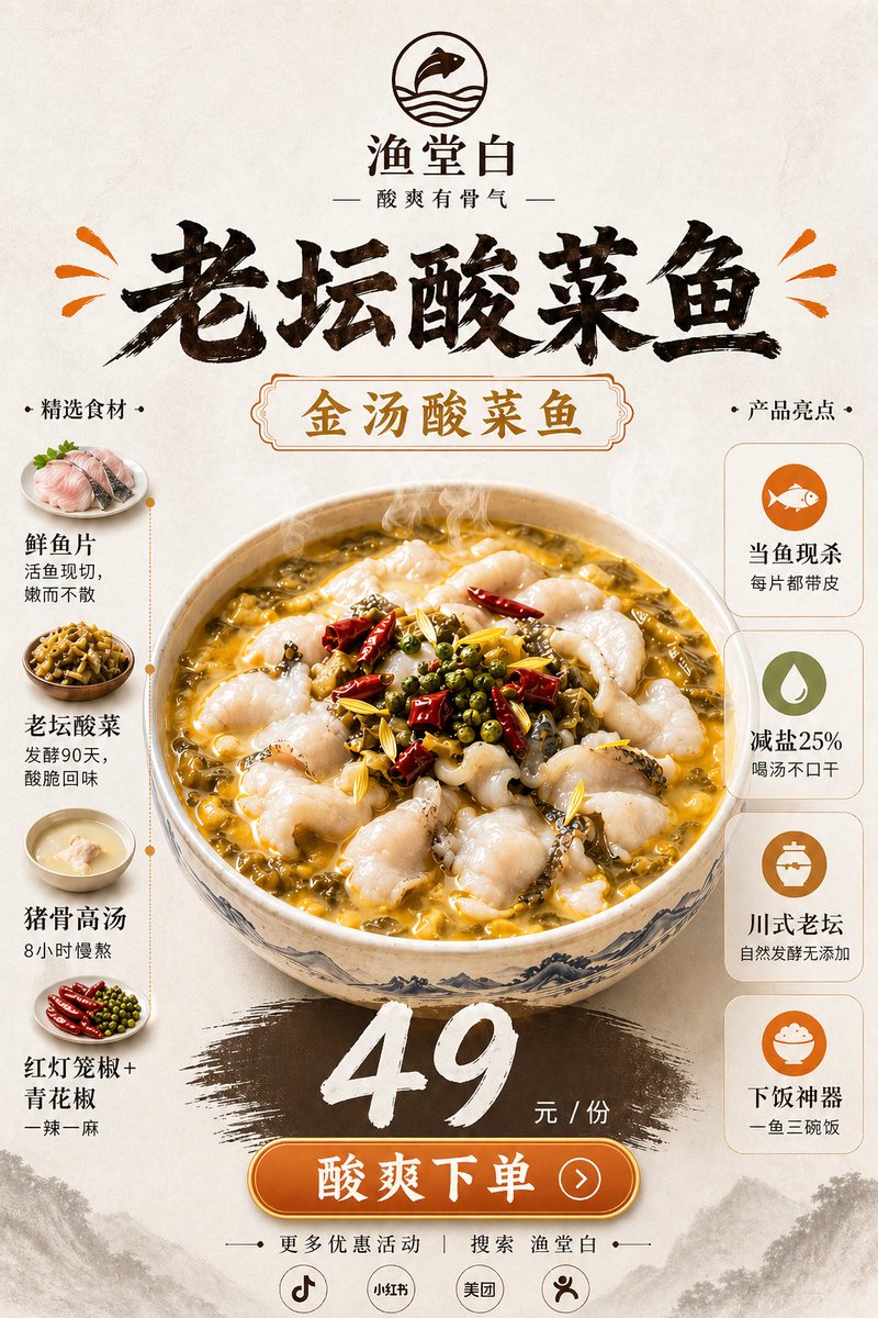
Goal: Create a vertical Chinese restaurant new-product poster for {argument name="dish name" default="老坛酸菜鱼"}, emphasizing appetite appeal, real food texture, ingredients, selling points, and a clear price/order call-to-action. Canvas: Vertical 2:3 poster, warm off-white rice-paper background with subtle fibers, faint ink-wash mountains along the bottom edge, premium Chinese dining advertisement style. Top branding: Centered circular logo showing a simple fish over wave lines. Under it place the brand name {argument name="brand name" default="渔堂白"} and the tagline 「酸爽有骨气」. Add a huge black brush-calligraphy headline 「老坛酸菜鱼」 across the upper third, with small orange splash marks on both sides. Main visual: In the center, show one large steaming ceramic bowl of golden sour pickled-cabbage fish soup. The bowl has blue-gray Chinese landscape patterning. The soup is glossy yellow-gold with visible chopped pickled greens, tender white fish slices, red dried chilies, green Sichuan peppercorns, yellow ginger strips, sesame-like spices, and rising steam. Keep the food photorealistic and highly appetizing while the poster graphics remain elegant and clean. Central label: Above the bowl, place an ornate rounded rectangular label with gold text 「金汤酸菜鱼」 and a thin decorative border. Left ingredient column: Title 「精选食材」. Show exactly 4 ingredient items stacked vertically, each with a small circular food photo and text: 1) 「鲜鱼片」 with subtext 「活鱼现切,嫩而不散」, 2) 「老坛酸菜」 with subtext 「发酵90天,酸脆回味」, 3) 「猪骨高汤」 with subtext 「8小时慢熬」, 4) 「红灯笼椒+青花椒」 with subtext 「一辣一麻」. Connect the 4 items with a thin dotted vertical orange line. Right selling-point column: Title 「产品亮点」. Show exactly 4 rounded white cards stacked vertically, each with one simple orange/green icon and text: 1) fish icon, 「当鱼现杀」 and 「每片都带皮」, 2) droplet icon, 「减盐25%」 and 「喝汤不口干」, 3) jar icon, 「川式老坛」 and 「自然发酵无添加」, 4) rice bowl icon, 「下饭神器」 and 「一鱼三碗饭」. Price and CTA: Below the bowl, paint a wide dark brown brush-stroke swash. Over it place a large white hand-painted price {argument name="price" default="49"}, followed by 「元 / 份」. Beneath, add a glossy orange rounded button with white text {argument name="call to action" default="酸爽下单"} and a small right-arrow circle. Footer: Add small text 「更多优惠活动 | 搜索 渔堂白」. Under it, place exactly 4 small circular platform icons/labels: Douyin-style music note, 「小红书」, 「美团」, and a simple person/share icon. Visual style: High-end Chinese food poster, realistic steaming dish photography blended with brush-calligraphy typography, warm cream/gold/orange/brown palette, clean symmetrical layout, strong depth and shine on the soup, no clutter, no extra dishes or extra text beyond the specified elements.

Mango Coconut Dessert Poster

Mango Coconut Dessert Poster

Editorial / Poster

Read full prompt

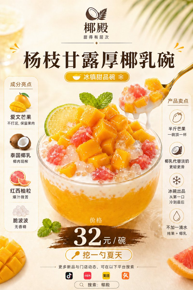
Goal: Create a vertical Chinese food-and-beverage launch poster for {argument name="product name" default="杨枝甘露厚椰乳碗"}, advertising a refreshing iced dessert bowl with realistic appetizing texture, ingredients, selling points, and price. Canvas: Portrait 2:3 poster, warm cream-beige background with soft tropical sunlight, faint palm-leaf shadows in the upper right, a blurred lemon drink on the upper left, scattered fruit props at the bottom corners, premium dessert-shop advertising style. Layout: Centered composition. At the top place a coconut brand logo icon and the brand name {argument name="brand name" default="椰殿"}, with the small tagline “甜得有层次” beneath it and thin decorative divider lines. Below, use a large dark-brown Chinese headline “杨枝甘露厚椰乳碗”. Under the headline add a rounded golden pill label reading “冰镇甜品碗” with a small bowl icon and snowflake icon. The middle is dominated by a transparent glass bowl filled with mango-yellow puree, thick coconut milk, translucent pearls, pink grapefruit pulp, and glossy mango cubes. A gold spoon enters from the upper right, lifting mango cubes, pearls, grapefruit, and dripping coconut milk. Add mint leaves on top for freshness. Main food details: Make the dessert hyper-realistic and glossy: exactly 5 visible ingredient types in the bowl — mango cubes, thick coconut milk, pink grapefruit pulp, translucent boba pearls, and mint leaves. Show chunky mango pieces piled high, creamy white coconut layer around the rim, orange mango puree at the base, and condensation/fresh chilled feeling. Left sidebar: A rounded vertical cream card titled “成分亮点” with exactly 4 stacked ingredient highlights, each with a small realistic ingredient illustration and Chinese text: 1) mango illustration, “爱文芒果 / 不打泥,保留果肉”; 2) coconut illustration, “泰国椰乳 / 椰肉现榨”; 3) grapefruit illustration, “红西柚粒 / 爆汁微苦”; 4) pearl illustration, “脆波波 / 无香精”. Right sidebar: A rounded vertical cream card titled “产品卖点” with exactly 4 stacked circular line icons and Chinese text: 1) mango icon, “半斤芒果 / 一碗顶一杯”; 2) coconut icon, “椰乳代替淡奶 / 更轻更滑”; 3) snowflake icon, “冰碗出品 / 从第一口冷到最后”; 4) droplet icon, “不加一滴水 / 纯果 + 椰乳”. Price and call to action: Under the bowl place a brown brush-stroke price band with the small label “价格” above a huge white price {argument name="price" default="32元 / 碗"}. Below it place a rounded white-and-gold CTA button with a spoon icon and the text {argument name="call to action" default="挖一勺夏天"}. Bottom area: Add a thin divider line and small Chinese copy “更多新品与门店动态,可在以下平台搜索”. Show exactly 4 platform icons in a row: Douyin/TikTok, Xiaohongshu, Meituan, and Dianping-style orange icon. At the very bottom add a rounded search bar reading “搜索:椰殿”. Visual style: Premium Chinese dessert poster, bright mango-yellow and coconut-white palette, dark chocolate-brown typography, gold accents, clean commercial layout, realistic food photography blended with polished graphic design, high contrast, sharp details, mouthwatering wet highlights, soft shadows, no people. Constraints: Keep all Chinese text legible and correctly placed. Use exactly 2 side information cards, exactly 8 total sidebar feature items, exactly 4 bottom platform icons, and one central dessert bowl. Do not add extra prices, extra products, watermarks, QR codes, or unrelated text.
Minimal Japanese Curry Plate Poster

Minimal Japanese Curry Plate Poster

Editorial / Poster

Read full prompt

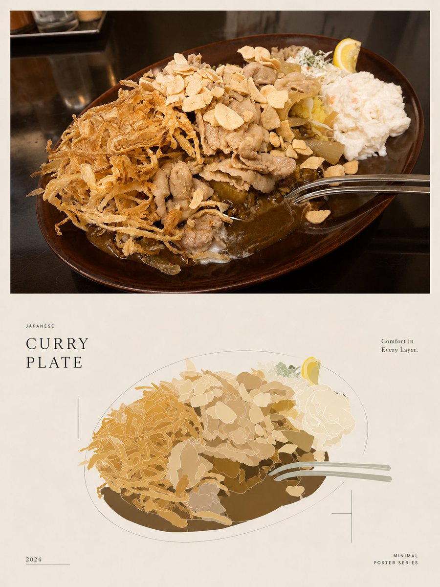
Goal: Create a minimalist editorial food poster that demonstrates reducing a realistic food photo into a clean low-detail illustration while preserving the composition. Canvas: Vertical poster in a 3:4 aspect ratio, warm off-white paper background, generous margins, quiet Japanese magazine/poster design. Layout: Divide the poster into exactly 2 main visual panels. The top half contains a realistic rectangular food photograph with a thin off-white border around it. The bottom half contains a simplified vector-style illustration of the same dish, centered and slightly smaller, surrounded by sparse typography and fine registration-mark lines. Top panel: Show a close-up restaurant photograph of a {argument name="dish name" default="Japanese curry plate"} on a dark glossy tabletop. The dish sits on an oval dark brown ceramic plate viewed from a high three-quarter angle. Include exactly 8 visible food components: 1 large pool of brown curry sauce, 1 mound of white rice mostly hidden under toppings, 1 pile of thin fried shredded onions on the left, 1 heap of sliced pork or beef in the center, 1 scattering of pale garlic chips across the top, 1 scoop of white potato salad on the right, 1 small garnish of chopped greens near the back, and 1 lemon wedge at the back right. Add exactly 1 shiny metal spoon entering from the right edge into the curry. Use natural warm restaurant lighting, realistic texture, shallow shadows, and no people. Bottom panel illustration: Recreate the same plate as a flattened minimal vector illustration using reduced information and reduced color. Keep the exact same 8 food components and 1 spoon, but simplify them into layered organic shapes with thin light outlines and a limited palette of curry brown, tan, cream, pale yellow, muted green, and soft gray. The oval plate is suggested by a fine gray outline and a dark brown curry shape beneath the toppings. Avoid photorealistic detail; make it look like a tasteful poster illustration. Text content: Add exactly 5 text blocks. Left of the illustration, small spaced uppercase text reads "JAPANESE" above a large elegant serif title reading "CURRY\nPLATE". Upper right, small serif copy reads "Comfort in\nEvery Layer." Bottom left, small text reads "2024" with a thin horizontal line beside it. Bottom right, small spaced uppercase text reads "MINIMAL\nPOSTER SERIES". Use refined black or dark brown typography. Graphic details: Add exactly 3 fine-line decorative marks around the lower illustration: 1 thin vertical line near the left of the title area, 1 small crosshair mark on the lower right of the illustrated plate, and 1 subtle horizontal line near the year. Maintain a restrained, premium editorial look with lots of negative space. Style constraints: Minimal colors, low visual noise, no extra captions, no logos, no watermark, no additional utensils, no extra plates, and no people. The final image should feel like a polished Japanese food poster comparing a realistic curry plate photograph with its simplified illustration.

Japanese Video Production Poster

Japanese Video Production Poster

Editorial / Poster

Read full prompt

Create a clean, premium Japanese corporate poster for a {argument name="company name" default="Arks"} video production company, in a minimalist editorial layout on an off-white background with lots of negative space. Portrait orientation, A4-like poster proportions. At the very top left, place an oversized bold black sans-serif logotype reading {argument name="company name" default="Arks"}, spanning nearly the full width of the page. In the upper right, add a small stacked brand mark in thin uppercase letters: "VIDEO" on one line, "PRODUCTION" on the next, "COMPANY" on the third, with a small burnt-orange geometric accent nearby. Below the logo, add a vertical burnt-orange bar on the left and a large elegant Japanese headline in black Mincho-style serif: {argument name="headline text" default="4つの領域で、映像を磨く。"}. Directly underneath, add a smaller service line in Japanese with slash separators: "SNS運用 / ショートドラマ / MV制作 / AI映像". The main body is a 2 by 2 grid of exactly 4 service panels with thin light-gray divider lines. Each panel has a large black editorial number and a Japanese label. Panel 1 label: "SNS運用" with the number "01"; image shows a close-up hand holding a smartphone displaying social media analytics, on a desk with charts, a calendar sheet, a pen, and a coffee mug, in warm natural office lighting; caption below in Japanese: "企画・分析・運用を一つの流れで。" Panel 2 label: "ショートドラマ" with the number "02"; image shows exactly 2 Japanese high-school-age students in white shirts standing outdoors on a rooftop or balcony, one female and one male, side-profile composition, muted overcast daylight, cinematic shallow depth of field; caption below: "共感が残る、短編の物語設計。" Panel 3 label: "MV制作" with the number "03"; image shows a moody musician playing electric guitar in a dim studio, backlit by soft haze, with a camera monitor in the foreground showing the same performer; caption below: "アーティストの世界観を、映像で可視化。" Panel 4 label: "AI映像" with the number "04"; image shows a dark professional AI video-generation or image-editing software interface on a monitor, with a cinematic scene of a lone figure standing on rocks under dramatic clouds, plus thumbnail timeline images and side control panels; caption below: "技術を表現へ変える、次世代の映像制作。" At the bottom left, place a small three-line English slogan in uppercase: {argument name="tagline text" default="CREATE.\nCONNECT.\nLEAVE A MARK."} with a small burnt-orange line accent above it. At the bottom right, place the website {argument name="website" default="arks-vp.com"} in small serif text with a short black horizontal line beside it. Use a refined mix of bold modern sans-serif for the large logo and numbers, and elegant Japanese serif for headlines and labels. Color palette: black, charcoal, warm off-white, light gray rules, and restrained burnt-orange accents. The overall feel should be realistic, polished, contemporary, Japanese editorial advertising design, with accurate Japanese typography and natural image tones.

Japanese Creative Agency Poster

Japanese Creative Agency Poster

Editorial / Poster

Read full prompt

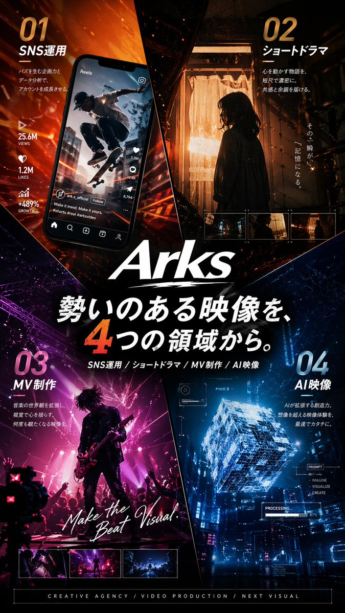
{"type":"Japanese promotional poster","purpose":"high-end cinematic advertising poster for a creative agency or video production brand","brand":{"name":"{argument name=\"brand name\" default=\"Arks\"}","logoStyle":"large white italic logotype centered slightly below the middle with a rough brush underline"},"format":{"orientation":"portrait","aspectRatio":"roughly 2:3","fullBleed":true},"style":{"overall":"premium futuristic Japanese commercial key visual, glossy, dramatic, highly polished, realistic photography blended with graphic design","mood":"energetic, bold, cinematic, urban, high-impact","colorPalette":["burning orange","amber","deep black","magenta-purple","electric blue","white typography"],"lighting":"strong contrast, neon glow, sparks, rim light, volumetric haze, reflective highlights","composition":"poster divided into 4 diagonal wedge-like sections converging toward the center logo and headline"},"layout":{"sections":[{"title":"01 SNS運用","position":"top-left","count":5,"labels":["01","SNS運用","25.6M VIEWS","1.2M LIKES","+489% GROWTH"],"scene":"a tilted smartphone showing an Instagram Reels style interface with a skateboarder mid-jump in an urban street scene; social media icons and engagement metrics run vertically beside or on the phone; fiery orange motion streaks radiate behind it"},{"title":"02 ショートドラマ","position":"top-right","count":5,"labels":["02","ショートドラマ","その一瞬が、","記憶になる。","3 small filmstrip thumbnails"],"scene":"a moody cinematic still of a woman in side silhouette standing indoors by a glowing curtain-lit doorway, warm tungsten light behind her, dark hallway framing, with 3 small rectangular preview thumbnails aligned near the bottom of this panel"},{"title":"03 MV制作","position":"bottom-left","count":4,"labels":["03","MV制作","Make the Beat Visual.","3 small preview thumbnails"],"scene":"a live concert performance with a guitarist in silhouette on stage, magenta and pink spotlights, crowd hands raised, dynamic rock music video energy, with handwritten white script text across the image and 3 thumbnail previews along the bottom edge"},{"title":"04 AI映像","position":"bottom-right","count":6,"labels":["04","AI映像","PROMPT","IMAGINE","VISUALIZE","CREATE"],"scene":"a glowing transparent futuristic cube floating above a cyberpunk cityscape at night, blue holographic interface overlays, technical HUD graphics, and a small progress readout like PROCESSING"}],"centerText":{"count":3,"labels":["{argument name=\"main headline\" default=\"勢いのある映像を、4つの領域から。\"}","SNS運用 / ショートドラマ / MV制作 / AI映像","CREATIVE AGENCY / VIDEO PRODUCTION / NEXT VISUAL"]}},"typography":{"language":"Japanese with some English subtext","headlineStyle":"very large bold white Japanese characters with one oversized orange numeral 4","sectionNumbers":"huge gradient numerals in each quadrant","supportText":"small clean sans-serif copy blocks under each section title","englishAccents":"mix of bold sans-serif and handwritten script for emphasis"},"background":{"base":"dark black with abstract shards and diagonal separators","effects":"glowing particles, light trails, embers, lens flare, subtle texture, neon reflections"},"rendering":{"quality":"ultra-detailed","finish":"commercial poster print ready","sharpness":"crisp text and graphics","realism":"photorealistic scenes within each quadrant combined into a cohesive agency advertisement"}}

Cinematic Japanese Agency Poster

Cinematic Japanese Agency Poster

Editorial / Poster

Read full prompt

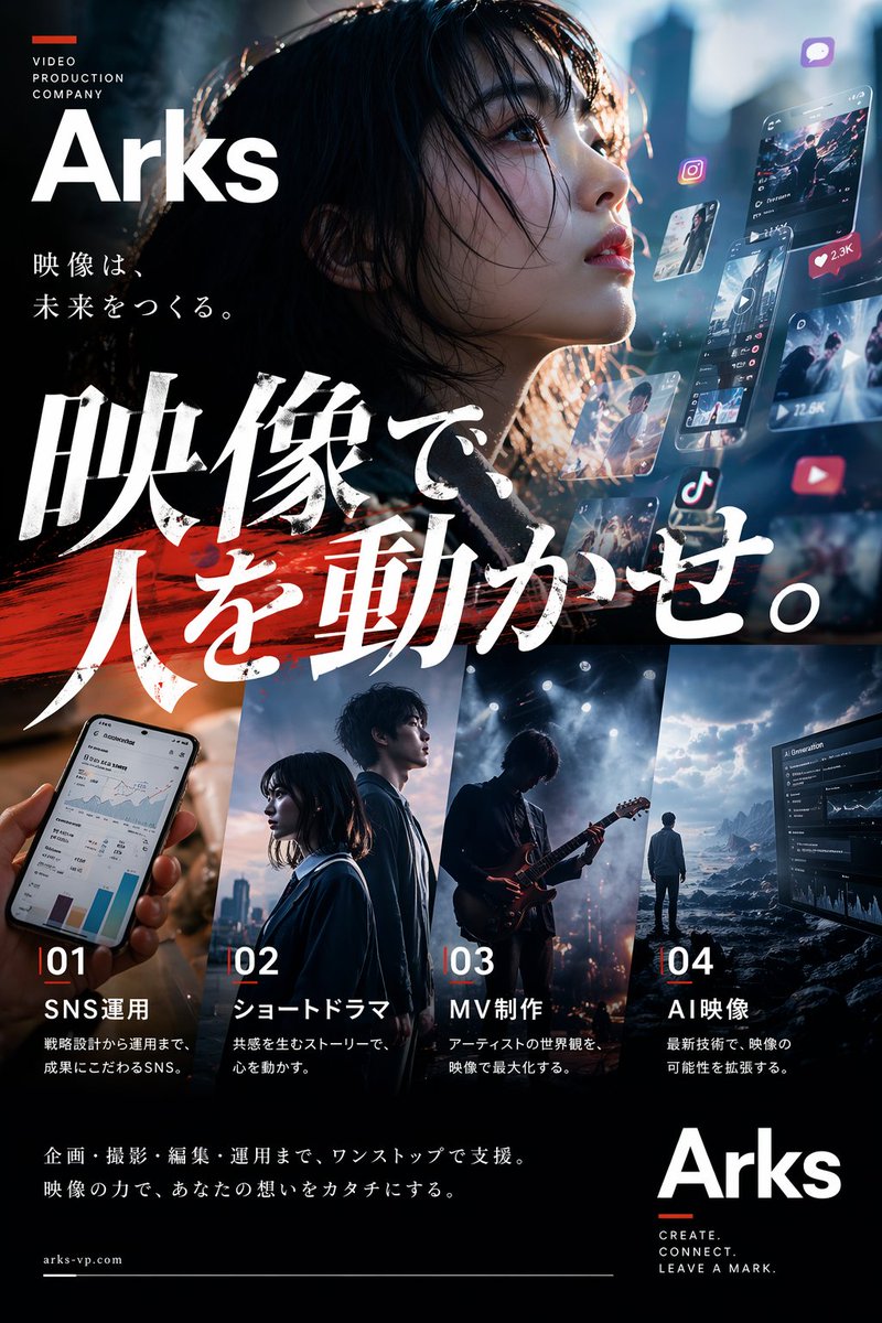
{"type":"cinematic Japanese promotional poster","brand":{"name":"{argument name=\"company name\" default=\"Arks\"}","industry":"video production company","website":"{argument name=\"website\" default=\"arks-vp.com\"}","tagline_english":["CREATE.","CONNECT.","LEAVE A MARK."],"small_header":"VIDEO PRODUCTION COMPANY"},"style":{"overall":"premium, high-contrast, cinematic, realistic advertising poster with polished typography integration","color_palette":["deep black","cool blue","white","vivid red accent"],"lighting":"moody backlight, soft glow, bokeh, screen light reflections, dramatic contrast","texture":"photo-real background with layered translucent digital UI panels and brushstroke graphic accents"},"canvas":{"orientation":"vertical poster","aspect_ratio":"2:3"},"layout":{"sections":[{"title":"top-left brand block","position":"upper left","count":4,"labels":["small red horizontal bar","VIDEO PRODUCTION COMPANY","Arks","映像は、未来をつくる。"]},{"title":"main headline area","position":"center-left to center","count":2,"labels":["映像で","人を動かせ。"]},{"title":"service panels","position":"bottom middle","count":4,"labels":["01 SNS運用","02 ショートドラマ","03 MV制作","04 AI映像"]},{"title":"bottom brand block","position":"lower right","count":4,"labels":["Arks","CREATE.","CONNECT.","LEAVE A MARK."]},{"title":"footer text","position":"lower left","count":3,"labels":["企画・撮影・編集・運用まで、ワンストップで支援。","映像の力で、あなたの想いをカタチにする。","arks-vp.com"]}],"composition":"large hero portrait filling the upper half, oversized Japanese calligraphy headline across the center, four vertical service cards aligned across the lower half, brand logo repeated in upper left and lower right"},"hero_image":{"subject":"close-up of a young person with dark hair partially covering the face, face mostly obscured in shadow","framing":"extreme close portrait from shoulders up","emotion":"mysterious, intense, aspirational","lighting":"rim light from behind with cool blue highlights and warm edge flare","background":"dark urban cinematic blur with floating social media and video interface elements"},"digital_elements":{"count":8,"items":["floating smartphone-style video feed with heart count 2.3K","vertical short-video interface panel with engagement icons and 12.5K count","small floating photo card","Instagram-style icon","chat/message app icon","TikTok-style icon","YouTube-style play icon","analytics dashboard screen on right edge"]},"headline":{"text":"{argument name=\"main headline\" default=\"映像で人を動かせ。\"}","language":"Japanese","style":"very large bold white brush-calligraphy style Mincho lettering with rough textured edges","accent":"wide red paint brushstroke behind the lower line"},"services":[{"number":"01","title":"SNS運用","description":"戦略設計から運用まで、成果にこだわるSNS。","image":"hand holding a smartphone showing analytics charts and dashboard"},{"number":"02","title":"ショートドラマ","description":"共感を生むストーリーで、心を動かす。","image":"two young people standing side by side in a cinematic city setting at dusk"},{"number":"03","title":"MV制作","description":"アーティストの世界観を、映像で最大化する。","image":"guitarist performing on a smoky stage with dramatic spotlights"},{"number":"04","title":"AI映像","description":"最新技術で、映像の可能性を拡張する。","image":"solitary person facing a surreal rocky seascape and a large analytics interface screen"}],"typography":{"mix":"bold modern sans-serif for English branding and numbers, elegant Japanese Mincho for body copy, expressive brush-calligraphy for headline","alignment":"mostly left-aligned with strong poster-grid structure"},"rendering_notes":"Make it look like a real agency PR poster for a cutting-edge Japanese video production company. Integrate Japanese text cleanly and accurately. Preserve strong readability despite the busy cinematic collage. Use realistic photography, layered ad design, premium composition, and convincing social-media-era visual storytelling."}

Cinematic Video Company Poster

Cinematic Video Company Poster

Editorial / Poster

Read full prompt

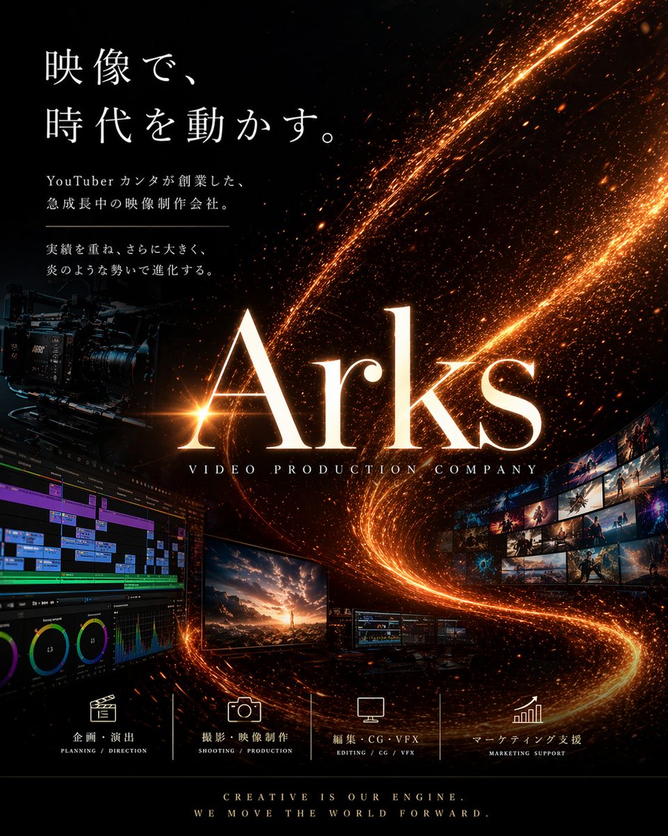
{"type":"cinematic corporate promotional poster","style":"luxury, high-impact, premium film production branding, realistic with polished graphic design","brand":{"name":"{argument name=\"brand name\" default=\"Arks\"}","subtitle":"VIDEO PRODUCTION COMPANY"},"canvas":{"orientation":"portrait","aspect_ratio":"4:5"},"background":{"base_color":"deep black","effects":["glowing orange-gold particle trails sweeping diagonally from upper right to lower center and curling upward","dense sparks and embers","subtle cosmic dust texture","high contrast illumination"]},"layout":{"sections":[{"title":"main headline block","position":"upper left","count":4,"labels":["映像で、","時代を動かす。","YouTuber カンタが創業した、急成長中の映像制作会社。","実績を重ね、さらに大きく、炎のような勢いで進化する。"]},{"title":"service icons row","position":"bottom center","count":4,"labels":["企画・演出","撮影・映像制作","編集・CG・VFX","マーケティング支援"]},{"title":"footer tagline","position":"very bottom center","count":2,"labels":["CREATIVE IS OUR ENGINE.","WE MOVE THE WORLD FORWARD."]}],"centerpiece":"oversized glowing serif logotype in the center","supporting_elements":"film production equipment and post-production screens arranged around the logo"},"objects":{"left_side":[{"item":"professional cinema camera rig","placement":"mid-left","look":"dark matte body with lens, mounted on support system, partially emerging from shadows"},{"item":"video editing timeline interface monitor","placement":"lower left","look":"large screen showing multitrack editing software with colorful timeline bars, scopes, and panels"}],"center":[{"item":"hero monitor","placement":"lower center-left","look":"display showing a dramatic cinematic landscape with a person standing under a glowing sky"},{"item":"two smaller workstation monitors","placement":"lower center-right","look":"compact displays showing editing or grading interfaces"}],"right_side":[{"item":"curved wall of image thumbnails","placement":"mid-right","count":15,"look":"15 small cinematic stills arranged in a sweeping arc, showing action, fantasy, landscapes, and dramatic scenes"}]},"typography":{"headline":{"font_style":"elegant Japanese Mincho-style serif","color":"white","size":"large","line_spacing":"generous"},"logo":{"font_style":"large refined serif","color":"warm white with orange glow","effect":"strong bloom and metallic firelit edges"},"service_labels":{"font_style":"clean small serif/sans mix","color":"white"},"footer":{"font_style":"small caps serif","color":"warm white"}},"color_palette":["black","orange-gold","amber","warm white","subtle blue accents from screens"],"lighting":"dark studio atmosphere with fiery glowing trails acting as key visual light source","mood":"ambitious, futuristic, energetic, elite, cinematic","text_rendering":"crisp, accurate Japanese and English typography, professionally typeset","image_goal":"a poster for a film and video production company that feels powerful, trustworthy, and visually spectacular","customization":{"headline":"{argument name=\"headline text\" default=\"映像で、時代を動かす。\"}","body_copy":"{argument name=\"body copy\" default=\"YouTuber カンタが創業した、急成長中の映像制作会社。 実績を重ね、さらに大きく、炎のような勢いで進化する。\"}","primary_glow_color":"{argument name=\"glow color\" default=\"orange-gold\"}","footer_tagline":"{argument name=\"footer tagline\" default=\"CREATIVE IS OUR ENGINE. WE MOVE THE WORLD FORWARD.\"}"}}

3D Isometric Block Art Reconstruction

3D Isometric Block Art Reconstruction

Editorial / Poster

Read full prompt

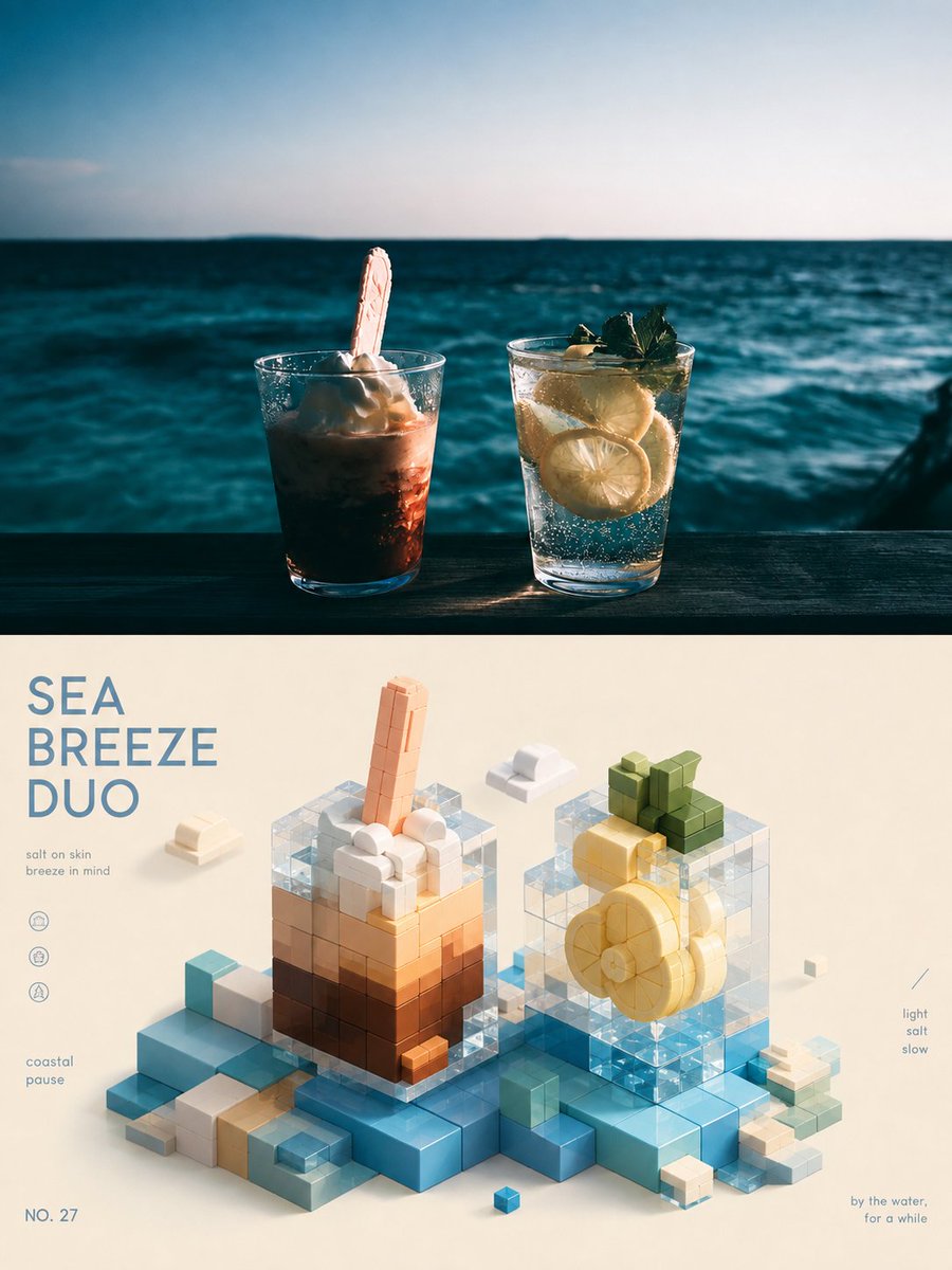
Please turn each photo I upload into an independent high-end design poster. Do not stitch multiple images together; each photo should be output separately. The overall layout uses a 3:4 vertical composition, with the top and bottom areas strictly 1:1, each occupying 50% of the frame. The top half retains the original photo, keeping the subject's structure, spatial relationships, real materials, natural lighting, and original color atmosphere, with only minor high-end photographic color grading to give it the texture of an art magazine, independent publication, or exhibition photography. To fit the aspect ratio, the environment/background can be naturally extended, but the subject must not be stretched, distorted, or changed. The bottom half extracts the most recognizable **subject, silhouette, posture, and narrative relationship** from the photo. Following the logic of "deconstruction—screening—refinement—reconstruction," it is transformed into a **3D / isometric spatial {argument name="style" default="healing-style block sculpture"}**. Focus on preserving the most unique volume proportions, axes, curves, intersections, layering, occlusions, and negative spaces of the subject, reorganized with rounded, simple, and tactile modular blocks; do not perfectly replicate details, but the correspondence with the original image above must be immediately felt. The composition is adaptively designed based on the subject's own visual center of gravity, posture direction, and spatial relationships. Rhythm is established through blocks of varying sizes, staggered heights, front-to-back intersections, partial suspension, density changes, and large areas of white space. Blocks can be spliced, stacked, nested, crossed, or naturally misplaced, allowing the subject to retain its identity while possessing a contemporary art toy-like sculptural feel and relaxed imagination, avoiding mechanical disassembly and simple pixelation. **The color scheme must be analyzed and generated from the original image above.** First, identify the most vibrant and recognizable main color relationships, along with comprehensive color temperature, brightness levels, cold-warm echoes, and key accent colors. Then, re-modulate these colors into a softer, clearer, brighter, and more airy healing color system. Preserve the hue identity and emotional memory of the original image, but moderately increase brightness, reduce harsh contrast, and purify muddy colors to make the colors feel gentle, childlike, light, and high-end. Different photos should naturally yield different color schemes; do not use any fixed preset color cards, and do not forcibly add colors that do not exist in the original image just for a "healing feel." Color establishes rhythm through **main color area, secondary color layers, homologous shades, and a tiny amount of vivid accent colors**, making the subject look rich but not cluttered, cute but not too sweet, soft but energetic. The block material uses a fine matte, soft diffuse reflection texture, with a feel like slight pulp, wood, pastel, or flexible materials, with rounded corners and soft shadows, avoiding plastic highlights, metallic feel, heavy CG, and cheap toy textures. Text establishes a light, high-end editorial micro-typography system. Extract a {argument name="length" default="2-5 word"} title from the photo's light and shadow, action, space, emotion, or symbolic meaning, and pair it with a few state words, locations, numbers, directional words, or miniature notes. Do not use years. Text can be arranged along block edges, module gaps, visual axes, or negative spaces, or it can intersect, be occluded by, or align with the blocks, making the text naturally part of the block composition. The overall presentation features a visual temperament of **Real Photography × {argument name="core element" default="Healing Blocks"} × Isometric Space × Original Color Translation × High-end Editorial Design**, which is gentle, light, childlike, quiet, exquisite, and imaginative but not naive.

Monochrome Halftone Print Poster Design

Monochrome Halftone Print Poster Design

Editorial / Poster

Read full prompt

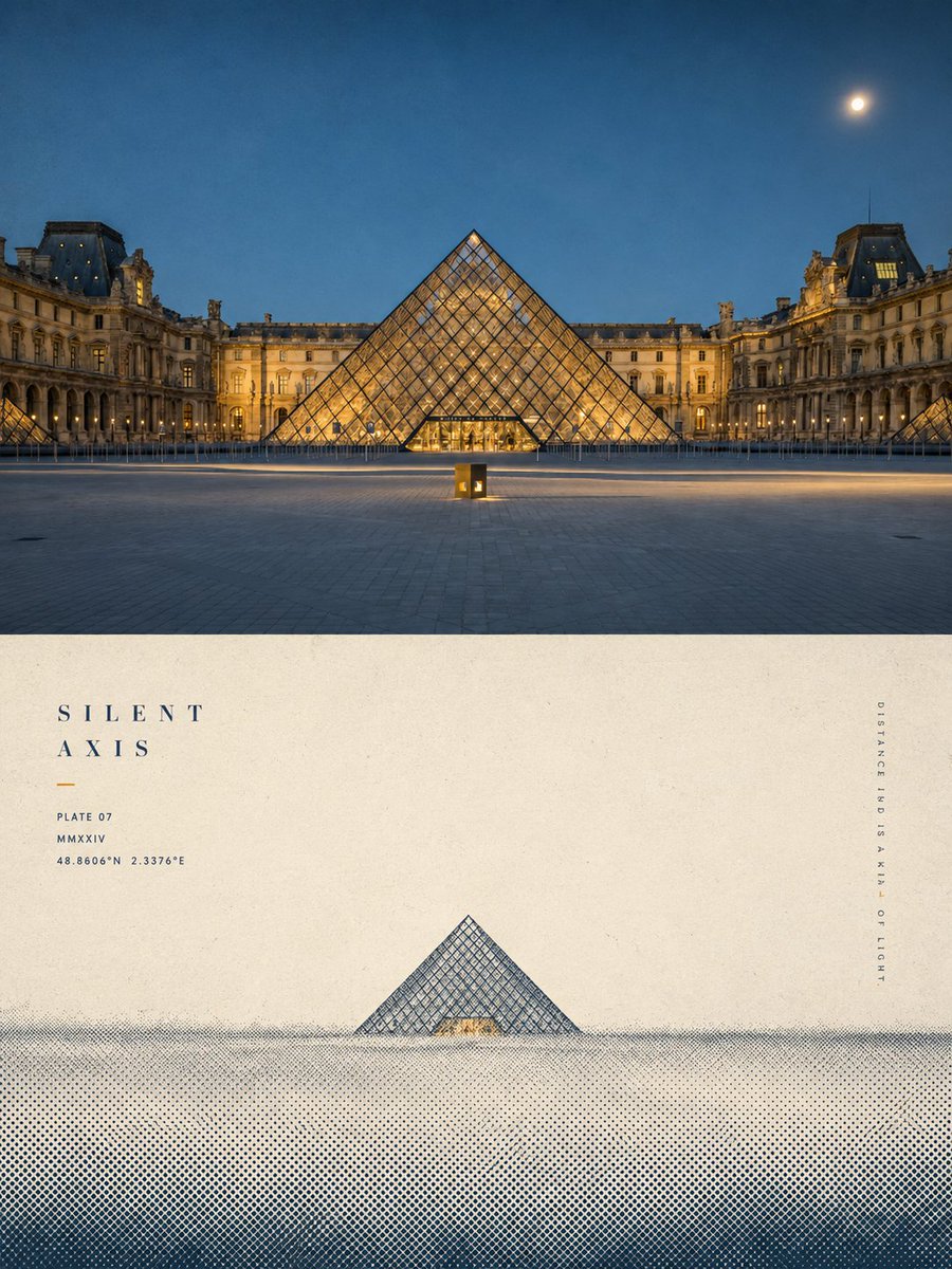
Please turn each uploaded photo into an individual high-end design poster. Use a 3:4 vertical composition, split into two equal halves. The top half preserves the original photo with editorial color grading. The bottom half extracts the subject's silhouette and narrative, reconstructing it as a minimalist screen print and halftone poster. Follow the principle of 'one subject, one direction, one spatial relationship' with large areas of negative space for a poetic feel. The color palette should be limited to 2-3 spot colors (paper base + main ink + mist layer). Use halftone dots for all transitions and shadows, retaining a physical paper and silk-screen ink texture. Include a restrained, high-end editorial typography system where text participates in the composition, using minimal titles and tiny auxiliary text in modernist fonts. The goal is a quiet, intellectual, and collectible visual style.

Carpe Diem Fashion Typography Poster

Carpe Diem Fashion Typography Poster

Editorial / Poster

Read full prompt

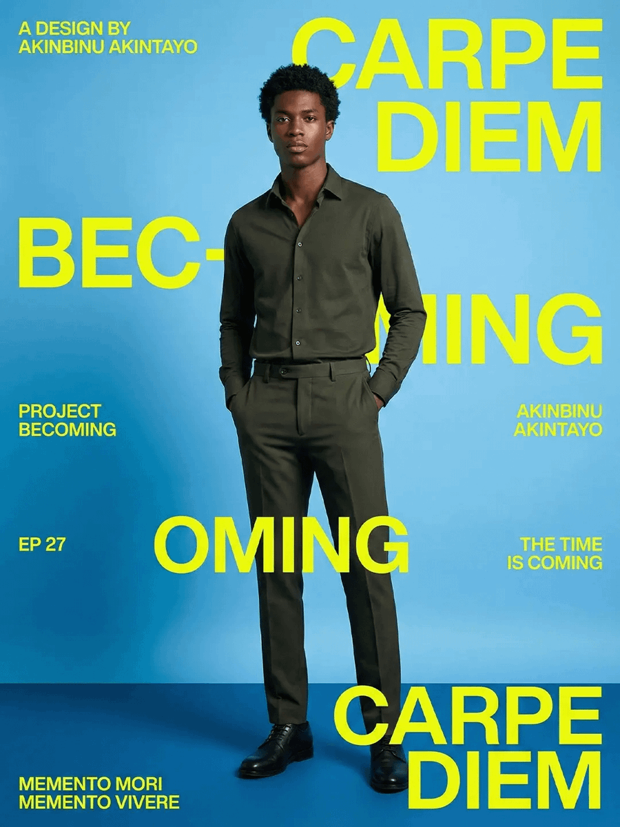
Goal: Create a bold editorial fashion poster / magazine cover for a motivational design project, featuring a full-body studio portrait of {argument name="character name" default="Akinbinu Akintayo"} standing confidently in front of oversized typography. Canvas: Vertical 4:5 poster, bright cyan-blue seamless studio background with a darker blue floor plane and soft vignette/shadowing near the bottom. High-contrast modern layout, cropped poster typography extending off the edges. Main subject: One tall Black male model, full body, centered slightly right, standing upright with both hands in trouser pockets. He wears a dark olive-green button-up shirt tucked into matching tailored trousers with a black belt and polished black dress shoes. Short curly black hair. Face is intentionally obscured by a vertical soft-blurred rectangular block over the center of the face, while ears, hairline, neck, and outfit remain visible. Studio lighting from upper left, realistic shadows on the floor. Typography style: Use huge uppercase condensed sans-serif lettering in fluorescent yellow-lime, bold and clean, layered behind and around the figure. Some words are partially hidden by the model or cropped by poster edges. Keep the typography flat, sharp, and poster-like. Text content: Include exactly 9 visible text blocks: 1) top left small text: "A DESIGN BY AKINBINU AKINTAYO"; 2) top right huge title: "CARPE DIEM"; 3) left middle huge cropped text: "BEC-"; 4) center-right huge cropped text partly behind model: "MING"; 5) left lower-middle small text: "PROJECT BECOMING"; 6) right lower-middle small text: "AKINBINU AKINTAYO"; 7) lower left small text: "EP 27"; 8) center lower huge text: "OMING"; 9) bottom right huge title: "CARPE DIEM". Add two extra small motto lines at the very bottom left as part of the final block area: "MEMENTO MORI" and "MEMENTO VIVERE". Add a small lower-right phrase: "THE TIME IS COMING". The overall poster concept implies the phrase "BECOMING" split across the composition. Layout: Place the model in the foreground so the typography is partially occluded by his body. The top-right "CARPE DIEM" should dominate the upper half, while another cropped "CARPE DIEM" anchors the bottom-right corner. The left-side "BEC-" should be very large and cropped off the left edge. The word fragments "MING" and "OMING" should appear in the middle and lower center, creating a layered typographic rhythm. Color palette: Cyan-blue background, neon yellow-lime text, dark olive outfit, black shoes. Minimal colors, clean commercial poster finish. Constraints: No logos, no watermark, no extra people, no props, no additional text beyond the specified typography. Preserve the bold fashion-editorial look and the intentionally obscured face.

Anime School Rom-Com Key Visual

Anime School Rom-Com Key Visual

Editorial / Poster

Read full prompt

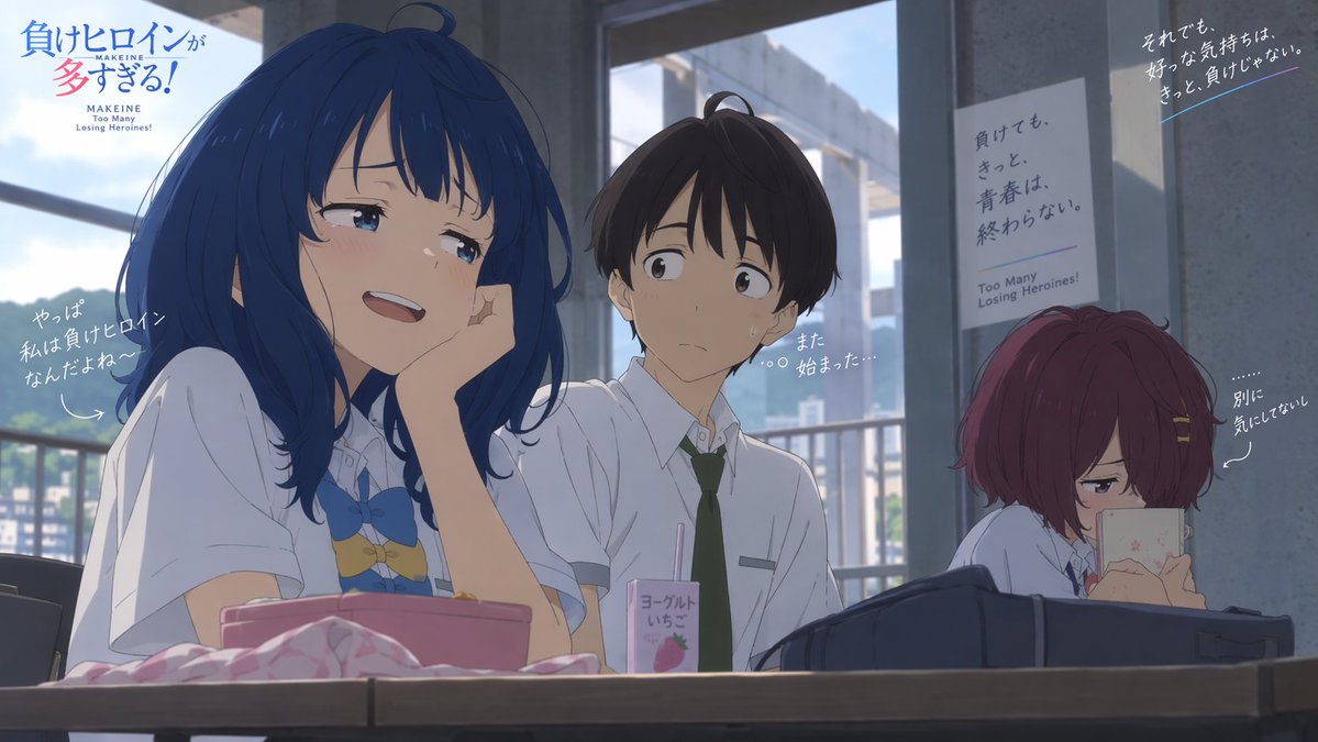
Goal: Create a cinematic anime key visual for a school rom-com scene titled {argument name="series title" default="負けヒロインが多すぎる!"}, with polished modern TV-anime rendering, natural lighting, and coherent character designs. Canvas: 16:9 horizontal frame, 1200×675 composition, set inside a bright but slightly shadowed school classroom or club room with large windows in the background showing blue sky, clouds, railings, and distant buildings. Use soft daylight from the windows, cool gray concrete pillars, shallow depth of field, and subtle filmic contrast with no visible grain. Layout: Three high-school students sit at desks in the foreground and midground. Place the main girl large on the left, the boy centered slightly behind her, and the second girl on the right, smaller and partially separated by a pillar. Add anime-style promotional text overlays and handwritten Japanese comments around the characters. Characters: Exactly 3 characters. 1) Main heroine on the left: a cheerful teenage girl with {argument name="main heroine hair color" default="deep blue"} shoulder-length messy hair, blue eyes, blushing cheeks, and a teasing smile; she wears a white short-sleeve school shirt with a blue bow tie and a cute decorative chest accessory, resting her cheek on one hand as she leans forward confidently. 2) Center boy: a nervous teenage boy with short dark brown hair, white short-sleeve school shirt, dark green necktie, and a slightly sweaty awkward expression, looking toward the main heroine as if trapped in a conversation. 3) Right-side heroine: a quiet teenage girl with short burgundy-red bobbed hair and hairpins, wearing a white school shirt, sitting lower behind a dark school bag while hiding behind or looking down at a small smartphone, appearing jealous or indifferent. Foreground objects: Include exactly 4 prominent desk items: a pink rectangular lunch box or pouch in front of the blue-haired girl, a crumpled pale pink cloth beside it, a small strawberry yogurt drink carton with a straw in front of the boy, and a large dark navy school bag across the right foreground. Text content: Include exactly 7 visible text elements. 1) Top-left title: 「負けヒロインが多すぎる!」 with small English subtitle “MAKEINE Too Many Losing Heroines!” beneath it. 2) Handwritten comment near the main heroine on the left: 「やっぱ 私は負けヒロインなんだよね〜」 with a curved arrow pointing to her. 3) Small thought text near the boy: 「また 始まった…」. 4) Poster on the center-right wall: 「負けても、きっと、青春は、終わらない。」 with small English “Too Many Losing Heroines!” beneath. 5) Handwritten quote in the upper-right corner: 「それでも、好きな気持ちは、きっと、負けじゃない。」 with a thin blue underline. 6) Handwritten comment near the red-haired girl: 「別に 気にしてない」 with a dotted line and arrow pointing to her. 7) On the drink carton, write 「ヨーグルト いちご」 with a strawberry graphic. Visual style: High-quality Japanese anime production still, delicate line art, expressive faces, soft cel shading, realistic classroom perspective, slightly muted colors, natural blue daylight, detailed hair highlights, emotional rom-com atmosphere, promotional poster composition. Constraints: Keep the composition faithful to a single wide anime screenshot, do not add extra characters, do not add extra desk objects beyond the four prominent items, keep all Japanese text legible and placed as described, avoid photorealism, avoid 3D rendering, avoid watermarks.

Isometric Micro Model Poster

Isometric Micro Model Poster

Editorial / Poster

Read full prompt

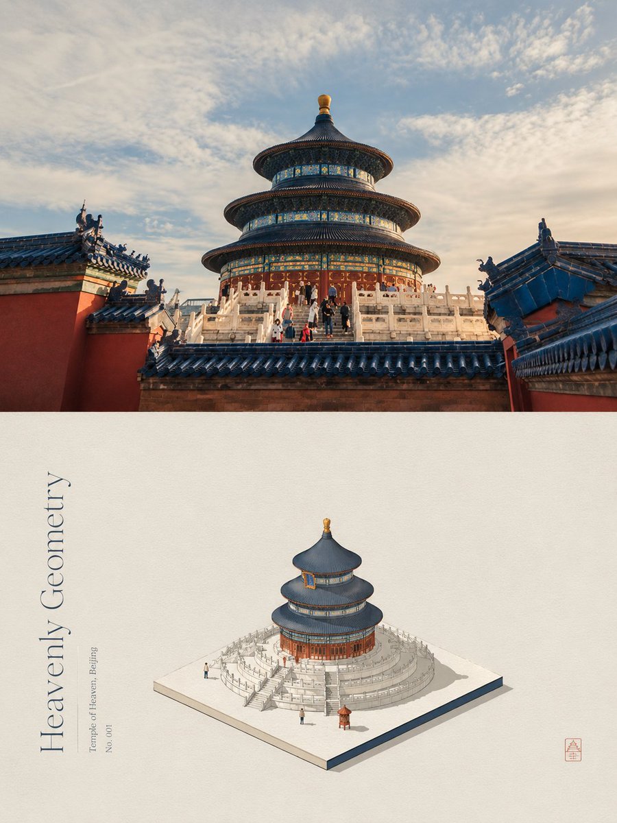
Turn each photo into a 3:4 poster. Top half: original photo. Bottom half: a minimalist {argument name="illustration style" default="isometric micro-model or architectural sand table"}. Express the subject using simplified blocks and clear edges as if placed on a paper base. Colors are extracted and {argument name="color processing" default="purified into a limited palette"} from the original photo to reduce noise and enhance the editorial feel. Use fine ink lines and flat colors. Text should be a {argument name="English title" default="short editorial header"} aligned with the isometric structure. The aesthetic is poetic, quiet, and curated.

Cinematic Football Commercial Storyboard

Cinematic Football Commercial Storyboard

Editorial / Poster

Read full prompt

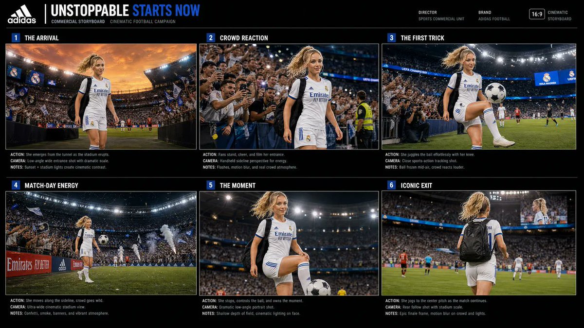
Goal: Create a polished commercial storyboard presentation for a 15-second ultra-realistic cinematic vertical football campaign featuring the same female footballer in every frame, titled {argument name="headline text" default="UNSTOPPABLE STARTS NOW"}. Canvas: Wide 16:9 black presentation board with thin white divider lines, a premium sports-agency layout, high contrast, realistic stadium photography in each panel, and a small top metadata bar. Use a black background, white condensed uppercase typography, and blue accent blocks for panel numbers and the word “STARTS.” Header: Place a white Adidas-style three-stripe logo at top left, followed by the main headline “UNSTOPPABLE STARTS NOW,” with “UNSTOPPABLE” in white and “STARTS NOW” in electric blue. Under it, add small text: “COMMERCIAL STORYBOARD CINEMATIC FOOTBALL CAMPAIGN.” On the top right add small production labels: “DIRECTOR / SPORTS COMMERCIAL UNIT,” “BRAND / ADIDAS FOOTBALL,” a small “16:9” badge, and “CINEMATIC STORYBOARD.” Layout: Use exactly 6 storyboard panels arranged in a 3-column by 2-row grid. Each panel has a blue numbered square, an uppercase scene title, one ultra-realistic cinematic image, and three tiny notes underneath labeled ACTION, CAMERA, and NOTES. Keep the same consistent reference character in all 6 panels: {argument name="character description" default="a young athletic blonde female footballer with a high ponytail, wearing a white Real Madrid-style football kit with black shoulder panels, blue trim, white socks, and football boots"}. Make the face neutral or softly obscured rather than celebrity-specific. Storyboard panels, exactly 6: 1. “THE ARRIVAL” — The player emerges from a stadium tunnel into a packed football arena at sunset, dramatic orange sky, Real Madrid-style flags in the crowd, huge stadium lights, low-angle wide entrance shot. Text below: ACTION: She emerges from the tunnel as the stadium erupts. CAMERA: Low-angle wide entrance shot with dramatic scale. NOTES: Sunset + stadium lights create cinematic contrast. 2. “CROWD REACTION” — Handheld sideline view as excited fans press forward cheering, filming on phones, flashes and stadium lights behind her while she walks past confidently. Text below: ACTION: Fans stand, cheer, and film her entrance. CAMERA: Handheld sideline perspective for energy. NOTES: Flashes, motion blur, and real crowd atmosphere. 3. “THE FIRST TRICK” — Close sports-action tracking shot as she juggles a {argument name="football type" default="black and white football"} effortlessly with her knee near the sideline, crowd roaring, bright stadium floodlights, blue Champions League-style ribbon signage. Text below: ACTION: She juggles the ball effortlessly with her knee. CAMERA: Close sports-action tracking shot. NOTES: Ball frozen mid-air, crowd reacts louder. 4. “MATCH-DAY ENERGY” — Wide cinematic stadium view with the player moving along the sideline, crowd packed and waving flags, confetti and smoke cannons, advertising boards, dynamic match-day atmosphere. Text below: ACTION: She moves along the sideline, crowd goes wild. CAMERA: Ultra-wide cinematic stadium view. NOTES: Confetti, smoke, banners, and vibrant atmosphere. 5. “THE MOMENT” — Dramatic low-angle portrait on the pitch as she controls the ball with one foot raised, stadium lights glowing overhead, shallow depth of field, intense heroic pause. Text below: ACTION: She stops, controls the ball, and owns the moment. CAMERA: Dramatic low-angle portrait shot. NOTES: Shallow depth of field, cinematic lighting on face. 6. “ICONIC EXIT” — Rear follow shot of the player jogging toward center pitch with a black backpack, jersey number visible, match continuing in the distance, giant stadium screen showing her, crowd and lights slightly motion blurred. Text below: ACTION: She jogs to the center pitch as the match continues. CAMERA: Rear follow shot with stadium scale. NOTES: Epic finale frame, motion blur on crowd and lights. Visual style: Ultra-realistic sports commercial photography, cinematic grading, crisp detail, stadium floodlights, crowd energy, slight motion blur, premium brand-storyboard aesthetic, clean editorial spacing, thin white borders around images, tiny but legible production-note typography. Constraints: Use exactly 6 panels and no extra panels. Maintain the same player, kit, hair, and body type across all panels. Keep the board landscape 16:9 even though it describes a vertical video campaign. Avoid random logos except the Adidas-style header mark and football-stadium branding cues. Make it look like a finished professional storyboard sheet, not a comic page.

Mixed Media Pastel Collage Poster

Mixed Media Pastel Collage Poster

Editorial / Poster

Read full prompt

Please make each photo I upload into a separate high-end design poster... The whole adopts a {argument name="composition ratio" default="3:4"} vertical composition, the upper and lower areas are strictly 1:1, each occupying 50% of the screen. The upper part retains the original photo... The lower part first understands the core theme most worth remembering of the original photo... then reconstructs it into a {argument name="illustration style" default="pastel hand-drawn graffiti material collage illustration with retro paper texture"}... The color scheme extracts {argument name="color count" default="2–4 kinds"} of the most vivid, friendly colors that best represent the spirit of the picture from the upper photo to re-modulate.

Retro Editorial Illustration Split Poster

Retro Editorial Illustration Split Poster

Editorial / Poster

Read full prompt

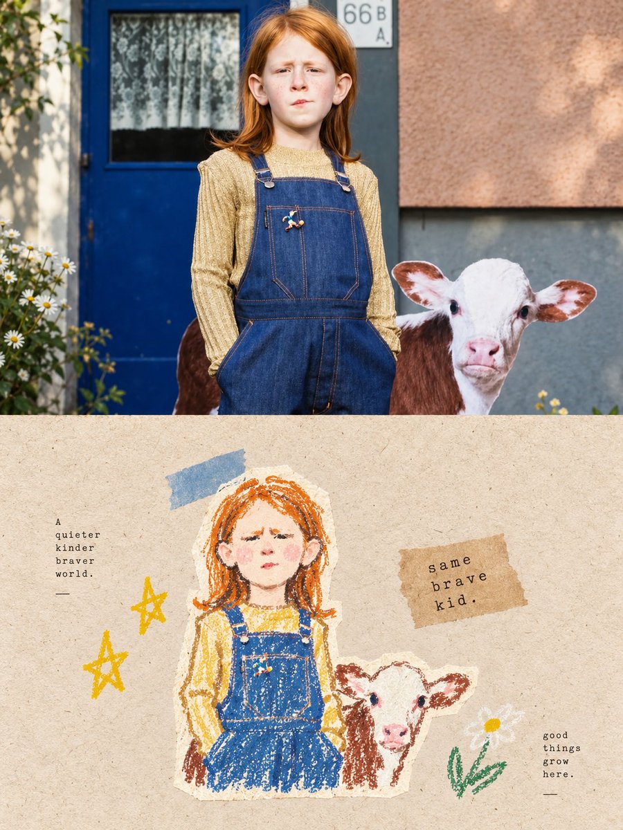
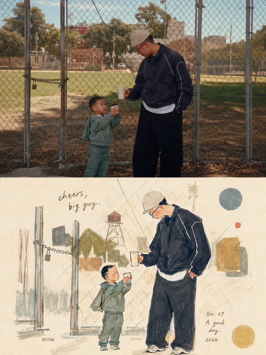
Please turn each photo I upload into a separate, high-end design poster. Do not combine multiple photos into a collage; output one poster per photo. Use an overall {argument name="composition ratio" default="3:4 vertical composition"}, strictly divided into two equal sections, with the top and bottom each occupying exactly 50% of the canvas height. For the top half, preserve the original photograph, maintaining the subject’s structure, realistic texture, natural lighting, and original color atmosphere. Apply only subtle, refined photographic color grading to give it the quality of editorial magazine photography and fine-art exhibition imagery. For the bottom half, extract the most recognizable subject, silhouette, pose, and narrative relationships from the photograph, then reinterpret them as a light, naïve, retro hand-drawn editorial illustration. Do not mechanically trace or reproduce every detail. Instead, reinterpret the subject through simplified forms, slightly exaggerated proportions, symbolic features, and humorous visual metaphors. Blend the aesthetics of modernist editorial illustration, Bauhaus composition, children’s picture books, and fashion sketching. Keep the forms concise and the lines thin, delicate, and slightly imperfect by hand. Derive the color palette from the photograph above, using a limited palette with high lightness and low-to-medium saturation. Leave generous areas of off-white or pale negative space. Use a mixed-media texture inspired by watercolor, gouache, colored pencil, oil pastel, and dry-brush techniques. Preserve visible paper grain, rough edges, and slight misregistration. Keep the overall composition balanced, airy, and spacious.

Layered Paper-Cut Illustration Poster

Layered Paper-Cut Illustration Poster

Editorial / Poster

Read full prompt

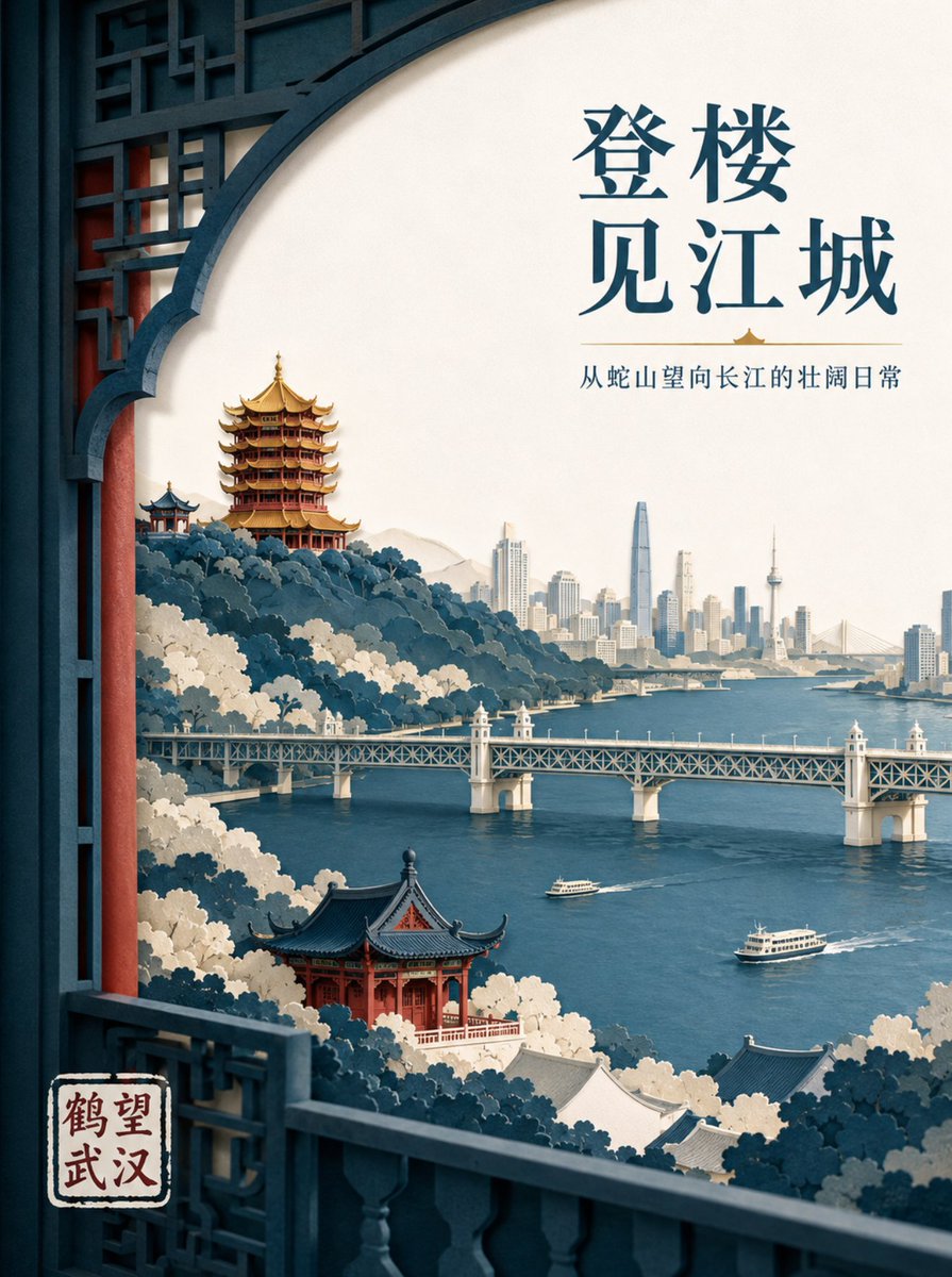
Create a high-end layered paper-cut illustration poster for the tourism brand "{argument name="brand name" default="He Wang Wuhan"}" with the theme "{argument name="theme" default="Looking at the river from the tower, seeing the landscape skeleton of Wuhan at a glance"}" in 3:4 vertical format. The composition uses a foreground window framing, with five to seven layers of thick textured paper forming Snake Hill, the Yellow Crane Tower, the Yangtze River, the Wuhan Yangtze River Bridge, and the city skyline on the opposite bank. The Yellow Crane Tower is located on the ridge in the background, with accurate relationships between layered eaves, golden glazed tiles, and vermilion pillars. The Yangtze River Bridge extends horizontally in the middle ground, with two small ferries on the river in controlled scale. The paper edges are sharp, with uniform soft lighting from the top left and realistic shadows between layers. Colors are indigo, warm off-white, cinnabar red, and a small amount of gilded gold for visual focus. The main title "{argument name="main title" default="Seeing the River City from the Tower"}" is placed in the large white space at the top right in two lines of modern Song typeface. The brand name "He Wang Wuhan" is placed at the bottom left in a paper seal format, keeping it modern rather than imitation antique.

AI Coding Assistant Promo Infographic

AI Coding Assistant Promo Infographic

Editorial / Poster

Read full prompt

{ "type": "app promotional infographic poster", "style": "clean, modern, glassmorphism, soft shadows, 3D icons", "theme": "{argument name=\"primary color theme\" default=\"blue and white\"}", "header": { "title": "{argument name=\"app name\" default=\"CodePilot\"}", "subtitle": "{argument name=\"subtitle\" default=\"你的 AI 编程副驾驶\"}", "features_list": "智能补全 · 代码生成 · 问答调试 · 代码解析", "main_icon": "glossy 3D rounded square, blue gradient, white {argument name=\"main icon symbol\" default=\"</>\"} and sparkles" }, "layout": { "sections": [ { "title": "feature_cards", "position": "middle grid", "count": 4, "items": [ { "label": "智能代码补全", "icon": "blue lightning bolt", "description": "上下文感知, 精准补全 让编码更快一步", "ui_element": "macOS style code window with Python calculate_total function" }, { "label": "AI 代码生成", "icon": "purple magic wand", "description": "根据自然语言描述 一键生成函数 & 脚本", "ui_element": "chat prompt bubble and code window with Python quick_sort function" }, { "label": "对话 & 调试助手", "icon": "green chat bubble", "description": "自然语言提问、定位 Bug 边聊边改, 高效解决问题", "ui_element": "chat interface with user question and green AI resolution bubble" }, { "label": "代码解析 & 注释", "icon": "orange document with magnifying glass", "description": "快速理解复杂代码 自动生成注释与说明", "ui_element": "code window with JS fetchData function and 3 floating action tags: 自动注释, 逻辑解析, 一键复制" } ] }, { "title": "为什么选择 CodePilot?", "position": "bottom left", "count": 4, "labels": ["提升效率", "精准可靠", "隐私安全", "易于集成"], "icons": ["clock", "checkmark", "shield", "puzzle piece"] }, { "title": "立即体验", "position": "bottom right", "count": 1, "elements": ["GitHub 开源项目", "{argument name=\"github link\" default=\"github.com/op7418/CodePilot\"}", "QR code"] } ] } }

Algerian Identity Card Mockup

Algerian Identity Card Mockup

Editorial / Poster

Read full prompt

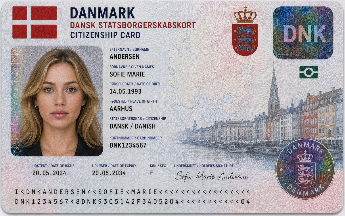
Ultra-realistic 16:9 close-up studio photograph of an {argument name="nationality" default="Algerian"} citizenship identity card placed on a clean light grey or soft neutral background. The card is horizontally aligned, centered in frame, captured in sharp macro focus with soft diffused studio lighting. The design follows an official Algerian government-issued identity document aesthetic with multilingual typography, engraved security artwork, and advanced anti-counterfeit detailing inspired by modern North African national ID systems. Large bold header at top reads: “الجمهورية الجزائرية الديمقراطية الشعبية” with secondary French title “RÉPUBLIQUE ALGÉRIENNE DÉMOCRATIQUE ET POPULAIRE” and subtitle “CARTE DE CITOYENNETÉ / CITIZENSHIP CARD.” Top-left corner features the Algerian national flag with red crescent and star emblem. Upper-right includes the national coat of arms of Algeria. The card contains a passport-style portrait of a young Algerian woman: – Warm olive North African skin tone with realistic natural texture – Medium-length dark brown or black hair with soft waves – Dark brown eyes, neutral expression, direct gaze – Minimal makeup with documentary realism – Wearing a dark blazer or black formal top with subtle gold jewelry Personal identity information displayed in Arabic, French, and English format: – اللقب / Nom / {argument name="last name label" default="Surname"}: BENYAHIA – الاسم / Prénom / {argument name="name" default="LEÏLA AMEL"} – تاريخ الميلاد / Date de naissance / {argument name="birth date" default="14 MAI / MAY 1993"} – مكان الميلاد / Lieu de naissance / Place of Birth: ALGER, ALGÉRIE – الجنسية / Nationalité / Nationality: ALGÉRIENNE – رقم المواطنة / Numéro de citoyenneté / Citizenship Number: DZA1234567 – تاريخ الإصدار / Date de délivrance / Date of Issue: 20 MAI / MAY 2024 – تاريخ الانتهاء / Date d’expiration / Date of Expiry: 20 MAI / MAY 2034 – الجنس / Sexe / Sex: F Security and design features include: – Intricate guilloche security line patterns across the entire card surface – Fine microprinted anti-counterfeit textures – Holographic foil patches with iridescent rainbow reflections – Transparent layered security overlays – Circular “DZA” holographic security seal – Crescent and star holographic motif integrated into security elements – Faint outline map of Algeria embedded into background texture – Detailed engraved illustration of Algiers skyline and Martyrs’ Memorial across the right side – Decorative geometric Islamic-inspired engraving patterns blended into background – Machine-readable identity strip along bottom edge – Signature at bottom: “Leïla A. Benyahia” Additional design styling: – Soft green, white, silver, and red gradients inspired by the Algerian flag – Polycarbonate laminated card texture with realistic reflections and embossed micro-detail – Modern high-security government document appearance with engraved banknote-style illustration work Lighting is soft and evenly diffused, emphasizing holographic effects, engraved textures, and realistic print detail without harsh shadows.

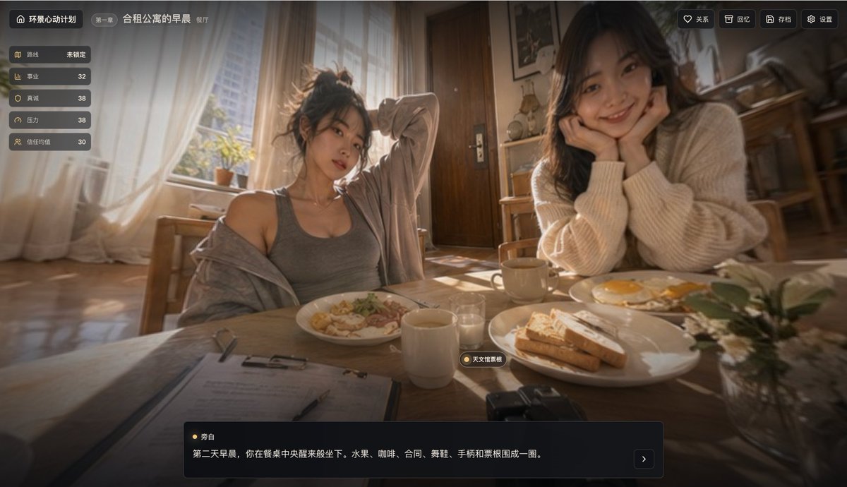
Cinematic Breakfast Dating Sim UI

Cinematic Breakfast Dating Sim UI

Editorial / Interface

Read full prompt

{"type":"cinematic visual novel game screenshot","genre":"romantic live-action interactive story interface","scene":{"location":"shared apartment dining room","time":"early morning","lighting":"warm golden sunrise streaming through large sheer-curtained windows, soft bloom, shallow depth of field, cozy domestic atmosphere","camera":"slightly low seated viewpoint from across a wooden breakfast table, wide-angle lens, intimate first-person perspective","mood":"gentle, nostalgic, subtly flirtatious, slice-of-life"},"subjects":{"count":2,"people":[{"position":"center-left","gender_presentation":"young woman","pose":"sitting casually at the breakfast table, one arm raised behind her head, cardigan slipping off one shoulder","outfit":"gray fitted tank top with a loose light gray cardigan","hair":"messy tied-up dark hair","expression":"relaxed morning look"},{"position":"right foreground","gender_presentation":"young woman","pose":"leaning forward with elbows on the table, face resting in both hands, looking toward the viewer","outfit":"oversized cream knit sweater","hair":"long dark wavy hair","expression":"soft, attentive, affectionate"}]},"table":{"items_count":10,"items":["plate of pasta or breakfast noodles in front of the left woman","plate with toast in the center-right","plate with two fried eggs near the right woman","white coffee mug in the center foreground","second mug near the right woman","small clear glass near the center","metal fork","clipboard with papers at the lower left","small camera at the lower center-right edge","small glass vase with white flowers and green leaves at the lower right"]},"background":{"elements_count":7,"elements":["large bright window with sheer curtains on the left","sunlit wooden floor","wooden door in the center back","wooden chairs","small shelf or cabinet with kitchen items","framed wall picture","softly blurred kitchen area on the far right"]},"ui":{"style":"modern dark translucent game HUD with rounded corners and gold accents","sections":[{"title":"环景心动计划","position":"top-left","count":1,"labels":["第一章 合租公寓的早晨 餐厅"]},{"title":"stats panel","position":"left side vertical","count":5,"labels":["路线 未锁定","事业 32","真诚 38","压力 38","信任均值 30"]},{"title":"action buttons","position":"top-right","count":4,"labels":["关系","回忆","存档","设置"]},{"title":"dialogue box","position":"bottom center","count":2,"labels":["旁白","第二天早晨,你在餐桌中央醒来般坐下。水果、咖啡、合司、舞鞋、手柄和票根围成一圈。"]},{"title":"location tag","position":"lower middle above dialogue box","count":1,"labels":["天文馆黎想"]}]},"rendering":{"look":"photorealistic cinematic still frame, premium dating sim interface, soft film grain, creamy bokeh, warm color grading, realistic skin and fabric textures, slight lens haze"},"parameters":{"chapter title":"{argument name=\"chapter title\" default=\"合租公寓的早晨\"}","game title":"{argument name=\"game title\" default=\"环景心动计划\"}","left character outfit":"{argument name=\"left character outfit\" default=\"gray tank top and loose cardigan\"}","right character outfit":"{argument name=\"right character outfit\" default=\"oversized cream knit sweater\"}","narration text":"{argument name=\"narration text\" default=\"第二天早晨,你在餐桌中央醒来般坐下。水果、咖啡、合司、舞鞋、手柄和票根围成一圈。\"}"}}

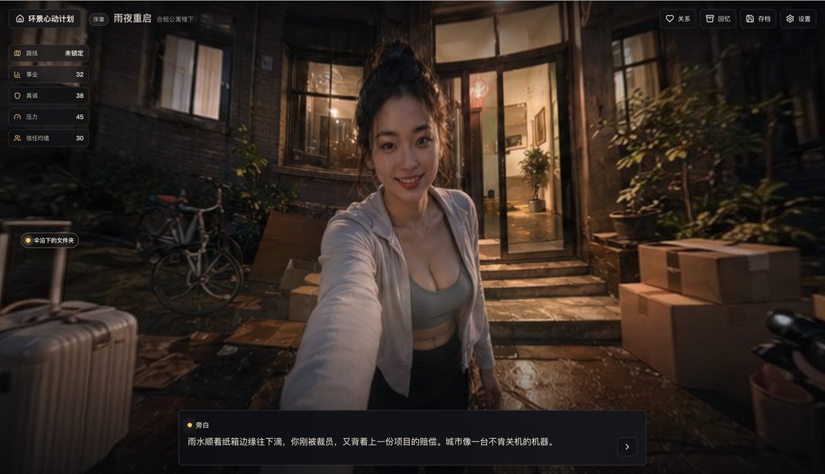
Rainy Night Visual Novel Game Screen

Rainy Night Visual Novel Game Screen

Editorial / Interface

Read full prompt

{"type":"cinematic visual novel game screenshot","genre":"interactive romance drama web game interface","setting":{"time":"rainy night","location":"outside the entrance of an old urban townhouse apartment courtyard","weather":"recent rain with wet reflective stone ground","lighting":"warm indoor tungsten light spilling out through the glass door into a dark blue-brown exterior"},"subject":{"count":1,"primary":"a young attractive woman in the foreground, photographed from a first-person perspective as if she is reaching out and leading the viewer by the hand","pose":"mid-torso framing, arm extended toward camera, slightly leaning forward","hair":"dark hair tied in a messy high bun","outfit":["white lightweight open zip hoodie","gray low-cut sports bra or fitted crop top","dark bottoms"],"expression":"face centered but obscured by a rectangular mosaic blur block"},"environment":{"visible_objects_count":8,"objects":["silver hard-shell rolling suitcase in the left foreground","small signpost on the left","bicycle leaning near the wall in the left midground","open glass entry door with lit interior hallway","potted plant visible inside the doorway","multiple potted plants outside on the right","stack of cardboard moving boxes on the right foreground","partial scooter or motorcycle handlebar at the far right edge"]},"camera":{"angle":"eye-level first-person game view","lens":"slightly wide angle","composition":"character centered, doorway directly behind her, cinematic shallow depth of field"},"ui":{"style":"modern Chinese game HUD with dark translucent panels and rounded corners","components_count":7,"components":[{"position":"top left","label":"坏景心动计划"},{"position":"top center-left","label":"序章 雨夜重启"},{"position":"top right","count":4,"labels":["关系","回忆","存档","设置"]},{"position":"left vertical stats panel","count":5,"labels":["路线","事业","真诚","压力","信任均值"]},{"position":"left floating folder button","label":"冷汀下的文件夹"},{"position":"bottom dialogue panel speaker","label":"旁白"},{"position":"bottom dialogue text","text":"雨水顺着纸箱边缘往下淌,你刚被裁员,又背上一份项目的赔偿。城市像一台不肯关机的机器。"}]},"mood":"moody, intimate, suspenseful, cinematic, slightly melancholic but alluring","quality":"photorealistic, high detail, premium game keyframe, dramatic reflections, soft bokeh, realistic skin and fabric, polished AAA narrative-game interface mockup","aspect_ratio":"16:9"}

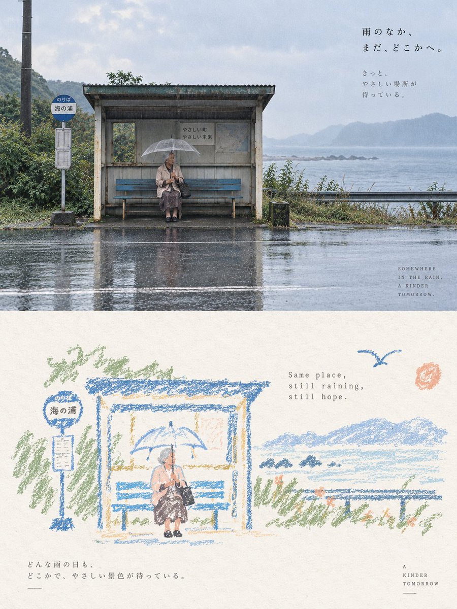
Vintage Crayon Art Poster

Vintage Crayon Art Poster

Editorial / Poster

Read full prompt

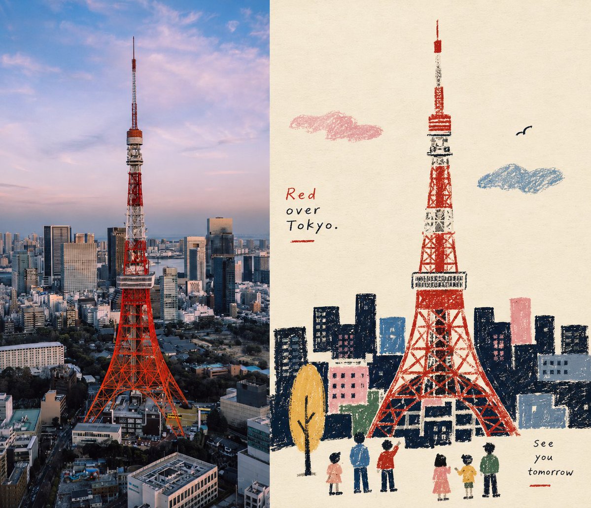
Please turn each photo I uploaded into an independent high-end design poster, no multi-image stitching, each photo output individually. The overall composition uses a {argument name="composition ratio" default="3:4 vertical composition"}, with the upper and lower areas strictly 1:1, each occupying 50% of the screen. The upper part preserves the original photo, maintaining the subject's identity, structure, posture, authentic texture, natural lighting, and original color atmosphere, with only slight professional color grading to give it the quality of an art magazine, independent publication, or exhibition image. The environment background can be naturally extended to fit the frame, but the subject must not be stretched, distorted, or changed. The lower part first understands the **core theme, subject relationship, structural trends, emotions, and visual metaphors** of the original photo, and then reconstructs it as a **{argument name="illustration style" default="vintage paper texture pastel crayon graffiti illustration"}**. Do not copy every object from the photo, nor completely redraw all content. Only retain the outlines, postures, directions, and visual memory points that best represent the original. Through deletion, generalization, slight exaggeration, and reorganization, make people immediately feel the correspondence between it and the photo above. The subject uses **coarse-grained chalk / crayon-style hand-drawn outlines**: lines are slightly thick, loose, dry, with powder particles, intermittent color loss, slight shaking, and incomplete closed edges, with naturally rounded tips. Only a very small amount of pastel color blocks, simple grids, stripes, dots, or random smears are added inside the subject, using minimal information to suggest structure, without realistic volume or complete details. The surrounding small elements use the **same line language** as the subject, but are further compressed into graffiti symbols identifiable in one or a few strokes. Stars, flowers, plants, artifacts, environmental clues, or abstract symbols should be simple, naive, open, and not completely closed, mainly single-line outlines with very little coloring. Do not draw them as exquisite icons, stickers, or independent small illustrations. The composition maintains the relationship between **small scale stamps and large areas of white space**, freely arranged according to the subject's own direction, proportion, and visual center of gravity, which can be eccentric, edge-aligned, suspended, or partially cropped. The subject and a very small number of graffiti symbols form a loose but clear visual community, and the remaining space is actively left empty. **White space itself is the main compositional element**, forming a sense of breathing, distance, and pause through the relationship between empty and solid, gathered and scattered, large contrast, and asymmetry; better to draw less than to fill it up. The background must use an **extremely light, bright, clean paper base color**, such as cream white, ivory white, light beige, pale apricot white, very light gray-white, or a near-white paper color intelligently matched based on the original image's overall color temperature. The paper only retains very slight fibers and particles, and must not be brownish, yellowish, grayish, or look old. **The background brightness must be significantly higher than the subject lines and color blocks to ensure that all crayon outlines, small symbols, and text are clearly visible and do not blur with the background.** The {argument name="color palette" default="color palette"} is extracted from the 2–4 most vivid, approachable, and representative colors from the upper photo, converted into bright and soft pastel crayon colors. This can naturally form light colors such as peach pink, apricot orange, cream yellow, mint green, sky blue, and light purple; the subject lines prioritize using coral pink, soft blue, cyan, warm orange, light purple, or cream dark tones that are clearer than the background, and small elements only sporadically repeat these colors to form an echo. The overall relationship maintains a contrast of **light background + clear colored lines + a small amount of soft color blocks**, which is bright, healing, relaxed, and has a sense of life. Avoid dark, dirty brown, dull Morandi, low contrast, fluorescent colors, and cheap candy feeling. A small amount of text is involved, with no language restrictions. Short sentences or text fragments can be freely extracted from the subject, action, emotion, memory, or metaphor, using a **thin, sparse, typing layout font with slight uneven spacing and old-fashioned mechanical printing errors**, and the color uses a clear but not dazzling gray-brown, soft black, deep blue-gray, or a dark color echoing the subject, ensuring sufficient readability on the light paper surface. The text is naturally scattered in the white space area, mixed with the subject and graffiti, without fixed title templates. The overall presentation is a high-end healing visual composed of **extremely light paper, coarse-grained crayon outlines, a small amount of pastel coloring, minimalist graffiti symbols, small-scale subjects, and a large amount of artistic white space**. The key is to make the subject and small elements float clearly on the light-colored paper, while maintaining a loose, naive, gentle, and mature editorial composition awareness. Avoid dark kraft paper, dark brown backgrounds, low-contrast lines, blurring background and subject, fine strokes, realistic redrawing, complex small icons, filling the background, smooth vectors, 3D feeling, and commercial template feeling.

Surrealist Fashion Brand Poster

Surrealist Fashion Brand Poster

Editorial / Poster

Read full prompt

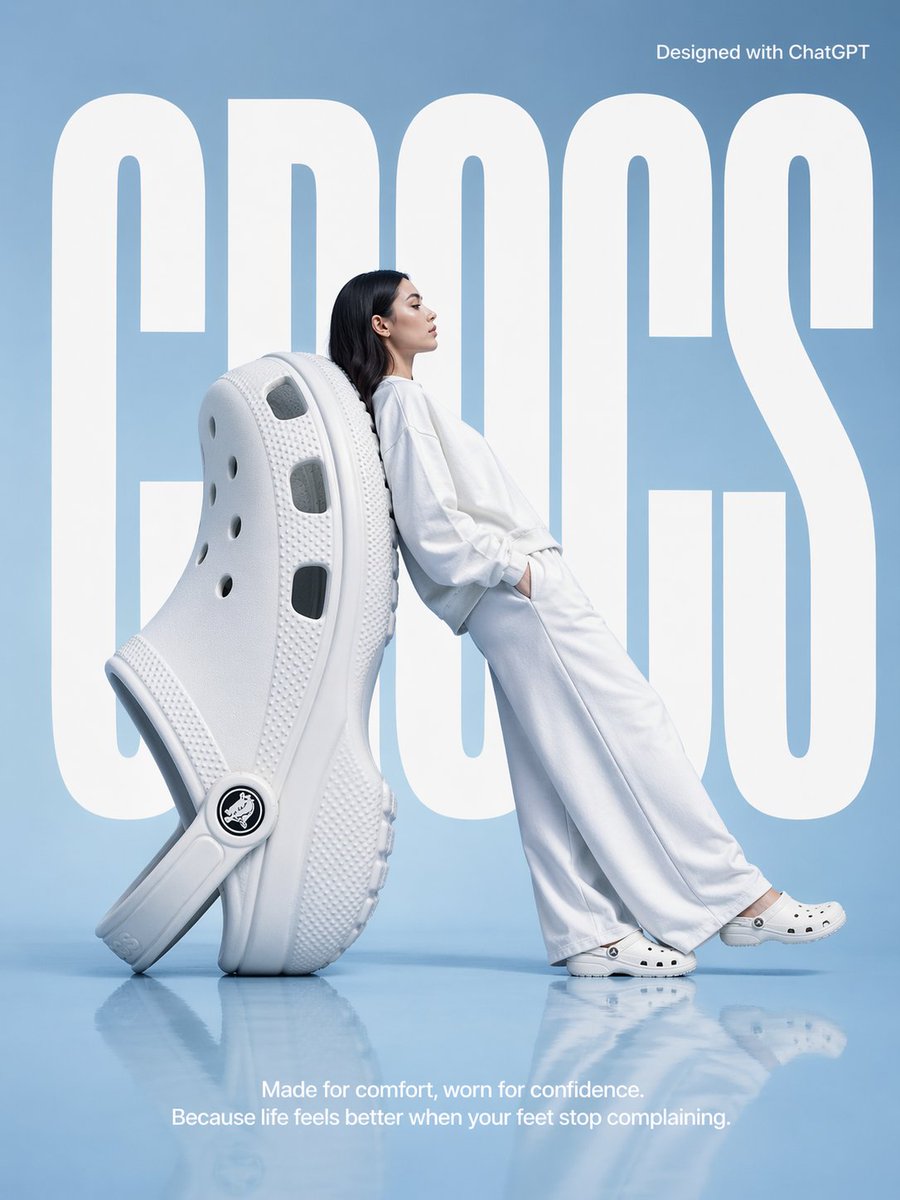
A high-fashion surrealist advertising poster for {argument name="brand" default="Crocs"}. The scene is set in a minimalist, monochrome {argument name="background color" default="light blue"} studio with a semi-reflective floor.  The central focus is an oversized, giant white Croc clog positioned on its heel at a diagonal angle, serving as a backrest. A fashion model with long dark hair, dressed in a {argument name="clothing" default="clean, all-white coordinated sweatshirt and wide-leg trousers"}, leans her entire back against the giant shoe in a relaxed, leaning posture. She is facing right in profile, looking ahead with a serene expression, and wearing standard-sized white Crocs. In the background, the word "CROCS" is written in massive, bold, white condensed sans-serif typography, partially occluded by the giant shoe and the model to create a sense of depth. At the top right, "Designed with ChatGPT"  At the bottom center, a white sans-serif tagline reads: "Made for comfort, worn for confidence. Because life feels better when your feet stop complaining." The lighting is soft, cool, and even, casting gentle shadows and a soft reflection of the subjects on the glossy blue floor. The overall aesthetic is clean, modern, and high-concept. Make the aspect ratio 3:4

Naive Folk Art Poster Design

Naive Folk Art Poster Design

Editorial / Poster

Read full prompt

Adopt a vertical 3:4 composition, with the top and bottom areas strictly 1:1, each occupying 50% of the screen. The top half retains the original photo's subject, structure, and texture with artistic magazine-like color grading. The bottom half extracts the most recognizable subjects and silhouettes, reconstructing them into a Naïve folk-inspired narrative illustration. Forms are simplified silhouettes and large primitive blocks. Texture uses crayons, oil pastels, and thick pencils with grain and paper-through effects. Outlines have a handcrafted, clumsy feel. The color scheme is a limited palette on warm white paper. Overall visual temperament: naive silhouettes, flat space, crayon grains, restrictive colors, and folk art symbols. Side-by-side layout, 7:6 ratio.

Wimbledon Motion Diptych

Wimbledon Motion Diptych

Editorial / Poster

Read full prompt

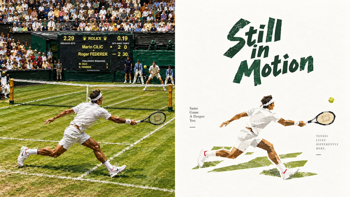
Goal: Create a two-panel editorial sports artwork about {argument name="tennis player" default="Roger Federer"} at Wimbledon, combining a rough painterly match scene with a minimalist poster illustration. Canvas: Wide horizontal 16:9 composition split exactly into 2 equal vertical panels. Left panel is a dense, realistic, rough-brush illustration of a grass-court tennis match; right panel is a clean off-white poster with distressed typography and collage-like tennis illustration. No outer border. Layout: Left panel occupies the left half and shows an action moment from behind the near player, lunging low across a worn green grass court toward the net. The far baseline has 1 opposing player in white preparing to return, with 2 ball kids or officials standing near the back wall. A large scoreboard sits high at center-left behind the court, with a packed audience filling the stands above it. Right panel occupies the right half with lots of negative space: large hand-painted green title at upper center-right, small slogan text at mid-left, a running tennis player illustration across the lower center, and a small vertical text block near the lower right. Left panel subject details: Depict exactly 2 tennis players: 1 foreground player in all-white tennis outfit, white headband, white shoes with small red accents, stretched into a dramatic forehand reach with racket extended; 1 distant opponent in white near the far baseline. Include 1 yellow tennis ball visible near the far player. The court is Wimbledon-style grass with scuffed, patchy texture, white boundary lines, a black net with yellow posts, and dark green walls. Use a crowded stadium background with many tiny spectators in hats and summer clothing. The left panel should feel like a photo transformed into thick oil-paint strokes, with visible palette-knife texture and rough edges. Scoreboard text: Include a black-and-green Rolex-style scoreboard with yellow lettering. It should show the names Marin CILIC and Roger FEDERER, with Federer leading; include readable fragments such as "ROLEX", "Marin CILIC", "Roger FEDERER", "PREVIOUS SETS", "SETS", "GAMES", "POINTS", and small challenge remaining lines, but do not worry about perfect numerical accuracy. Right panel visual style: Minimalist off-white paper background with subtle grain. At the top, write {argument name="headline text" default="Still in Motion"} in large dark forest-green, rough dry-brush, slanted hand-lettering. The illustrated player below should match the foreground player from the left panel, drawn as a low-poly paper collage / torn-paper texture in white, tan, brown, gray, and green, sprinting to the right with a black racket and a small yellow tennis ball floating ahead. Add exactly 3 rough green brush-stroke court marks beneath the player. Right panel text content: Add two small serif text blocks: on the left of the illustrated player, stacked lines reading {argument name="left slogan" default="Same Game A Deeper You"} with a short horizontal rule beneath; near the lower right, stacked lines reading {argument name="right slogan" default="TENNIS LIVES DIFFERENTLY HERE."} with a short horizontal rule beneath. Color and mood: Wimbledon greens, white clothing, sunlit grass, dark scoreboard, warm crowd tones, and an elegant vintage sports-magazine mood. The overall finish should be rough, textured, slightly imperfect, artistic, and editorial rather than glossy. Constraints: Use exactly 2 panels, exactly 2 tennis players, exactly 1 visible tennis ball in the left panel, exactly 1 visible tennis ball in the right panel, exactly 1 large scoreboard, exactly 3 green brush-stroke court marks in the right panel. Avoid logos other than the scoreboard-style Rolex reference, avoid watermarks, and keep the right panel spacious and uncluttered.