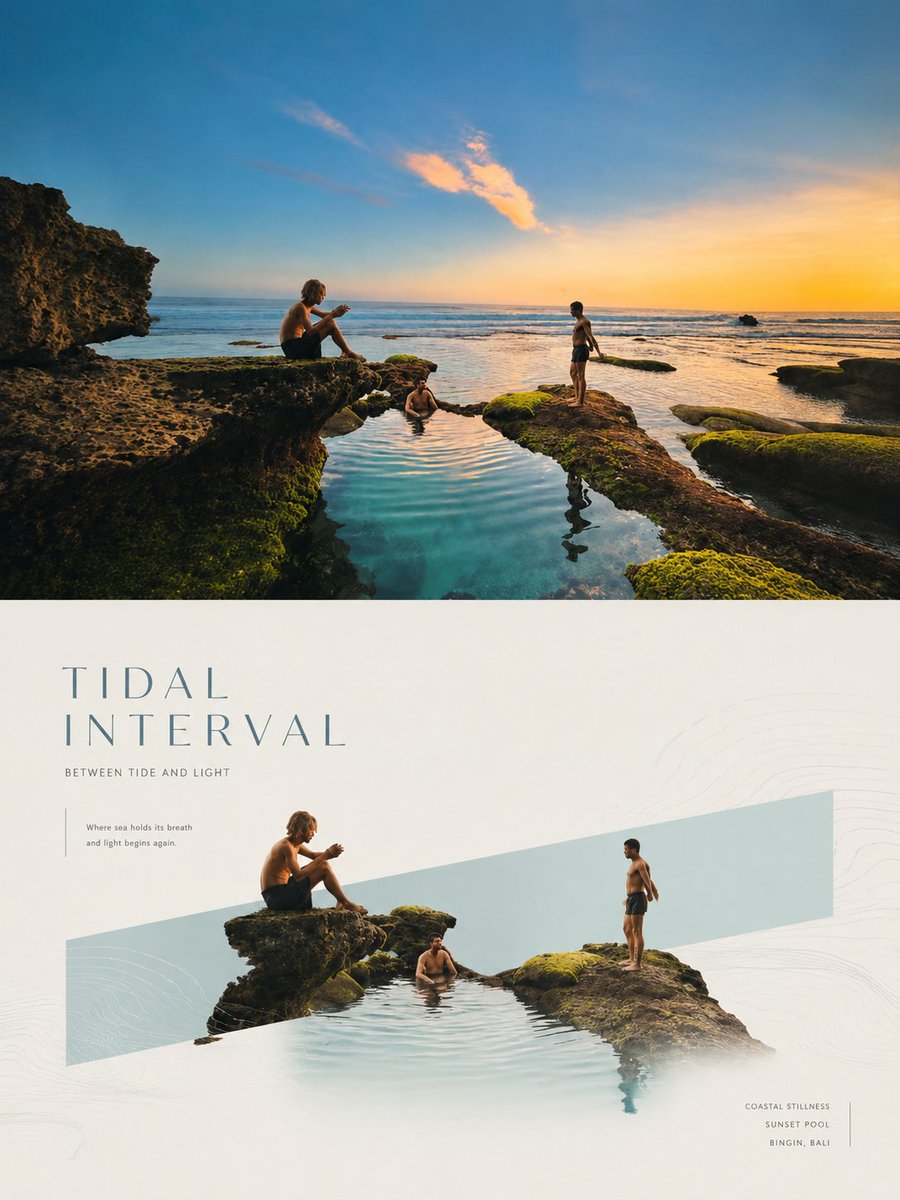
Please make each photo I upload into an independent high-end design poster, no multi-photo splicing, each photo output separately. The overall composition is 3:4 vertical, with the top and bottom regions strictly 1:1, each occupying 50% of the screen. The top half preserves the original photo, maintaining the subject structure, real texture, natural lighting, and original color atmosphere, with only slight high-end photography color grading to give it the exquisite texture of high-end brand advertising, art magazines, and exhibition visuals. To adapt to the frame, the sky, ground, or environmental background can be naturally extended, while the subject itself remains unchanged. The bottom half extracts the most recognizable **subject, outline, posture, and narrative relationship** of the photo, reconstructing it into a minimalist visual poster with high-end commercial aesthetics. The core language is **'real objects crossing geometric emotional windows'**: a narrow, restrained, low-saturation geometric color block is set in the screen as a visual anchor and spatial container. **The direction of the color block is not fixed, it can be horizontal, vertical, or diagonal**, naturally determined according to the center of gravity of the subject, the direction of movement, the trend of the outline, and the rhythm of the layout. The subject enters the color block in a real photographic or exquisite realistic way, and partially crosses the border, breaks the frame, extends or passes through the boundary, forming a sense of natural growth, spatial penetration, and white space breathing. The composition remains minimalist, clear, and balanced, establishing order through geometric color blocks, subject boundary-crossing relationships, and large areas of white space. The subject can be centered, off-center, growing vertically, or stretching horizontally, but always maintains a single focus. The background is mainly white, light gray, or very light warm colors, and very slight cultural patterns, linear graphics, topographic lines, water wave lines, lighting outlines, or abstract symbols can be added as faint auxiliary levels. The color matching extracts the most recognizable and energetic color relationships from the top photo, transforming them into a high-end system of **light-colored geometric windows + real subject colors + a minimal amount of neutral color typography**. The color of the color block can be softened into mist blue, light cyan, cream white, pale pink, warm gray, light gold, or other light tones consistent with the temperament of the original image, making the overall look light, clean, modern, and exquisite. Text naturally intervenes as part of the layout structure. A short English title can be extracted from the subject, emotion, action, state, or symbolic meaning of the photo, accompanied by a small number of subtitles, locations, status words, or micro-notes. The title can be arranged horizontally, vertically, or along the relationship between the color block and the subject. Auxiliary information is neatly arranged in small font size, thin font weight, and stretched letter spacing, making it present a high-end editorial feel like high-end real estate, luxury goods, aesthetic magazines, or seasonal solar term visuals. The overall temperament emphasizes **Eastern white space, modern order, natural vitality, and high-end commercial beauty**. Whether the subject is a person, animal, plant, building, utensil, food, vehicle, or natural landscape, it should maintain a clear, elegant, and transferable visual echo between real photography and geometric emotional windows. Please make each photo I upload into an independent high-end design poster, no multi-photo splicing, each photo output separately. The overall composition is 3:4 vertical, with the top and bottom regions strictly 1:1, each occupying 50% of the screen. The top half preserves the original photo, maintaining the subject structure, real texture, natural lighting, and original color atmosphere, with only slight high-end photography color grading to give it the exquisite texture of high-end brand advertising, art magazines, and exhibition visuals. To adapt to the frame, the sky, ground, or environmental background can be naturally extended, while the subject itself remains unchanged. The bottom half extracts the most recognizable **subject, outline, posture, and narrative relationship** of the photo, reconstructing it into a minimalist visual poster with high-end commercial aesthetics. The core language is **'real objects crossing geometric emotional windows'**: a narrow, restrained, low-saturation geometric color block is set in the screen as a visual anchor and spatial container. **The direction of the color block is not fixed, it can be horizontal, vertical, or diagonal**, naturally determined according to the center of gravity of the subject, the direction of movement, the trend of the outline, and the rhythm of the layout. The subject enters the color block in a real photographic or exquisite realistic way, and partially crosses the border, breaks the frame, extends or passes through the boundary, forming a sense of natural growth, spatial penetration, and white space breathing. The composition remains minimalist, clear, and balanced, establishing order through geometric color blocks, subject boundary-crossing relationships, and large areas of white space. The subject can be centered, off-center, growing vertically, or stretching horizontally, but always maintains a single focus. The background is mainly white, light gray, or very light warm colors, and very slight cultural patterns, linear graphics, topographic lines, water wave lines, lighting outlines, or abstract symbols can be added as faint auxiliary levels. The color matching extracts the most recognizable and energetic color relationships from the top photo, transforming them into a high-end system of **light-colored geometric windows + real subject colors + a minimal amount of neutral color typography**. The color of the color block can be softened into mist blue, light cyan, cream white, pale pink, warm gray, light gold, or other light tones consistent with the temperament of the original image, making the overall look light, clean, modern, and exquisite. Text naturally intervenes as part of the layout structure. A short English title can be extracted from the subject, emotion, action, state, or symbolic meaning of the photo, accompanied by a small number of subtitles, locations, status words, or micro-notes. The title can be arranged horizontally, vertically, or along the relationship between the color block and the subject. Auxiliary information is neatly arranged in small font size, thin font weight, and stretched letter spacing, making it present a high-end editorial feel like high-end real estate, luxury goods, aesthetic magazines, or seasonal solar term visuals. The overall temperament emphasizes **Eastern white space, modern order, natural vitality, and high-end commercial beauty**. Whether the subject is a person, animal, plant, building, utensil, food, vehicle, or natural landscape, it should maintain a clear, elegant, and transferable visual echo between real photography and geometric emotional windows.
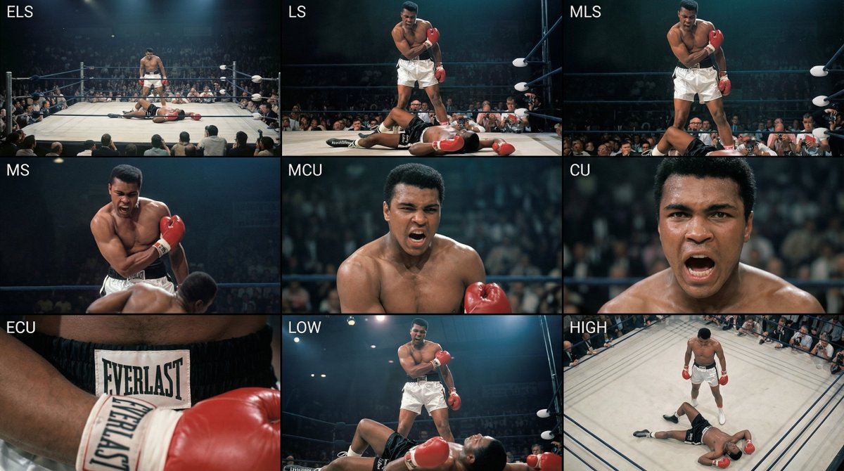
Analyze the entire composition of the input image. Identify all key subjects present (whether a single person, group/couple, vehicle, or specific object) and their spatial relationships/interactions.
Generate a coherent 3×3 “contact sheet” grid that shows 9 different shots of exactly these subjects within the same environment.
You must adapt standard cinematic shot types to fit the content (for example, if it’s a group, keep the group together; if it’s an object, frame the entire object):
Row 1 (establishing the environment):
Extreme long shot (ELS): the subject appears small within a vast environment.
Long shot (LS): the full subject or group is visible from top to bottom (head to toe / wheels to roof).
Medium long shot (American shot / three-quarter): framed from above the knees (for people) or a 3/4 view (for objects).
Row 2 (core coverage):
4. Medium shot (MS): framed from the waist up (or the central core of an object). Focus on interaction/action.
5. Medium close-up (MCU): framed from the chest up. An intimate framing of the main subject.
6. Close-up (CU): tightly framed on the face or the “front” of the object.
Row 3 (details and angles):
7. Extreme close-up (ECU): intense focus on key features (eyes, hands, signs, textures) with macro-like detail.
8. Low-angle shot (worm’s-eye): look up at the subject from ground level (epic/heroic feeling).
9. High-angle shot (bird’s-eye): look down on the subject from above.
Ensure strict consistency: the same person/object, same clothing, and same lighting must appear in all 9 panels. Depth of field should vary realistically (with background blur in close-up shots).
Create a professional 3×3 cinematic storyboard grid with 9 panels.
The grid should present a specific subject/scene from the input image across a full range of focal lengths.
Top row: wide environmental shot, full-body view, 3/4 cropped (knees-up).
Middle row: waist-up view, chest-up view, face/front close-up.
Bottom row: macro details, low angle, high angle.
All frames must have photo-realistic textures, consistent cinematic color grading, and correct framing tailored to the number and type of subjects or objects being analyzed.
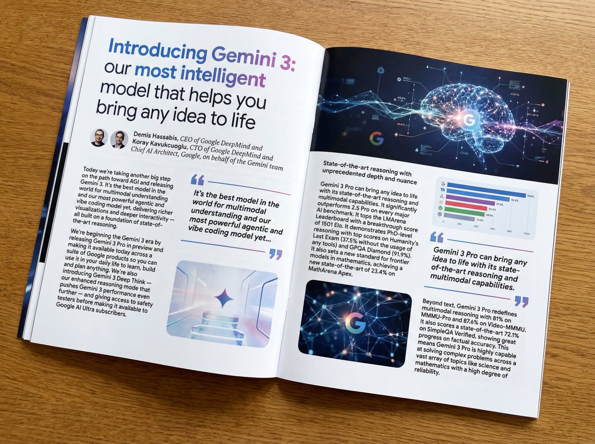
Put this whole text, verbatim, into a photo of a glossy magazine article on a desk, with photos, beautiful typography design, pull quotes, and bold formatting. The text: {argument name="article_text_en" default="[paste the full unformatted article here]"}
Create decorative text based on the word "{argument name="word" default=""}". Write the specified word largely and create decorative text designs associated with the image of the word. Create original designs with flexible ideas, without being constrained by existing fonts. The background should be a single color, white or black, matching the design.