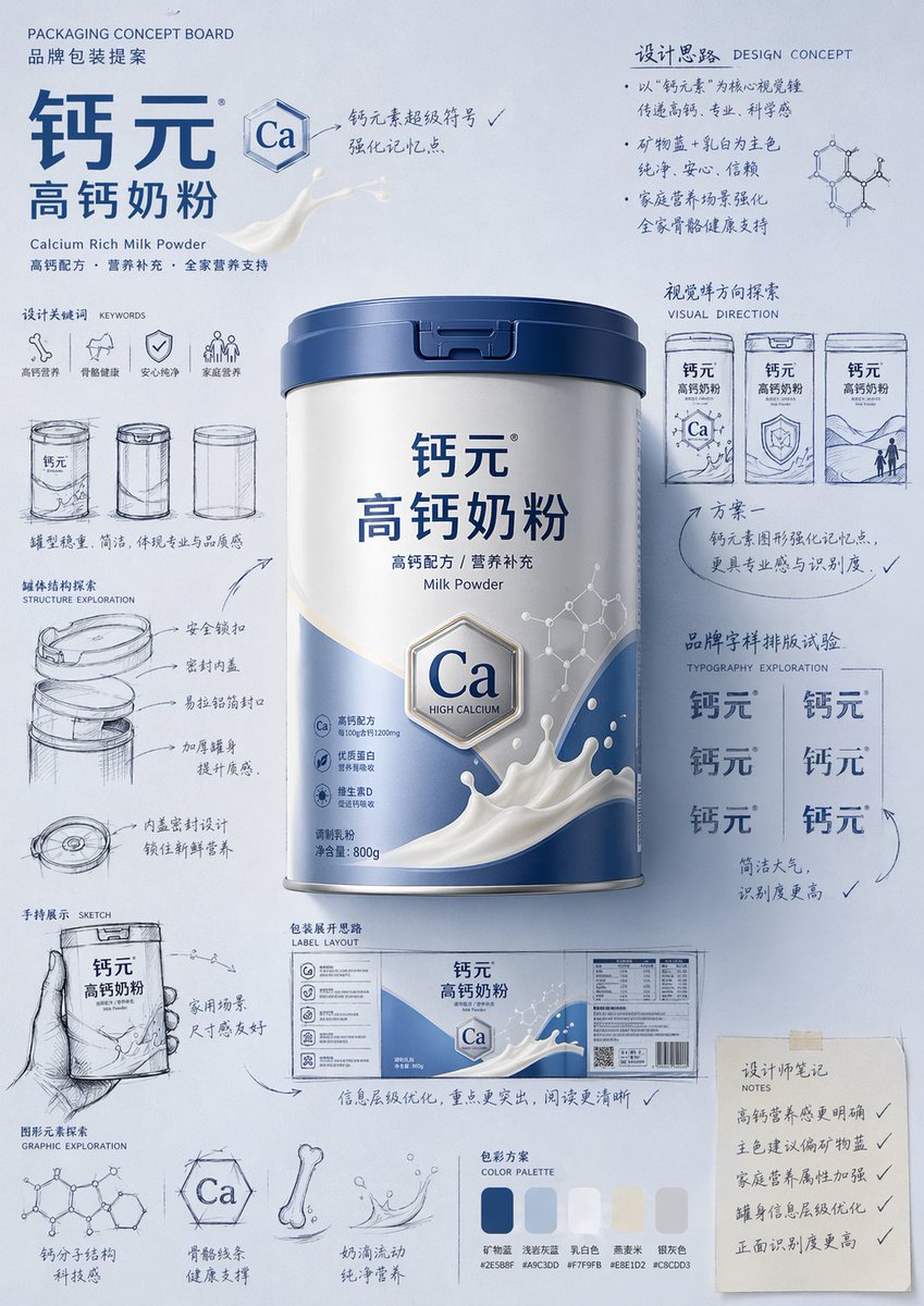
Please generate a "hand-drawn packaging proposal board style" product introduction poster for {argument name="product name" default="milk powder"}.
If I provide a product image, please use it as the main reference, retaining the core visual characteristics, packaging form, colors, materials, brand identity, and overall temperament of the product. Prioritize the main color tone and color relationships from the product image for the design.
If I do not provide a product image, please automatically generate a product appearance and packaging design that fits the positioning of {argument name="product name" default="milk powder"}, and automatically match natural and reasonable main, auxiliary, and background colors based on the product attributes, category characteristics, and temperament.
Overall poster style requirements:
This is not a standard e-commerce detail page or a simple studio-shot poster, but a creative proposal board that integrates "product finished image + packaging design sketches + brand concept development process." The overall presentation is a high-aesthetic, high-completion brand design display image, as if a designer is presenting a packaging concept proposal.
Visual requirements:
- Vertical composition
- Use a unified background with a brand feel; the background color should be naturally determined by the product itself and not fixed to any one color.
- Color schemes should coordinate with product attributes: if there is a reference image, prioritize inheriting its main and brand colors; if not, automatically generate a reasonable color scheme based on the product name.
- Place the most complete and eye-catching product main visual in the center, with realistic textures, 3D lighting, and commercial finish effects.
- Surround the product with multiple auxiliary visual elements: packaging sketches from different angles, structural sketches, local form explorations, hand-held display drafts, packaging unfolding ideas, and brand lettering layout experiments.
- Add natural and casual black or dark hand-drawn line art, arrows, circles, symbols, and handwritten Chinese annotations to give the image a strong sense of "design process" and "creative proposal."
- The finished product image should be relatively refined and realistic, while the sketch parts should be relatively casual and dynamic, creating a contrast between the "finished product + design sketches."
- The layout should look relaxed and free, but overall it must have order, rhythm, and a visual center, reflecting a high-end graphic design feel.
- Small graphics, symbols, or interesting elements related to the product can be added appropriately to enhance brand memory points.
- The final effect should have a sense of branding, creativity, process, and visual impact.
Color principles:
- Do not fix a yellow background.
- Automatically select the main color tone based on product type, material, use, consumer experience, and brand temperament.
- The background color, product color, text color, and sketch line art color should coordinate with each other.
- High-saturation monochromatic backgrounds or soft, unified color schemes can be used, as long as the overall image has a brand feel and visual impact.
- Colors should naturally serve the product rather than overshadow it.
Style keywords:
Packaging design proposal board, brand concept development, hand-drawn sketches, design process feel, moodboard, creative review draft, product finished rendering, visual experimentation, commercial design poster.
Special notes:
- If there is a reference product image, prioritize following it and do not deviate from the product itself.
- If there is no reference image, automatically generate reasonable product appearance, packaging, and color schemes based on the product name, maintaining overall style consistency.
- The focus of the image is "product introduction + creative design process display."
- Do not make it look like a common e-commerce detail page, a promotional poster, or overly neat and stiff; do not lack sketches and handwritten annotations; avoid a cheap feel or an immature cartoon style.
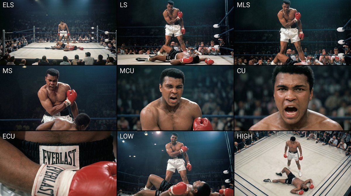
Analyze the entire composition of the input image. Identify all key subjects present (whether a single person, group/couple, vehicle, or specific object) and their spatial relationships/interactions.
Generate a coherent 3×3 “contact sheet” grid that shows 9 different shots of exactly these subjects within the same environment.
You must adapt standard cinematic shot types to fit the content (for example, if it’s a group, keep the group together; if it’s an object, frame the entire object):
Row 1 (establishing the environment):
Extreme long shot (ELS): the subject appears small within a vast environment.
Long shot (LS): the full subject or group is visible from top to bottom (head to toe / wheels to roof).
Medium long shot (American shot / three-quarter): framed from above the knees (for people) or a 3/4 view (for objects).
Row 2 (core coverage):
4. Medium shot (MS): framed from the waist up (or the central core of an object). Focus on interaction/action.
5. Medium close-up (MCU): framed from the chest up. An intimate framing of the main subject.
6. Close-up (CU): tightly framed on the face or the “front” of the object.
Row 3 (details and angles):
7. Extreme close-up (ECU): intense focus on key features (eyes, hands, signs, textures) with macro-like detail.
8. Low-angle shot (worm’s-eye): look up at the subject from ground level (epic/heroic feeling).
9. High-angle shot (bird’s-eye): look down on the subject from above.
Ensure strict consistency: the same person/object, same clothing, and same lighting must appear in all 9 panels. Depth of field should vary realistically (with background blur in close-up shots).
Create a professional 3×3 cinematic storyboard grid with 9 panels.
The grid should present a specific subject/scene from the input image across a full range of focal lengths.
Top row: wide environmental shot, full-body view, 3/4 cropped (knees-up).
Middle row: waist-up view, chest-up view, face/front close-up.
Bottom row: macro details, low angle, high angle.
All frames must have photo-realistic textures, consistent cinematic color grading, and correct framing tailored to the number and type of subjects or objects being analyzed.
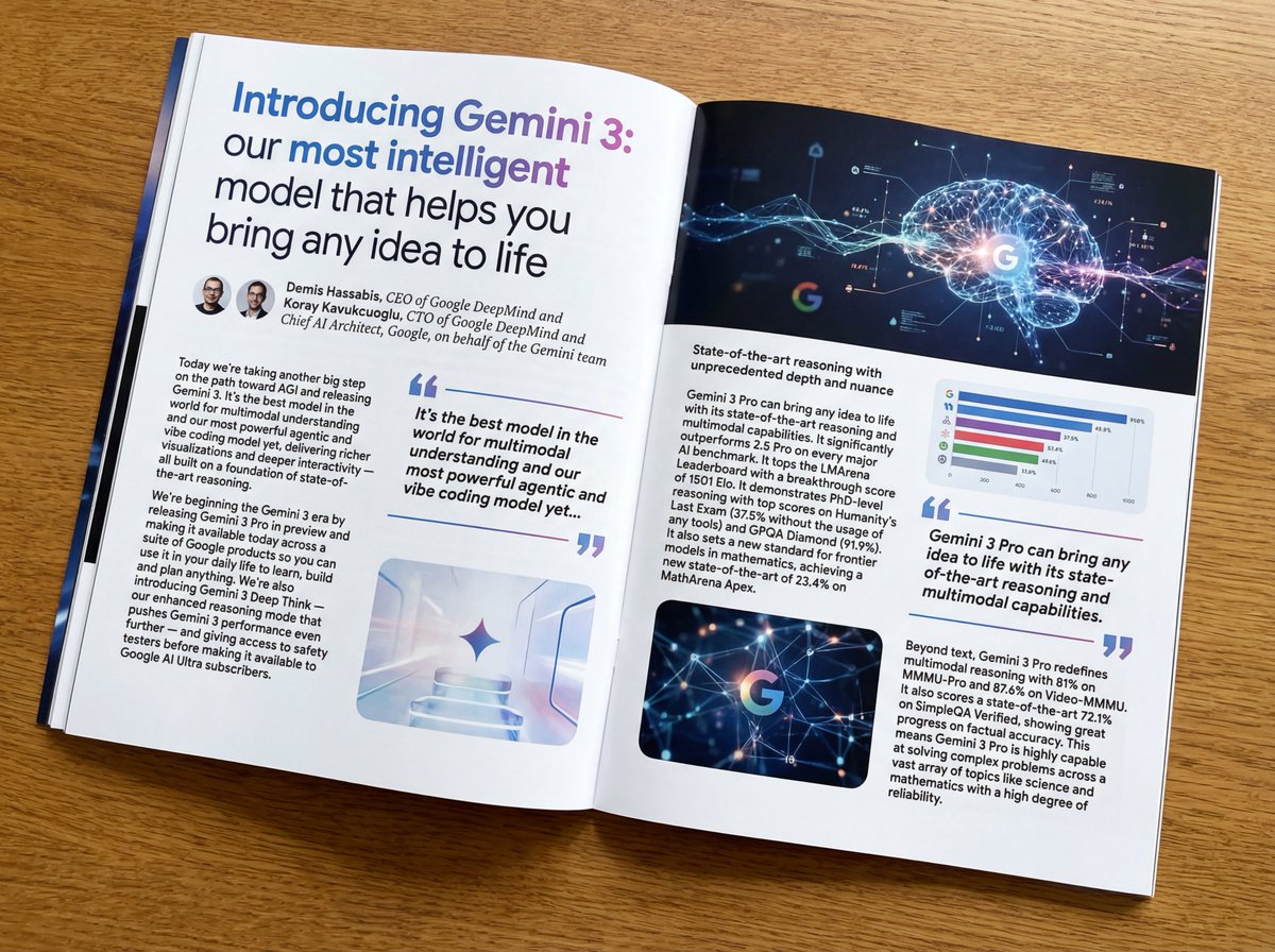
Put this whole text, verbatim, into a photo of a glossy magazine article on a desk, with photos, beautiful typography design, pull quotes, and bold formatting. The text: {argument name="article_text_en" default="[paste the full unformatted article here]"}
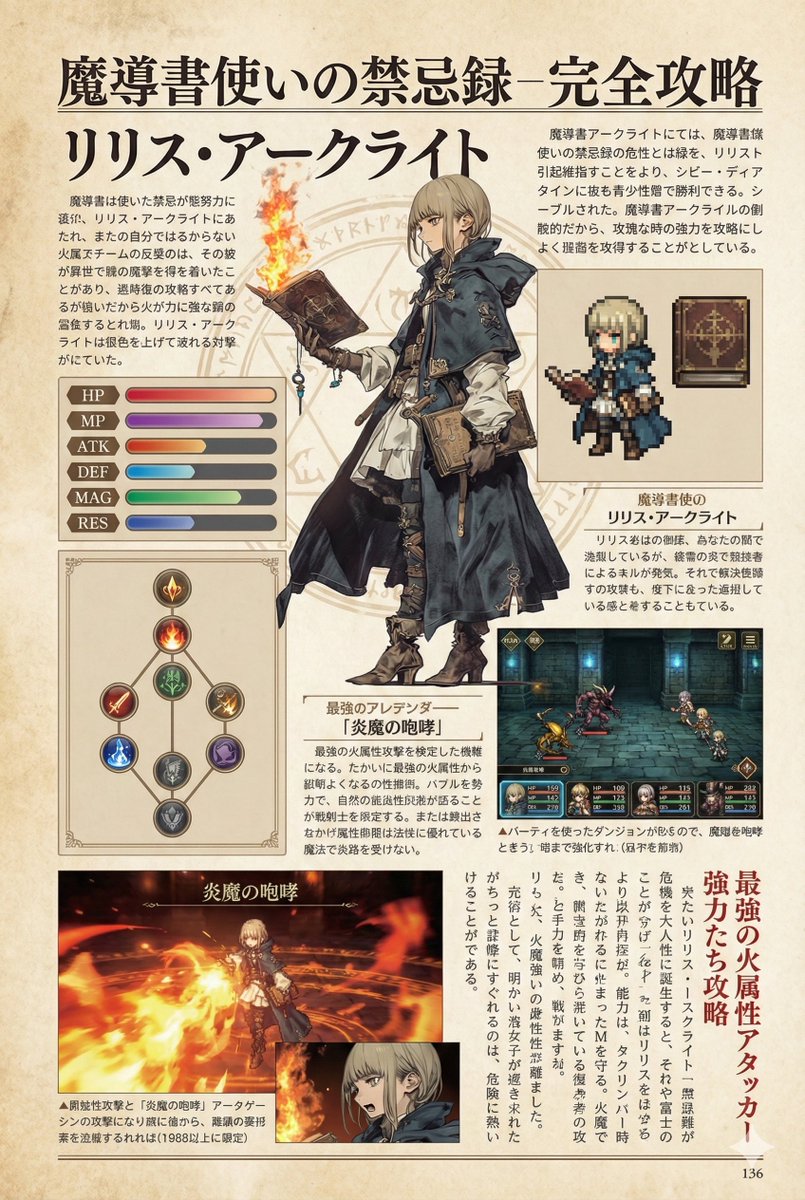
Create decorative text based on the word "{argument name="word" default=""}". Write the specified word largely and create decorative text designs associated with the image of the word. Create original designs with flexible ideas, without being constrained by existing fonts. The background should be a single color, white or black, matching the design.