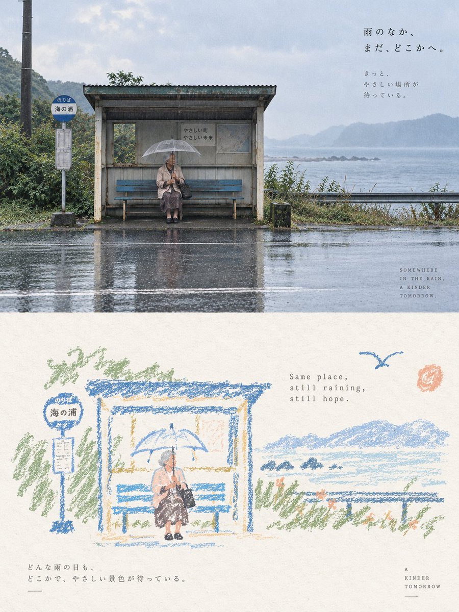
Please turn each photo I uploaded into an independent high-end design poster, no multi-image stitching, each photo output individually. The overall composition uses a {argument name="composition ratio" default="3:4 vertical composition"}, with the upper and lower areas strictly 1:1, each occupying 50% of the screen.
The upper part preserves the original photo, maintaining the subject's identity, structure, posture, authentic texture, natural lighting, and original color atmosphere, with only slight professional color grading to give it the quality of an art magazine, independent publication, or exhibition image. The environment background can be naturally extended to fit the frame, but the subject must not be stretched, distorted, or changed.
The lower part first understands the **core theme, subject relationship, structural trends, emotions, and visual metaphors** of the original photo, and then reconstructs it as a **{argument name="illustration style" default="vintage paper texture pastel crayon graffiti illustration"}**. Do not copy every object from the photo, nor completely redraw all content. Only retain the outlines, postures, directions, and visual memory points that best represent the original. Through deletion, generalization, slight exaggeration, and reorganization, make people immediately feel the correspondence between it and the photo above.
The subject uses **coarse-grained chalk / crayon-style hand-drawn outlines**: lines are slightly thick, loose, dry, with powder particles, intermittent color loss, slight shaking, and incomplete closed edges, with naturally rounded tips. Only a very small amount of pastel color blocks, simple grids, stripes, dots, or random smears are added inside the subject, using minimal information to suggest structure, without realistic volume or complete details.
The surrounding small elements use the **same line language** as the subject, but are further compressed into graffiti symbols identifiable in one or a few strokes. Stars, flowers, plants, artifacts, environmental clues, or abstract symbols should be simple, naive, open, and not completely closed, mainly single-line outlines with very little coloring. Do not draw them as exquisite icons, stickers, or independent small illustrations.
The composition maintains the relationship between **small scale stamps and large areas of white space**, freely arranged according to the subject's own direction, proportion, and visual center of gravity, which can be eccentric, edge-aligned, suspended, or partially cropped. The subject and a very small number of graffiti symbols form a loose but clear visual community, and the remaining space is actively left empty. **White space itself is the main compositional element**, forming a sense of breathing, distance, and pause through the relationship between empty and solid, gathered and scattered, large contrast, and asymmetry; better to draw less than to fill it up.
The background must use an **extremely light, bright, clean paper base color**, such as cream white, ivory white, light beige, pale apricot white, very light gray-white, or a near-white paper color intelligently matched based on the original image's overall color temperature. The paper only retains very slight fibers and particles, and must not be brownish, yellowish, grayish, or look old. **The background brightness must be significantly higher than the subject lines and color blocks to ensure that all crayon outlines, small symbols, and text are clearly visible and do not blur with the background.**
The {argument name="color palette" default="color palette"} is extracted from the 2–4 most vivid, approachable, and representative colors from the upper photo, converted into bright and soft pastel crayon colors. This can naturally form light colors such as peach pink, apricot orange, cream yellow, mint green, sky blue, and light purple; the subject lines prioritize using coral pink, soft blue, cyan, warm orange, light purple, or cream dark tones that are clearer than the background, and small elements only sporadically repeat these colors to form an echo. The overall relationship maintains a contrast of **light background + clear colored lines + a small amount of soft color blocks**, which is bright, healing, relaxed, and has a sense of life. Avoid dark, dirty brown, dull Morandi, low contrast, fluorescent colors, and cheap candy feeling.
A small amount of text is involved, with no language restrictions. Short sentences or text fragments can be freely extracted from the subject, action, emotion, memory, or metaphor, using a **thin, sparse, typing layout font with slight uneven spacing and old-fashioned mechanical printing errors**, and the color uses a clear but not dazzling gray-brown, soft black, deep blue-gray, or a dark color echoing the subject, ensuring sufficient readability on the light paper surface. The text is naturally scattered in the white space area, mixed with the subject and graffiti, without fixed title templates.
The overall presentation is a high-end healing visual composed of **extremely light paper, coarse-grained crayon outlines, a small amount of pastel coloring, minimalist graffiti symbols, small-scale subjects, and a large amount of artistic white space**. The key is to make the subject and small elements float clearly on the light-colored paper, while maintaining a loose, naive, gentle, and mature editorial composition awareness. Avoid dark kraft paper, dark brown backgrounds, low-contrast lines, blurring background and subject, fine strokes, realistic redrawing, complex small icons, filling the background, smooth vectors, 3D feeling, and commercial template feeling.
View original prompt
请将我上传的每一张照片分别制作成一张独立的高级设计海报,不多图拼接,每张照片单独输出。整体采用{argument name="构图比例" default="3:4竖版构图"},上下两个区域高度严格1:1,各占画面50%。
上半部分保留原始照片,保持主体身份、结构、姿态、真实质感、自然光影和原有色彩氛围,仅进行轻微高级调色,使其具有艺术杂志、独立出版物与展览图像质感。为适配画幅,可自然扩展环境背景,但不得拉伸、扭曲或改变主体。
下半部分先理解原照片最值得被记住的**核心主题、主体关系、结构走势、情绪与视觉隐喻**,再重构为**{argument name="插画风格" default="复古纸张肌理的粉彩蜡笔涂鸦插画"}**。不要逐物复制照片,也不要把所有内容完整转绘,只保留最能代表原物的轮廓、姿态、方向 and 视觉记忆点,通过删减、概括、轻微夸张 and 重新组合,使人一眼感受到它与上方照片之间的对应关系。
主体使用**粗颗粒粉笔 / 蜡笔式手绘轮廓**:线条略粗、松弛、干涩,带有粉末颗粒、断续掉色、轻微抖动 and 不完全闭合的边缘,笔端自然钝圆。主体内部只加入极少量粉彩色块、简单网格、条纹、圆点或随手涂抹,用最少信息提示结构,不做写实体积 and 完整细节。
周围小元素与主体使用**同一种线条语言**,但进一步压缩为一笔或几笔即可识别的涂鸦符号。星星、花朵、植物、器物、环境线索或抽象符号都应简单、稚拙、开放、不完全闭合,以单线轮廓为主,极少填色。不要画成精致图标、贴纸或独立小插画。
构图保持**小尺度章印与大面积留白**的关系,根据主体自身的方向、比例 and 视觉重心自由安排位置,可偏心、贴边、悬置或局部裁切。主体与极少量涂鸦符号形成松散但明确的视觉群落,其余空间主动留空。**留白本身就是主要构图元素**,通过空与实、聚与散、大小反差 and 不对称关系形成呼吸感、距离感与停顿感;宁可少画,也不要填满。
背景必须使用**极浅、明亮、干净的纸张底色**,例如奶油白、象牙白、浅米白、淡杏白、极浅灰白或根据原图综合色温智能匹配的近白纸色。纸张只保留非常轻微的纤维 and 颗粒,不能偏棕、偏黄、偏灰或显得陈旧。**背景明度必须明显高于主体线条与色块,确保所有蜡笔轮廓、小符号 and 文字清楚可见,不得与背景糊在一起。**
配色从上方照片中提取 **{argument name="配色提取" default="2–4 种最鲜活、最有亲和力、最能代表画面精神的颜色"}**重新调制,转化为明亮柔和的粉彩蜡笔色。可自然形成蜜桃粉、杏橙、奶油黄、薄荷青、天空蓝、淡紫等轻盈色彩;主体线条优先使用比背景更清晰的珊瑚粉、柔蓝、青绿、暖橙、淡紫或奶油深色调,小元素只零星重复这些颜色形成呼应。整体保持**浅背景 + 清晰彩线 + 少量柔和色块**的对比关系,明快、治愈、轻松、有生活感。避免灰暗、脏褐、沉闷莫兰迪化、低对比、荧光色 and 廉价糖果感。
文字少量介入,不限制语种。可从主体、动作、情绪、记忆或隐喻中自由提炼短句或文字片段,使用**轻薄、疏朗、带轻微字距不齐与旧式机械印字误差的打字排版字体**,颜色使用清晰但不刺眼的灰褐、柔黑、深蓝灰或与主体呼应的深色,确保在浅色纸面上有足够可读性。文字自然散落在留白区域,与主体 and 涂鸦形成图文混排,不做固定标题模板。
整体呈现**极浅纸面、粗颗粒蜡笔轮廓、少量粉彩填色、极简涂鸦符号、小尺度主体与大量艺术留白**共同构成的高级治愈视觉。重点是让主体与小元素清楚浮现在浅色纸面上,同时保持松弛、天真、温柔 and 成熟的编辑构图意识。避免深色牛皮纸、暗棕背景、低对比线条、背景与主体糊成一团、精细描边、写实转绘、复杂小图标、背景填满、光滑矢量、3D感 and 商业模板感。
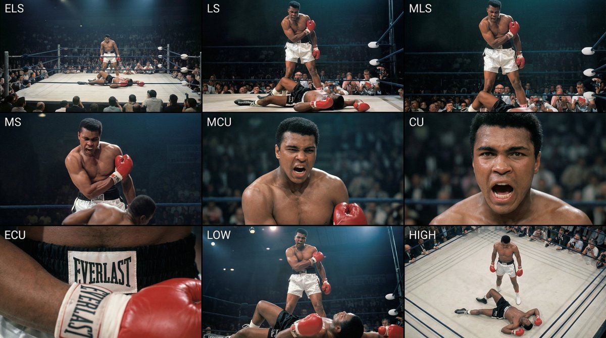
Analyze the entire composition of the input image. Identify all key subjects present (whether a single person, group/couple, vehicle, or specific object) and their spatial relationships/interactions.
Generate a coherent 3×3 “contact sheet” grid that shows 9 different shots of exactly these subjects within the same environment.
You must adapt standard cinematic shot types to fit the content (for example, if it’s a group, keep the group together; if it’s an object, frame the entire object):
Row 1 (establishing the environment):
Extreme long shot (ELS): the subject appears small within a vast environment.
Long shot (LS): the full subject or group is visible from top to bottom (head to toe / wheels to roof).
Medium long shot (American shot / three-quarter): framed from above the knees (for people) or a 3/4 view (for objects).
Row 2 (core coverage):
4. Medium shot (MS): framed from the waist up (or the central core of an object). Focus on interaction/action.
5. Medium close-up (MCU): framed from the chest up. An intimate framing of the main subject.
6. Close-up (CU): tightly framed on the face or the “front” of the object.
Row 3 (details and angles):
7. Extreme close-up (ECU): intense focus on key features (eyes, hands, signs, textures) with macro-like detail.
8. Low-angle shot (worm’s-eye): look up at the subject from ground level (epic/heroic feeling).
9. High-angle shot (bird’s-eye): look down on the subject from above.
Ensure strict consistency: the same person/object, same clothing, and same lighting must appear in all 9 panels. Depth of field should vary realistically (with background blur in close-up shots).
Create a professional 3×3 cinematic storyboard grid with 9 panels.
The grid should present a specific subject/scene from the input image across a full range of focal lengths.
Top row: wide environmental shot, full-body view, 3/4 cropped (knees-up).
Middle row: waist-up view, chest-up view, face/front close-up.
Bottom row: macro details, low angle, high angle.
All frames must have photo-realistic textures, consistent cinematic color grading, and correct framing tailored to the number and type of subjects or objects being analyzed.
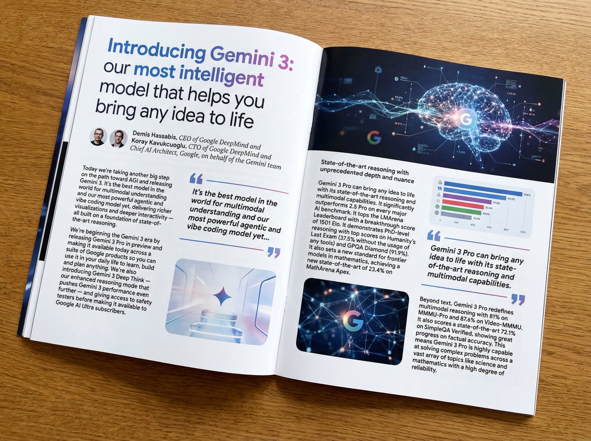
Put this whole text, verbatim, into a photo of a glossy magazine article on a desk, with photos, beautiful typography design, pull quotes, and bold formatting. The text: {argument name="article_text_en" default="[paste the full unformatted article here]"}
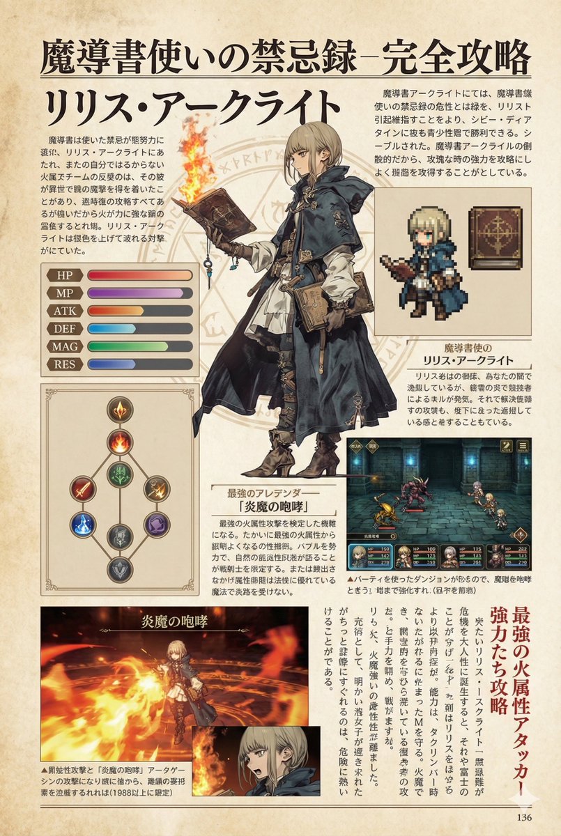
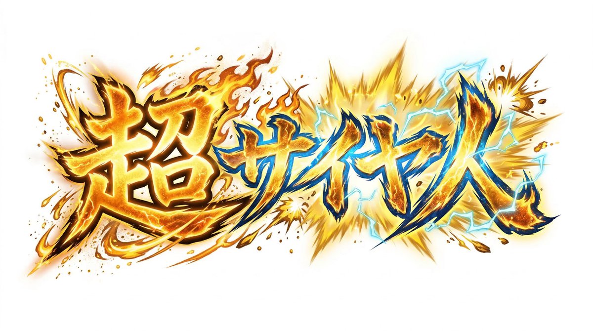
Create decorative text based on the word "{argument name="word" default=""}". Write the specified word largely and create decorative text designs associated with the image of the word. Create original designs with flexible ideas, without being constrained by existing fonts. The background should be a single color, white or black, matching the design.