THE LIBRARY

Editorial image prompts.

Browse images and open the prompts behind them.

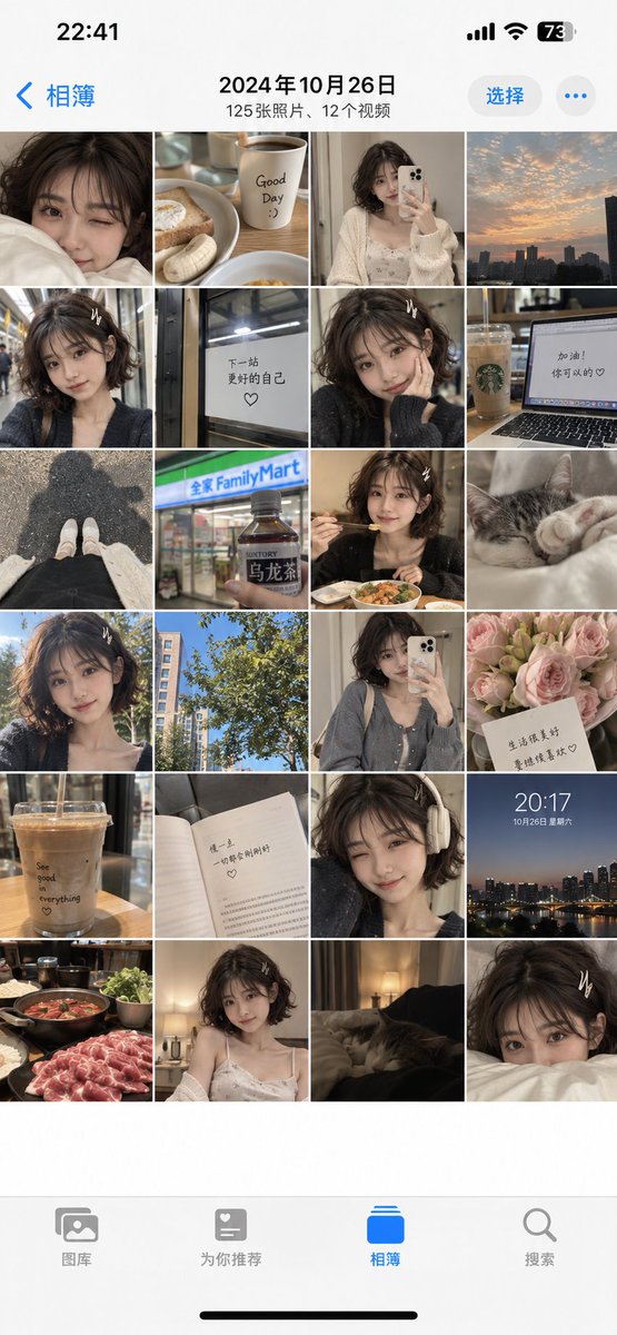
Girlfriend Phone Camera Roll

Girlfriend Phone Camera Roll

Editorial / Interface

Read full prompt

Generate a one-day camera roll of the person in the reference image as a single screenshot of the iPhone Photos app interface. Make it look like a realistic camera roll capturing casual everyday moments. The iPhone interface should be in Simplified Chinese. Use Apple phone screen aspect ratio.

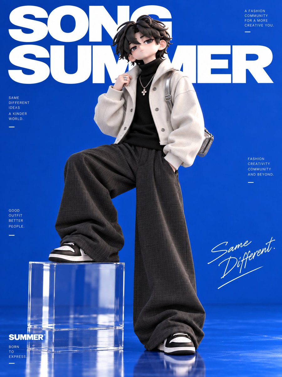
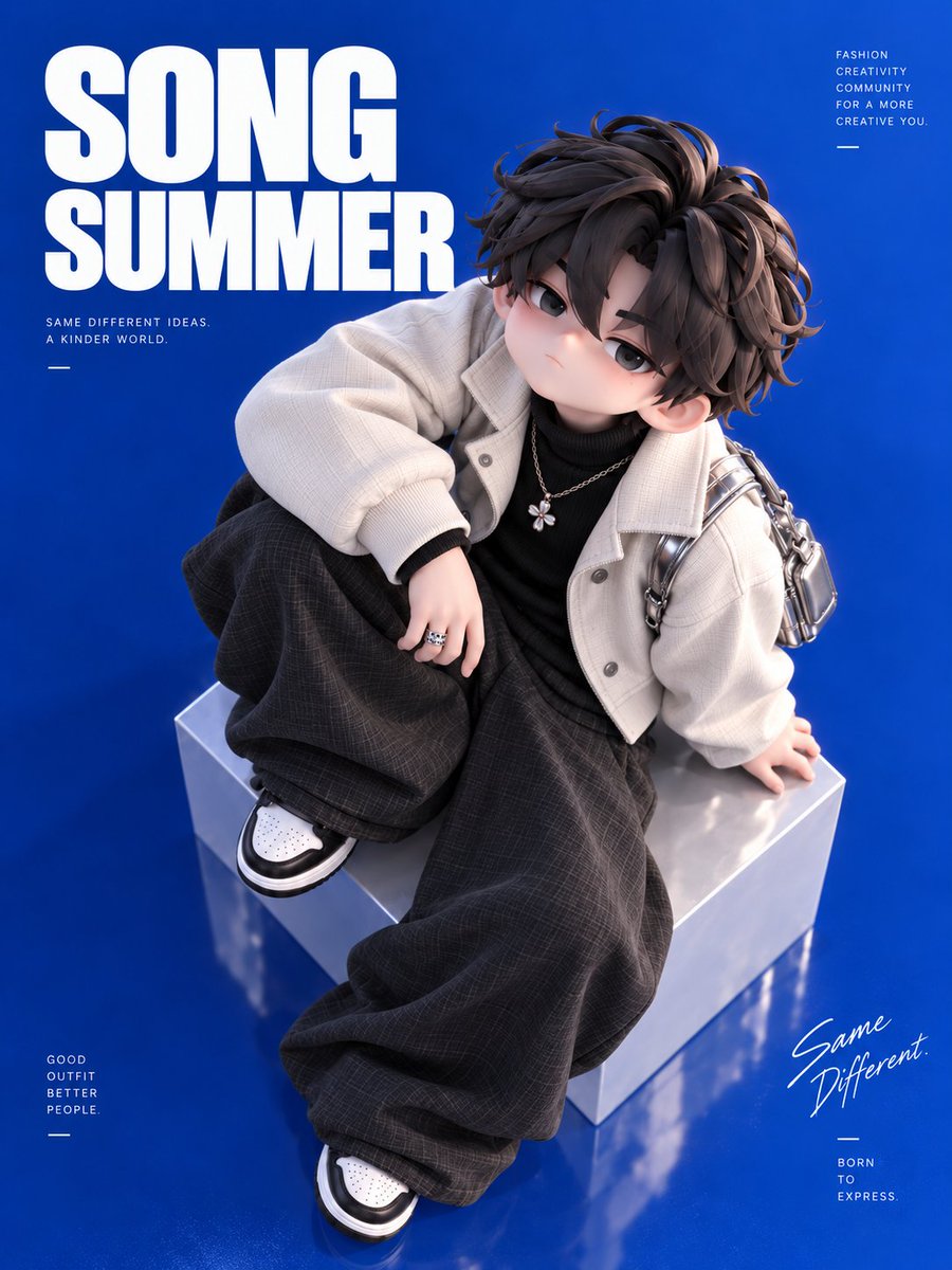
3D Chibi Boy Fashion Poster

3D Chibi Boy Fashion Poster

Editorial / Poster

Read full prompt

Create a vertical fashion poster featuring a 3D-rendered chibi-style boy sitting on a metallic silver cube against a solid royal blue background. The character has messy dark brown hair, large expressive eyes, and a neutral expression. He wears an oversized cream-colored corduroy jacket over a black turtleneck, baggy dark grey plaid trousers, and white sneakers with black accents. Accessories include a silver chain necklace with a flower pendant, a ring, and a small silver backpack. Typography Layout: - Top Left: Large, bold white sans-serif text reading "SONG SUMMER" stacked in two lines. Below it, smaller text reads "SAME DIFFERENT IDEAS. A KINDER WORLD." - Top Right: Small right-aligned text block reading "FASHION CREATIVITY COMMUNITY FOR A MORE CREATIVE YOU." - Bottom Left: Small left-aligned text block reading "GOOD OUTFIT BETTER PEOPLE." - Bottom Right: Handwritten script text "Same Different." followed by small sans-serif text "BORN TO EXPRESS."

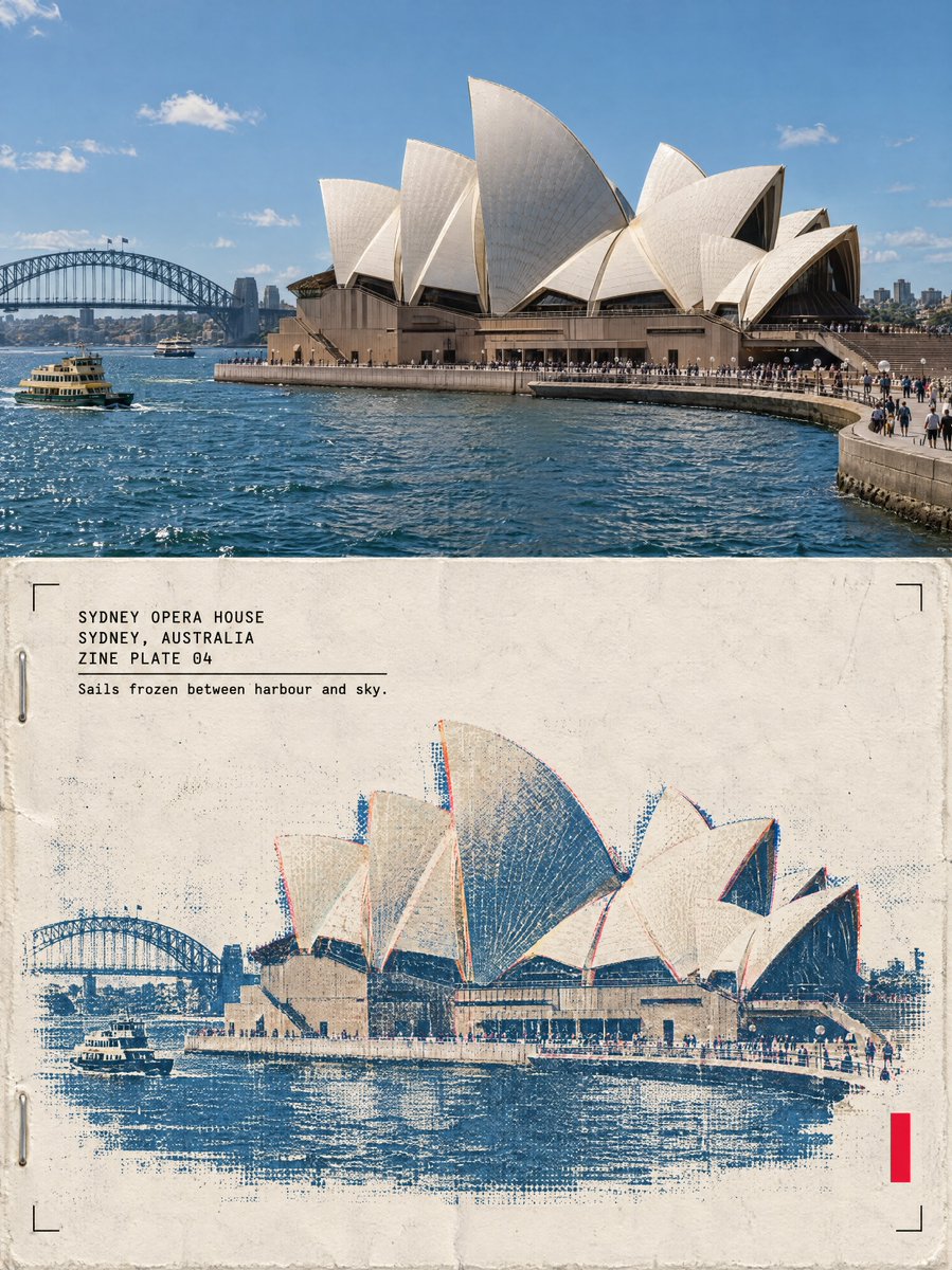
Risograph Architecture Poster

Risograph Architecture Poster

Editorial / Poster

Read full prompt

One poster, 3:4 vertical canvas. Split into two roughly equal zones — a realistic photograph on top, a printed reconstruction below — divided by one clean sharp horizontal line. The structure must not be stretched, warped, tilted or repositioned unnaturally. TOP HALF — THE REAL SHOT {argument name="structure_description" default="[STRUCTURE DESCRIPTION]"}. {argument name="plate_light" default="[PLATE LIGHT]"}. Preserve the structure faithfully: same architecture, proportions, perspective, distinctive details, natural light and shadow. Add only a subtle high-end color grade and the faintest film grain. Never redesign or reinterpret the architecture. BOTTOM HALF — THE PRINTED RECONSTRUCTION Rebuild the same structure as a two-color risograph zine print: bold flat spot-color shapes (one deep ink layer plus the structure's muted colors as a second spot layer), visible misregistration offsets between the layers, drum streaks, coarse layered ink-grain, halftone texture from overlapping dots, a zine masthead bar, two staple marks and paste-up edges. The photograph dissolves outward into flat spot-color shapes, misaligned layers and grainy ink. The structure must remain immediately recognizable. {argument name="plate_density" default="[PLATE DENSITY]"}. Texture: cheap zine paper, layered soy ink, misregistration, drum streaks, folded-edge wear, cut-and-paste edges, restrained crop marks, one small fluorescent red calibration bar. Color: cream zine paper, black ink, one deep spot color, the structure's original muted colors, a single fluorescent red accent. Never fully desaturate the structure. The structure occupies roughly 60-88% of the frame width. Leave 22-38% of the paper visibly untouched and empty — generous negative space so the poster reads as an archival specimen, not a packed screen. TYPOGRAPHY — a clean fixed-width architectural title block, pinned top-left at a small fixed inset, black ink, monospaced technical typeface, verbatim, each line in caps: "{argument name="name" default="[NAME]"}" "{argument name="city_country" default="[CITY, COUNTRY]"}" "ZINE PLATE 0N" A thin horizontal rule under the third line, then one short observational caption verbatim: "{argument name="caption" default="[CAPTION]"}" A solid vertical red rectangle — the only red in the poster — is pinned to the bottom-right corner zone about 12% from the bottom and right edges. Four thin black crop marks sit in the four corners of the bottom half at identical insets. Red bar, crop marks and text block keep exactly the same position and size relative to the frame. MOOD: underground zine crossed with an architecture fanzine — young, tactile, collectible. Sophisticated, minimal, ta

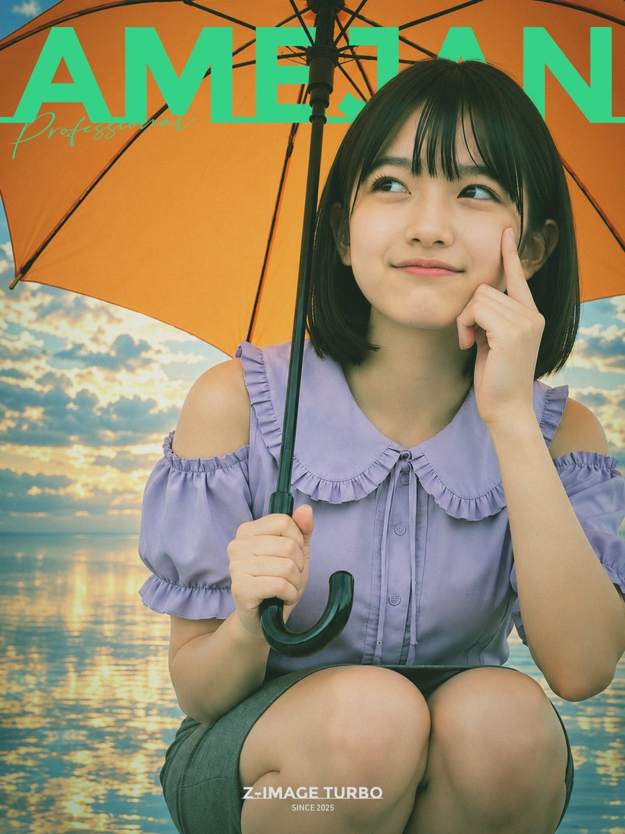
Orange Umbrella Magazine Cover

Orange Umbrella Magazine Cover

Editorial / Poster

Read full prompt

Create a vertical fashion magazine cover portrait of {argument name="character name" default="AMELIAN"}, a young East Asian woman crouching or sitting close to the camera under a large orange umbrella. She has a short black bob haircut with straight bangs, smooth natural makeup, and a soft thoughtful smile while looking up toward the upper right; her right index finger touches her cheek and her left hand grips the black umbrella handle with a curved hook visible near the bottom center. She wears a pastel lavender blouse with cold-shoulder cutouts, ruffled short sleeves, a large rounded ruffle collar, front buttons, and a dark gray skirt. The background is a surreal rainy-day seaside sunset: calm reflective water, golden clouds, blue sky, warm sunlight shimmering on the ocean, but with a slightly flat, edited-photo look and minimal depth. The umbrella fills the upper half of the frame with visible black ribs and center pole, creating a warm orange canopy behind her head. Add oversized bold uppercase turquoise masthead text across the very top reading {argument name="masthead text" default="AMELIAN"}, partially hidden behind the umbrella and subject, plus a small elegant cursive turquoise subtitle on the left reading {argument name="subtitle text" default="Professional"}. At the bottom center add a small white logo-style caption reading {argument name="bottom logo text" default="Z-IMAGE TURBO"} with tiny text below reading {argument name="bottom tagline" default="SINCE 2025"}. Use a glossy editorial photography style, soft teal-and-orange color grading, gentle film grain, slightly moiré-like texture, realistic skin, shallow portrait framing, and a 3:4 vertical composition.

Song Summer 3D Anime Fashion Poster

Song Summer 3D Anime Fashion Poster

Editorial / Poster

Read full prompt

Create a vertical 3:4 fashion poster featuring a stylized 3D anime boy sitting on a white cube against a solid lime green background. The character has messy dark brown hair, closed eyes with a gentle smile, and wears an oversized cream-colored zip-up hoodie over a black turtleneck, baggy dark grey plaid trousers, and black-and-white sneakers. He holds a silver retro camera up to his face with both hands, wearing a silver cross necklace and a ring on his right hand. A small silver shoulder bag hangs at his side. Typography Layout: - Top Left/Center: Large, bold black sans-serif text "SONG SUMMER" partially obscured by the character's head. - Top Right: Small stacked text "A FASHION COMMUNITY FOR A MORE CREATIVE YOU." followed by a registered trademark symbol ®. - Mid Left: Bold heading "SAME DIFFERENT." followed by a list: "FASHION", "CREATIVITY", "COMMUNITY", "A KINDER WORLD." - Lower Left: Vertical list of words: "PEOPLE", "IDEAS", "STYLE", "LIFE", "SUMMER". - Right Side (overlapping character): Handwritten script font in black reading "Capture More Good Days." - Far Right Edge: Vertical text block "TURN EVERYDAY INTO SOMETHING SPECIAL." - On the White Cube: Black logo text "SONG SUMMER®" and smaller text below it "SAME DIFFERENT IDEAS. A KINDER WORLD." - Bottom Footer: Small text line including "SUMMER® 2024", "FASHION CREATOR —", "STYLE BUILDS PEOPLE.", and a barcode graphic on the bottom right corner labeled "SONG SUMMER".

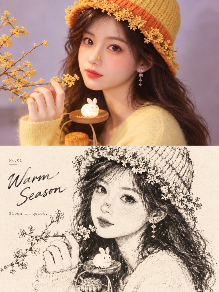
Dual-Panel Portrait & Sketch Poster

Dual-Panel Portrait & Sketch Poster

Editorial / Poster

Read full prompt

Create a vertical 3:4 poster divided into two equal halves (1:1 ratio). The top half features a high-resolution, photorealistic portrait of a young woman with long wavy brown hair. She is wearing a yellow knit beanie adorned with small orange osmanthus flowers and a soft yellow sweater. Her makeup includes peach blush, red lips, and a tiny flower petal on her nose. She holds a branch of yellow osmanthus flowers in one hand and rests the other near a wooden stand holding a glowing white rabbit figurine and a mooncake. The background is a soft lavender purple. The bottom half displays a black-and-white pencil sketch illustration of the same subject and composition, rendered with artistic shading and texture. On the left side of the sketch section, include the text 'No.01' above a large cursive title 'Warm Season', followed by smaller text 'Bloom in quiet.' below it.

Tennis Match Result Poster

Tennis Match Result Poster

Editorial / Poster

Read full prompt

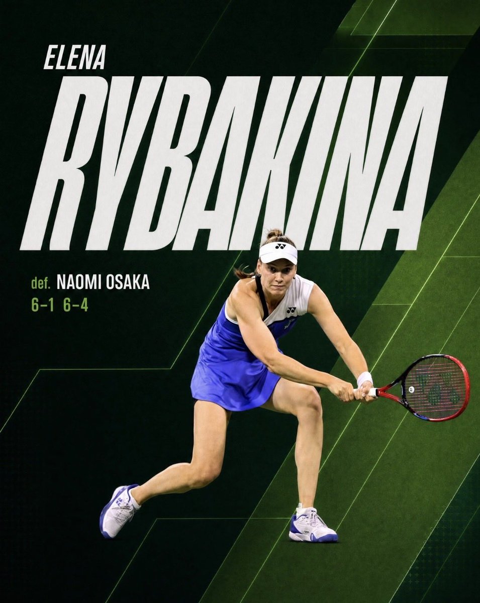
Goal: Create a square social media match-result graphic for a professional tennis account, celebrating {argument name="player name" default="Elena Rybakina"} after a win. Canvas: 4:5 vertical sports poster, dark cinematic palette, 1024 x 1280 style composition. Use a deep black-green tennis-court background with layered diagonal geometric panels, subtle court-line angles, faint grid texture, and neon green accent streaks. Layout: Put the player action cutout in the lower-right half, overlapping the typography. The athlete is captured mid-rally in a low two-handed backhand stance, leaning forward, racquet extended to the right. She wears a white visor, white sleeveless tennis top, bright royal-blue skirt, white wristband, and white tennis shoes with blue accents; use realistic photographic lighting and a clean cutout edge. Text content: Use exactly 4 visible text elements: 1) small first name at upper left: "ELENA"; 2) enormous bold surname across the upper and middle canvas: "RYBAKINA"; 3) small result label at left below the surname: "def."; 4) opponent and score line: "NAOMI OSAKA" and "6-1 6-4". If customized, use {argument name="first name text" default="ELENA"}, {argument name="surname text" default="RYBAKINA"}, {argument name="opponent name" default="NAOMI OSAKA"}, and {argument name="score text" default="6-1 6-4"}. Typography: Make the surname extremely large, condensed, italic, all-caps, white, with a slightly rough sports-print texture; it should dominate the image and run nearly edge to edge. The first name is smaller, italic, all-caps, white, positioned above the surname. The word "def." and the score are lime green; the opponent name is white, bold, condensed, all-caps. Visual style: Premium tennis broadcast graphic, high contrast, energetic, polished social asset, realistic player photography combined with graphic design overlays. Use dark greens, black, white, royal blue, and lime green. Add subtle shadows so the player separates from the background and text. Constraints: No logos except tiny indistinct apparel marks if needed, no watermark, no extra captions, no additional players, no border, keep the spelling and match score clear and readable.

Futuristic Sportswear Campaign Poster Prompt

Futuristic Sportswear Campaign Poster Prompt

Editorial / Poster

Read full prompt

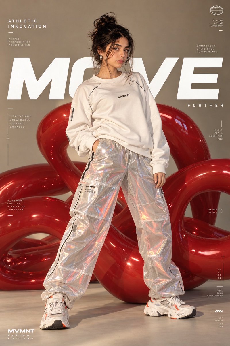
Use my uploaded female face as the ONLY identity reference for the main model. Preserve my exact facial identity and natural appearance throughout the image. Keep my facial structure, skin tone, eyes, eyebrows, nose, lips, cheekbones, jawline, facial proportions, hairline, and natural skin texture consistent and instantly recognizable. Do not beautify, reshape, feminize, masculinize, age, de-age, or alter my facial features. Create a premium futuristic sportswear advertising campaign poster, using the uploaded reference image as the composition and visual-style inspiration. A confident young woman stands in a powerful full-body fashion pose, slightly leaning with one hand resting near her waist and the other relaxed beside her. She wears an oversized white high-performance athletic sweatshirt with subtle technical detailing and futuristic transparent iridescent reflective track pants, loose and slightly baggy with realistic folds and glossy translucent material. Add premium chunky white futuristic running sneakers with subtle orange accents and thick sculpted soles. Her hair is styled in a messy high bun with a few naturally loose strands, elegant but effortless. Minimal sophisticated makeup, natural skin texture, subtle glossy lips, refined editorial beauty styling. Small modern statement earrings. Behind her is a large abstract glossy red sculptural inflatable form, consisting of smooth interconnected rounded tubes and organic loops. The red material has realistic reflections, soft highlights, and a premium studio-product appearance. Background: warm beige/taupe seamless studio backdrop, clean luxury fashion photography aesthetic, subtle gradient lighting. Composition: vertical fashion campaign poster, full body visible from head to shoes, model centered, dynamic wide-legged stance, generous negative space around the subject. Keep the large red abstract sculpture behind and around the model without covering her face. Add sophisticated minimal technical typography and graphic design elements around the edges, inspired by high-end athletic innovation campaigns. Large bold white word “MOVE” positioned behind the model, partially obscured naturally by her body. Smaller text such as “ATHLETIC INNOVATION,” “SPORTSWEAR ENGINEERED PERFORMANCE,” “LIGHTWEIGHT / BREATHABLE / FLEXIBLE / DURABLE,” and small technical measurement markings. Clean geometric lines, tiny interface-style graphics, subtle measurement indicators and modern editorial layout. Lighting: high-end commercial studio lighting, soft directional key light, subtle rim lighting, realistic shadows, glossy reflections on the red sculpture and transparent pants, beautifully controlled highlights. Photography: ultra-realistic premium fashion campaign photography, editorial sportswear advertising, sophisticated composition, realistic fabric and skin detail, natural anatomy, sharp focus, cinematic depth, subtle filmic contrast, luxury brand campaign qual

iPhone Photo Library Cat Grid Mockup

iPhone Photo Library Cat Grid Mockup

Editorial / Interface

Read full prompt

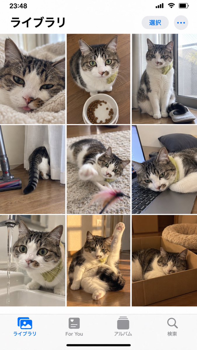
Goal: Create a realistic iPhone photo library screenshot featuring a grid of cat photos. Canvas: Vertical mobile aspect ratio (9:16) mimicking an iOS interface. Layout: A standard iOS status bar at the top, a header with Japanese text, a 3x3 grid of square images in the center, and a bottom navigation bar with four icons. Sections: - Top Bar: Status bar showing time '23:48', signal bars, wifi icon, and battery. Below that, a large bold title on the left reading 'ライブラリ' (Library). On the right, a blue pill-shaped button reading '選択' (Select) and a three-dot menu icon. - Image Grid: Nine distinct photos arranged in a 3x3 grid. All photos feature the same tabby and white cat wearing a small green collar or bib. - Row 1: Close-up of face licking nose; sitting next to a food bowl; sitting by a window looking down. - Row 2: Butt sticking out from behind a curtain; playing with a feather toy; lying head-down on a laptop keyboard. - Row 3: Drinking water from a faucet; stretching one paw up while lying down; sleeping inside a cardboard box. - Bottom Bar: Four navigation icons with labels below them. Left to right: Blue 'Photos' icon labeled 'ライブラリ' (Library), grey heart icon labeled 'For You', grey stack icon labeled 'アルバム' (Albums), grey magnifying glass labeled '検索' (Search). Visual style: Photorealistic UI mockup. The photos within the grid should look like high-quality amateur pet photography—natural lighting, slightly candid angles, warm tones. Text content: Preserve all Japanese text exactly as described in the layout sections.

Minimalist Editorial Travel Poster Prompt

Minimalist Editorial Travel Poster Prompt

Editorial / Poster

Read full prompt

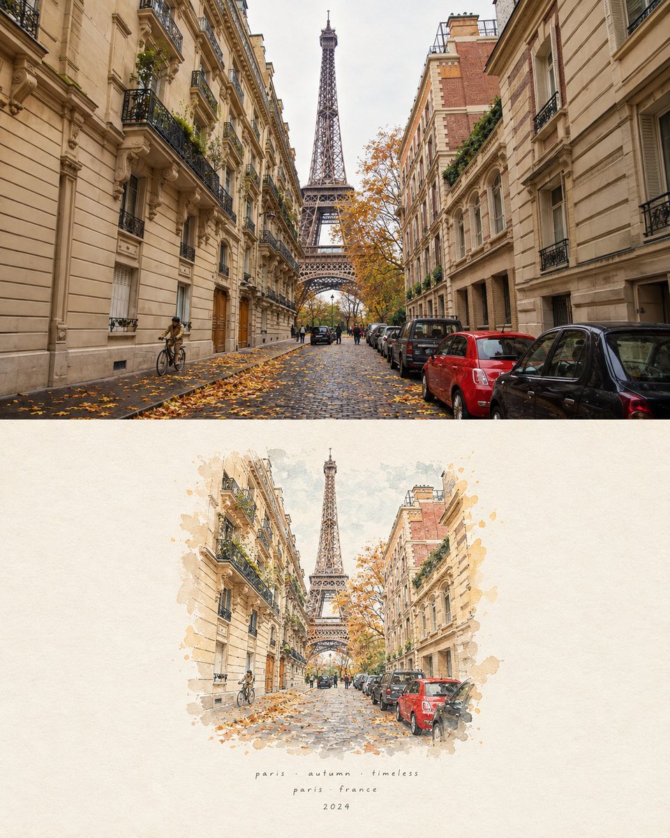
Create a sophisticated minimalist editorial travel-art poster based on the provided reference photograph of {argument name="landmark" default="LANDMARK / COUNTRY"}. TOP SECTION — REAL PHOTOGRAPH: Preserve the original photograph as faithfully as possible. Keep the exact subject, recognizable architecture or facial features, proportions, pose, clothing, surroundings, perspective, lighting, and important environmental details. Enhance it with a cinematic yet natural color grade, atmospheric depth, subtle film grain, and beautiful soft lighting. The photograph should feel authentic, premium, calm, and emotionally evocative. BOTTOM SECTION — HAND-PAINTED MEMORY: Recreate the same subject and scene as a delicate handcrafted watercolor and ink illustration. Preserve the recognizable silhouette, composition, proportions, and defining details, but simplify them into elegant artistic brushwork. Use loose watercolor washes, fine ink outlines, subtle paper texture, soft bleeding pigments, imperfect hand-painted edges, and minimal architectural/environmental details. The illustrated version should feel like a beautiful travel sketch painted from memory, not a completely different scene. Keep the main subject immediately recognizable. COMPOSITION: Use a clean vertical 4:5 poster format with the realistic photograph occupying the upper portion and the watercolor interpretation occupying the lower portion. Separate the two sections with a subtle clean transition and generous warm ivory/off-white negative space. BACKGROUND: Warm textured handmade paper, subtle natural grain, minimal and uncluttered. Use a restrained color palette derived from the original photograph and the location. TYPOGRAPHY: Add small elegant handwritten/editorial typography beneath the illustration: {argument name="short phrase" default="SHORT PHRASE / POETIC LINE"} {argument name="location details" default="CITY / COUNTRY / PERSON / PLACE"} {argument name="year description" default="YEAR / COORDINATES / SHORT DESCRIPTION"} Typography should be tiny, refined, widely spaced, understated, and slightly imperfect like handwritten travel-journal lettering. AESTHETIC: Recreate the landmark as a delicate architectural watercolor sketch, preserving its exact silhouette, proportions, distinctive structural details, surrounding landscape, and recognizable character.

Vintage Mixed-Media Portrait with Rose

Vintage Mixed-Media Portrait with Rose

Editorial / Poster

Read full prompt

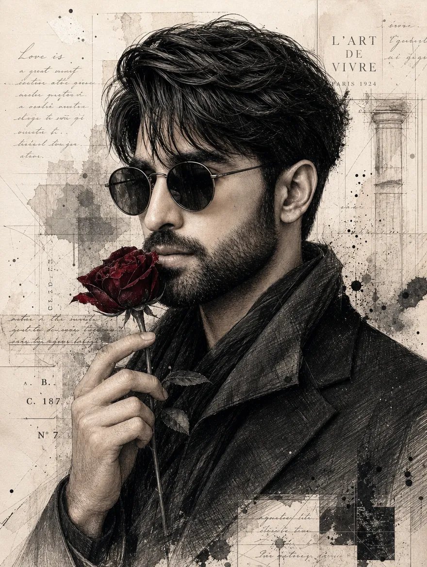
Create a highly detailed editorial mixed-media portrait of a stylish young man, matching the reference composition and visual aesthetic. SUBJECT: A handsome young man shown in a left-facing side-profile / three-quarter profile, with neatly styled voluminous dark black hair swept back slightly off his forehead, a full groomed beard and mustache, wearing round wire-frame sunglasses with dark lenses, and dressed in a textured charcoal-black jacket or coat with a popped collar. He holds a single deep red rose by its stem near his chin with one hand, fingers delicately wrapped around the thorny stem. STYLE & COMPOSITION: Editorial fashion illustration meets vintage collage art. The background is aged parchment paper overlaid with faded French typographic elements including 'L'ART DE VIVRE PARIS 1924', cursive script fragments like 'Love is a great secret...', technical blueprint lines, ink splatters, watercolor stains, and torn paper edges creating a layered grunge texture. The subject blends seamlessly into this mixed-media backdrop with visible pencil sketching textures on the clothing and skin shading. COLOR PALETTE: Desaturated sepia tones for the background and monochrome greys for the figure, contrasted sharply by the rich crimson red of the rose petals. LIGHTING: Soft directional studio lighting highlighting facial structure and fabric folds while maintaining an overall muted vintage atmosphere.

Cherry Blossom Tear Poster

Cherry Blossom Tear Poster

Editorial / Poster

Read full prompt

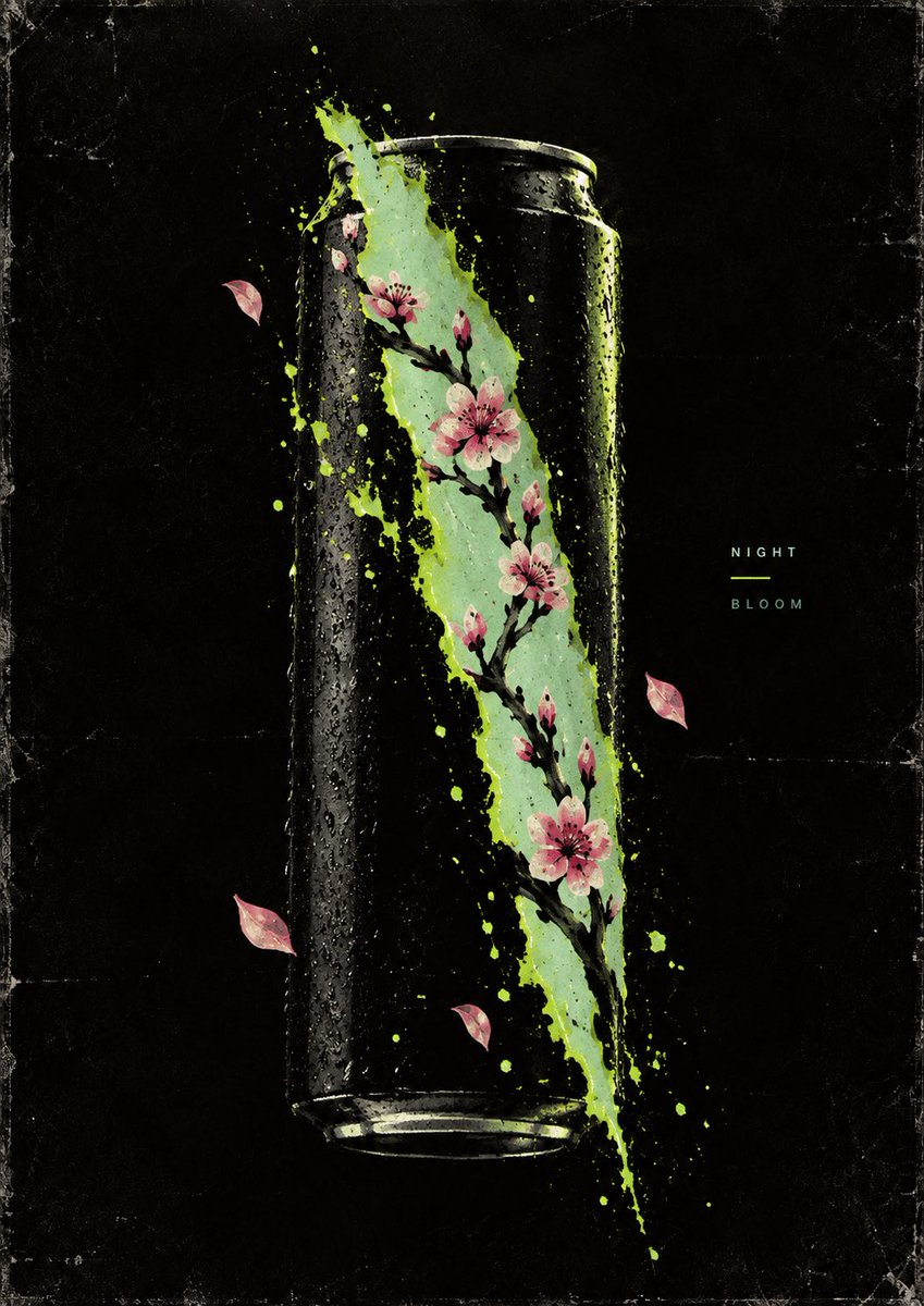
A vertical poster design featuring a minimalist, high-contrast composition on a black background with a subtle grainy texture. The central visual element consists of two jagged, diagonal slashes that tear through the darkness, revealing a pale mint-green void underneath. These slashes are bordered by rough, energetic splatters of neon lime green paint, creating a glowing effect against the black. Emerging from these rifts are delicate branches of pink cherry blossoms (sakura) with dark brown stems and small buds, extending outward into the black space. Several loose pink petals float in the air around the branches. On the right side, vertically centered relative to the main graphic, is small, widely spaced sans-serif text in white reading "TEA" above a thin horizontal line, and "ENERGY" below it.

Global Travel Destination Poster Blend

Global Travel Destination Poster Blend

Editorial / Poster

Read full prompt

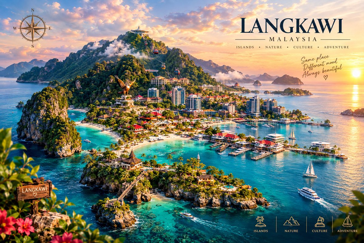
Turn the three provided travel-poster reference images into one breathtaking, ultra-premium animated travel destination artwork, seamlessly blending the visual identity and most beautiful elements of LANGKAWI, SWITZERLAND, and BALI into a single cohesive cinematic composition. REFERENCE BLENDING Use all three uploaded reference images as visual inspiration and combine their strongest recognizable elements into one unified destination poster. From Langkawi, incorporate the dramatic tropical island landscape, turquoise sea, lush green mountains, cable cars, coastal resorts, tropical vegetation, boats, beaches, rocky islands, and warm golden sunset atmosphere. From Switzerland, incorporate majestic snow-covered Alpine mountains, crystal-clear turquoise lakes, charming European villages, elegant castles, green valleys, waterfalls, scenic railways, alpine scenery, and peaceful mountain atmosphere. From Bali, incorporate lush tropical cliffs, dramatic ocean coastline, Balinese temple architecture, tiered pagodas, palm trees, waterfalls, luxury resorts, infinity pools, tropical beaches, and warm sunset lighting. Do not simply place the three original images side by side. Recompose and merge their elements naturally into one spectacular fantasy travel destination, making the three locations feel visually connected as if they exist within one grand cinematic landscape. COMPOSITION Create a wide luxury travel-poster composition with a powerful central visual hierarchy. Place the grand snow-covered Swiss Alps toward the upper background, rising majestically through soft clouds. Blend the Swiss mountain valleys naturally into lush tropical hills and dramatic island cliffs inspired by Langkawi and Bali. Create a large crystal-clear turquoise lake and ocean system flowing naturally through the landscape, visually connecting the Alpine region with the tropical islands. Include a beautiful tropical coastline in the foreground with turquoise water, small islands, elegant beaches, luxury resorts, boats, yachts, and palm trees. Add subtle Balinese temple structures on elevated tropical cliffs. Include a refined Swiss village with traditional chalet-style buildings near the mountain lake. Add Langkawi-inspired cable cars traveling across the green mountain landscape. Include a graceful waterfall descending from the tropical cliffs into the turquoise water. Add small sailing boats, luxury yachts, scenic boats, and distant vessels across the water. Use layered depth: foreground tropical flowers and foliage, middle-ground resorts and villages, and massive mountains and glowing sky in the background. The entire composition must feel natural, balanced, luxurious, cinematic, and visually believable rather than looking like three separate pictures pasted together. STYLE Create an ultra-detailed premium cinematic travel advertisement with photorealistic environmental rendering, luxury tourism campaign quality, high dynamic range, rich natural textures, realistic atmospheric perspective, extremely detailed mountains, water, vegetation, architecture, clouds, boats, and landscapes. Use a sophisticated combination of tropical turquoise, emerald green, alpine white, warm golden sunlight, soft blue sky, and subtle sunset tones. Create beautiful volumetric sunlight passing through clouds and mountains. Add realistic reflections across the lakes and ocean. Use soft atmospheric mist around the mountains and distant islands. Maintain exceptional clarity and sharpness throughout the main landscape. The final result should feel like a high-end international tourism campaign, luxury magazine cover, cinematic destination poster, and premium travel advertisement combined. TEXT & GRAPHIC DESIGN Create elegant premium typography integrated naturally into the upper-right portion of the composition. Main title: "THREE WORLDS • ONE JOURNEY" Secondary destination line: "LANGKAWI • SWITZERLAND • BALI" Add a refined subtitle: "ISLANDS • ALPS • CULTURE • ADVENTURE" Use sophisticated luxury editorial typography with clean spacing, elegant proportions, and excellent readability. Do not allow text to cover important scenery. Do not introduce random words, misspellings, distorted letters, duplicate text, or meaningless typography. Add subtle destination labels integrated into appropriate locations: "LANGKAWI" "SWITZERLAND" "BALI" Keep all typography elegant and restrained so the scenery remains the primary focus. ANIMATION Create 16 consecutive frames of one seamless cinematic travel-poster animation. Frame 1 begins with a wide establishing view of the complete blended landscape. Frames 2–4 slowly reveal the tropical Langkawi-inspired coastline, turquoise water, cable cars, beaches, and lush cliffs. Frames 5–8 gradually shift visual attention toward the majestic Swiss Alps, snowy peaks, mountain lake, villages, waterfalls, and scenic railway. Frames 9–12 smoothly transition toward the Bali-inspired tropical cliffs, temples, palm trees, luxury resorts, infinity pools, and glowing ocean. Frames 13–15 bring all three visual worlds together into one grand panoramic composition. Frame 16 returns naturally to the opening composition so the animation can loop seamlessly. Use very subtle cinematic camera movement: slow forward push-in, gentle panoramic movement, soft atmospheric parallax, subtle cloud movement, natural water motion, gentle palm-tree movement, small boats slowly drifting, cable cars moving naturally along their lines, soft sunlight changing across the landscape. Keep all major landmarks stable and recognizable. Do not distort buildings, mountains, temples, boats, or typography during movement. Avoid excessive zooming or fast camera movement. The animation should feel calm, luxurious, elegant, and cinematic. LIGHTING & ATMOSPHERE Begin with soft golden-hour sunlight. Gradually blend warm sunset light with cool alpine daylight. Maintain a beautiful golden glow around the mountain peaks and clouds. Add subtle sun rays, atmospheric haze, realistic reflections, and gentle highlights on the water. The final frames should have a spectacular warm sunset glow across the entire destination. DETAIL QUALITY Extremely high environmental detail. Sharp mountain textures. Realistic snow and ice. Detailed tropical leaves and palm trees. Natural ocean waves and turquoise underwater depth. Realistic village architecture. Detailed Balinese temples. Elegant luxury resorts. Realistic boats, yachts, cable cars, waterfalls, and railway elements. Natural cloud formations with cinematic depth. No artificial-looking cutouts. No pasted-image appearance. No obvious seams between Langkawi, Switzerland, and Bali. All three environments must blend naturally into one coherent world. CONSISTENCY Keep the overall composition, camera perspective, lighting direction, architectural proportions, color balance, and typography consistent throughout all 16 frames. Do not randomly change the location, mountain shape, coastline, buildings, or major landmarks between frames. Maintain a premium polished travel-advertising appearance from beginning to end. Keep the main title and destination labels stable and readable throughout the animation. NEGATIVE PROMPT No blurry image, no low resolution, no cartoon style, no anime style, no plastic-looking scenery, no artificial landscape, no distorted mountains, no warped buildings, no duplicated boats, no deformed temples, no floating architecture, no unnatural water, no excessive saturation, no random objects, no messy composition, no overlapping landmarks, no broken typography, no misspelled text, no extra words, no watermark, no logo artifacts, no frame borders, no visible editing seams, no flickering, no jitter, no sudden camera movement, no inconsistent lighting, no duplicated scenery, no unrealistic perspective, no compression artifacts. DELIVERABLES Create one premium animated travel destination GIF using all 16 frames. Maintain a smooth
Futuristic Tech Editorial Poster Template

Futuristic Tech Editorial Poster Template

Editorial / Poster

Read full prompt

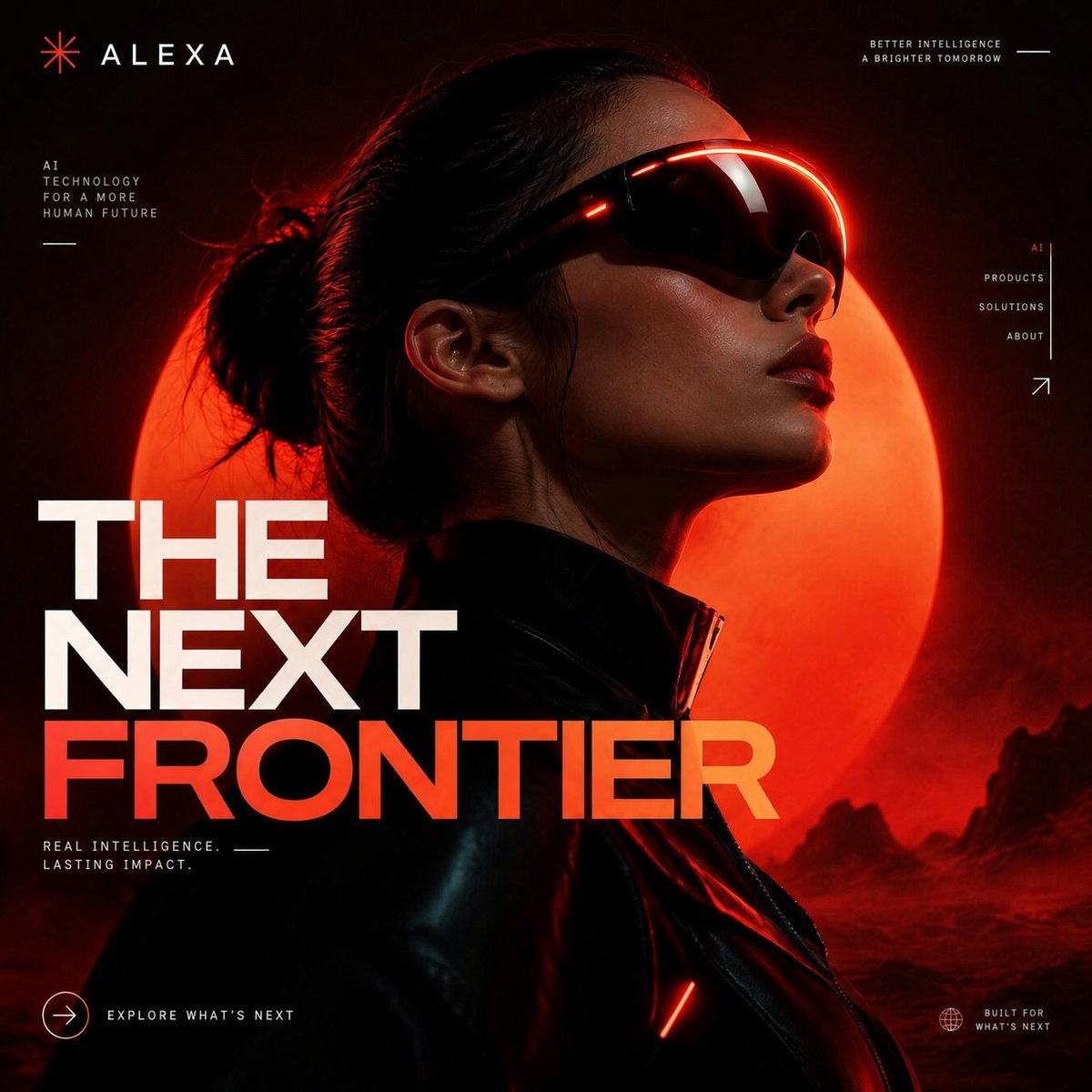
Create a premium futuristic technology editorial poster featuring {argument name="main subject" default="[MAIN SUBJECT]"}, designed for a modern digital agency, AI company or technology brand. Use a bold minimal composition with {argument name="background lighting" default="[BACKGROUND COLOR / LIGHTING]"}, dramatic cinematic lighting, deep shadows, glowing red and orange highlights, subtle atmospheric haze and high-end commercial photography. Place {argument name="main subject" default="[MAIN SUBJECT]"} prominently in the composition using a {argument name="visual style effect" default="[VISUAL STYLE / EFFECT]"}, with strong contrast, clean silhouettes and sophisticated futuristic details. Add oversized modern sans-serif typography reading "{argument name="main headline" default="[MAIN HEADLINE]"}", integrated directly into the composition with clean editorial hierarchy, strategic line breaks and occasional overlapping with the subject. Include small minimalist interface details, micro typography, directional arrows, tiny labels, subtle branding marks and understated call-to-action elements around the edges. Use a restrained palette dominated by black, deep red, vivid scarlet, warm orange and soft ivory. Keep the layout spacious, polished and highly intentional. Premium technology branding, futuristic creative agency campaign, contemporary Swiss editorial design, cinematic advertising photography, modern AI startup aesthetic, luxury digital branding, clean grid system, dramatic contrast, sophisticated art direction, ultra sharp, professional graphic design....

Y2K Harajuku Album Cover Grid

Y2K Harajuku Album Cover Grid

Editorial / Poster

Read full prompt

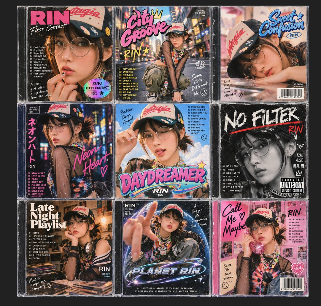
A 3x3 grid of nine distinct album cover designs featuring a consistent character, {argument name="character name" default="RIN"}. The style is retro Y2K Harajuku street fashion with a mix of photography and graphic design elements. Each cover features the same young woman wearing round wire-frame glasses, a beige baseball cap with red script text "Nostalgia", colorful beaded necklaces, and sheer black mesh tops over various outfits. Top Left: Title "RIN First Contact" in pink and white. Close-up portrait, hand near mouth. Tracklist on left. Text: "A small girl with a big dream from the city." Holographic sticker effect. Top Center: Title "City Groove" in graffiti-style pink and yellow font with a crown icon. Full body shot sitting on a curb against a blurred neon city background. Tracklist on left. Text: "Same City Different Me :)". Top Right: Title "Sweet Confusion" in blue bubbly script. Portrait leaning on arm, soft focus. Text: "Love Music and Other Mistakes..." Barcode at bottom right. Middle Left: Vertical Japanese text "ネオンハート" (Neon Heart) in pink. Profile view looking back. Background is blurry neon lights. English title "Neon Heart" handwritten in pink. Middle Center: Title "DAYDREAMER" in large 3D chrome/pink lettering. Character winking, holding cap brim. Blue sky background with clouds. Handwritten text "Better Days Ahead". Middle Right: Grayscale/black and white photo. Large distressed white text "NO FILTER" with red underline. Parental Advisory Explicit Content label. Text: "REAL MUSIC REAL ME". Bottom Left: Title "Late Night Playlist" in bold serif font. Character resting chin on hand, headphones around neck, vinyl records in foreground. Warm indoor lighting. Text: "Music keeps me company." Bottom Center: Title "PLANET RIN" in futuristic chrome font with planetary rings. Character reaching hand toward camera lens, fisheye perspective. Dark space background. Text: "A Bigger Me Somewhere Out There." Bottom Right: Pink collage background. Handwritten black text "Call Me Maybe" with heart symbol. Character holding a pink flip phone to ear. Polaroid photos scattered in background.

Photo to Watercolor Illustration Split

Photo to Watercolor Illustration Split

Editorial / Poster

Read full prompt

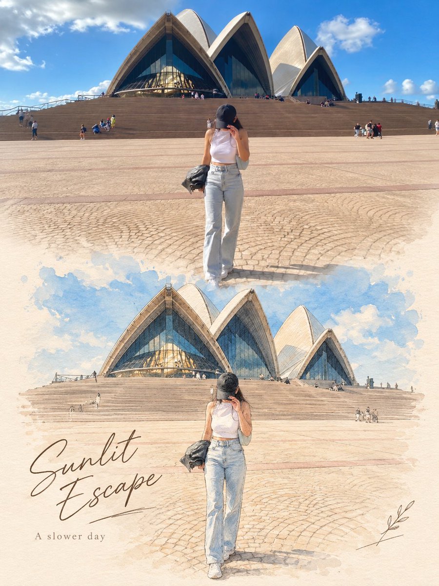
Use the uploaded image as the exact reference. Preserve the original subjects, identities, poses, composition, colors, lighting, background, and key details. Do not add, remove, or rearrange major elements. Create a vertical 3:4 editorial poster with two sections: - Top half: keep the original photo natural, sharp, and essentially unchanged. - Bottom half: recreate the exact same scene as a refined hand-drawn illustration in soft watercolor, colored pencil, and fine ink sketch style. Keep the same subjects, positions, perspective, and recognizable details. Use soft pastel tones, a warm off-white paper background, subtle paper texture, and a premium editorial / art-book / postcard feel. Add a soft seamless transition between the photo and illustration. Add minimal elegant typography: a handwritten-style title and a small simple subtitle. Use context-appropriate text such as “{argument name="title" default="A Brighter Day"}” and “{argument name="subtitle" default="A Slower Life"}”, or for pets/family “Good Friends”, “Brighter Days”, or “Happier Tails ♡”. Optional: add a few subtle hand-drawn decorative details like tiny petals, leaves, hearts, or sketch marks only if they naturally fit. Do not change identities or the scene, and do not make the lower section look like photorealism, 3D, anime, or cartoon.

Little Black 25-Panel Meme Sticker Sheet

Little Black 25-Panel Meme Sticker Sheet

Editorial / Poster

Read full prompt

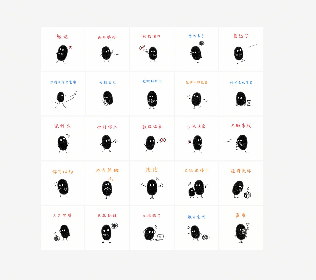
Goal: Create a clean sticker-pack contact sheet showing {argument name="character name" default="Little Black"}, a tiny black bean-shaped doodle mascot, in 25 different meme reactions with handwritten captions. Canvas: Square or near-square canvas, light warm gray background, centered white 5-by-5 grid. Use thin pale gray dividers and generous margins. Each cell is a white square with one caption near the top and one small character illustration centered below it. Layout: Exactly 25 discrete sticker panels arranged in 5 columns and 5 rows. Keep the mascot size consistent, with slight pose variation in every cell. Count and caption order, left to right, top to bottom: {argument name="25 captions in order" default="就这; 还不够好; 别找借口; 想太多了; 差远了; 方向比努力重要; 长期主义; 先做好自己; 允许一切发生; 时间会给答案; 凭什么; 你行你上; 就你话多; 少来这套; 不服来战; 你可以的; 为你骄傲; 抱抱; 已经很棒了; 还得是你; 人工智障; 又在胡说; 又报错了; 教不会啊; 真香"}. Character style: A simple black oval fuzzy creature with subtle white speckled texture, two white dot eyes, tiny stick arms and legs, and a small expressive mouth. Minimal hand-drawn black line art, cute but sarcastic, like a social media emoji sticker set. Use small props and motion marks sparingly. Panel details: 1) dismissive face with a small red anger mark, 2) skeptical shrug with wavy line, 3) pointing at a crossed-out sign, 4) worried with a scribble thought cloud, 5) shouting or angry with a dotted line shooting away, 6) walking between two winding road lines, 7) holding a small trophy/cup, 8) clasping hands with anxious encouragement, 9) calm open-arm pose, 10) sitting beside an hourglass, 11) hands on hips with question marks, 12) pointing forward challengingly, 13) pointing at a crossed speech bubble, 14) holding up a red object/gesture as refusal, 15) yelling while running in from the side, 16) supportive cheering pose, 17) proud face with small sparkles, 18) open arms with a small heart, 19) two mascots side by side with a heart, 20) mascot beside a small ChatGPT-like knot logo, 21) mascot looking at the logo with a question mark, 22) annoyed mascot with a scribbly thought bubble, 23) frustrated at a laptop showing an X error, 24) lecturing beside the logo with ellipsis, 25) hugging or holding the logo with hearts. Typography and color: Handwritten Chinese captions in casual marker style. Use mostly red, blue, and orange captions, varying by panel as in a playful sticker sheet. Keep all drawings monochrome black with tiny red/orange/blue accent marks only. Constraints: Exactly 25 cells and 25 mascots, no extra panels, no photorealism, no shadows, no watermark, no decorative background clutter. The overall impression should be a neat downloadable emoji/sticker pack preview.

Foldable Recipe App Mockup

Foldable Recipe App Mockup

Editorial / Interface

Read full prompt

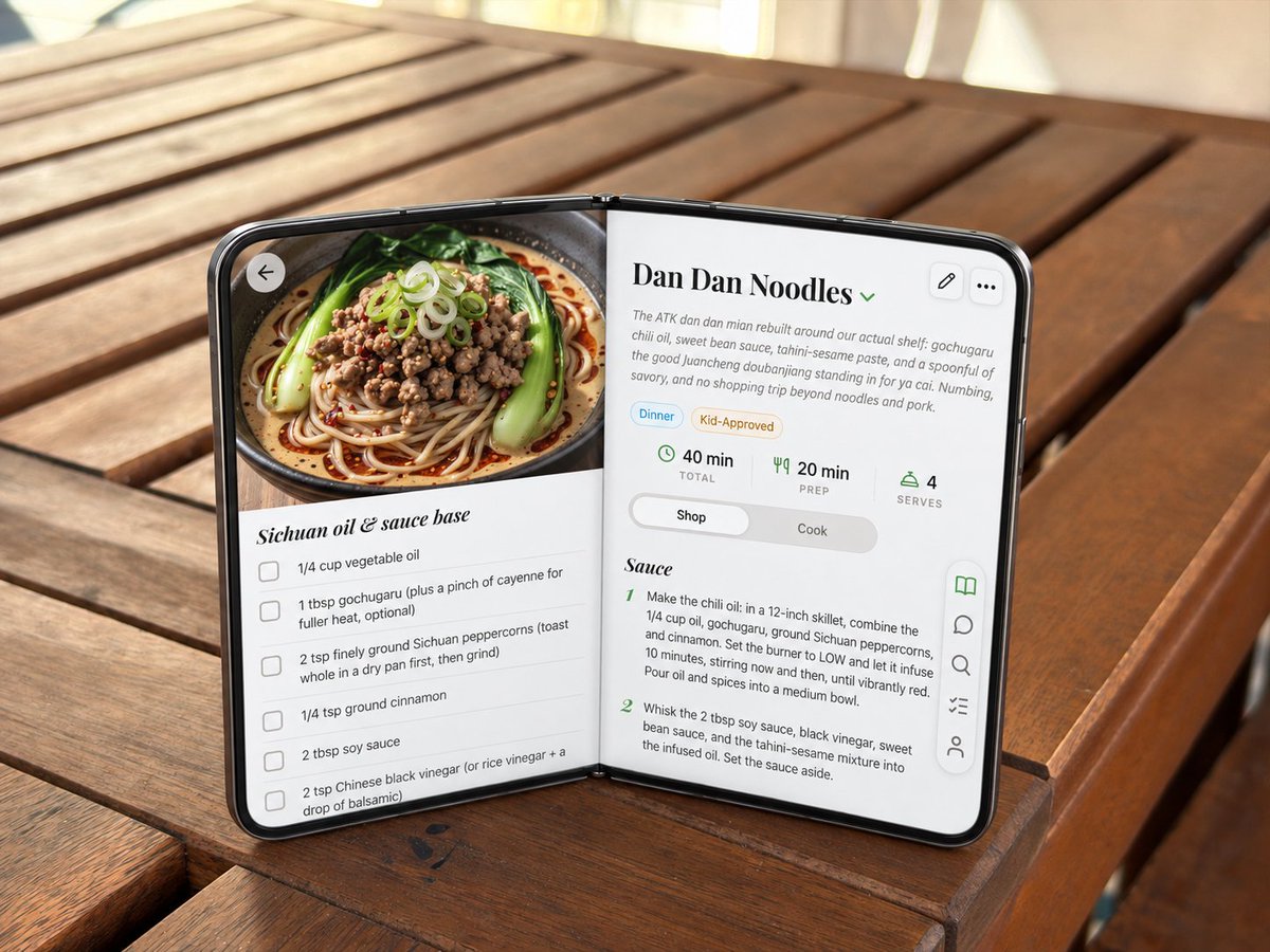
Using the provided reference image, transform the blank open foldable mock device into a realistic open-screen smartphone/tablet running a polished recipe app UI, while preserving the exact tabletop setting, camera angle, lighting, hinge pose, and overall open-book orientation. Goal: Replace the gray blank panels with edge-to-edge glossy screens and a thin black phone bezel, making the device look like a premium dual-screen foldable phone in an open-book pose. Screen content: Show a cooking app recipe page for {argument name="recipe title" default="Dan Dan Noodles"}. The layout should span both halves naturally across the hinge. Left screen: Add a large appetizing food photo at the top showing a bowl of noodles with greens, minced topping, scallions, and chili oil. Under it, create an ingredient checklist section titled {argument name="ingredient section title" default="Sichuan oil & sauce base"} with exactly 5 visible checkbox rows: vegetable oil, gochugaru with optional cayenne, ground Sichuan peppercorns, ground cinnamon, and soy sauce / Chinese black vinegar text partially continuing near the bottom. Add a circular back arrow button over the upper-left of the food image. Right screen: Create the recipe detail and instructions panel. Include the title, a small green dropdown chevron, a short descriptive paragraph, two pill tags labeled “Dinner” and “Kid-Approved,” and exactly 3 stat blocks: “40 min TOTAL,” “20 min PREP,” and “4 SERVES.” Add a segmented control with “Shop” selected and “Cook” unselected. Below, show a section titled “Sauce” with exactly 2 numbered instruction steps visible. Controls: Add exactly 2 small rounded-square action buttons at the upper-right of the right screen: edit pencil and three-dot menu. Add a floating vertical toolbar on the lower-right edge with exactly 5 icons: open book highlighted in green, chat bubble, search, checklist, and user/profile. Style constraints: Keep the generated UI crisp, realistic, and slightly perspective-warped to match the device angle. Stretch the app to the screen edges, make the black rim and hinge believable, preserve the original warm outdoor wooden table background, and avoid changing the physical placement of the foldable device.

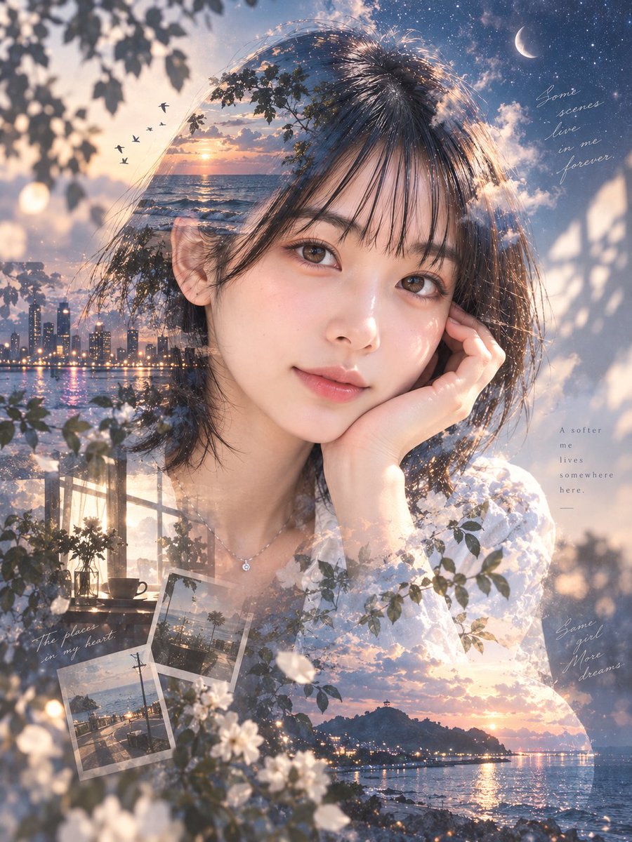
Ethereal Double Exposure Portrait

Ethereal Double Exposure Portrait

Editorial / Poster

Read full prompt

Create a serene and ethereal double-exposure portrait of {argument name="subject description" default="a young woman with short dark hair, resting her chin on her hand with a gentle expression"}. The composition blends the subject's silhouette with a collage of dreamlike scenery. Inside her hair and upper body, integrate a sunset over the ocean with birds flying, a crescent moon in a starry sky, and soft clouds. Within her torso area, merge a city skyline at dusk reflecting on water, a cozy interior scene with plants and a coffee cup by a window, and scattered polaroid-style photos of coastal landscapes. Overlay delicate white flowers and green leaves across the lower portion and edges. Add handwritten English text elements: "Some scenes live in me forever." in the top right, "A softer me lives somewhere here." in the middle right, "The places in my heart." near the bottom left photos, and "Same girl More dreams" in the bottom right corner. Use a soft, romantic color palette dominated by blues, warm oranges from the sunsets, and creamy whites. Lighting should be diffused and magical, enhancing the transparency of the overlaid images.

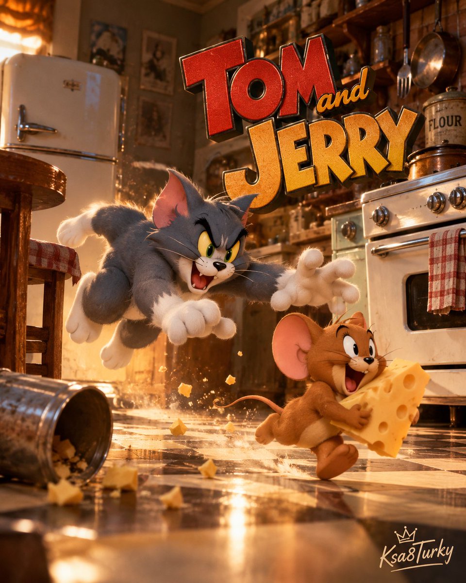
Realistic Tom and Jerry Kitchen Chase

Realistic Tom and Jerry Kitchen Chase

Editorial / Poster

Read full prompt

A hyper-realistic, cinematic 3D render of the classic cartoon characters Tom and Jerry in a chaotic kitchen scene. In the foreground, Jerry is running towards the right side of the frame, clutching a large wedge of yellow Swiss cheese with holes, his expression gleeful and energetic. Behind him, Tom is lunging forward aggressively, mouth open in a roar, claws extended, attempting to catch Jerry. The characters have realistic fur textures and expressive faces. The setting is a vintage-style kitchen with warm, golden lighting. To the left, there is a retro white refrigerator and a wooden stool with a red-and-white checkered cushion. A metal trash can has been knocked over on the floor, spilling crumbs and debris onto the black-and-white checkered tile floor. To the right, a vintage stove and oven are visible, along with hanging pots and pans. Above the characters, the text "Tom and JERRY" appears in a stylized, bold font; "Tom" is in red block letters, "and" is in small yellow script, and "JERRY" is in large gold block letters. The overall atmosphere is dynamic and action-packed.

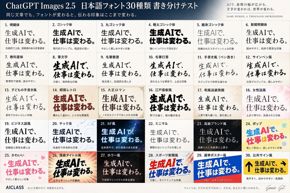
Japanese Font Comparison Poster

Japanese Font Comparison Poster

Editorial / Poster

Read full prompt

Goal: Create a polished Japanese typography comparison poster testing 30 different font styles for the same phrase, in a premium editorial infographic style for {argument name="model name" default="ChatGPT Images 2.5"}. Canvas: Landscape 3:2 poster, approximately 1200×800 px, ivory paper background with subtle texture, thin gray grid lines, high-resolution print layout. Header: A dark navy-to-slate gradient banner across the top. Large white serif title on the left: 「{argument name="headline text" default="ChatGPT Images 2.5 日本語フォント30種類 書き分けテスト"}」. Smaller white subtitle underneath: 「同じ文章でも、フォントが変わると、伝わる印象はここまで変わる。」 On the upper right, add a small refined slogan block: 「AIで、表現の幅が広がる。文字が変われば、世界が変わる。」 and below it in tiny spaced English capitals: “SAME WORDS, A THOUSAND IMPRESSIONS.” Main layout: Below the header, create an exact 5-row by 6-column grid containing exactly 30 numbered font sample cards. Each card has a small bold Japanese label at the top, one large sample phrase in the specified font style, and a tiny Japanese impression note below. The repeated sample phrase must be 「{argument name="sample phrase" default="生成AIで、仕事は変わる。"}」. Keep the phrase visually dominant in every cell while changing only typography, weight, color, texture, and decorative background according to the style. The 30 cards, in order from left to right, top to bottom: 1. 「明朝体」 elegant traditional Mincho serif, black, formal and trustworthy. 2. 「ゴシック体」 modern bold Gothic sans, black, simple and highly legible. 3. 「丸ゴシック体」 rounded Gothic, soft friendly black text. 4. 「極太ゴシック体」 very heavy extra-bold black Gothic, strong impact. 5. 「細身ゴシック体」 thin stylish Gothic, light gray-black, refined. 6. 「新聞明朝体」 newspaper-style Mincho, readable and intellectual. 7. 「教科書体」 textbook style, clean educational Japanese letterforms. 8. 「筆文字」 bold expressive brush calligraphy, energetic ink strokes. 9. 「毛筆楷書」 formal brush kaisho, traditional and dignified. 10. 「毛筆行書」 flowing semi-cursive brush script, elegant. 11. 「手書き風(ペン書き)」 casual pen handwriting, warm and natural. 12. 「サインペン風」 marker-pen handwriting, casual and cheerful. 13. 「子どもの手書き風」 childlike handwritten style, cute uneven strokes. 14. 「昭和レトロ」 warm retro Showa-era display type, deep red-brown, nostalgic. 15. 「大正ロマン」 Taisho romantic serif display, framed with delicate ornamental corner borders and beige paper. 16. 「江戸看板風」 Edo-period signboard style, thick black lively characters. 17. 「和風高級旅館」 refined Japanese luxury ryokan style, calm serif over pale patterned background. 18. 「女性誌風」 women’s magazine style, elegant thin serif over soft pink floral background. 19. 「ビジネス誌風」 business magazine style, serious black serif, trustworthy. 20. 「テック系」 tech style, blue-black sans over pale circuit-line background. 21. 「SF風」 science-fiction style, glowing cyan-white text on dark starry space background. 22. 「ミニマル」 minimalist thin sans/serif, lots of whitespace, quiet beauty. 23. 「高級ブランド風」 luxury brand style, white serif on black background with subtle gold accents. 24. 「ポップ」 playful pop style, bright blue and pink rounded letters on yellow with colorful dots. 25. 「かわいい」 cute pastel pink rounded letters with small hearts. 26. 「漫画タイトル風」 manga title style, bold black dynamic letters with speed lines and orange burst background. 27. 「ホラー風」 horror style, distressed pale text on dark red-black eerie background. 28. 「スポーツ新聞風」 sports newspaper style, bold red and blue italic headline with dynamic diagonal shapes. 29. 「選挙ポスター風」 election poster style, bold white text on blue and red campaign-poster blocks. 30. 「公共サイン風」 public sign style, yellow signboard with black arrows and heavy black text, practical and highly readable. Footer: A clean footer strip along the bottom. Left: “AICLASS” in bold dark type, followed by tiny Japanese tagline 「AIと言葉の力で、可能性を広げる。」 Center: small Japanese sentence 「フォントは、ただの文字ではない。それは、伝えたい想いのかたち。」 Right: handwritten signature-style text “Genie G2”. Visual style: Crisp Japanese typography specimen sheet, professional magazine design, accurate grid alignment, varied font rendering, subtle paper grain, balanced margins, no random extra panels. Use exactly 30 cards and keep every card numbered.

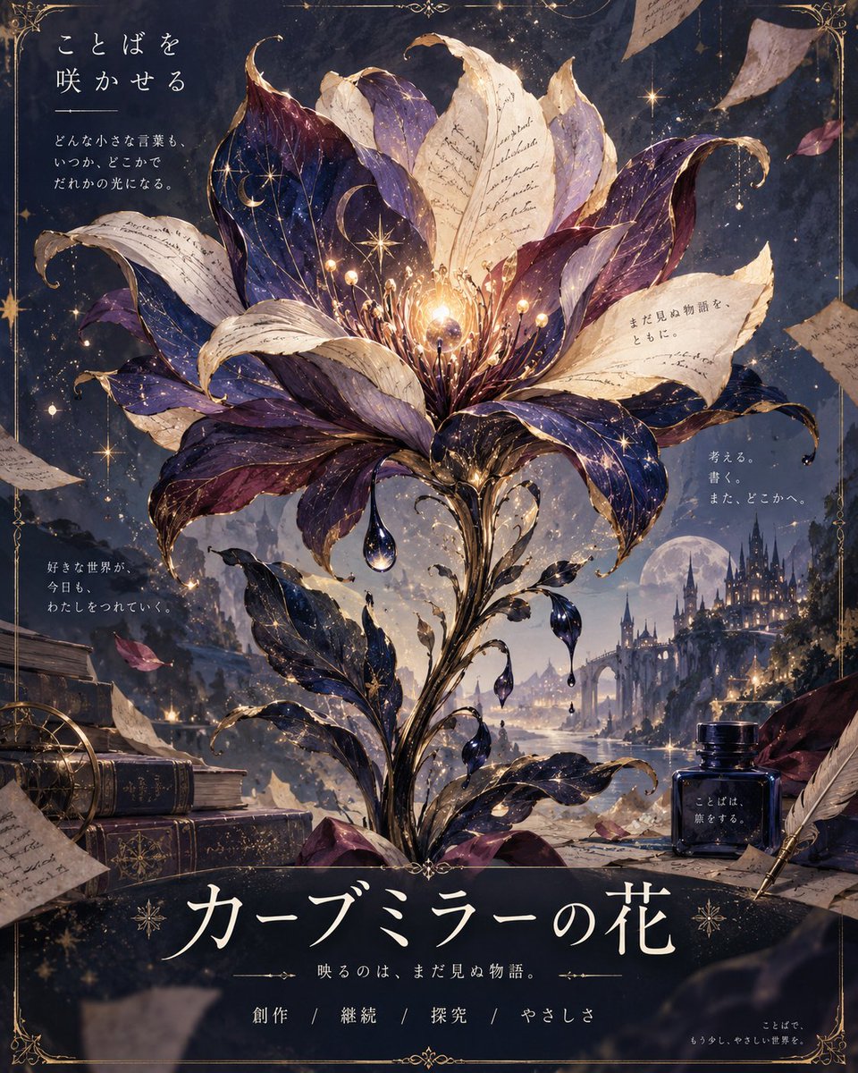
Magical Parchment Flower Illustration

Magical Parchment Flower Illustration

Editorial / Poster

Read full prompt

A vertical digital illustration in a fantasy art style featuring a large, magical flower blooming from a dark, starry background. The flower's petals are textured like old parchment paper with faint handwritten script and celestial motifs (stars, moons) in deep purple and blue tones. A glowing golden orb sits at the center of the bloom, emitting light rays and floating sparkles. Surrounding the flower are scattered pieces of torn paper, some with visible Japanese text fragments. In the lower left corner, there is a stack of antique books with gold-embossed spines and a brass compass. In the lower right corner, an ink bottle labeled 'ことばは、旅をする。' (Words travel.) sits next to a quill pen. The background shows a distant castle silhouette under a full moon, reflected on water below. At the top left, white Japanese text reads: 'ことばを咲かせる' (Make words bloom), followed by smaller text: 'どんな小さな言葉も、いつか、どこかで誰かの光になる。' (No matter how small the word, someday, somewhere, it becomes someone's light). On the right side, floating text reads: '考える。書く。また、どこかへ。' (Think. Write. Somewhere else again.). Near the bottom, large stylized white Japanese characters read: 'カーブミラーの花' (Curve Mirror Flower), with a subtitle: '映るのは、まだ見ぬ物語。' (What reflects is a story yet unseen). Below that, four keywords separated by slashes: '創作 / 継続 / 探究 / やさしさ' (Creation / Continuation / Exploration / Kindness). The overall color palette is rich with midnight blues, purples, golds, and cream whites, creating a mystical and literary atmosphere.

Tactical RPG Interface Mockup

Tactical RPG Interface Mockup

Editorial / Interface

Read full prompt

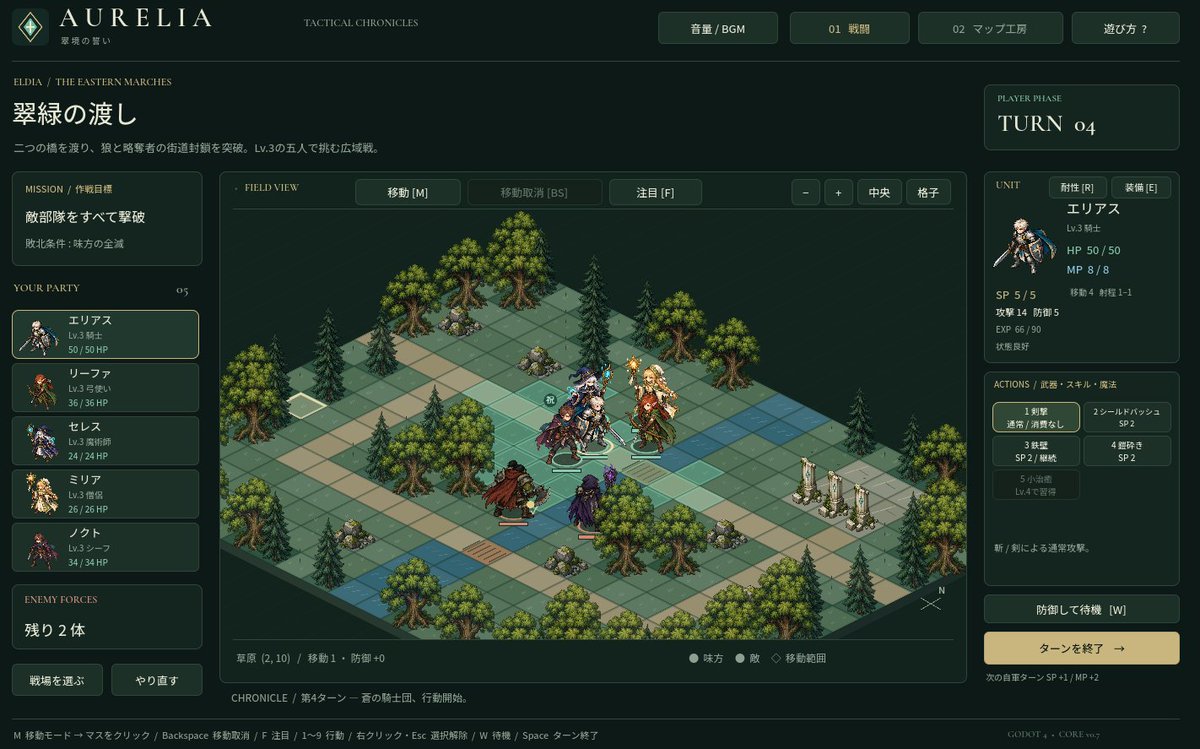
Goal: Create a high-fidelity mockup of a tactical RPG (SLRPG) battle interface, specifically resembling the aesthetic of 'Aurelia'. Canvas: A widescreen desktop UI layout with a dark forest-green and gold color scheme. Layout: - Top Header: Logo 'AURELIA' on the left, navigation buttons 'Volume/BGM', '01 Battle', '02 Map Workshop', and 'Help?' on the right. - Left Sidebar: Mission briefing text in Japanese ('翠緑の渡し'), followed by a vertical list of 5 party members with small portraits and HP bars. Bottom section shows 'Enemy Forces' count. - Center Stage: An isometric grid map featuring grassy tiles, pine trees, rocks, and stone pillars. Several pixel-art style character sprites are positioned on the grid. - Right Sidebar: Turn counter ('TURN 04'), detailed stats for the selected unit (Elias), including HP/MP/SP and attack/defense values. Below this is an action menu with 5 skill slots and a large 'End Turn' button. - Footer: A status bar displaying tile information and keyboard shortcuts. Visual Style: Dark fantasy UI design, crisp typography, isometric perspective, retro-modern hybrid look. Text content: Use Japanese labels for all UI elements as seen in the reference image.

Ganma Cat CAPTCHA Interface

Ganma Cat CAPTCHA Interface

Editorial / Interface

Read full prompt

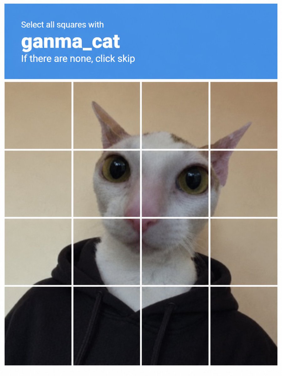
Create a realistic CAPTCHA verification interface image. The top section is a solid blue header bar containing white text: 'Select all squares with' in small font, followed by 'ganma_cat' in large bold lowercase font, and 'If there are none, click skip' in smaller text below. Beneath the header is a 4x4 grid of square tiles separated by thin white lines. The grid displays a single continuous photo of a white cat with large yellow-green eyes and pink ears, wearing a black hoodie. The background behind the cat is a plain beige wall.

Holographic Liquid Crystal White Tiger

Holographic Liquid Crystal White Tiger

Editorial / Poster

Read full prompt

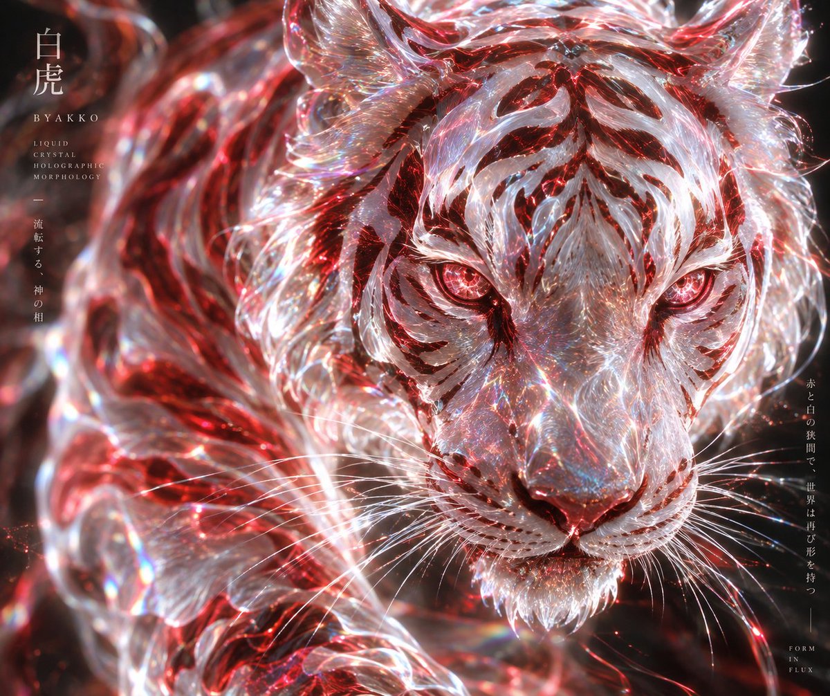
A hyper-realistic, close-up portrait of a majestic white tiger composed entirely of swirling liquid crystal and holographic glass. The fur is rendered as translucent, flowing ribbons of clear material that refract light into prismatic rainbows. Deep crimson red energy pulses through the internal structure of the glass, creating glowing stripes and illuminating the eyes with an intense ruby-red glow. The background is dark and moody, allowing the luminous subject to pop. In the top left corner, elegant vertical Japanese text reads "白虎" (Byakko) followed by smaller English text: "LIQUID CRYSTAL HOLOGRAPHIC MORPHOLOGY". On the right side, faint vertical Japanese text adds a poetic touch. The overall aesthetic is ethereal, futuristic, and divine.

Premium Whisky Outdoor Dining Poster

Premium Whisky Outdoor Dining Poster

Editorial / Poster

Read full prompt

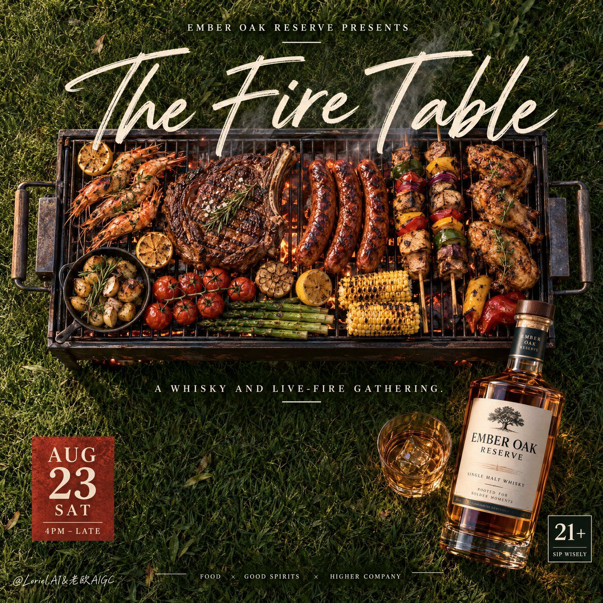
Create a Cannes-level ultra-premium outdoor whisky and live-fire dining advertising poster for a fictional spirit house called EMBER OAK RESERVE, preserving the exact structural logic of a top-down lawn event poster while merging narrative atmosphere, forensic food realism, and curatorial restraint. The composition is square or near-square and viewed directly from above: a richly textured green grass field fills the entire background, one central rectangular grill loaded with impeccably arranged flame-kissed food anchors the image, a giant handwritten English title sweeps across the upper-middle over the grill, a small presenter line sits at the top, one bold date block sits at the lower left, one restrained age-responsibility tile sits at the lower right, a minimal sponsor or host strip runs along the bottom center, and one premium whisky bottle stands as the product-signature hero at the lower-right edge. The final image must feel like a luxury cookout ritual rather than a noisy event flyer. Core composition: keep the grass field broad and open so the layout breathes. Position the grill slightly above center, spanning horizontally across the frame, with carefully staged food arranged for instant readability from poster distance. Overlay the grill with one large elegant handwritten title such as “The Fire Table” or “The Flame Hour,” rendered in creamy warm-white script with strong authority and graceful flow. Above it, place one compact uppercase presenter line such as “EMBER OAK RESERVE PRESENTS.” Beneath the grill, keep one restrained subtitle line like “A whisky and live-fire gathering.” On the lower left, add one solid ember-red date tile with stacked information. On the lower right, place one refined “21+ / SIP WISELY” style badge. Across the bottom center, keep only a minimal host-and-partner strip with sparse marks and clean spacing. Orbit atmosphere: the poster should feel like a late-summer golden-hour gathering on a private lawn just before night fully arrives. The embers, smoke, grilled food, and whisky must carry a sense of mature anticipation, intimacy, and social heat. The grass is not just background; it becomes the calm stage beneath the ritual of fire, food, and amber spirit. The mood must be warm, magnetic, and upscale, with a slightly cinematic hush rather than festival chaos. Transit realism: render every object with world-class commercial precision. The grill should show heat-darkened bars, subtle carbon residue, and believable metal reflections. The sausages must have taut blistered skins and real grill marks; the skewers should show caramelized vegetables and meat with proper charring; the larger steak or chop should carry glossy rendered fat, seared crust, and juicy highlights. Corn, peppers, and chicken pieces should feel freshly flame-finished, not over-styled. Ember sparks must be sparse and physically plausible. Smoke should rise in thin elegant ribbons with soft transparency and no muddy haze. The whisky bottle must show thick clear glass, precise shoulder geometry, realistic label print, clean neck detail, and dense amber liquid with luminous internal depth. Port restraint: simplify the layout into a more curated statement. Keep only the giant script title, the central grill feast, the small presenter line, one subtitle, the date block, the age tile, one compact bottom partner strip, and the bottle. Remove excess extra badges, noisy sponsor clutter, and decorative overkill. Let the scale contrast between open grass, central grill, and hero bottle create the luxury. Hero product design: create a collectible bottle for EMBER OAK RESERVE with warm amber whisky, thick premium glass, a refined cream-and-charcoal label system, and a subtle deep green or navy accent. The bottle should sit near the lower-right edge, upright and clearly legible, catching warm rim light from the grill area and soft daylight reflections from above. It must feel gift-worthy, mature, and premium, like a high-end single malt made for outdoor evening rituals. The bottle is the commercial anchor that confirms the event’s prestige. Lighting: use bright natural top light with late-afternoon warmth and subtle live-fire contribution. The grass must remain crisp and dimensional, the grill foods should glow with appetizing caramelization, and the bottle should catch premium amber and glass-edge highlights. The brightest emphasis should remain on the grill center and bottle label zone. Avoid dead black patches, muddy shadows, fake orange bloom, or excessive fire glow. Material and texture: emphasize grass blade density, grill metal heat wear, sausage blistering, steak crust, roasted vegetable skins, skewer wood texture, smoke transparency, ember pinpoints, glass thickness, liquid refraction, label paper grain, and condensation-free premium bottle finish. Every material must feel physically real, expensive, and photographed in a world-class studio-meets-outdoor setup. Color hierarchy: 60% natural grass green and deep outdoor lawn tones; 30% ember orange, grilled brown, caramelized meat tones, and whisky amber gold; 10% warm ivory typography, ember-red information blocks, and crisp label highlights. The palette must feel rich, smoky, summery, and premium. Design intent: the final poster must preserve the exact impact logic of the source image—grass background, central grill feast, giant script title, top presenter line, lower information blocks, bottom partner strip, and side whisky bottle—while merging Orbit atmosphere, Transit realism, and Port minimal curation into one resolved luxury campaign image. The grill creates the mythology of the gathering, but the whisky bottle defines the brand’s authority and desire. Rendering style: ultra-photoreal luxury event advertising, premium barbecue editorial poster, top-down lifestyle food campaign, refined whisky product integration, cinematic ember atmosphere, restrained graphic hierarchy, world-class commercial retouching, immaculate print-ready finish. Negative prompt: copied original text, real brand names, cheap event flyer styling, cluttered sponsor row, muddy grass, low-detail grilled food, fake smoke, cartoon flames, plastic-looking bottle, unreadable label, warped grill geometry, excessive sparks, random props, black blotches, distorted perspective, messy layout, watermark

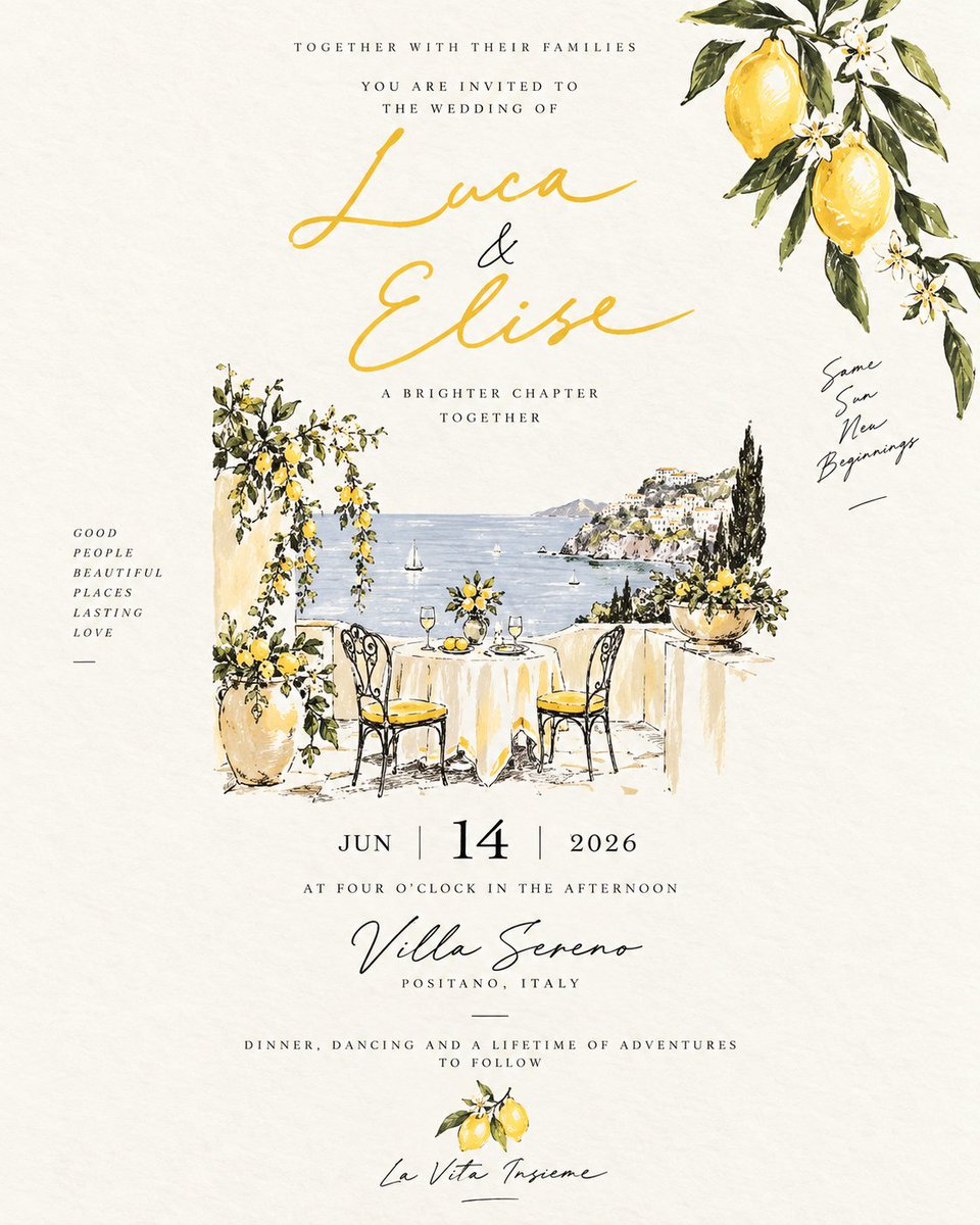
Amalfi Coast Lemon Wedding Invitation

Amalfi Coast Lemon Wedding Invitation

Editorial / Poster

Read full prompt

Create a vertical wedding invitation card with an elegant, hand-painted Amalfi Coast theme. The background is textured cream paper. In the top right corner, paint a watercolor branch of lemons and white blossoms. Centered at the top in small serif caps: 'TOGETHER WITH THEIR FAMILIES' followed by 'YOU ARE INVITED TO THE WEDDING OF'. Below this, write the names '{argument name="couple names" default="Luca & Elise"}' in large, flowing golden-yellow calligraphy. Underneath the names, add the text 'A BRIGHTER CHAPTER TOGETHER' in small caps. The central illustration should depict a romantic terrace overlooking the sea. Include a round table covered with a white cloth, set for two with wine glasses and a lemon centerpiece, flanked by two black wrought-iron chairs with yellow cushions. To the left of the table, place a tall terracotta pot overflowing with lemon branches. The background shows a calm blue sea with sailboats and a cliffside town on the right. On the far left margin, list vertically: 'GOOD PEOPLE BEAUTIFUL PLACES LASTING LOVE'. On the far right margin, write handwritten script: 'Same Sun New Beginnings'. Below the illustration, center the date: 'JUN | {argument name="day" default="14"} | {argument name="year" default="2026"}'. Follow with 'AT FOUR O'CLOCK IN THE AFTERNOON'. Then, the venue name '{argument name="venue name" default="Villa Sereno"}' in dark cursive script, with 'POSITANO, ITALY' below it. At the bottom, include the line 'DINNER, DANCING AND A LIFETIME OF ADVENTURES TO FOLLOW', a small lemon icon, and the phrase '{argument name="closing phrase" default="La Vita Insieme"}' in script.

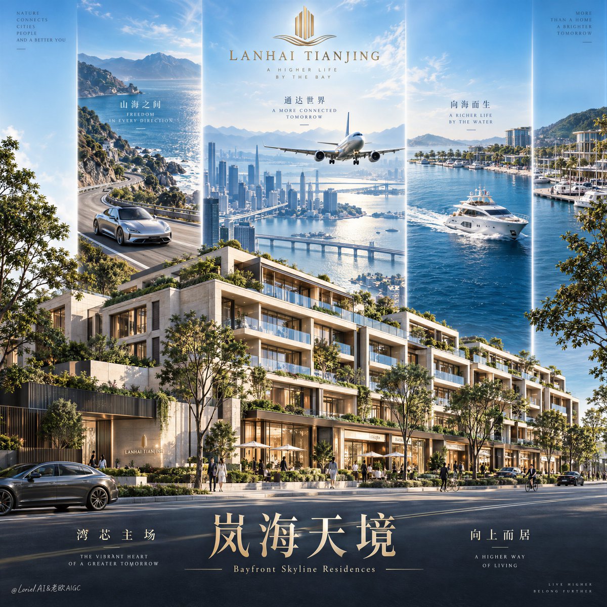
Luxury Real Estate Poster Design

Luxury Real Estate Poster Design

Editorial / Poster

Read full prompt

A hyper-real premium real estate poster advertisement for a fictional domestic luxury development brand called LANHAI TIANJING, designed as a high-end architectural campaign visual that preserves a strong three-panel aspirational structure while making the residential property the absolute visual hero. In the foreground, create a highly realistic low-rise luxury mixed-use residential block occupying the full lower half of the composition: stepped contemporary architecture, elegant stone-and-glass facade, planted rooftop terraces, continuous balcony rhythm, warm boutique storefront glow at street level, mature roadside trees, a clean broad boulevard, a few small refined pedestrians and bicycles for scale, all physically plausible, meticulously detailed, and clearly premium. Behind the building, rise three monumental vertical vision panels integrated into the poster like luminous branded portals. Keep the same tall, narrow, clean-edged three-column structure, evenly spaced, with the central panel slightly dominant. Left panel: a sunlit coastal mountain boulevard with a silver luxury electric grand tourer moving through a scenic curve, conveying freedom, status, and effortless access. Center panel: a bright bayfront skyline with waterfront towers, layered bridges, transport infrastructure, and a passenger jet flying toward camera above the city, expressing metropolitan reach, connectivity, and urban momentum. Right panel: a serene private marina scene with a sleek white yacht cutting through deep blue water near a high-end coastal leisure zone, expressing waterfront lifestyle and exclusive privilege. The three panels must feel unified in perspective, light quality, and graphic authority, acting as symbolic lifestyle extensions of the property rather than random collage fragments. Framing and composition: vertical hero poster, slightly low eye-level architectural angle, strong rule of thirds, the property mass grounded and dominant in the lower field, the three aspiration panels rising behind it into the sky, generous negative space at the top for the logo and at the bottom for the title typography. Preserve the original visual grammar of upward ambition and layered value stacking, but sharpen the hierarchy so the residential architecture reads first, the central aspirational skyline reads second, and the side panels complete the narrative. Keep the flow from top emblem to middle triptych to building volume to bottom title band. Lighting and color: bright cinematic daylight with polished ad-grade contrast, clear atmospheric glow in the upper sky, crisp sunlight on facade edges, soft shadow depth beneath balconies, refined glass reflections, luminous but controlled highlights across vehicles, aircraft, water, and architecture. Build stronger light-dark separation across the building mass to emphasize terrace depth and material volume. Color system: 60% clean sky blue, bay cyan, and cool daylight atmosphere; 30% warm ivory stone, greenery, and soft urban neutrals; 10% metallic gold accents in the logo and typography. The frame must feel fresh, prosperous, elegant, and globally aspirational, without muddy shadows, dead black patches, or oversaturated brochure harshness. Materials and finish: ultra-real architectural visualization fused with luxury commercial photography. Dense matte mineral stone, crisp low-iron glass, realistic planted greenery with varied leaf density, elegant metal balcony rails, smooth asphalt, restrained storefront illumination, polished metallic vehicle bodywork, aerodynamic aircraft surface, glossy yacht hull, coherent scale relationships across every element. Maintain premium realism with clean micro-detail, subtle atmospheric depth, and highly controlled retouching, as if created for a Cannes-level property campaign. Typography: place a refined minimal gold emblem at the top center, with the brand name "LANHAI TIANJING" below it in elegant uppercase serif. In the lower title band, set the Chinese main title exactly as "Lan Hai Tian Jing" in large luxurious gold typography with graceful, slightly calligraphic serif character construction. Directly below it, add the English subtitle exactly as "Bayfront Skyline Residences" in a small refined serif. Add two supporting Chinese copy clusters in the lower typography zone: left cluster exactly "Wan Xin Zhu Chang", right cluster exactly "Xiang Shang Er Ju", each paired with a subtle line of tiny English microcopy in a delicate editorial serif. Typography must feel integrated, spacious, and premium, with precise alignment, elegant kerning, controlled scale hierarchy, and safe margins away from the main building silhouette. Output and constraints: polished luxury real estate commercial poster, architecture-first hierarchy, clean and unified visual system, no real city names, no real people names, no random clutter, no extra decorative noise. Keep architecture structurally correct, windows aligned, balconies logical, street scale believable, trees rooted, pedestrians small and anatomically normal, vehicles and yacht physically accurate, aircraft proportionally correct, typography readable and elegant. Avoid warped architecture, duplicated windows, broken perspective, malformed vehicles, unreadable text, floating objects, muddy grading, cheap CGI plastic surfaces, chaotic collage edges, distorted anatomy, extra fingers, broken limbs, black blotches, and off-style visual drift.