Editorial / Poster
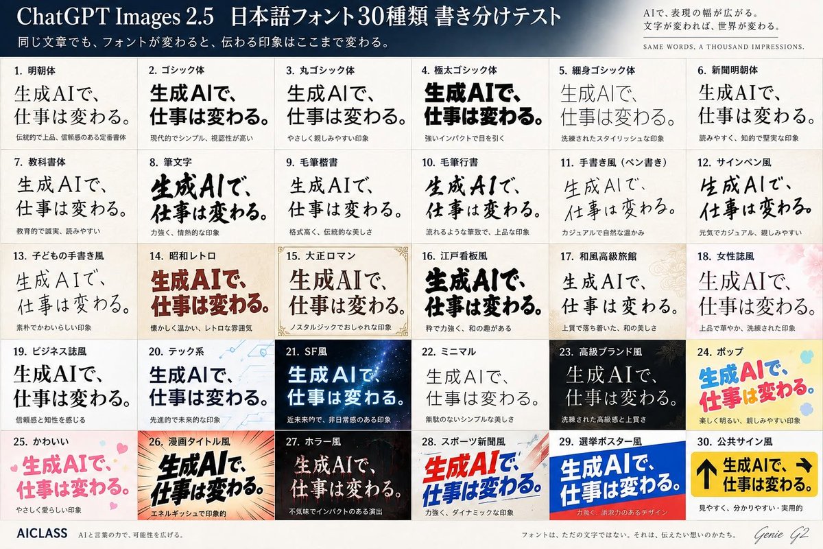
Japanese Font Comparison Poster
5. Canvas: Landscape 3:2 poster, approximately 1200×800 px, ivory paper background with subtle texture, thin gray grid lines, high-resolution print layout. Header: A dark navy-to-slate gradient banner across the top. 5 日本語フォント30種類 書き分けテスト」.
Fields you can change: model name, headline text, sample phrase.
Full prompt
Goal: Create a polished Japanese typography comparison poster testing 30 different font styles for the same phrase, in a premium editorial infographic style for {argument name="model name" default="ChatGPT Images 2.5"}.
Canvas: Landscape 3:2 poster, approximately 1200×800 px, ivory paper background with subtle texture, thin gray grid lines, high-resolution print layout.
Header: A dark navy-to-slate gradient banner across the top. Large white serif title on the left: 「{argument name="headline text" default="ChatGPT Images 2.5 日本語フォント30種類 書き分けテスト"}」. Smaller white subtitle underneath: 「同じ文章でも、フォントが変わると、伝わる印象はここまで変わる。」 On the upper right, add a small refined slogan block: 「AIで、表現の幅が広がる。文字が変われば、世界が変わる。」 and below it in tiny spaced English capitals: “SAME WORDS, A THOUSAND IMPRESSIONS.”
Main layout: Below the header, create an exact 5-row by 6-column grid containing exactly 30 numbered font sample cards. Each card has a small bold Japanese label at the top, one large sample phrase in the specified font style, and a tiny Japanese impression note below. The repeated sample phrase must be 「{argument name="sample phrase" default="生成AIで、仕事は変わる。"}」. Keep the phrase visually dominant in every cell while changing only typography, weight, color, texture, and decorative background according to the style.
The 30 cards, in order from left to right, top to bottom:
1. 「明朝体」 elegant traditional Mincho serif, black, formal and trustworthy.
2. 「ゴシック体」 modern bold Gothic sans, black, simple and highly legible.
3. 「丸ゴシック体」 rounded Gothic, soft friendly black text.
4. 「極太ゴシック体」 very heavy extra-bold black Gothic, strong impact.
5. 「細身ゴシック体」 thin stylish Gothic, light gray-black, refined.
6. 「新聞明朝体」 newspaper-style Mincho, readable and intellectual.
7. 「教科書体」 textbook style, clean educational Japanese letterforms.
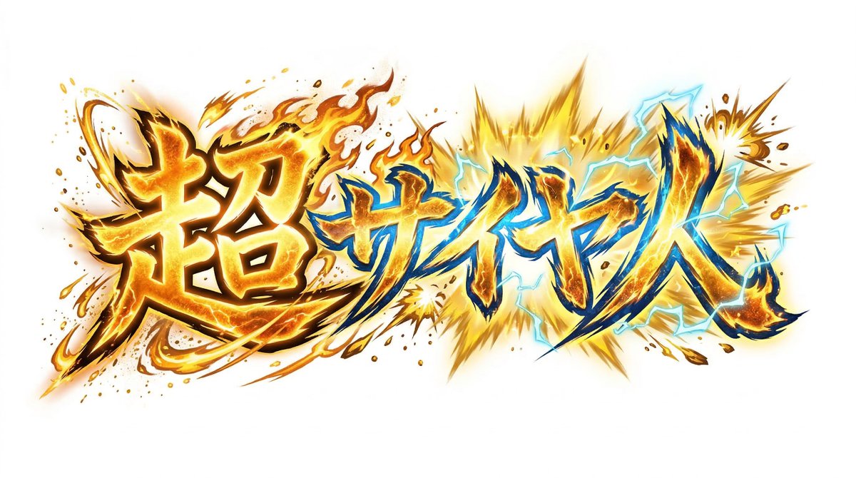
8. 「筆文字」 bold expressive brush calligraphy, energetic ink strokes.
9. 「毛筆楷書」 formal brush kaisho, traditional and dignified.
10. 「毛筆行書」 flowing semi-cursive brush script, elegant.
11. 「手書き風(ペン書き)」 casual pen handwriting, warm and natural.
12. 「サインペン風」 marker-pen handwriting, casual and cheerful.
13. 「子どもの手書き風」 childlike handwritten style, cute uneven strokes.
14. 「昭和レトロ」 warm retro Showa-era display type, deep red-brown, nostalgic.
15. 「大正ロマン」 Taisho romantic serif display, framed with delicate ornamental corner borders and beige paper.
16. 「江戸看板風」 Edo-period signboard style, thick black lively characters.
17. 「和風高級旅館」 refined Japanese luxury ryokan style, calm serif over pale patterned background.
18. 「女性誌風」 women’s magazine style, elegant thin serif over soft pink floral background.
19. 「ビジネス誌風」 business magazine style, serious black serif, trustworthy.
20. 「テック系」 tech style, blue-black sans over pale circuit-line background.
21. 「SF風」 science-fiction style, glowing cyan-white text on dark starry space background.
22. 「ミニマル」 minimalist thin sans/serif, lots of whitespace, quiet beauty.
23. 「高級ブランド風」 luxury brand style, white serif on black background with subtle gold accents.
24. 「ポップ」 playful pop style, bright blue and pink rounded letters on yellow with colorful dots.
25. 「かわいい」 cute pastel pink rounded letters with small hearts.
26. 「漫画タイトル風」 manga title style, bold black dynamic letters with speed lines and orange burst background.
27. 「ホラー風」 horror style, distressed pale text on dark red-black eerie background.
28. 「スポーツ新聞風」 sports newspaper style, bold red and blue italic headline with dynamic diagonal shapes.
29. 「選挙ポスター風」 election poster style, bold white text on blue and red campaign-poster blocks.
30. 「公共サイン風」 public sign style, yellow signboard with black arrows and heavy black text, practical and highly readable.
Footer: A clean footer strip along the bottom. Left: “AICLASS” in bold dark type, followed by tiny Japanese tagline 「AIと言葉の力で、可能性を広げる。」 Center: small Japanese sentence 「フォントは、ただの文字ではない。それは、伝えたい想いのかたち。」 Right: handwritten signature-style text “Genie G2”.
Visual style: Crisp Japanese typography specimen sheet, professional magazine design, accurate grid alignment, varied font rendering, subtle paper grain, balanced margins, no random extra panels. Use exactly 30 cards and keep every card numbered.