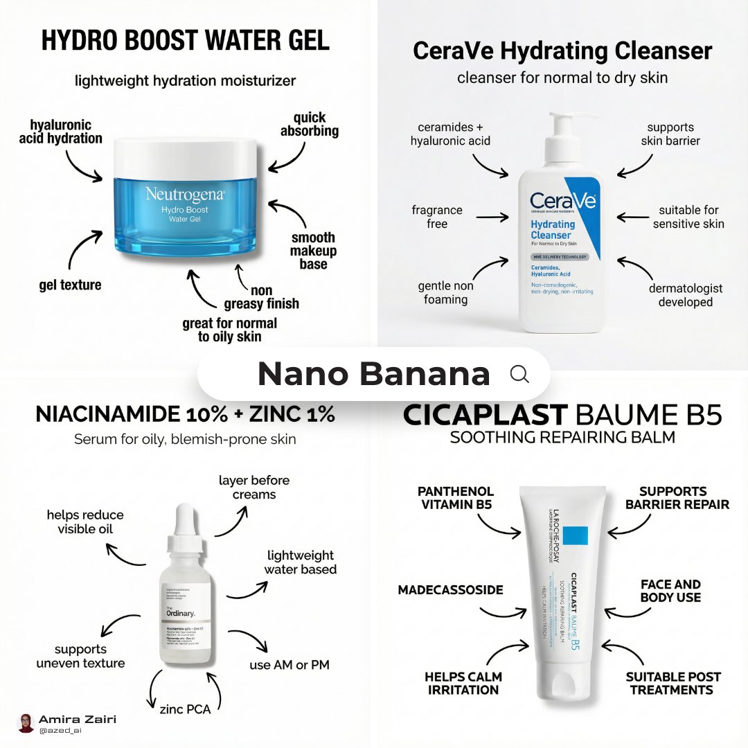
Infographic Poster Creation Prompt
Diagram / Infographic
Read full prompt
Create an infographic poster using this prompt 👇
THE LIBRARY
Browse images and open the prompts behind them.
Diagram / Infographic
Create an infographic poster using this prompt 👇
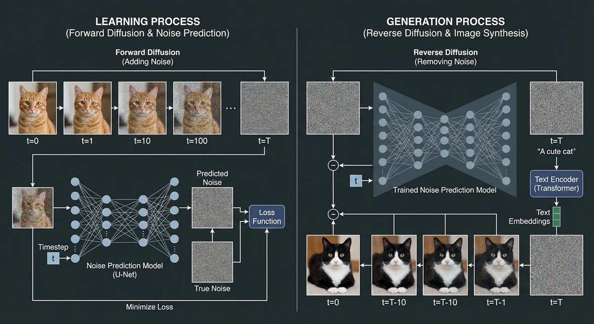
Diagram / Infographic
Using a cat image and noise images, create a diagram explaining the image generation process of a diffusion model. In the training process, show the process of adding noise to the cat image through forward diffusion, and depict the process of creating the noise prediction model.
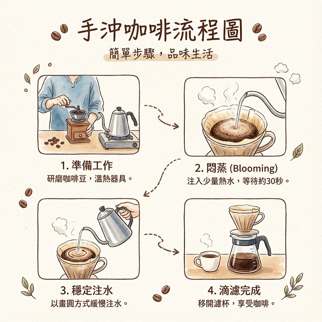
Diagram / Infographic
Please draw a flowchart for hand-drip coffee with simple explanations. The style should be like a Japanese fashion/lifestyle magazine, but the explanatory text should be in Taiwanese Traditional Chinese.
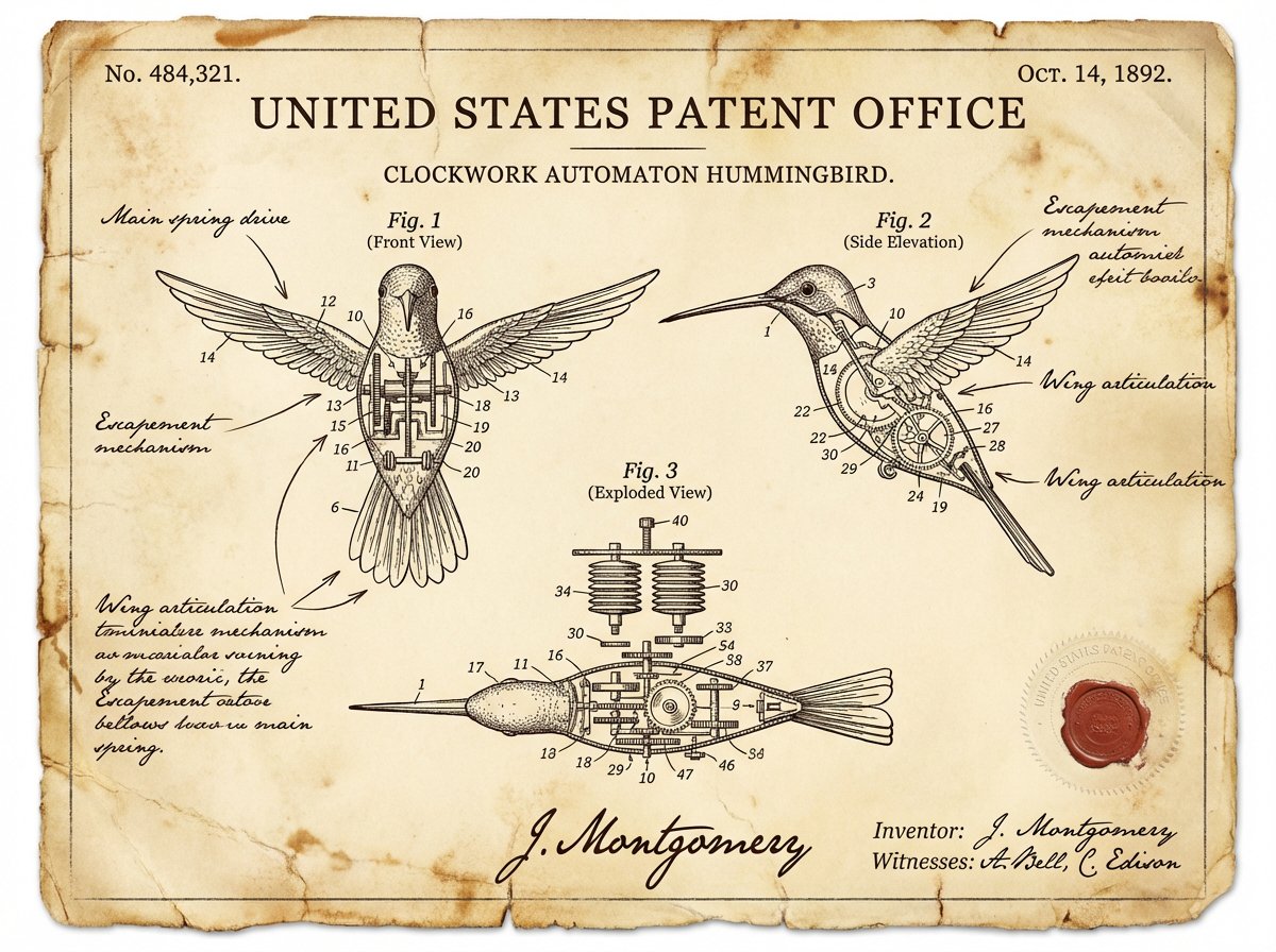
Diagram / Infographic
A vintage patent document for {argument name="invention" default="INVENTION"}, styled after late 1800s United States Patent Office filings. The page features precise technical drawings with numbered callouts (Fig. 1, Fig. 2, Fig. 3) showing front, side, and exploded views. Handwritten annotations in fountain-pen ink describe mechanisms. The paper is aged ivory with foxing stains and soft fold creases. An official embossed seal and red wax stamp appear in the corner. A hand-signed inventor's name and date appear at the bottom. The entire image feels like a recovered archival document—authoritative, historic, and slightly mysterious.
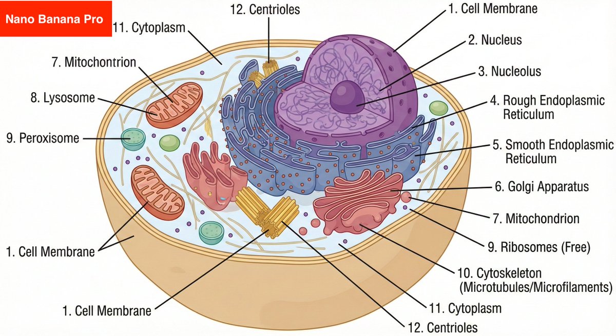
Diagram / Infographic
Create a fully labeled diagram of a human cell with at least 10 labeled elements. Make sure these labels are precise and accurate.
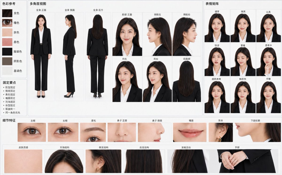
Diagram / Infographic
Create a "{argument name="chart title" default="Character Identity Consistency Reference Chart"}" based on the attached original character image, horizontal {argument name="ratio" default="16:10"}, {argument name="background color" default="light gray-white background"}, professional visual data board layout. The primary goal is to make all panels clearly recognizable as the exact same character at a glance, rather than multiple similar individuals. Treat the character's identity in the reference image as an unchangeable hard constraint. Strictly lock: - Face width-to-height ratio, cheekbones, cheeks, jawline, and chin - Eye contours, distance between eyes, eyelid structure, and gaze temperament - Eyebrow arch, thickness, color, and eyebrow-to-eye distance - Bridge of the nose, tip, nostrils, and side profile nose shape - Upper/lower lip thickness, lip peak, corners, and natural lip color - Skin tone, pores, flush, and natural skin texture - Hairline, parting, bangs, side hair, back hair length, and hair strand flow - Age impression, skeletal frame, shoulder width, limb length, and overall body type - Original clothing, original art style, light texture, and overall atmosphere Use large panels in the center to display: - Full body front - Full body side - Full body back - Face front - Left profile - Right profile - Three-quarter left - Three-quarter right - Back of the head Maintain perfectly consistent skull structure, relative position of facial features, hair volume, and body proportions for every angle. The profile must accurately continue the bridge of the nose, lips, chin, and forehead structure from the front; generating different character-style profiles is prohibited. Configure a small expression matrix on the right: - Normal - Smile - Serious - Surprised - Shy - Thinking - Troubled - Slightly sad - Calm Maintain the same pupils, base eye size, nose shape, lip shape, and face shape. Smiles should be natural and restrained, not changing the character's age or temperament. Configure fine identity anchors at the bottom: - Left eye / Right eye / Eyebrows - Nose (front/side) / Lips / Ears - Jawline contour / Skin texture - Bangs / side hair / back hair structure / Hair end flow - Hands Add 5-7 accurate color samples on the left: hair, eyes, skin, lips, clothing, shadow, and tone color. Add minimalist "Fix Points": face shape fixed, eye area fixed, nose shape fixed, lips fixed, bangs fixed, body type fixed, clothing unified, same character priority. Background clean, soft uniform lighting, no cinematic lighting, strong depth of field, or decorative elements. Realistic characters retain natural pores, fine hair, and slight skin tone variations; non-realistic characters strictly maintain the original image's lines, color blocks, shadows, and materials without unauthorized style conversion. All labels use clear simplified Chinese, moderate font size, not overlapping characters. If space is insufficient, prioritize identity anchors and main angles, reduce duplicate panels, and do not force a full layout by shrinking text or sacrificing character consistency.
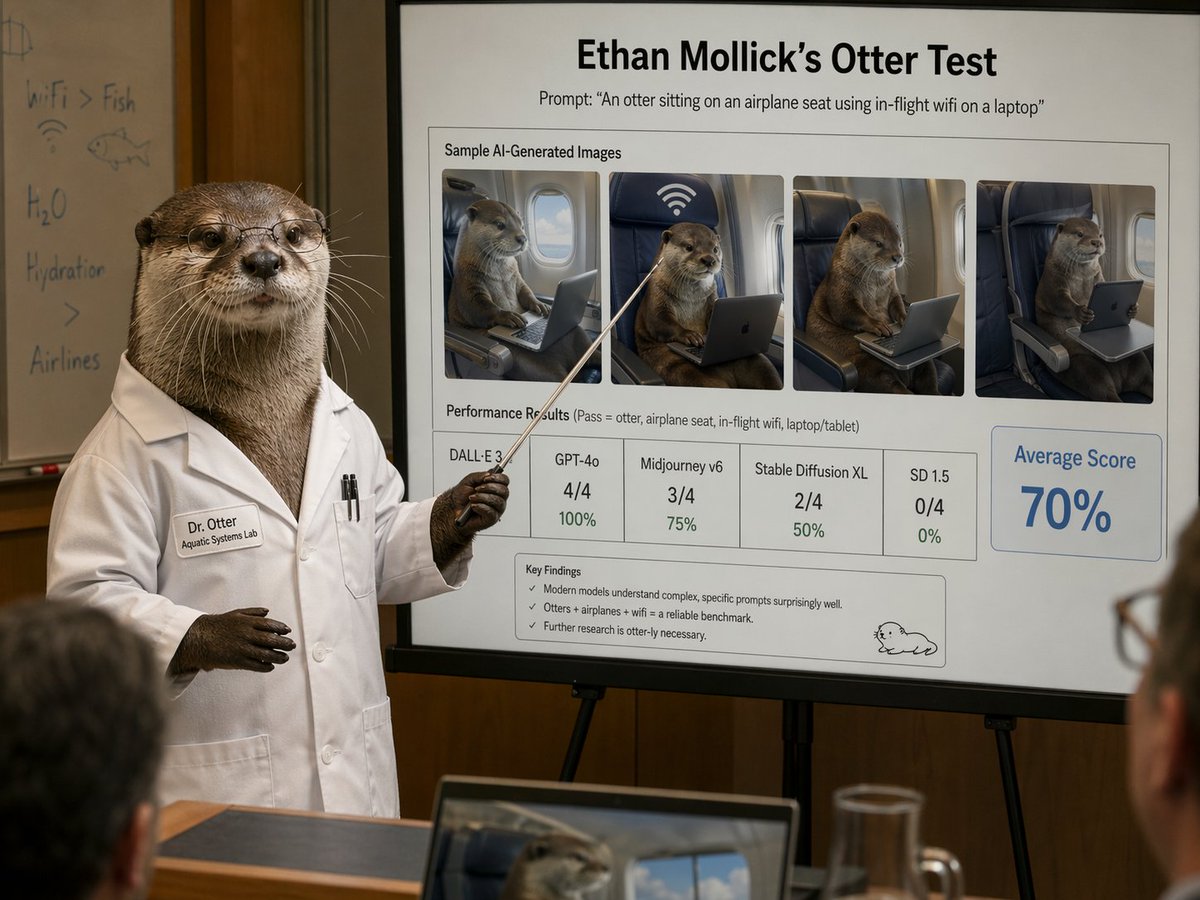
Diagram / Infographic
A photorealistic humorous academic presentation in a conference room: an anthropomorphic otter scientist stands at the left side of the frame wearing a crisp white lab coat and holding a thin pointing stick toward a large presentation board on an easel. The otter is upright like a human, with realistic brown fur, dark paws, and a professional posture. The lab coat has a stitched name tag reading "Dr. Otter" and a smaller line reading "Aquatic Systems Lab," plus two pens in the chest pocket. The otter’s face is partially censored by a square blur block. Behind the otter is a whiteboard with faint handwritten notes and doodles, including "WiFi > Fish," "H2O," "Hydration," a fish sketch, and a wifi symbol. The main focus is a large clean presentation slide with sharp readable text and polished corporate-academic layout. At the top, a bold title reads "{argument name="headline text" default="Ethan Mollick’s Otter Test"}" and beneath it a subtitle reads "Prompt: \"{argument name="prompt text" default="An otter sitting on an airplane seat using in-flight wifi on a laptop"}\"". Below that is a boxed section titled "Sample AI-Generated Images" containing exactly 4 side-by-side sample images of a realistic otter seated in an airplane seat using a laptop or tablet, each framed like model outputs, with one showing a large wifi symbol above the seat. Beneath the images is a section labeled "Performance Results (Pass = otter, airplane seat, in-flight wifi, laptop/tablet)" with exactly 5 score boxes: "DALL·E 3" with no visible numeric score, "GPT-4o" with "4/4" and "100%", "Midjourney v6" with "3/4" and "75%", "Stable Diffusion XL" with "2/4" and "50%", and "SD 1.5" with "0/4" and "0%". On the right side is a large highlighted box reading "Average Score" and "{argument name="average score" default="70%"}" in large blue type. At the bottom of the slide is a "Key Findings" box with exactly 3 bullet points: "Modern models understand complex, specific prompts surprisingly well.", "Otters + airplanes + wifi = a reliable benchmark.", and "Further research is otter-ly necessary." A small simple cartoon otter doodle appears in the lower-right corner of the slide. The room is warmly lit with wood-paneled walls, shallow depth of field, and a few blurred audience members in the foreground, including a laptop at the bottom edge showing an otter image on its screen and a glass pitcher on a table. Style: ultra-realistic editorial photography, deadpan scientific satire, believable conference presentation, high detail, natural indoor lighting, professional lens compression, readable slide typography, polished yet absurd.
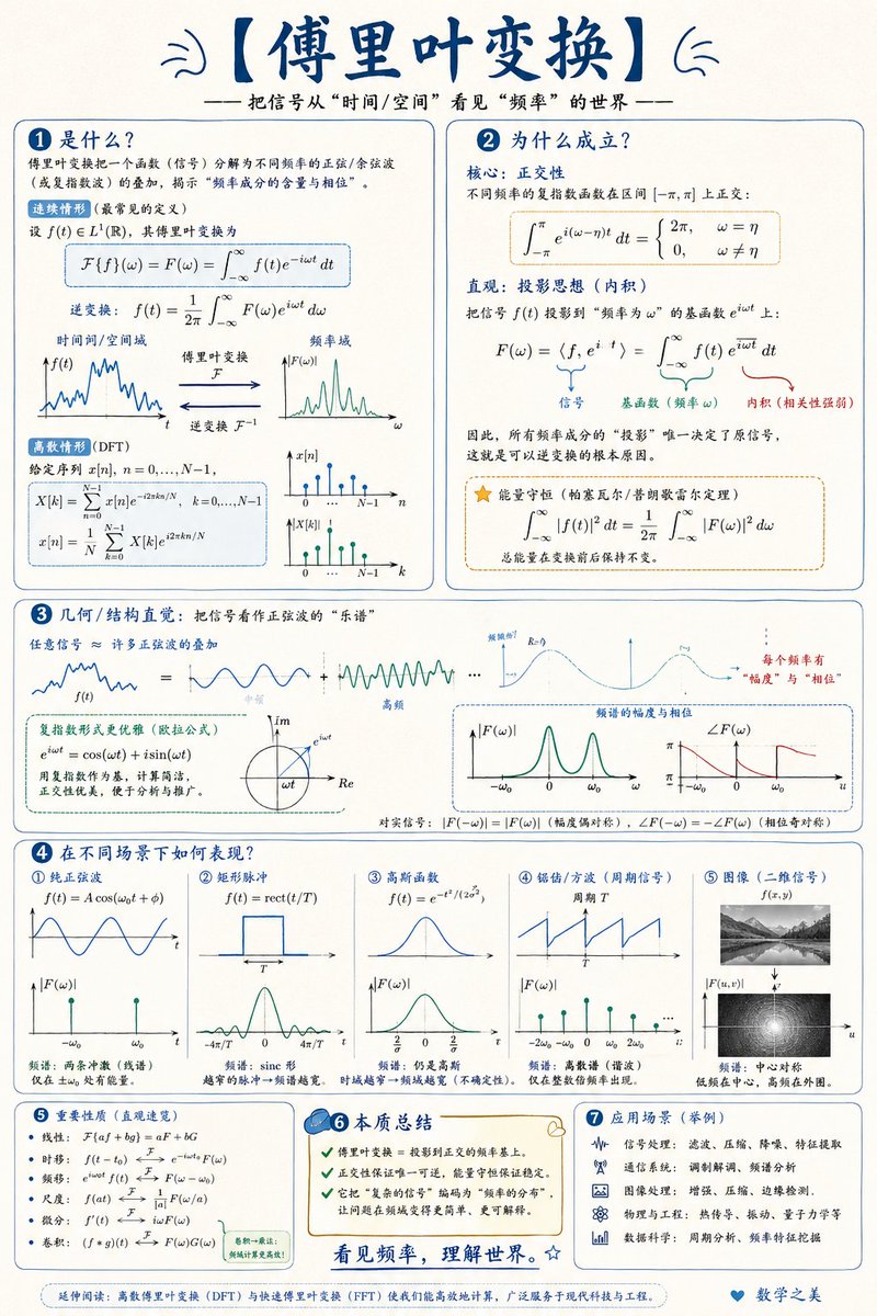
Diagram / Infographic
Please create a mathematical visualization infographic about "{argument name="topic" default="mathematical concepts/knowledge points"}" to help readers intuitively understand: what it is, why it holds true, the geometric/structural intuition, and how it behaves in different scenarios. The image should look like a high-quality math lecture handout + hand-drawn educational poster—elegant, clear, and informative without being cluttered. Visual style: {argument name="layout" default="vertical or horizontal"}, clean light-colored paper background, dark blue headings, black/dark gray body lines, accented with a few elegant blue, turquoise, gold, and red colors. Use rounded-corner cards, thin borders, numbered labels, hand-drawn arrows, partial magnification boxes, and summary columns. The overall design should be aesthetic, balanced, and academic, allowing one to immediately grasp the "structure" and "reasoning" behind the concept.
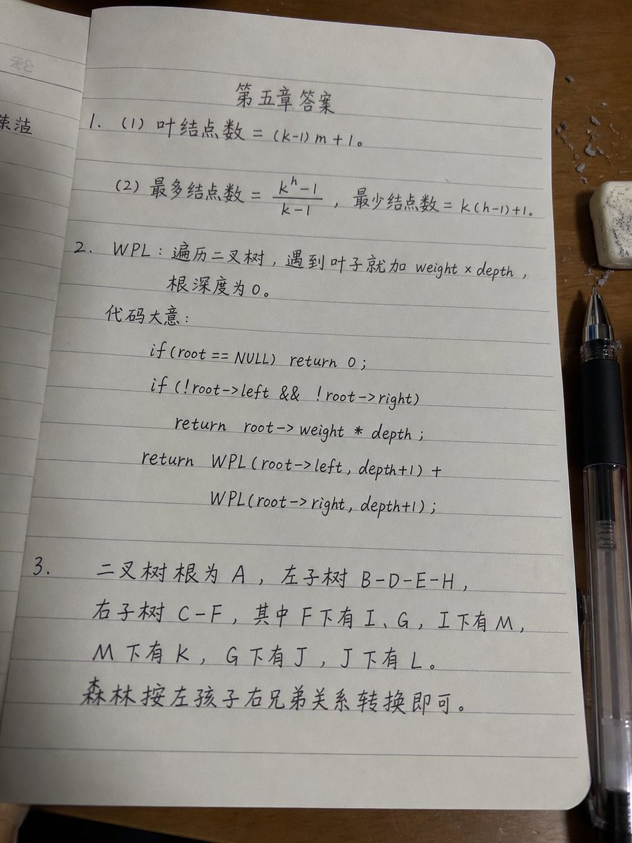
Diagram / Infographic
Goal: Create a realistic smartphone photo of a lined notebook page on a wooden desk, showing a handwritten software/data-structure homework answer sheet in slightly messy but believable black gel-pen handwriting. The page title should be centered near the top as {argument name="page title" default="第五章答案"}. Make it look like an actual photo submitted for class, with small imperfections, uneven writing, mild page curvature, shadows, and perspective distortion. Canvas and camera: Vertical 3:4 photo, shot from above at a slight angle. The main notebook page fills most of the frame, tilted very slightly. The lighting is warm indoor desk lighting, with soft shadows and a realistic phone-camera look, not a flat scan. Scene details: Use an open notebook with pale gray horizontal ruled lines and rounded page corners. A partial previous page is visible along the left edge. The notebook rests on a medium-brown wooden desk. On the right side, place a black transparent-bodied gel pen vertically near the lower-right edge, and a small white eraser with gray smudges near the upper-right corner. Add a few tiny eraser crumbs or paper debris scattered around the eraser. Keep the page off-white with subtle texture. Handwritten content: Use Chinese handwritten notes mixed with math and C-style pseudocode. The handwriting should be neat enough to read but intentionally slightly casual and uneven, with natural spacing and occasional slant variation. Write exactly 3 numbered answer sections: 1. Section 1 contains exactly 2 subitems: - “(1) 叶结点数 = (k-1)m + 1。” - “(2) 最多结点数 = (k^h - 1)/(k - 1),最少结点数 = k(h-1)+1。” 2. Section 2 defines WPL and contains a short explanation plus exactly 5 pseudocode lines. Write: - “WPL:遍历二叉树,遇到叶子就加 weight × depth,” - “根深度为 0。” - “代码大意:” Then center or indent the following 5 code lines beneath it: - “if(root == NULL) return 0;” - “if(!root->left && !root->right)” - “return root->weight * depth;” - “return WPL(root->left, depth+1) +” - “WPL(root->right, depth+1);” 3. Section 3 contains exactly 5 handwritten lines describing binary tree and forest conversion: - “二叉树根为 A,左子树 B-D-E-H,” - “右子树 C-F,其中 F下有 I、G,I下有 M,” - “M下有 K,G下有 J,J下有 L。” - “森林按左孩子右兄弟关系转换即可。” The section number “3.” should start on the left margin, with the text continuing across the lower half of the page. Visual style: Photorealistic, natural shadows, realistic lined paper, black ink, casual student handwriting. The writing should look handwritten rather than printed or typeset. Slightly imperfect alignment with ruled lines is desirable. Constraints: Do not add extra diagrams, stamps, watermarks, decorative graphics, or typed fonts. Keep exactly 3 numbered sections, exactly 2 subitems in section 1, exactly 5 pseudocode lines in section 2, and the listed Chinese homework text only.
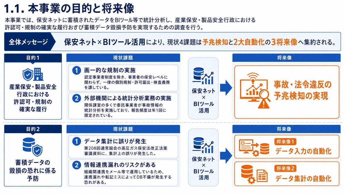
Diagram / Infographic
Goal: Create a polished Japanese corporate strategy slide about the purpose and future vision of a project using accumulated data from an insurance-safety network and BI tools. Canvas: 16:9 horizontal presentation slide, white background, navy and light-blue corporate palette, thin blue outlines, clean grid alignment, dense but readable Japanese business-slide typography. Title: Large navy heading at top left: 「1.1. 本事業の目的と将来像」. Top overview box: Directly under the title, add a white rectangular box with a thin navy border. On the left, include a dark navy pill label 「概要」. To the right, write: 「本事業では、保安ネットに蓄積されたデータをBIツール等で統計分析し、産業保安・製品安全行政における許認可・規制の確実な履行および蓄積データ毀損予防を実現するための調査を行う。」 Overall message band: Below the overview, add a pale blue horizontal band. On the left, a dark-blue arrow label 「全体メッセージ」. Main message text in bold navy: 「保安ネット×BIツール活用により、現状4課題は予兆検知と2大自動化の3将来像へ集約される。」 Main layout: Three columns with headings from left to right: 「目的」, 「現状課題」, 「将来像」. Use two horizontal rows separated by a dotted divider. Use arrows from current issues toward future vision cards. Left column, exactly 2 dark navy purpose cards: 1. Card label 「目的1」 in a small white rounded pill, main text: 「産業保安・製品安全行政における許認可・規制の確実な履行」. 2. Card label 「目的2」 in a small white rounded pill, main text: 「蓄積データの毀損の恐れに係る予防」. Center column, exactly 4 current issue items grouped into two pale-gray rounded containers, each item with a navy circular number badge: 1. 「画一的な規制の実施」 with smaller explanation 「認定事業者制度を除き、事業者の保安レベルに関わらず、一律の個別規制・許可届出・検査義務を課している。」 2. 「外部機関による統計分析業務の実施」 with smaller explanation 「関係課室の多くで委託事業者が事故情報の統計分析を実施しており、報告頻度は年1回に限定されている。」 3. 「データ集計に誤りが発生」 with smaller explanation 「第208回通常国会の高圧ガス保安法改正法案審議資料に、集計上の誤りが発生した。」 4. 「情報連携漏れのリスクがある」 with smaller explanation 「組織間連携をメール等で運用しているため、連携漏れや転記ミスによってDB不備が発生する恐れがある。」 Right column, exactly 3 future vision cards with blue outline and simple line icons: 1. Top large card connected from the first issue group by a thick navy arrow, icon of a magnifying glass with rising bar chart and warning triangle, text: 「事故・法令違反の予兆検知の実現」. 2. Middle card connected from the second issue group by a branching arrow, icon of a computer monitor/document with upload or transfer arrows, text: 「データ入力の自動化」. 3. Bottom card connected by the same branching arrow, icon of a database cylinder with gear, text: 「データ集計の自動化」. Bottom message strip: Full-width white strip with thin blue border. On the left, a circular target icon. Text in bold navy: 「保安ネットの蓄積データをBIツールで可視化・分析することで、規制運用の高度化とデータ品質向上を同時に実現」. Visual style: Japanese consulting deck aesthetic, crisp vector icons, consistent navy #003b8f / deep blue #001f5b accents, pale blue highlight bands, rounded cards, subtle gray dividers, no photos, no shadows beyond very light card depth. Keep all text sharp and legible, with the exact count of 2 purpose cards, 4 issue items, and 3 future vision cards. Use {argument name="project data source" default="保安ネット"}, {argument name="analysis tool" default="BIツール"}, {argument name="slide title" default="1.1. 本事業の目的と将来像"}, {argument name="overall message" default="保安ネット×BIツール活用により、現状4課題は予兆検知と2大自動化の3将来像へ集約される。"}, and {argument name="bottom message" default="保安ネットの蓄積データをBIツールで可視化・分析することで、規制運用の高度化とデータ品質向上を同時に実現"}.
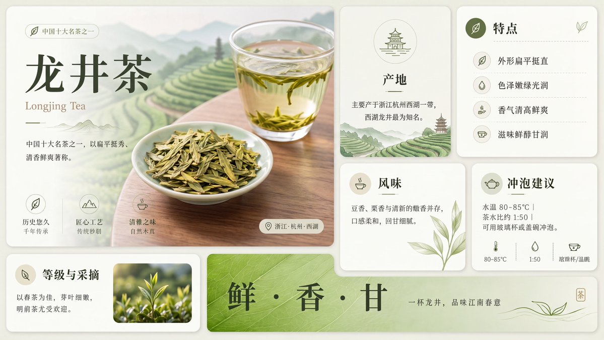
Diagram / Infographic
Using the provided reference image, redraw and upscale it into a cleaner, sharper, more polished version while preserving the same overall infographic layout, all original text content, and the Longjing tea theme. Keep the product title {argument name="tea name" default="龙井茶"} and the English subtitle {argument name="English tea name" default="Longjing Tea"} unchanged. Goal: Make the image look less like a rough GPT-generated graphic by removing broken, noisy, meaningless textures and replacing them with crisp, intentional detail. Enhancements to apply: Increase resolution and clarity; sharpen typography, icons, borders, tea leaves, glass, and card edges; make the lighting softer and more natural; improve material realism for the tea, cup, dried leaves, and ceramic dish; clean up any fuzzy or fragmented artifacts. Meaningful detail additions: In the main hero panel, replace the vague pale background with a refined scenic tea plantation landscape of layered green terraces, misty mountains, and a wooden tabletop beneath the tea cup and plate. In the origin card, add a small matching tea-terrace landscape illustration at the bottom. Make the bottom green banner more vivid with a natural leaf-vein texture. Layout constraints: Preserve exactly 7 visible content panels/sections: the large hero panel, origin card, features card, flavor card, brewing suggestion card, grade-and-picking card, and bottom slogan banner. Preserve exactly 4 feature rows in the features card, exactly 3 small icon benefits in the hero panel, and exactly 3 brewing parameter icons along the bottom of the brewing card. Do not add extra sections, extra labels, watermarks, logos, or decorative clutter. Style: Elegant Chinese tea brochure design, cream-and-sage palette, refined minimal UI cards, soft shadows, crisp vector-like icons, realistic tea photography elements, calm premium product-advertising finish.
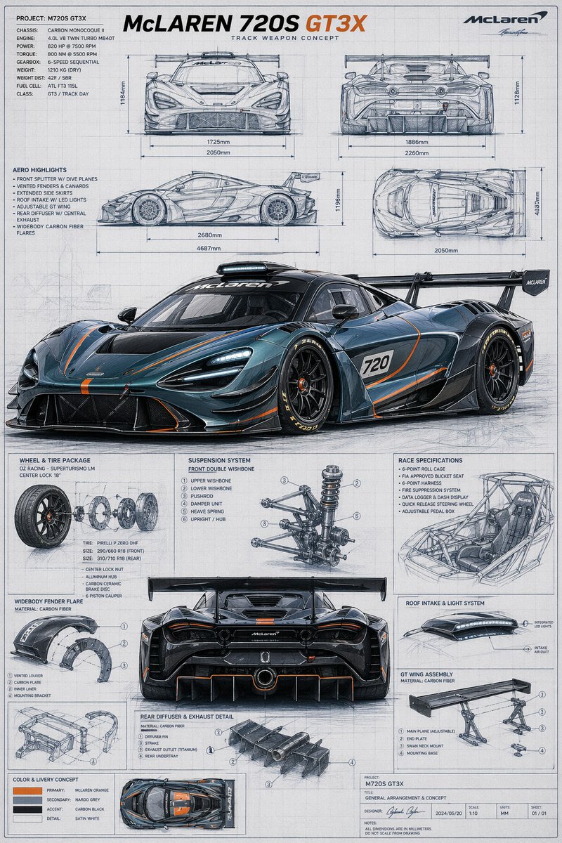
Diagram / Infographic
{"type":"automotive technical blueprint poster","subject":{"vehicle":"{argument name=\"car model\" default=\"McLaren 720S GT3X\"}","category":"track weapon concept supercar","brand":"McLaren","primary render":{"view":"front three-quarter low angle hero shot","finish":"glossy dark metallic blue-gray body with exposed carbon fiber aero parts","accent color":"{argument name=\"accent color\" default=\"McLaren orange\"}","livery details":"thin orange striping across hood, splitter, side skirts, doors, diffuser, and rear surfaces, white race number panel with 720 on the door, black multi-spoke center-lock racing wheels, low-profile slick tires with yellow sidewall lettering, very large rear wing, aggressive front splitter, roof scoop, vented hood, deep side intakes, extreme rear diffuser"},"poster text":{"headline":"{argument name=\"headline text\" default=\"McLAREN 720S GT3X\"}","subheadline":"TRACK WEAPON CONCEPT","project":"PROJECT: M720S GT3X","title block":"GENERAL ARRANGEMENT & CONCEPT"},"palette":{"background":"light gray drafting paper","linework":"blue-gray pencil and ink sketch lines","text":"charcoal gray and black","highlight":"orange accent text and pinstripes"}},"layout":{"style":"clean engineering presentation board with grid background, technical callouts, dimension arrows, section boxes, and mixed photoreal render plus hand-drawn blueprint sketches","sections":[{"title":"orthographic views","position":"top half","count":4,"labels":["front view","rear view","side view","top view"]},{"title":"specification blocks","position":"upper left","count":2,"labels":["PROJECT / CHASSIS / ENGINE / POWER / TORQUE / GEARBOX / WEIGHT / FUEL / CLASS","AERO HIGHLIGHTS"]},{"title":"component detail boxes","position":"lower half around center rear view","count":8,"labels":["WHEEL & TIRE PACKAGE","WIDEBODY FENDER FLARE","SUSPENSION SYSTEM","RACE SPECIFICATIONS","REAR DIFFUSER & EXHAUST DETAIL","ROOF INTAKE & LIGHT SYSTEM","GT WING ASSEMBLY","COLOR & LIVERY CONCEPT"]},{"title":"main rendered vehicle views","position":"center and lower middle","count":2,"labels":["front three-quarter hero render","rear view render"]}],"counts":{"orthographic drawings":4,"main photoreal renders":2,"component diagrams":8,"color swatches":4},"color swatches":["primary: {argument name=\"primary color\" default=\"McLaren orange\"}","secondary: naroo grey","accent: carbon black","detail: satin white"],"dimension annotations":"include multiple metric measurements in millimeters around the orthographic views with horizontal and vertical arrows","branding":"top-right McLaren logo and signature-like mark, bottom-right project title block with date, scale, units, and sheet numbering"},"composition":"portrait poster, highly detailed, symmetrical technical infographic layout, precise industrial design aesthetic, realistic reflections on the hero car render, blueprint-style sketch shading everywhere else, white-gray paper with subtle wear and drafting texture","quality":"ultra-detailed, accuracy-first, crisp typography, concept-art meets engineering blueprint, premium automotive presentation board"}
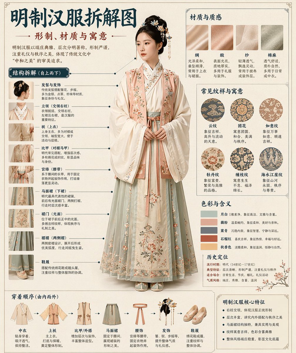
Diagram / Infographic
Please automatically generate a "Museum Guide-style Chinese Breakdown Infographic" based on the [Theme: {argument name="theme" default="Hanfu"}]. Requirements: The entire image must combine a realistic main visual, structural breakdown, Chinese annotations, material descriptions, pattern meanings, color symbolism, and a summary of core features. You need to automatically determine the most suitable subject, clothing system, artifact structure, era style, key components, material craftsmanship, color scheme, and layout based on the [Theme] without further user input. The overall style should be: National Museum exhibition board, historical clothing guide, or cultural museum special infographic, rather than a common poster, ancient-style photo, e-commerce details page, or anime illustration. The background should use paper textures like off-white, silk white, or light tea color. The overall look should be high-end, restrained, professional, and collectible. The layout is fixed as: - Top: Chinese main title + sub-title + introduction - Left: Structural breakdown area with Chinese leader lines marking key components and matching close-ups - Top Right: Material/Craftsmanship/Texture area showing real texture samples with descriptions - Middle Right: Pattern/Color/Meaning area showing the main color palette, pattern samples, and cultural explanations - Bottom: Wearing order / Composition flowchart + summary of core features If the theme is suitable for person display, use a full-body standing pose of a real person as the central subject; if it's more suitable for artifacts, use a central subject breakdown, but maintain the complete Chinese infographic format. All text must be in Simplified Chinese, clear, neat, and readable without garbled characters or typos.
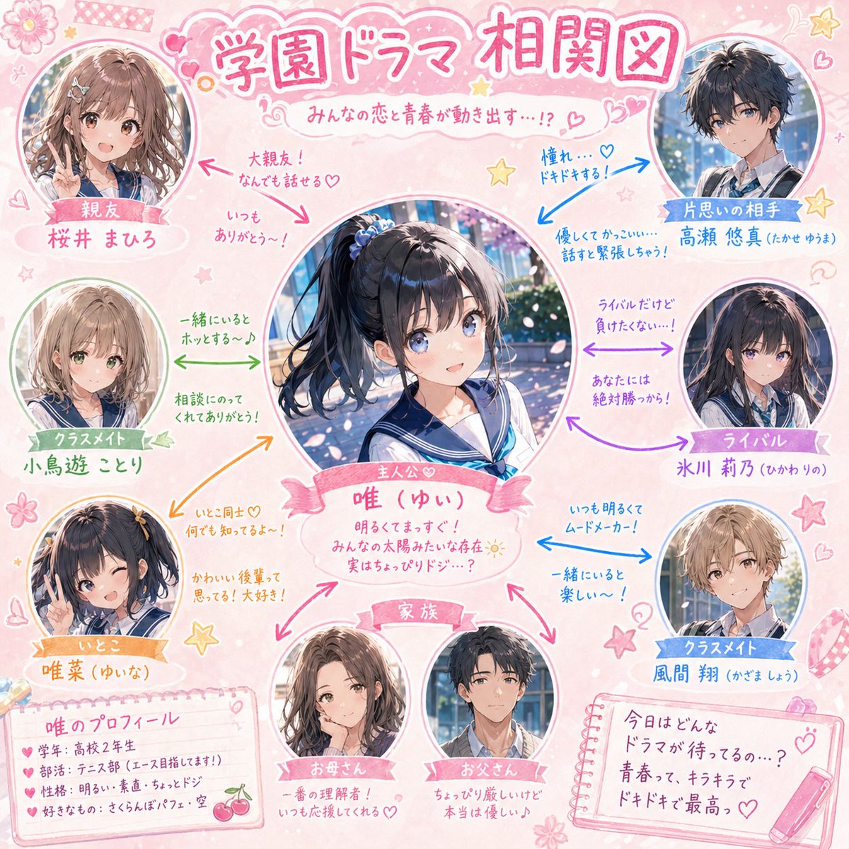
Diagram / Infographic
Please create a school drama-style 'character relationship chart' centered on the character in the attached illustration. [Conditions] - Main character name: [{argument name="character name" default="enter name here"}] - Place the main character prominently in the center. - Arrange best friends, rivals, unrequited loves, family, classmates, cousins, etc., in a radial layout around them. - Display each character as a cute cutout illustration of their face or upper body. - Connect relationships with colored arrows (→). - Add short, cute handwritten-style comments near the arrows (e.g., 'Best friends!', 'Heart-pounding...', 'Rivals, but...'). - Use a {argument name="color theme" default="pink/pastel"} base for the whole design, scattered with cute decorations like stars, hearts, and flowers. - The title should be in a 'School Drama Relationship Chart' style. - Aim for a warm and fun school rom-com atmosphere.
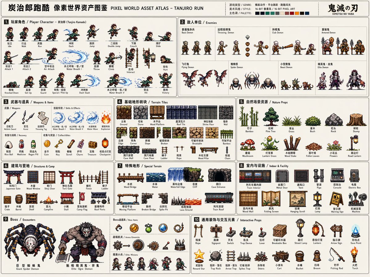
Diagram / Infographic
Please create a high-completion, high-information-density "Pixel World Asset Atlas" suitable for serialized release based on [Game Theme: {argument name="game theme" default="Demon Slayer/Tanjiro"}]. This is not a regular pixel illustration or a single game scene, but a "2D pixel game asset overview map" for game development, art setting, level design, and visual proposals. The visual should look like a complete game material board, systematically organizing core characters, enemies, items, terrain, scenes, mechanisms, Bosses, and decorative elements required for a [Game Type: {argument name="game type" default="Side-scrolling action"}] into a single clear, professional, and reusable game asset atlas. [Basic Settings] Theme Worldview: [Game Theme] Game Type: [Game Type] Era Background: [Era Background] Protagonist Identity: [Protagonist Identity] Enemy Types: [Enemy Types] Main Scenes: [Main Scene Environment] Overall Style: [Style Direction, e.g., {argument name="style" default="16-bit retro arcade pixel style"}] Main Color: [Main Color] Secondary Color: [Secondary Color] Accent Color: [Accent Color] Aspect Ratio: [Aspect Ratio, Landscape 4:3] If not filled, automatically match according to the optimal plan for the game theme. [Overall Visual Requirements] The visual uses a large landscape canvas with a light or low-interference background, looking like a game development asset sheet or an instruction-style resource catalog. All elements should be 2D pixel art sprites with uniform pixel density, clear black/dark outlines, limited color scales, and retro game textures. Do not generate realistic photography, 3D rendering, painterly illustration, or movie poster styles. Focus on being "systematically complete, clearly categorized, resource-rich, and high in developability." [Layout Structure] The map uses a modular grid layout with fine lines dividing different resource areas. Each area needs a numbered title and short category labels, with a reading path from left to right, top to bottom. The layout should have the orderliness of an instruction manual or game dev document. Information density must be high but not chaotic; elements within each module should be equidistantly arranged. [Modules to Include] 1. Player Character Module: Show complete action frames including standing, walking/running, jumping, etc. frames arranged horizontally like a sprite sheet. 2. Enemy Unit Module: Design multiple enemies including common, ranged, heavy, and elite units. 3. Weapons & Items Module: Show melee, ranged, projectiles, effects, and pickups. 4. Basic Terrain Tile Module: Show ground, walls, platforms, corners, and different material blocks. 5. Natural/External Scene Resource Module: Show trees, grass, rocks, and obstacles. 6. Building/Base/Camp Resource Module: Show doors, windows, walls, ladders, and camp facilities. 7. Special Terrain Module: Show bridges, water bodies, cliffs, and cave openings. 8. Indoor/Underground/Facility Resource Module: Show pipes, consoles, metal doors, and equipment. 9. Boss / Encounter Resource Module: Show large Bosses, special vehicles, and giant mechanisms. 10. General Decoration & Interaction Elements Module: Show ladders, ropes, signs, switches, and mechanisms. [Visual Detail Requirements] All resources must maintain consistent pixel size logic and worldview consistency. Clear scale relationships. Action frames must show continuity; terrain tiles must be tileable; items and mechanisms must have functional recognizability; Boss elements should feel oppressive.
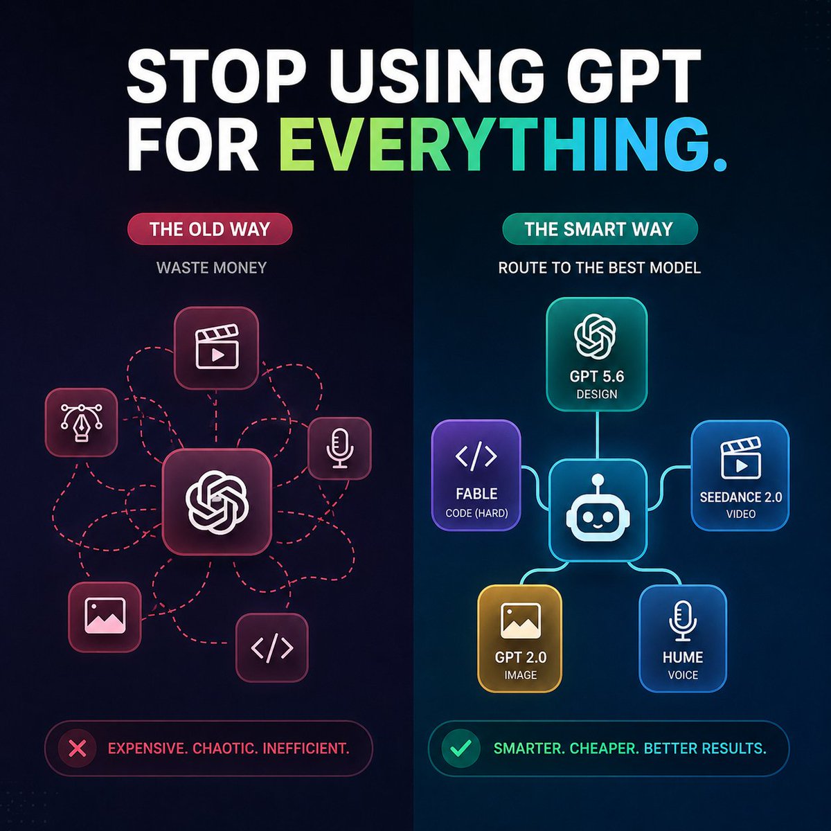
Diagram / Infographic
Create a square 1:1 dark futuristic tech infographic for social media comparing two AI workflow approaches. Canvas: 768x768 or similar, deep navy-to-black background with subtle dotted grid texture and a vertical split down the center. At the top, place a huge bold uppercase headline: “STOP USING GPT FOR {argument name="headline word" default="EVERYTHING"}.” The words “STOP USING GPT FOR” are white, and the final word is a left-to-right gradient from lime green to cyan-blue, with a cyan period. Use a clean heavy sans-serif font, high contrast, crisp vector-like rendering. Layout: two side-by-side columns. Left column is labeled as the bad workflow, right column as the improved workflow. The left side has a red/pink theme with a pill label reading “THE OLD WAY,” a small subtitle “WASTE MONEY,” and a central rounded-square GPT/OpenAI-style knot icon. Around it are exactly 5 smaller rounded-square task icons connected by messy red dashed routing lines: 1 video clapper/play icon at upper center, 2 design pen-nib/Bezier icon at left, 3 microphone icon at right, 4 image/photo icon at lower left, 5 code brackets icon at lower right. The messy dashed lines loop and cross, showing chaos. Right column has a teal/blue theme with a pill label reading “THE SMART WAY,” a small subtitle “ROUTE TO THE BEST MODEL,” and a central rounded-square robot router icon. Connect it with clean glowing solid lines to exactly 5 model cards: 1 top card with OpenAI knot icon labeled “GPT 5.6” and “DESIGN,” 2 left purple card with code brackets labeled “{argument name="coding model" default="FABLE"}” and “CODE (HARD),” 3 right blue card with clapper/play icon labeled “{argument name="video model" default="SEEDANCE 2.0"}” and “VIDEO,” 4 bottom-left gold card with image icon labeled “{argument name="image model" default="GPT 2.0"}” and “IMAGE,” 5 bottom-right blue card with microphone icon labeled “{argument name="voice model" default="HUME"}” and “VOICE.” Use rounded glassmorphism cards with neon outlines and soft glow. Bottom callouts: under the left column, place a red outlined rounded status bar with a red X icon and text “EXPENSIVE. CHAOTIC. INEFFICIENT.” Under the right column, place a teal/green outlined rounded status bar with a green check icon and text “SMARTER. CHEAPER. BETTER RESULTS.” Keep all text legible, centered, and aligned. Use strong contrast, modern SaaS marketing style, subtle gradients, neon highlights, no extra logos, no watermark, no additional text beyond the specified labels.
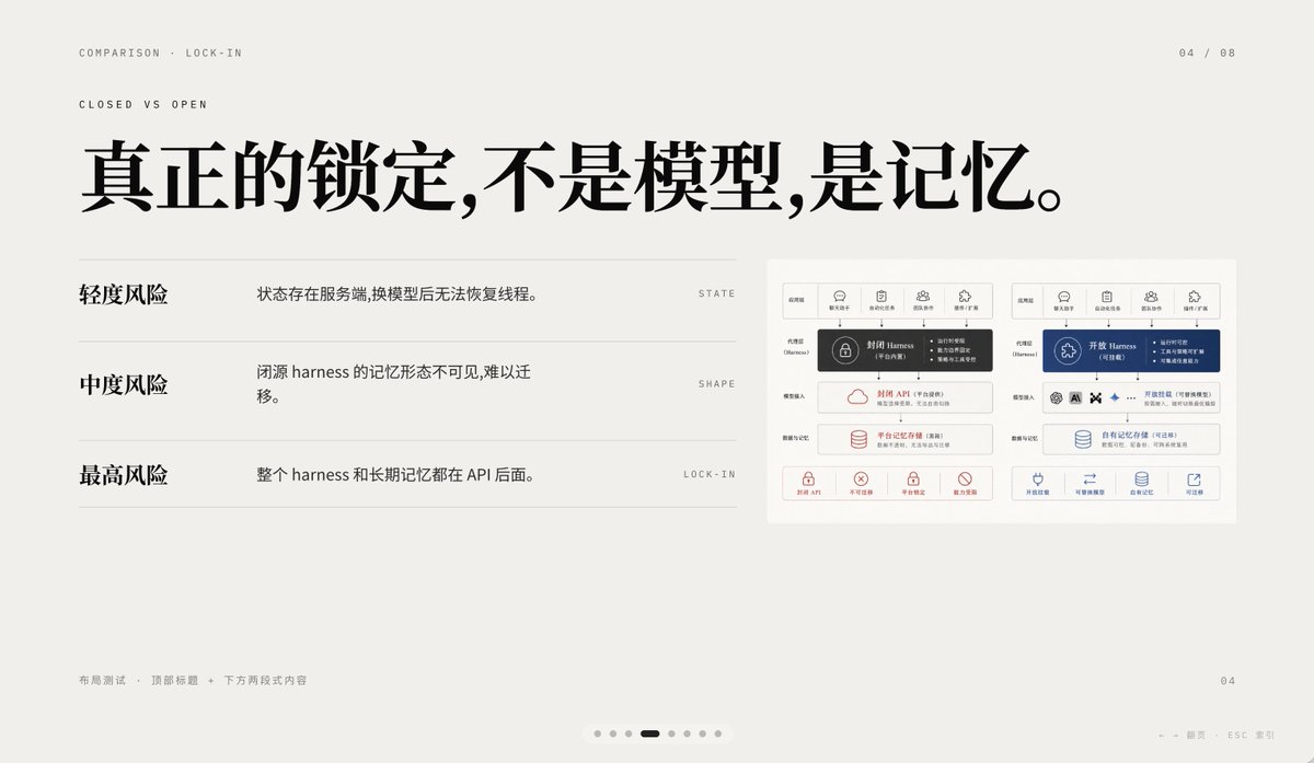
Diagram / Infographic
A minimalist editorial presentation slide in 16:9 format with a warm light-gray paper background, lots of negative space, refined Swiss-style grid layout, and high-end PPT/keynote design aesthetics. The slide is a comparison page about lock-in, using elegant Chinese typography mixed with tiny English navigation text. At the top left, place two small uppercase English breadcrumb lines: “COMPARISON · LOCK-IN” and below it “CLOSED VS OPEN”, in a thin sans-serif with wide tracking. At the top right, place the page indicator “04 / 08”. Center-left across the upper half, add a very large bold black Chinese headline: “真正的锁定,不是模型,是记忆。” On the left half below the headline, create a three-row comparison list separated by thin horizontal gray rules. Row 1 has the bold Chinese label “轻度风险” on the left, with the explanatory sentence “状态存在服务端,换模型后无法恢复线程。” to its right, and a tiny uppercase English keyword aligned far right: “STATE”. Row 2 has the bold label “中度风险”, with the sentence “闭源 harness 的记忆形态不可见,难以迁移。” and the far-right keyword “SHAPE”. Row 3 has the bold label “最高风险”, with the sentence “整个 harness 和长期记忆都在 API 后面。” and the far-right keyword “LOCK-IN”. On the right side of the slide, place a small inset comparison diagram card with a white background and subtle border, containing 2 side-by-side system architecture panels. The left panel represents a closed system in dark gray and muted red accents; the right panel represents an open system in deep blue accents. Each panel should have 5 small top icon tabs, a central highlighted harness block, several stacked rounded rectangular modules below, and a bottom row of 4 small capability icons with short Chinese labels. Keep the inset detailed but small, so it reads as a supporting visual rather than the main focus. At the bottom left, add tiny light-gray Chinese footer text: “布局测试 · 顶部标题 + 下方两段式内容”. At the bottom right, place a small page number “04”. Centered near the bottom edge, add a carousel indicator with exactly 7 small dots, where the 4th dot is a short dark rounded pill indicating the active slide and the other 6 dots are pale gray circles. Also add tiny faint navigation hints at the lower right edge reading “← → 翻页 ESC 关闭”. Use crisp vector text rendering, understated contrast, elegant spacing, and a calm premium infographic style suitable for a business presentation about AI platform comparison and API memory lock-in.
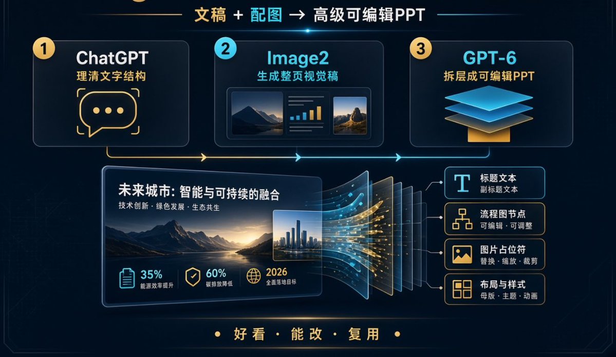
Diagram / Infographic
Goal: Create a dark futuristic Chinese workflow infographic slide showing how to turn written content plus images into an advanced editable PPT, with a premium tech presentation aesthetic. Canvas: Wide 16:9 horizontal slide, deep navy/black background with subtle circuit-line texture, thin glowing border, cyan and gold neon accents, soft bloom highlights, clean corporate SaaS style. Main headline: Centered at the top, use {argument name="headline text" default="文稿 + 配图 → 高级可编辑PPT"}. Highlight “文稿” in gold, “配图” in cyan, and the rest in white. Add a small cyan lens flare under the headline. Top workflow layout: Place exactly 3 large rounded rectangular cards across the upper half, connected by a glowing horizontal process line and arrows that run left to right. 1. Card 1: Yellow numbered circle “1”, title “ChatGPT”, subtitle “理清文字结构”, large gold chat-bubble icon with three dots. 2. Card 2: Cyan numbered circle “2”, title “Image2”, subtitle “生成整页视觉稿”, small mock visual preview containing exactly 3 inner panels: a landscape image, a mini bar-chart/text panel, and a second landscape image. 3. Card 3: Yellow numbered circle “3”, title “GPT-6”, subtitle “拆层成可编辑PPT”, layered floating blue sheets over a gold base icon. Central demonstration: In the lower middle-left, create one large tilted PPT slide mockup with rounded corners and glow. Slide title text: {argument name="demo slide title" default="未来城市:智能与可持续的融合"}. Slide subtitle: {argument name="demo slide subtitle" default="技术创新 · 绿色发展 · 生态共生"}. Inside the slide, show a cinematic mountain lake landscape at sunset, plus a small inset city skyline image on the right. Metric row inside the slide: Show exactly 3 metric items along the bottom of the slide: “35% 能源效率提升” with a clipboard icon in cyan, “60% 碳排放降低” with a shield/check icon in gold, and “2026 全面落地目标” with a globe icon in gold. Layer conversion effect: To the right of the central slide, show the slide splitting into multiple translucent editable layers, about 7 visible stacked panels, with flowing cyan and gold data particles moving from the slide into the layers. Editable output list: On the right side, create exactly 4 stacked rounded cards connected by thin lines to the separated layers: 1. “标题文本” with smaller text “副标题文本”, icon: large letter T. 2. “流程图节点” with smaller text “可编辑 · 可调整”, icon: flowchart nodes. 3. “图片占位符” with smaller text “替换 · 缩放 · 裁剪”, icon: image placeholder. 4. “布局与样式” with smaller text “母版 · 主题 · 动画”, icon: layout grid. Bottom slogan: Centered near the bottom, in gold Chinese characters with dot separators, use {argument name="bottom slogan" default="好看 · 能改 · 复用"}. Visual style: High-resolution presentation infographic, crisp vector-like UI, luminous cyan and warm gold strokes, glassmorphism cards, subtle depth and perspective, modern Chinese typography, clean spacing, no people, no logos, no watermark. Keep all listed text legible and preserve the exact counts: 3 top workflow cards, 3 metric items, 4 editable-output cards, and 7 visible separated layer panels.
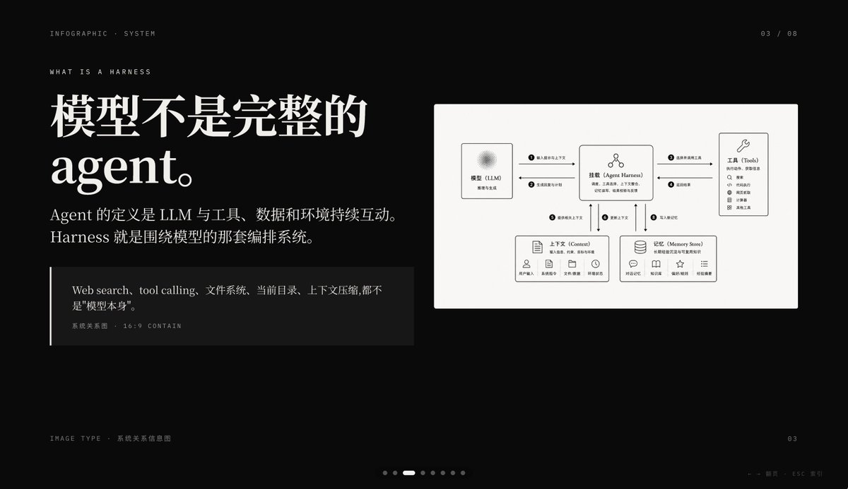
Diagram / Infographic
{"type":"dark editorial infographic slide","style":"premium keynote-style presentation page with minimalist Swiss-inspired layout, strong contrast, elegant serif headline paired with small uppercase sans-serif metadata, lots of negative space, cinematic black background, subtle grain, refined white typography, monochrome diagram card","aspect_ratio":"16:9","background":{"color":"deep black"},"layout":{"sections":[{"title":"top metadata","position":"top edge","count":3,"labels":["INFOGRAPHIC · SYSTEM","03 / 08","WHAT IS A HARNESS"]},{"title":"main text block","position":"left side","count":3,"labels":["模型不是完整的 agent。","Agent 的定义是 LLM 与工具、数据和环境持续互动。Harness 就是围绕模型的那套编排系统。","Web search、tool calling、文件系统、当前目录、上下文压缩, 都不是\"模型本身\"。"]},{"title":"diagram card","position":"right side","count":5,"labels":["模型(LLM)","挂载(Agent Harness)","工具(Tools)","上下文(Context)","记忆(Memory Store)"]},{"title":"footer","position":"bottom edge","count":4,"labels":["IMAGE TYPE · 系统关系信息图","03","← → 翻页 ESC 关闭","7 pagination dots with the 3rd highlighted"]}],"centerpiece":"a large off-white rectangular card on the right containing a clean systems diagram"},"typography":{"headline_font":"high-contrast editorial serif, oversized, bold","body_font":"modern serif for Chinese body copy","meta_font":"thin uppercase sans-serif with generous tracking"},"diagram":{"card_color":"warm light gray","border":"none or extremely subtle","line_style":"thin black connector arrows","icon_style":"simple outline icons","nodes":[{"name":"模型(LLM)","position":"upper left inside card","details":"small box with subtle radial texture behind the heading, subtitle suggests reasoning and generation"},{"name":"挂载(Agent Harness)","position":"upper center inside card","details":"central orchestration box with small person-like icon above title and short descriptive text below"},{"name":"工具(Tools)","position":"upper right inside card","details":"tall box with wrench icon and a vertical list of 8 tool items"},{"name":"上下文(Context)","position":"lower left inside card","details":"wide box with document icon, description line, and 5 small labeled icons along the bottom"},{"name":"记忆(Memory Store)","position":"lower right inside card","details":"wide box with database icon, description line, and 5 small labeled icons along the bottom"}],"connections":{"count":8,"description":"numbered circular markers on the connector arrows show the orchestration flow between the 5 nodes, including bidirectional links from the central harness to tools, context, and memory, plus one link from the model to the harness"}},"color_palette":{"count":4,"colors":["black background","white headline text","soft gray body text","warm light-gray diagram panel"]},"customization":{"headline":"{argument name=\"headline text\" default=\"模型不是完整的 agent。\"}","page_index":"{argument name=\"page number\" default=\"03 / 08\"}","section_kicker":"{argument name=\"section label\" default=\"WHAT IS A HARNESS\"}","diagram_topic":"{argument name=\"diagram topic\" default=\"系统关系信息图\"}","quote":"{argument name=\"quote\" default=\"Web search、tool calling、文件系统、当前目录、上下文压缩, 都不是\"模型本身\"。\"}"}}
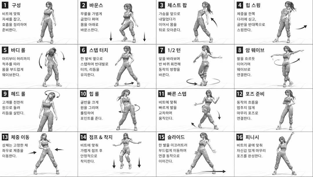
Diagram / Infographic
[STYLE] monochromatic grayscale illustration, 3D rendered character, clean instructional reference sheet, white background, comic-style cell grid layout, technical diagram aesthetic [LAYOUT] 4x4 grid layout, 16 panels total, each panel separated by thin black border lines, numbered cells from 1 to 16, consistent panel size [CHARACTER] {argument name="character" default="young female dancer, athletic build, ponytail hairstyle, crop top and baggy pants, sneakers"}, same character in all panels [PANEL STRUCTURE - per cell] top-left: bold number badge + {argument name="title" default="Korean title text"} center: full-body character pose illustration bottom-left: {argument name="description" default="Korean description text (3-4 lines)"} overlay: directional arrows indicating movement direction [ARROWS / MOTION INDICATORS] curved arrows, straight arrows, circular rotation indicators, placed around the character to show movement flow and direction [RENDERING STYLE] high detail 3D sculpt style, soft studio lighting, subtle shadows, no color, grayscale shading, clean linework, game concept art quality [NEGATIVE] no background scenery, no color tones, no extra characters, no cluttered backgrounds
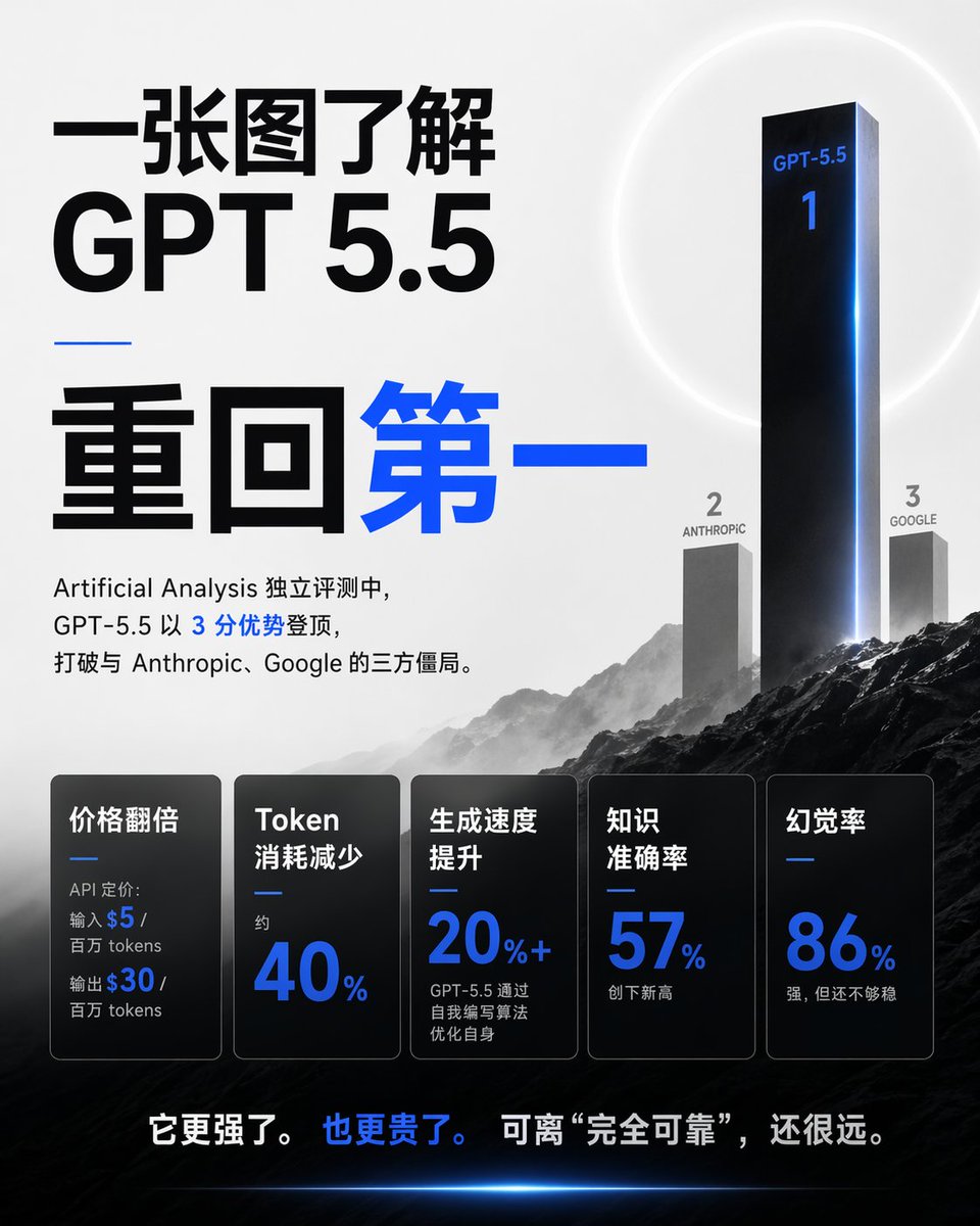
Diagram / Infographic
Goal: Create a square 1:1 Chinese tech-news infographic poster explaining {argument name="topic" default="GPT 5.5"} in 30 seconds, with a dramatic AI benchmark ranking theme. Canvas: 768×768 square poster, light gray-to-white background in the upper half, dark cinematic mountain landscape in the lower half, high contrast black typography with electric blue accents. Layout: Left side is dominated by huge Chinese headline typography. Right side shows a 3D benchmark podium/ranking scene rising from mountains. Bottom third contains exactly 5 dark translucent metric cards in a row. Very bottom has one bold Chinese conclusion sentence. Main headline text: Use large black Chinese text at top left: 「一张图了解」. Directly below it, huge black Latin text: 「GPT 5.5」. Under a short thin blue horizontal divider, use oversized Chinese text: 「重回第一」, with 「重回」 in black and 「第一」 in bright blue. Intro paragraph under the headline: 「Artificial Analysis 独立评测中,GPT-5.5 以 3 分优势登顶,打破与 Anthropic、Google 的三方僵局。」 Keep the number 3 in blue and the rest mostly black. Ranking scene: Create exactly 3 vertical ranking pillars on the right, integrated into misty mountains. Rank 1 is a very tall glossy black monolith with blue rim lighting, labeled 「GPT-5.5」 near the top and a large blue 「1」 below it. Rank 2 is a shorter gray monolith to the left labeled 「2」 and 「ANTHROPIC」. Rank 3 is a shorter gray monolith to the right labeled 「3」 and 「GOOGLE」. Add a faint white circular halo behind the first-place monolith and a blue glow along its right edge. Metric cards: Add exactly 5 rounded rectangular black/charcoal glass cards across the lower third, each with a thin border, subtle gradient, and a small blue divider line. The 5 cards are: 1) 「价格翻倍」 with small text 「API 定价: 输入 $5 / 百万 tokens 输出 $30 / 百万 tokens」 where $5 and $30 are blue; 2) 「Token 消耗减少」 with small 「约」 and huge blue 「40%」; 3) 「生成速度提升」 with huge blue 「20%+」 and small text 「GPT-5.5 通过自我编写算法优化自身」; 4) 「知识准确率」 with huge blue 「57%」 and small text 「创下新高」; 5) 「幻觉率」 with huge blue 「86%」 and small text 「强,但还不够稳」. Bottom conclusion: Centered near the bottom over the dark landscape, write 「它更强了。 也更贵了。 可离 “完全可靠”,还很远。」 with 「也更贵了。」 in blue and the rest white. Visual style: Premium editorial AI benchmark poster, sharp modern sans-serif typography, monochrome palette with electric blue highlights, cinematic fog, dark rocky mountains, subtle lens glow, clean spacing, realistic 3D monoliths, no people, no logo, no watermark. Parameters: The main customizable subject is {argument name="model name" default="GPT-5.5"}; the ranking lead score can be {argument name="advantage text" default="3 分优势"}; the rank 2 competitor is {argument name="second competitor" default="Anthropic"}; the rank 3 competitor is {argument name="third competitor" default="Google"}; the bottom message can be {argument name="conclusion text" default="它更强了。也更贵了。可离 “完全可靠”,还很远。"}.
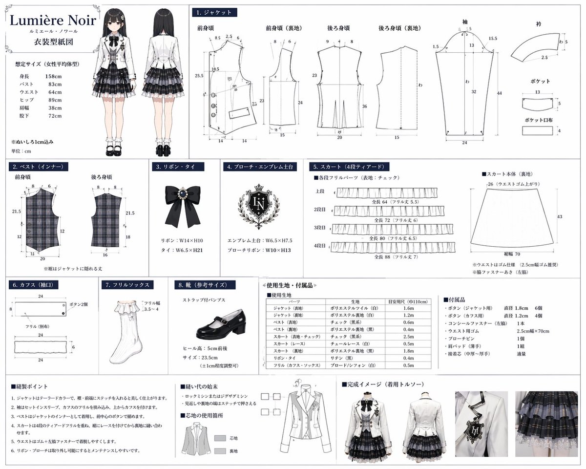
Diagram / Infographic
{ "type": "costume design and sewing pattern reference sheet", "header": { "title": "{argument name=\"brand name\" default=\"Lumière Noir\"}", "subtitle": "ルミエール・ノワール", "document_type": "{argument name=\"document title\" default=\"衣装型紙図\"}", "character_illustration": { "count": 2, "poses": ["front view", "back view"], "description": "{argument name=\"character type\" default=\"anime girl with long black hair\"} wearing a {argument name=\"outfit style\" default=\"monochrome idol uniform with white jacket and plaid skirt\"}" }, "size_chart": "list of 6 body measurements" }, "layout": { "grid_sections": [ { "id": "1", "title": "1. ジャケット", "description": "Jacket pattern pieces with measurement lines", "piece_count": 8, "labels": ["前身頃", "前身頃 (裏地)", "後ろ身頃", "後ろ身頃 (裏地)", "袖", "衿", "ポケット", "ポケット口布"] }, { "id": "2", "title": "2. ベスト(インナー)", "description": "Plaid vest pattern pieces", "piece_count": 2, "labels": ["前身頃", "後ろ身頃"] }, { "id": "3", "title": "3. リボン・タイ", "description": "Black ribbon tie illustration with jewel", "piece_count": 1 }, { "id": "4", "title": "4. ブローチ・エンブレム土台", "description": "Ornate crest emblem illustration", "text_detail": "{argument name=\"emblem initials\" default=\"LN\"}", "piece_count": 1 }, { "id": "5", "title": "5. スカート(4段ティアード)", "description": "Skirt pattern pieces", "piece_count": 5, "labels": ["上段", "2段目", "3段目", "4段目", "スカート本体 (裏地)"] }, { "id": "6", "title": "6. カフス(袖口)", "description": "Cuff pattern pieces", "piece_count": 3 }, { "id": "7", "title": "7. フリルソックス", "description": "White frill sock illustration", "piece_count": 1 }, { "id": "8", "title": "8. 靴(参考サイズ)", "description": "Black strap pump shoe illustration", "piece_count": 1 } ], "bottom_sections": [ { "title": "使用生地・付属品", "description": "Materials and accessories list", "elements": [ {"type": "fabric table", "rows": 10}, {"type": "accessories list", "items": 7} ] }, { "title": "縫製ポイント & 完成イメージ", "description": "Sewing instructions and final product photos", "elements": [ {"type": "instruction list", "count": 6}, {"type": "diagrams", "count": 2, "description": "seam finishing and interfacing guides"}, {"type": "mannequin photos", "count": 4, "poses": ["front full", "front half", "back half", "detail shot"]} ] } ] } }
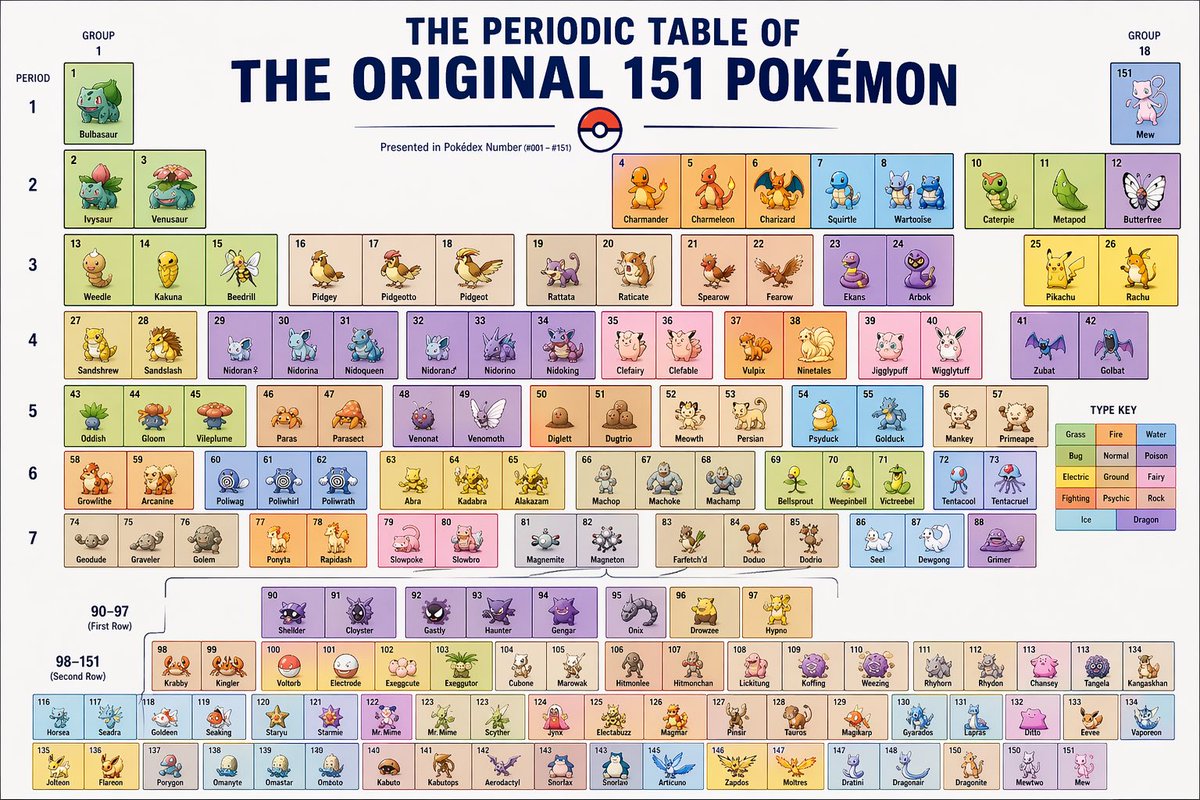
Diagram / Infographic
the periodic table of {argument name="subject" default="Pokémon"}
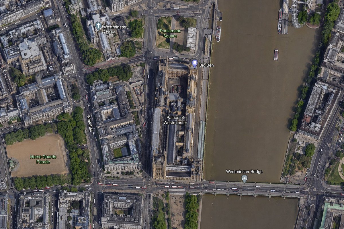
Diagram / Infographic
A high-resolution top-down satellite map view of central {argument name="city" default="London"}, focused tightly on the area around {argument name="landmark" default="Big Ben"} and the Palace of Westminster beside the River Thames. Show a realistic aerial orthographic perspective like a modern digital map or satellite layer, with detailed rooftops, streets, trees, shadows, and brownish river water. Place the long Palace of Westminster complex vertically near the center-right, directly along the west bank of the river, with Big Ben at the northeast corner of the palace near the river edge. A bridge labeled {argument name="bridge name" default="Westminster Bridge"} crosses horizontally near the bottom of the frame from left to right over the river. Include 6 visible map labels total: {argument name="label 1" default="Westminster Abbey"}, {argument name="label 2" default="Parliament Square"}, Big Ben, Palace of Westminster, Westminster Bridge, and Horse Guards Parade. Also show Whitehall as a labeled road running vertically on the left side of the palace area. Surrounding details should include Westminster Abbey in the upper left quadrant, Parliament Square above the palace, Horse Guards Parade as a large sandy rectangular ground in the lower left quadrant, dense city blocks and roads on the left half, the River Thames occupying the full right side, embankments on both sides, a few boats on the river, and tree-lined streets and parks. Use natural satellite-image colors, crisp cartographic label overlays, and the look of a zoomed-in online maps screenshot.
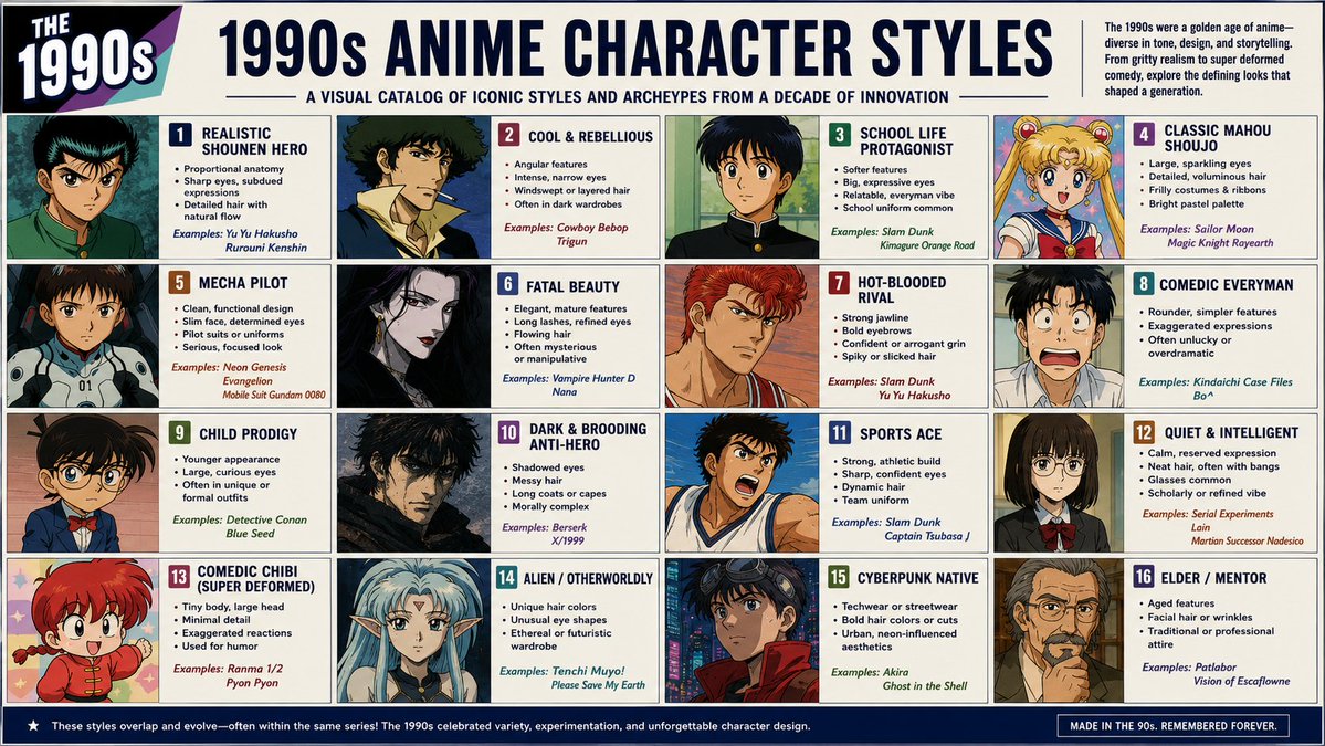
Diagram / Infographic
Create an English infographic catalog poster showing {argument name="era" default="1990s"} anime character styles in a clean labeled grid layout, each panel featuring a different archetype and visual language. Use 16:9 aspect ratio.
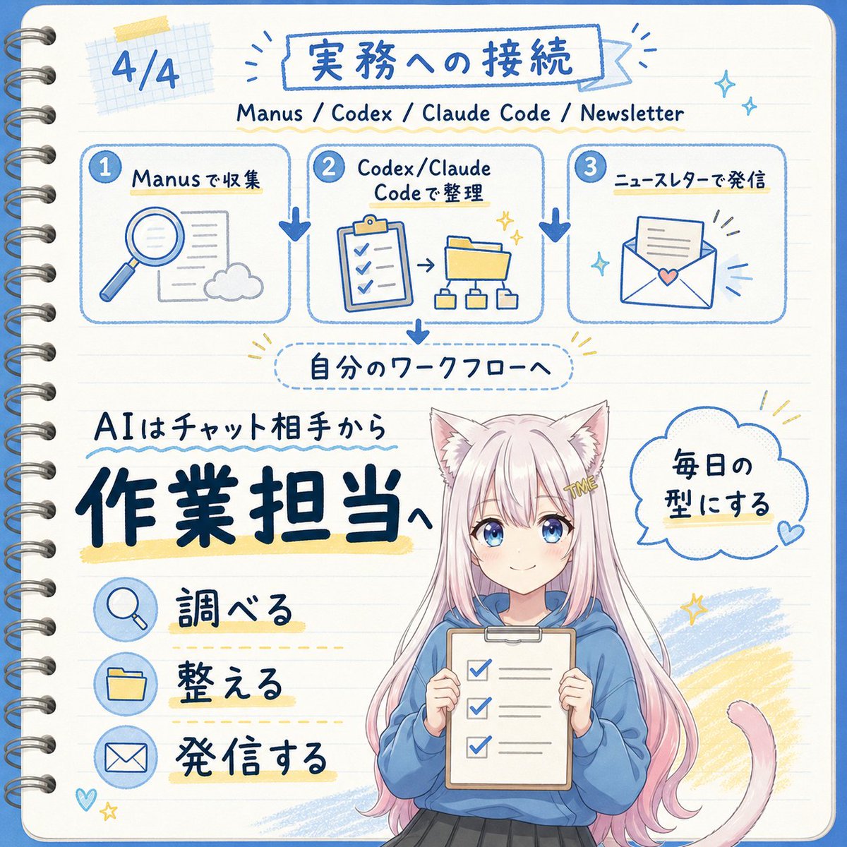
Diagram / Infographic
Goal: Create a square, hand-drawn Japanese notebook-style infographic about turning AI from a chat partner into an operations/work assistant, with a cute anime mascot at the bottom. Canvas: 1:1 square image, cream lined notebook paper background with rounded corners, blue border line, visible metal spiral binding along the left edge, soft grid-paper tape decoration near the top left, and blue/yellow pen-marker accents. Overall look should be clean, friendly, handwritten, and sketchnote-like. Text content: Use Japanese handwritten lettering. Top left page marker: “4/4”. Main title inside a blue outlined banner: {argument name="main title" default="実務への接続"}. Subtitle beneath it: “Manus / Codex / Claude Code / Newsletter”. Mid-page label in a dotted rounded rectangle: “自分のワークフローへ”. Large main message on the lower left: “AIはチャット相手から” above very large bold navy text {argument name="main message" default="作業担当へ"}. Speech bubble on the right of the character: {argument name="speech bubble text" default="毎日の型にする"}. Layout: Top third contains exactly 3 connected workflow cards in a horizontal row, each with a numbered blue circle and rounded blue outline. Card 1 is labeled “Manusで収集” and shows a magnifying glass, document, and cloud icon. Card 2 is labeled “Codex/Claude Codeで整理” and shows a clipboard checklist, arrow, folder, and small hierarchy diagram. Card 3 is labeled “ニュースレターで発信” and shows an envelope with a paper and small heart. Add thick blue downward arrows between the cards and another blue arrow down from the center card to the dotted workflow label. Lower section: On the left, place exactly 3 action rows with circular blue icons and Japanese labels: 1) magnifying glass icon with “調べる”, 2) folder icon with “整える”, 3) envelope icon with “発信する”. Underline or highlight each label with pale yellow marker strokes and dotted guide lines. Character details: Bottom center-right features a cute anime cat-eared girl mascot from about knees up, with long pastel pink hair, white cat ears, a pink cat tail curling to the right, and a small gold hair clip reading “ME”. She wears a loose blue hoodie and dark skirt, holding a clipboard checklist with exactly 3 checked boxes. Keep the face area intentionally covered by a plain beige rectangular mask, as if anonymized. Use {argument name="character hair color" default="pastel pink"} hair and {argument name="hoodie color" default="blue"} hoodie if customized. Visual style: Blue ink line art with occasional navy bold lettering, pale yellow highlights, soft sky-blue scribble fills, small sparkles, hearts, and radiating accent lines. Use a cheerful educational newsletter aesthetic, like a hand-drawn planner page mixed with kawaii anime illustration. Maintain legible text, balanced spacing, and no photorealism. Constraints: Include exactly 3 workflow cards and exactly 3 action rows. Do not add extra panels, extra numbered steps, watermarks, logos, or English translations on the image beyond the subtitle line.
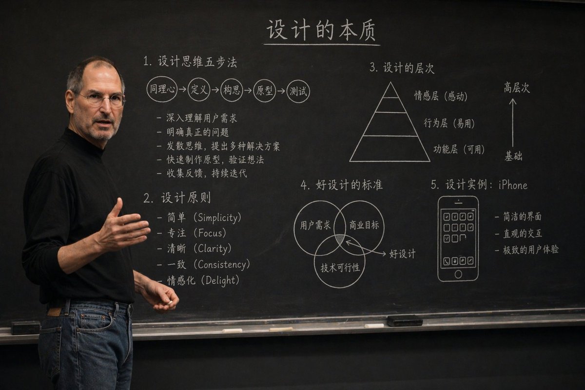
Diagram / Infographic
Generate a realistic university classroom photo, iPhone 16 quality, {argument name="teacher" default="Teacher XX"} teaching {argument name="subject" default="XX knowledge"}, with detailed and clear chalk explanations and helpful diagrams on the blackboard, no students required.
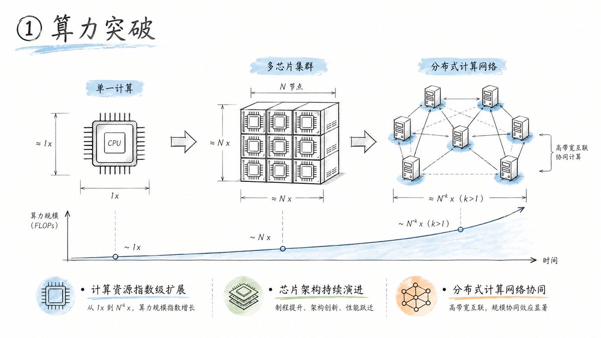
Diagram / Infographic
- Pure white background, plenty of negative space - Engineering drawing line style (delicate, precise) - Handwritten title (dark gray) - Engineering annotation style to display steps - Light blue, light green, and light orange watercolor accents (high transparency) - Modern feel similar to Apple/Tesla product design sketches - Concise icons with step-by-step descriptions - Clean, professional, and tech-savvy