Product / Advertising
Farnese Gelateria Brand Board
Goal: Create a premium accessible gelateria brand identity presentation for Farnese, inspired by the landscape and culture of Governador Valadares: Ibituruna Peak, free flight/paragliding, warm sun, hills, vegetation, and an old industrial smokestack.
Fields you can change: brand name, descriptor text, primary burgundy.
Full prompt
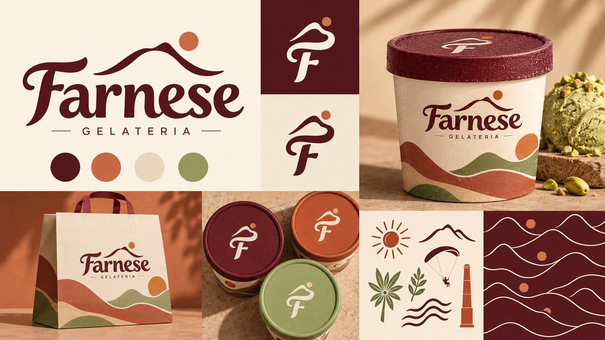
Goal: Create a premium accessible gelateria brand identity presentation for {argument name="brand name" default="Farnese"}, inspired by the landscape and culture of Governador Valadares: Ibituruna Peak, free flight/paragliding, warm sun, hills, vegetation, and an old industrial smokestack. The overall feeling is artisanal, contemporary, warm, and refined.
Canvas: Wide horizontal brand board, 16:9 ratio, arranged as a clean collage grid on a warm cream background with realistic mockup photography mixed with flat vector assets.
Layout: Use exactly 8 visible panels. Panel 1 is a large logo panel on the upper left occupying about two-fifths of the width and half the height. Panel 2 is a small burgundy square logo mark tile near the top center. Panel 3 is a small cream logo mark tile directly beneath it. Panel 4 is a large ice cream pint mockup on the upper right. Panel 5 is a shopping bag mockup on the lower left. Panel 6 is a group of three small gelato cup lids in the lower middle. Panel 7 is a cream icon sheet in the lower right-middle. Panel 8 is a burgundy repeating pattern tile on the far lower right.
Logo details: The main wordmark reads {argument name="brand name" default="Farnese"} in an elegant custom serif script with thick and thin strokes, deep burgundy color, and a slightly old-world Italian gelateria feel. Above the wordmark, place a minimalist mountain silhouette line with a round sun dot near the right peak, suggesting Ibituruna Peak. Below the wordmark, write {argument name="descriptor text" default="GELATERIA"} in widely spaced uppercase sans serif letters, flanked by two thin horizontal lines.
Color palette: Show exactly 4 circular swatches beneath the main logo: 1 deep burgundy, 2 burnt terracotta orange, 3 warm cream beige, 4 muted olive green. Use {argument name="primary burgundy" default="#5A0D17"}, terracotta, cream, and olive throughout the board.
Brand mark tiles: Show exactly 2 simplified monogram logo mark tiles. The mark combines a flowing mountain/paraglider curve and a lowercase-style F. The top tile has a deep burgundy background with a cream monogram and a small terracotta dot. The bottom tile has a cream background with a burgundy monogram and terracotta dot.
Product mockups: Include exactly 4 branded physical items: 1 large gelato pint on the upper right with a burgundy lid, 1 paper shopping bag on the lower left, and 2 visible small gelato cups in the lower middle, plus 1 third small cup lid partially overlapping in muted olive. The pint and bag both carry the full {argument name="brand name" default="Farnese"} logo and layered wavy landscape bands in terracotta, olive, and burgundy. Add realistic paper/cardboard texture, speckled print grain, warm sunlight, and soft shadows. On the upper-right product scene, include one scoop of pale green pistachio gelato on a small stone slab and scattered pistachios.
Icon sheet: Include exactly 7 simple line icons on a cream panel: 1 radiating sun, 1 mountain outline, 1 paraglider with a tiny pilot, 1 palm-like plant, 1 small leafy branch, 1 industrial smokestack tower, and 1 stack of three wavy landscape lines. Draw them in burgundy, terracotta, and olive with clean vector strokes.
Pattern tile: Create a deep burgundy square pattern filled with repeated cream wavy mountain lines and terracotta sun dots. Use exactly 5 horizontal wave-line rows and 3 terracotta sun dots distributed vertically.
Visual style: High-end branding case-study aesthetic, warm Mediterranean gelato packaging, natural materials, tactile print textures, cohesive grid composition, soft studio sunlight, refined contrast, no people, no clutter, no extra text beyond the brand name and descriptor.