A clean educational infographic poster explaining "{argument name="topic" default="Topic"}".
[Overall Style]
Modern minimalist UI style, background in soft light colors (e.g., cream #FAF7F2 / light gray-blue), restrained and comfortable color palette suitable for long reading sessions.
[Core Requirements (Key)]
Naturally organize content modules based on the information structure of the "topic". Do not force a fixed number or order of modules; prioritize clear logical information over formal symmetry.
[Layout (Adaptive)]
- Use grid layout (auto-select 2 columns / 3 columns / irregular distribution)
- Card count adjusts based on content (usually 5–9)
- High information density modules can be enlarged (higher visual weight)
- Simple modules can be shrunk or merged
[Card Design]
- White cards (#FFFFFF)
- Rounded corners + subtle shadows (soft layering)
- Maintain uniform spacing and alignment
[Each Information Module Includes]
- Simple illustrations (unified style)
- Clear headings (strong hierarchy)
- 1–3 core explanatory sentences (avoid wordiness)
- Examples / comparisons / summaries provided where necessary
[Content Organization Principles (Emphasis)]
Auto-select appropriate structure based on theme, e.g.:
- Concept type → definition + principle + characteristics + example
- Contrast type → A vs B (comparative structure)
- Process type → steps / flowcharts
- System type → components + relationships
- Skill type → methods + tips + common mistakes
[Visual Hierarchy]
- Title > Module Title > Main Text > Supporting Information
- Important info can be highlighted with color or icons
[Color Suggestions]
- Primary color: Choose based on theme (Tech=Blue, Learning=Green, Warning=Orange)
- Secondary colors: 1–2 types suffice
- Avoid high saturation and flashiness
[Style Requirements]
- Generous negative space, strong sense of "breathability"
- Unified icons (linear or flat)
- High readability as priority
- Clear educational orientation
[Extra Optimization (Optional)]
- Can include: comparison blocks / process arrows / structure diagrams
- Can have a "Core Summary" module as a visual finale.
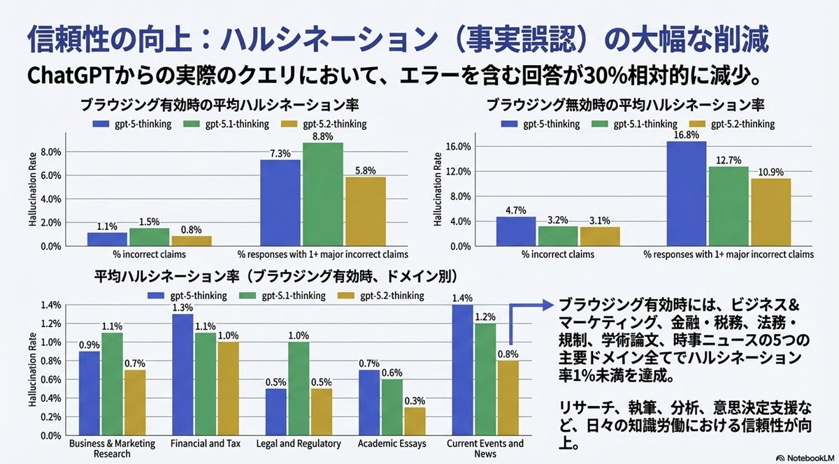
Completely reproduce the attached image as a single slide in a pptx file.
Make the text fully editable, and crop and use the diagrams and graphs from the original image as they are.
Generate an image that clearly summarizes the following {argument name="news_source_en" default="Yahoo News"} article in a single slide, using diagrams and illustrations.
---
{argument name="news_body_en" default="{paste the Yahoo News article here}"}
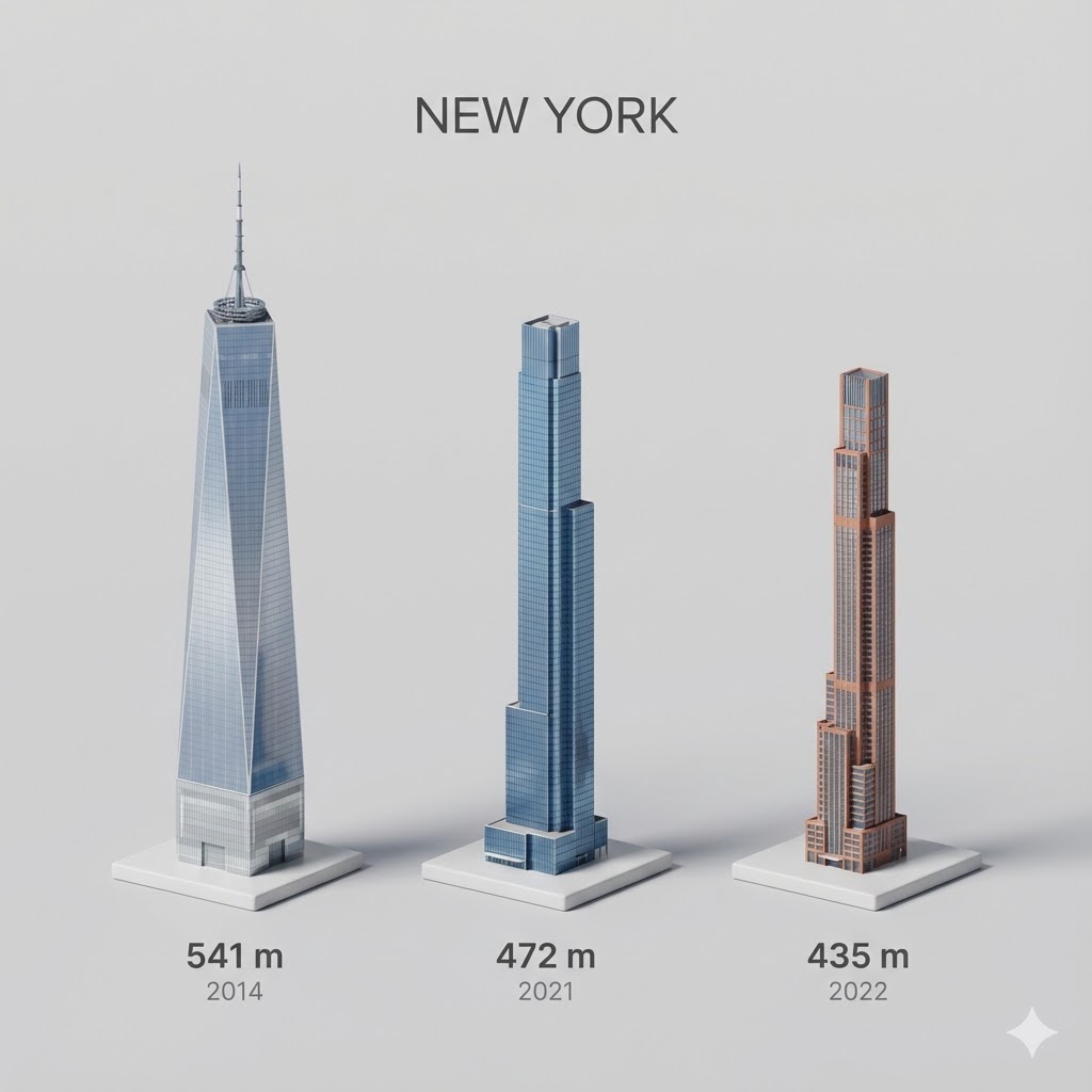
Present a clear, side miniature 3D cartoon view of the tallest buildings in {argument name="city in English" default="YOUR CITY"}. Use minimal textures with realistic materials and soft, lifelike lighting and shadows. Use a clean, minimalistic composition showing exactly the three tallest buildings in {argument name="reference city in English" default="Sopot"}, arranged from left to right in strict descending height order. The tallest must appear visibly tallest, the second must be clearly shorter than the first, and the third must be clearly shorter than the second.
All buildings must follow accurate relative proportions: if a building is taller in real life, it must be taller in the image by the same approximate ratio. No building may be visually stretched or compressed.
Each building should stand separately on a thin, simple ceramic base. Below each base, centered text should display:
Height in meters — semibold sans-serif, medium size
Year built — lighter-weight sans-serif, smaller size, directly beneath the height text
Provide consistent padding, spacing, leading, and kerning. Write “{argument name="city name title" default="YOUR CITY NAME"}” centered above the buildings, using a medium-sized sans-serif font.
No building top should overlap or touch the text above. Use accurate architectural proportions based on real-world references. Maintain a consistent camera angle and identical scale for each building model.
No forced perspective. Use straight-on orthographic-style rendering. Do not exaggerate or stylize size differences beyond proportional accuracy.
Use a square 1080×1080 composition. Use a clean, neutral background. Ensure no extra objects are present.
I want an illustrated diagram explaining the roles of dopamine and D2 receptors in the synaptic cleft between neurons, and how they relate to schizophrenia. Antipsychotic drugs exert their effects by blocking D2 receptors. Please diagram this for the three cases: healthy person | hallucination and delusion state | under antipsychotic medication. Generate a horizontally oriented image.