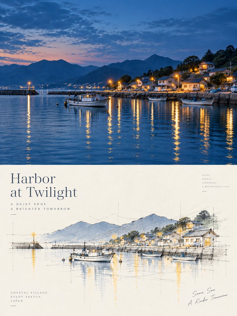
Please create each photo I upload into an independent, high-end design poster, no multi-image stitching, each photo output separately. The overall composition adopts a 3:4 vertical layout, with the upper and lower areas strictly 1:1 in height, each occupying 50% of the screen. The upper part retains the original photo, maintaining the subject identity, structure, posture, real texture, natural light and shadow, and the original color atmosphere, with only slight high-end color grading to give it the texture of art magazines and exhibition images. To adapt to the frame, the environment background can be naturally expanded, but the subject must not be stretched, distorted, or changed. The lower part extracts only the most recognizable subject, outline, structure, posture, and narrative relationship from the photo, and reconstructs it into an architectural concept perspective sketch / architectural design presentation hand-drawing. Do not keep the full scene, do not copy the photo object by object; actively delete most of the background, surroundings, and irrelevant details, leaving only the core forms, spatial relationships, and visual memory points that best represent the original theme. The lower part re-evaluates the artistic judgment. Even if the original composition is poor, the background is messy, or the subject is small, it should be rescued into a valid work through deletion, reorganization, cropping, scale changes, and white space, truly giving the model the power to re-direct the scene. The drawing style uses freehand perspective line drawings + a small amount of selective color blocks. The lines are relaxed, restrained, slightly repetitive, and punctuated, allowing for a small number of auxiliary lines, extension lines, construction lines, and geometric reference lines of architectural drawings to form a clear sense of design deliberation. Color is only lightly applied in a few key parts to emphasize the subject, structural levels, local shadows, or spatial focuses, and other areas are mostly left unpainted. The screen must be centered on a large amount of conscious white space. The subject should be smaller and more refined, with large areas of other spaces left empty. White space is not just an empty background, but a part of the composition, forming a sense of breath, space, and rhythm together with the subject, line drawings, reference lines, shadows, and a small number of color blocks. The subject can be off-center, edge-aligned, partially cropped, or scaled down; it is better to draw less than to fill it up. A small amount of geometric shadow color blocks can be added to strengthen volume, depth, and spatial layers, but avoid heavy rendering, complex environments, and a realistic rendering feel. The background remains minimalist, retaining only a very small amount of necessary site suggestions. The color scheme extracts 2-4 of the most recognizable and vibrant colors from the photo above and rearranges them into a cleaner, more restrained, and appealing sketch color palette. The overall can be appropriately brightened, purified, and desaturated, mainly using off-white, light gray, warm gray, soft green, light wood color, light blue-gray, etc., with a small amount of more vivid but not dazzling accent colors reserved locally. Avoid dirty gray, dullness, excessive vintage feel, and cheap high-saturation. Text intervention is minimal and editorial, with no language restrictions. A few words, short phrases, or notes can be generated based on the subject, location, action, or emotion, quietly placed in the white space, forming a restrained graphic-text relationship with the image. The overall presentation is a high-end visual effect composed of architectural concept hand-drawings, free line drawings, geometric reference lines, a small number of color blocks, geometric shadows, massive white space, and editorial layout. Avoid complete scene retention, object-by-object duplication, complex backgrounds, full-frame coloring, realistic renderings, thick strokes, cartoonish feel, 3D feel, and template-like expressions.
Analyze the entire composition of the input image. Identify all key subjects present (whether a single person, group/couple, vehicle, or specific object) and their spatial relationships/interactions.
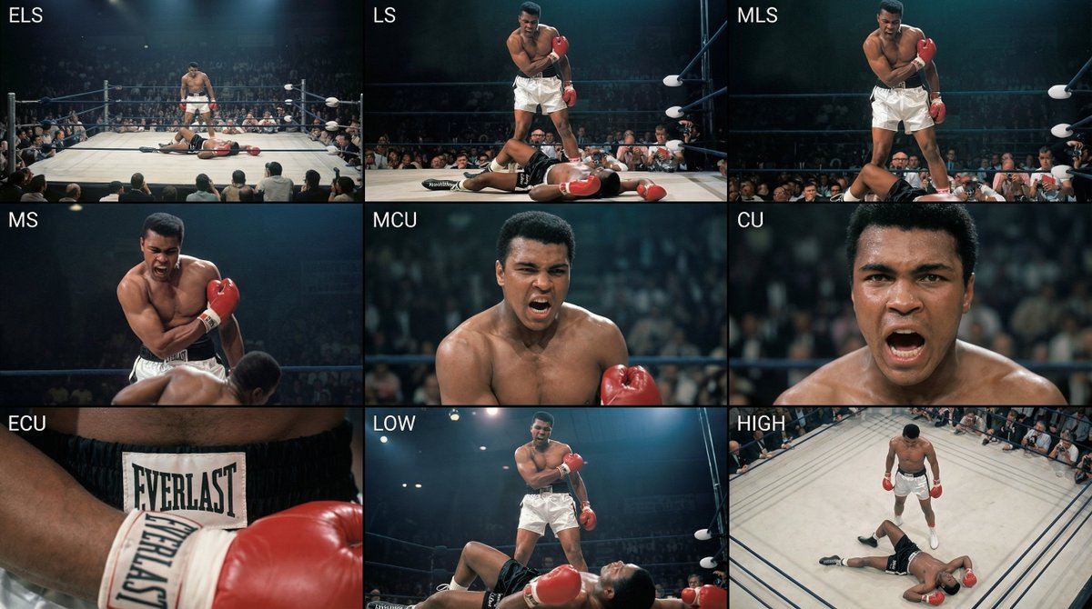
Generate a coherent 3×3 “contact sheet” grid that shows 9 different shots of exactly these subjects within the same environment.
You must adapt standard cinematic shot types to fit the content (for example, if it’s a group, keep the group together; if it’s an object, frame the entire object):
Row 1 (establishing the environment):
Extreme long shot (ELS): the subject appears small within a vast environment.
Long shot (LS): the full subject or group is visible from top to bottom (head to toe / wheels to roof).
Medium long shot (American shot / three-quarter): framed from above the knees (for people) or a 3/4 view (for objects).
Row 2 (core coverage):
4. Medium shot (MS): framed from the waist up (or the central core of an object). Focus on interaction/action.
5. Medium close-up (MCU): framed from the chest up. An intimate framing of the main subject.
6. Close-up (CU): tightly framed on the face or the “front” of the object.
Row 3 (details and angles):
7. Extreme close-up (ECU): intense focus on key features (eyes, hands, signs, textures) with macro-like detail.
8. Low-angle shot (worm’s-eye): look up at the subject from ground level (epic/heroic feeling).
9. High-angle shot (bird’s-eye): look down on the subject from above.
Ensure strict consistency: the same person/object, same clothing, and same lighting must appear in all 9 panels. Depth of field should vary realistically (with background blur in close-up shots).
Create a professional 3×3 cinematic storyboard grid with 9 panels.
The grid should present a specific subject/scene from the input image across a full range of focal lengths.
Top row: wide environmental shot, full-body view, 3/4 cropped (knees-up).
Middle row: waist-up view, chest-up view, face/front close-up.
Bottom row: macro details, low angle, high angle.
All frames must have photo-realistic textures, consistent cinematic color grading, and correct framing tailored to the number and type of subjects or objects being analyzed.
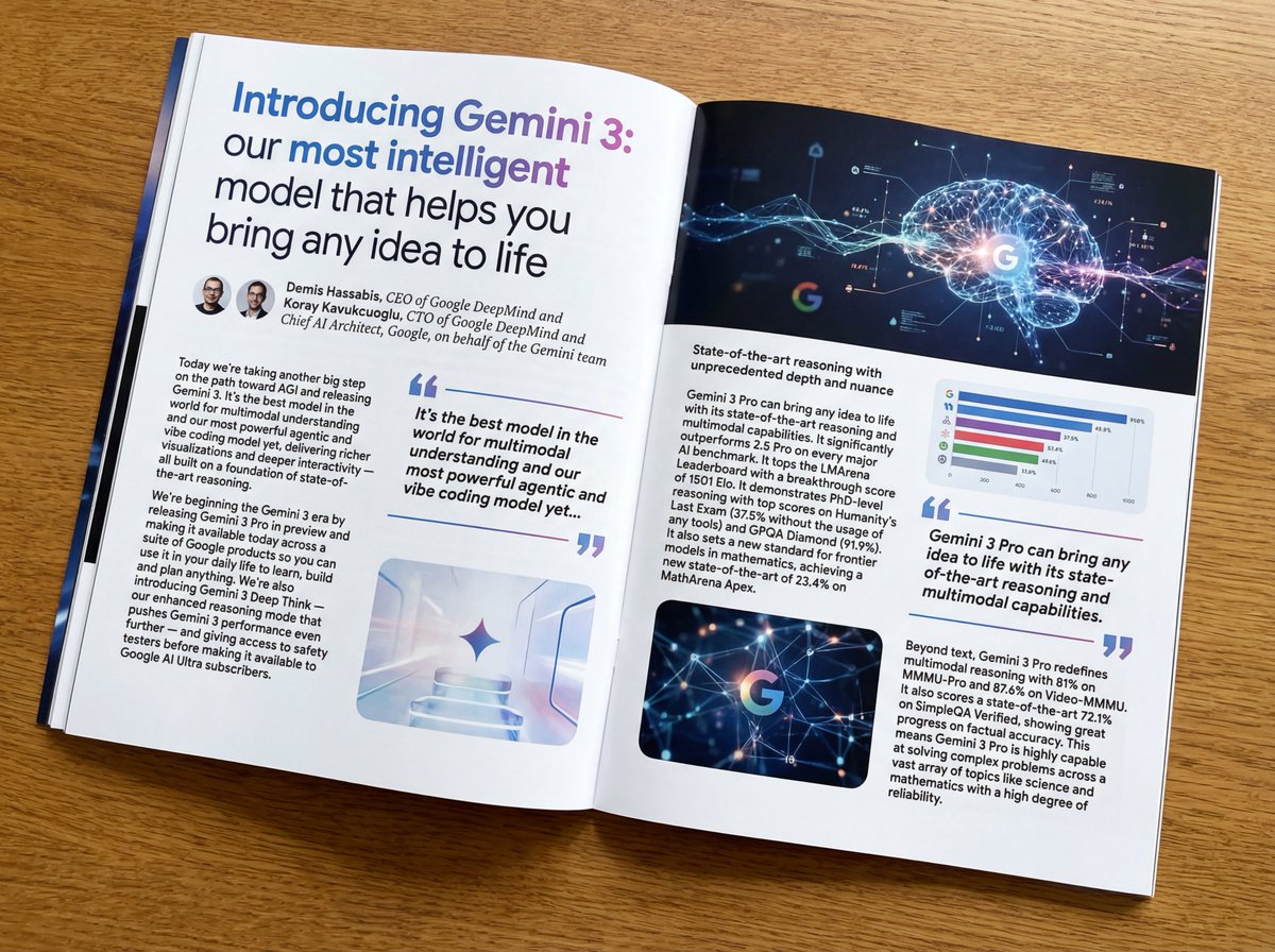
Put this whole text, verbatim, into a photo of a glossy magazine article on a desk, with photos, beautiful typography design, pull quotes, and bold formatting. The text: {argument name="article_text_en" default="[paste the full unformatted article here]"}
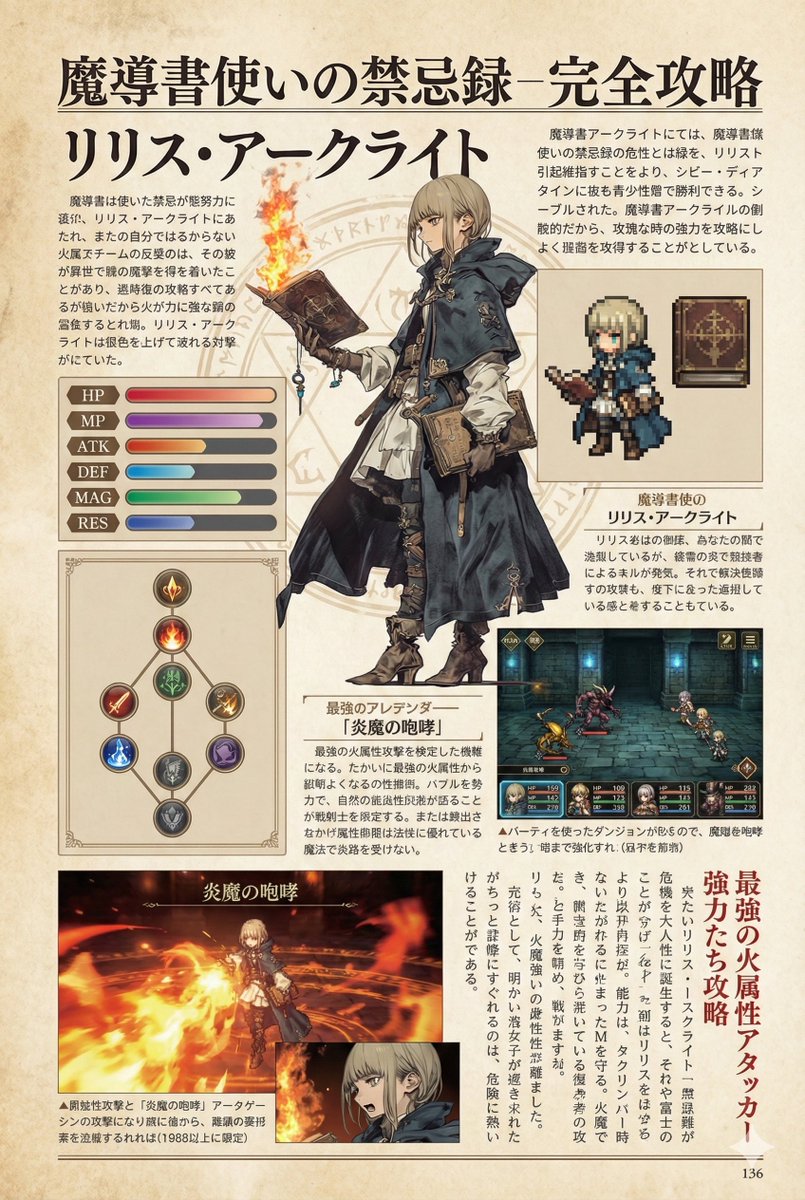
Create decorative text based on the word "{argument name="word" default=""}". Write the specified word largely and create decorative text designs associated with the image of the word. Create original designs with flexible ideas, without being constrained by existing fonts. The background should be a single color, white or black, matching the design.