Editorial / Interface
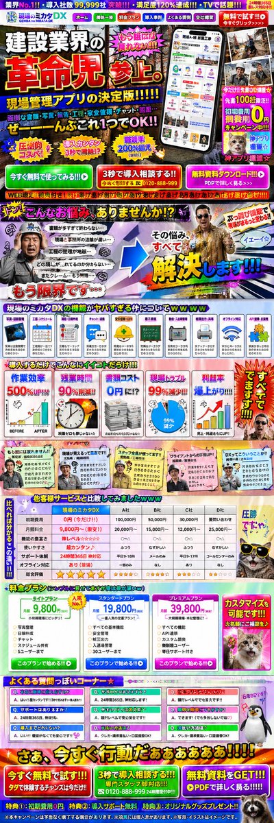
Intentionally Poor UI/UX Landing Page Design
Full prompt
Create an LP design for a {argument name="industry" default="site management app for the construction industry"} that has 0% visibility, 0% legibility, 0% readability, 0% utility, 100% bounce rate, 100% exit rate, and 100% cancellation rate, with the worst possible layout, color scheme, font choice, photographic materials, and responsive design.
View original prompt
{argument name="業種" default="建設業"}向けの{argument name="アプリの種類" default="現場管理アプリ"}用のLPで 視認性0% 判読性0% 可読性0% 実用性0% 離脱率100% 直帰率100% 解約率100% で、レイアウトも配色選択もフォントも写真素材もレスポンシブ対応も最悪なLPデザインを作ってみて