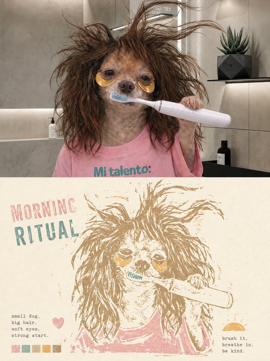
Please create an independent high-end design poster for each photo I upload, with no multi-photo stitching; each photo should be output separately. The overall composition uses a 3:4 vertical layout, with the upper and lower areas strictly at a 1:1 height ratio, each occupying 50% of the frame. The upper part retains the original photo, maintaining the subject's identity, structure, posture, spatial relationships, authentic materials, natural light and shadow, and original color atmosphere, with only slight high-end photographic color grading to give it the texture of an independent magazine, art publication, or exhibition photography. To adapt to the frame, the sky, ground, or environmental background can be naturally extended, but the subject must not be stretched, distorted, mirrored, or altered. The lower part extracts the most recognizable subject, outline, posture, and narrative relationship from the photo, reconstructing it as a limited-color woodcut print mark suspended on paper. Do not directly copy the entire photo or simply apply a filter; instead, actively prune complex backgrounds and trivial details, keeping only the outlines, proportions, directions, light and dark zones, key structures, and core spatial relationships that determine recognizability. Re-summarize the subject using the language of woodcut, linocut, and hand-stamped printing to make it instantly identifiable while possessing a rustic, clumsy, and strongly handcrafted artistic temperament. The graphic brushstrokes should carry the characteristic clumsiness and handmade traces of woodcut prints: lines need not be smooth or precise, allowing for slight hesitations like knife carvings, uneven thickness, fuzzy edges, stiff transitions, local fractures, gaps, misalignments, and irregular negative space; the edges of color blocks can show dry brushing, missing prints, ink shortages, and coarse-grained textures. The overall style is not a refined vector illustration but feels as if it were carved out stroke by stroke with a hand chisel and ink, carrying a simple, direct, slightly naive yet very durable printmaking quality. The composition centers on a single visual anchor point, large areas of negative space, and incomplete edges. Position and scale are determined by the subject's own visual center of gravity, action direction, and structural flow—it can be centered, offset, slightly cropped, or extended in a certain direction. Ample warm paper negative space is preserved around the subject, with edges gradually disappearing through ink gaps, fractured textures, paper transparency, and natural wear, avoiding a complete rectangular border so the image feels like a memory gently pressed onto the paper. The color scheme extracts the most recognizable and vibrant colors from the photo above but transforms them into a 'little fresh,' soft, healing, and bright limited-color logic. Use clean and light comprehensive color systems such as cream white, ivory white, pale pink, misty green, light blue, pale yellow, light orange, mint green, soft coral, and light ochre, maintaining low to medium saturation, high brightness, and soft contrast. Retain the most moving color memory points of the original image but avoid dark, dull, dirty, heavy, and overly retro color schemes. All colors should appear as if matte solid ink were printed layer by layer, soft and clear, yet still retaining the grain and warmth of a print. Text is also integrated as part of the print composition rather than fixed descriptive text. Extract a main title of 1-3 words from the subject's identity, action, emotion, state, location, or metaphor in the photo, paired with a set of very short keywords or a miniature description. The main title can be arranged along the subject's outline, negative space boundaries, visual axes, or print edges, forming a supporting, interleaving, misaligned, or echoing relationship with the graphic; auxiliary small text remains tiny and restrained, using typewriter fonts, monospaced serif fonts, or old-archive-style layouts, like notes in a travel diary or a private print collection. Do not use fixed years; let the text grow naturally based on the photo itself. The overall emphasis is on the rustic handmade feel of woodcut prints, fresh and soft limited colors, paper negative space, incomplete edges, and restrained layout, presenting a warm, quiet, healing, light, nostalgic but not dark high-end print temperament. Whether the subject is a person, animal, plant, architecture, object, vehicle, or natural landscape, a clear and clever visual echo should be maintained between the real photography above and the print reconstruction below, avoiding ordinary filters, complete background replicas, smooth vector outlines, cartoon illustrations, travel template vibes, and cheap retro feelings.
Analyze the entire composition of the input image. Identify all key subjects present (whether a single person, group/couple, vehicle, or specific object) and their spatial relationships/interactions.
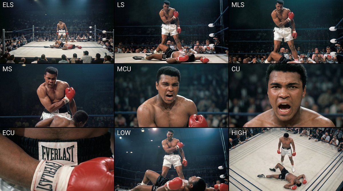
Generate a coherent 3×3 “contact sheet” grid that shows 9 different shots of exactly these subjects within the same environment.
You must adapt standard cinematic shot types to fit the content (for example, if it’s a group, keep the group together; if it’s an object, frame the entire object):
Row 1 (establishing the environment):
Extreme long shot (ELS): the subject appears small within a vast environment.
Long shot (LS): the full subject or group is visible from top to bottom (head to toe / wheels to roof).
Medium long shot (American shot / three-quarter): framed from above the knees (for people) or a 3/4 view (for objects).
Row 2 (core coverage):
4. Medium shot (MS): framed from the waist up (or the central core of an object). Focus on interaction/action.
5. Medium close-up (MCU): framed from the chest up. An intimate framing of the main subject.
6. Close-up (CU): tightly framed on the face or the “front” of the object.
Row 3 (details and angles):
7. Extreme close-up (ECU): intense focus on key features (eyes, hands, signs, textures) with macro-like detail.
8. Low-angle shot (worm’s-eye): look up at the subject from ground level (epic/heroic feeling).
9. High-angle shot (bird’s-eye): look down on the subject from above.
Ensure strict consistency: the same person/object, same clothing, and same lighting must appear in all 9 panels. Depth of field should vary realistically (with background blur in close-up shots).
Create a professional 3×3 cinematic storyboard grid with 9 panels.
The grid should present a specific subject/scene from the input image across a full range of focal lengths.
Top row: wide environmental shot, full-body view, 3/4 cropped (knees-up).
Middle row: waist-up view, chest-up view, face/front close-up.
Bottom row: macro details, low angle, high angle.
All frames must have photo-realistic textures, consistent cinematic color grading, and correct framing tailored to the number and type of subjects or objects being analyzed.
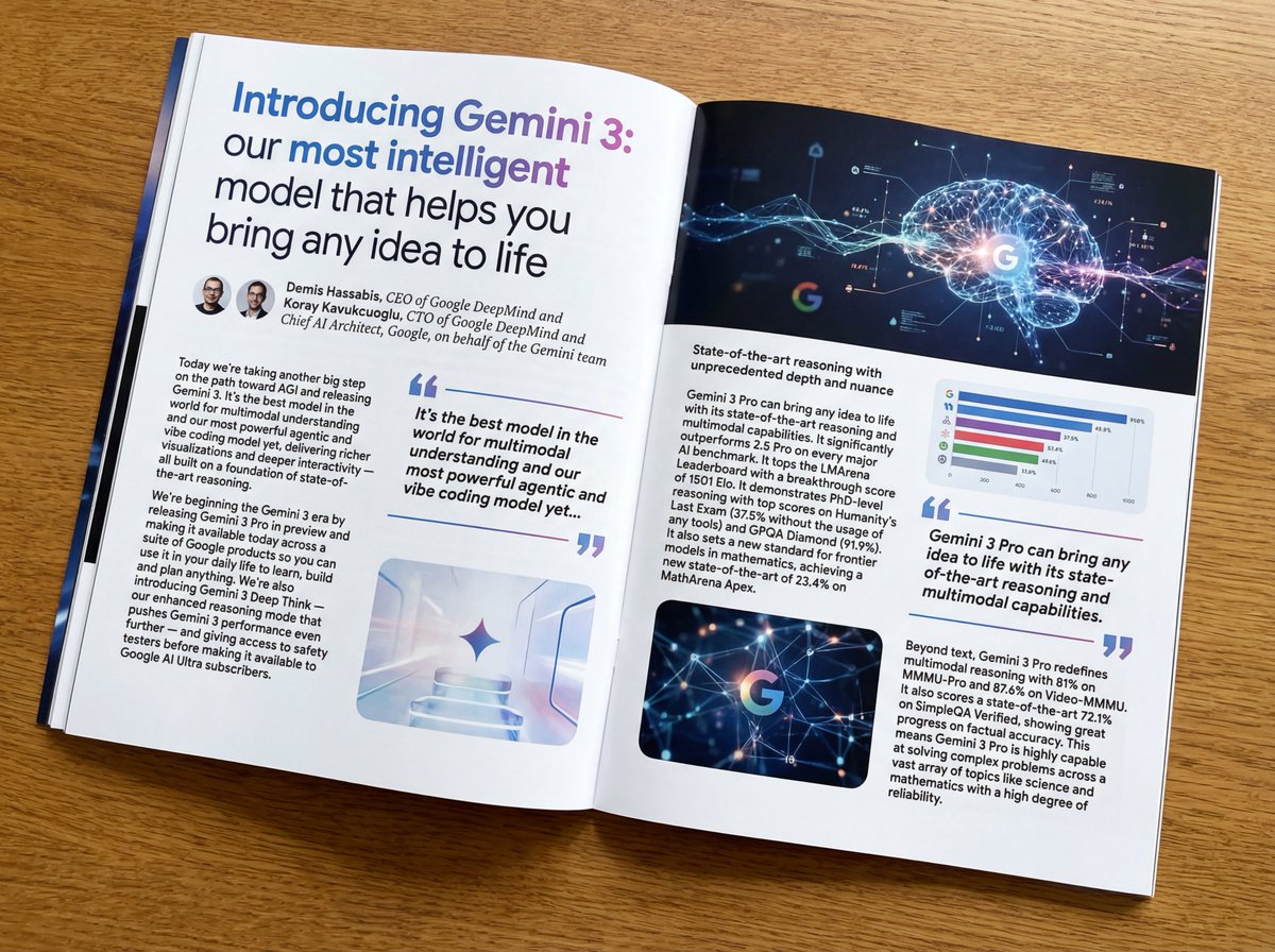
Put this whole text, verbatim, into a photo of a glossy magazine article on a desk, with photos, beautiful typography design, pull quotes, and bold formatting. The text: {argument name="article_text_en" default="[paste the full unformatted article here]"}
Create decorative text based on the word "{argument name="word" default=""}". Write the specified word largely and create decorative text designs associated with the image of the word. Create original designs with flexible ideas, without being constrained by existing fonts. The background should be a single color, white or black, matching the design.