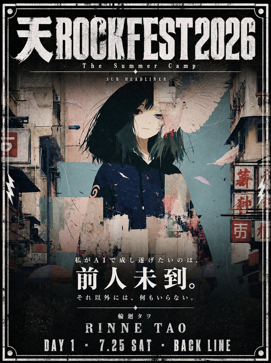
Use the attached illustration as the main visual. Do not alter the character, face, or art style in any way.
Create a vertical music festival poster (portrait, 2:3 ratio) with a dark, cinematic atmosphere.
---
LAYOUT:
- The illustration fills the full poster as background
- The character's face must be clearly visible — keep the center of the image free from heavy overlays
- Dark gradient overlay at the very top (behind title text only) and at the bottom (behind artist info only)
- The middle zone where the face appears should remain mostly unobscured
- The illustration should occupy as much of the poster as possible — minimize the text footprint
- The illustration must bleed into the catchcopy zone — the image should remain visible and partially unobscured all the way down through {argument name="catchcopy end" default="[insert final catchcopy here]"} — only the very bottom (artist name and date line) needs a solid dark background
- The bottom text block must be kept as small and tight as possible — prioritize illustration space over text size
- All text in white
---
TOP AREA:
Title logotype — "天ROCKFEST2026":
Ultra-bold slab or condensed gothic hybrid font, heavily distressed with uneven ink coverage, stamp-pressed texture, roughened edges as if screen-printed on a worn surface — think overinked woodblock print meets industrial stencil. Characters should feel physically heavy and slightly irregular, NOT clean digital type. The kanji "天" and Latin "ROCKFEST2026" must read as one unified logotype with consistent damage texture throughout. Color: solid white with ink-dropout gaps revealing the dark background beneath.
Below the title logotype:
Small spaced text (clean, thin): The Summer Camp
Thin horizontal rule with small star or diamond ornaments at center
Very small all-caps text: SUB HEADLINER
---
BOTTOM AREA:
The entire bottom text block must occupy no more than 18% of the total poster height — keep every text element as compact and tight as possible.
The dark gradient at the bottom should begin only below {argument name="catchcopy line" default="[insert final catchcopy here]"} — the catchcopy lines sit directly over the illustration with only a very subtle dark veil, not a solid overlay. The solid dark background applies only to the artist name and date line at the very bottom.
Line 1 — very small size, wide letter-spacing, distressed display font — worn ink texture and rough edges, consistent with the title logotype:
{argument name="first catchcopy" default="[insert first catchcopy line here]"}
Line 2 — small Japanese mincho/serif, heavy weight, clean (no distress):
{argument name="main catchcopy" default="[insert main catchcopy phrase here]"}
[Generous vertical margin between Line 2 and Line 3]
Line 3 — small size, wide letter-spacing, thin weight, clean:
{argument name="final catchcopy" default="[insert final catchcopy line here]"}
Thin horizontal rule with small diamond ornament at center
Line 4 — very small, wide letter-spacing:
{argument name="artist name" default="[insert artist name in Japanese here]"}
Line 5 — very large display font, elegant tracking, distressed weight
View original prompt
Use the attached illustration as the main visual. Do not alter the character, face, or art style in any way.
Create a vertical music festival poster (portrait, 2:3 ratio) with a dark, cinematic atmosphere.
---
LAYOUT:
- The illustration fills the full poster as background
- The character's face must be clearly visible — keep the center of the image free from heavy overlays
- Dark gradient overlay at the very top (behind title text only) and at the bottom (behind artist info only)
- The middle zone where the face appears should remain mostly unobscured
- The illustration should occupy as much of the poster as possible — minimize the text footprint
- The illustration must bleed into the catchcopy zone — the image should remain visible and partially unobscured all the way down through {argument name="catchcopy end" default="[ここにキャッチコピー最終行]"} — only the very bottom (artist name and date line) needs a solid dark background
- The bottom text block must be kept as small and tight as possible — prioritize illustration space over text size
- All text in white
---
TOP AREA:
Title logotype — "天ROCKFEST2026":
Ultra-bold slab or condensed gothic hybrid font, heavily distressed with uneven ink coverage, stamp-pressed texture, roughened edges as if screen-printed on a worn surface — think overinked woodblock print meets industrial stencil. Characters should feel physically heavy and slightly irregular, NOT clean digital type. The kanji "天" and Latin "ROCKFEST2026" must read as one unified logotype with consistent damage texture throughout. Color: solid white with ink-dropout gaps revealing the dark background beneath.
Below the title logotype:
Small spaced text (clean, thin): The Summer Camp
Thin horizontal rule with small star or diamond ornaments at center
Very small all-caps text: SUB HEADLINER
---
BOTTOM AREA:
The entire bottom text block must occupy no more than 18% of the total poster height — keep every text element as compact and tight as possible.
The dark gradient at the bottom should begin only below {argument name="catchcopy line" default="[ここにキャッチコピー最終行]"} — the catchcopy lines sit directly over the illustration with only a very subtle dark veil, not a solid overlay. The solid dark background applies only to the artist name and date line at the very bottom.
Line 1 — very small size, wide letter-spacing, distressed display font — worn ink texture and rough edges, consistent with the title logotype:
{argument name="first catchcopy" default="[ここにキャッチコピー1行目]"}
Line 2 — small Japanese mincho/serif, heavy weight, clean (no distress):
{argument name="main catchcopy" default="[ここにキャッチコピーのメインフレーズ(最も印象的な一文)]"}
[Generous vertical margin between Line 2 and Line 3]
Line 3 — small size, wide letter-spacing, thin weight, clean:
{argument name="final catchcopy" default="[ここにキャッチコピー最終行]"}
Thin horizontal rule with small diamond ornament at center
Line 4 — very small, wide letter-spacing:
{argument name="artist name" default="[ここにアーティスト名(日本語)]"}
Line 5 — very large display font, elegant tracking, distressed weight
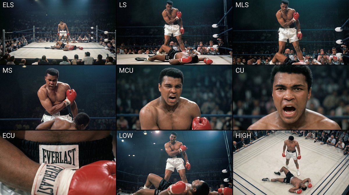
Analyze the entire composition of the input image. Identify all key subjects present (whether a single person, group/couple, vehicle, or specific object) and their spatial relationships/interactions.
Generate a coherent 3×3 “contact sheet” grid that shows 9 different shots of exactly these subjects within the same environment.
You must adapt standard cinematic shot types to fit the content (for example, if it’s a group, keep the group together; if it’s an object, frame the entire object):
Row 1 (establishing the environment):
Extreme long shot (ELS): the subject appears small within a vast environment.
Long shot (LS): the full subject or group is visible from top to bottom (head to toe / wheels to roof).
Medium long shot (American shot / three-quarter): framed from above the knees (for people) or a 3/4 view (for objects).
Row 2 (core coverage):
4. Medium shot (MS): framed from the waist up (or the central core of an object). Focus on interaction/action.
5. Medium close-up (MCU): framed from the chest up. An intimate framing of the main subject.
6. Close-up (CU): tightly framed on the face or the “front” of the object.
Row 3 (details and angles):
7. Extreme close-up (ECU): intense focus on key features (eyes, hands, signs, textures) with macro-like detail.
8. Low-angle shot (worm’s-eye): look up at the subject from ground level (epic/heroic feeling).
9. High-angle shot (bird’s-eye): look down on the subject from above.
Ensure strict consistency: the same person/object, same clothing, and same lighting must appear in all 9 panels. Depth of field should vary realistically (with background blur in close-up shots).
Create a professional 3×3 cinematic storyboard grid with 9 panels.
The grid should present a specific subject/scene from the input image across a full range of focal lengths.
Top row: wide environmental shot, full-body view, 3/4 cropped (knees-up).
Middle row: waist-up view, chest-up view, face/front close-up.
Bottom row: macro details, low angle, high angle.
All frames must have photo-realistic textures, consistent cinematic color grading, and correct framing tailored to the number and type of subjects or objects being analyzed.
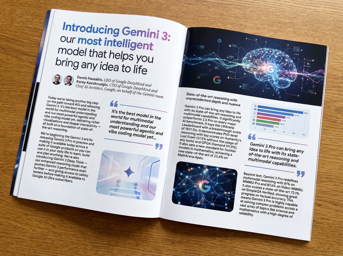
Put this whole text, verbatim, into a photo of a glossy magazine article on a desk, with photos, beautiful typography design, pull quotes, and bold formatting. The text: {argument name="article_text_en" default="[paste the full unformatted article here]"}
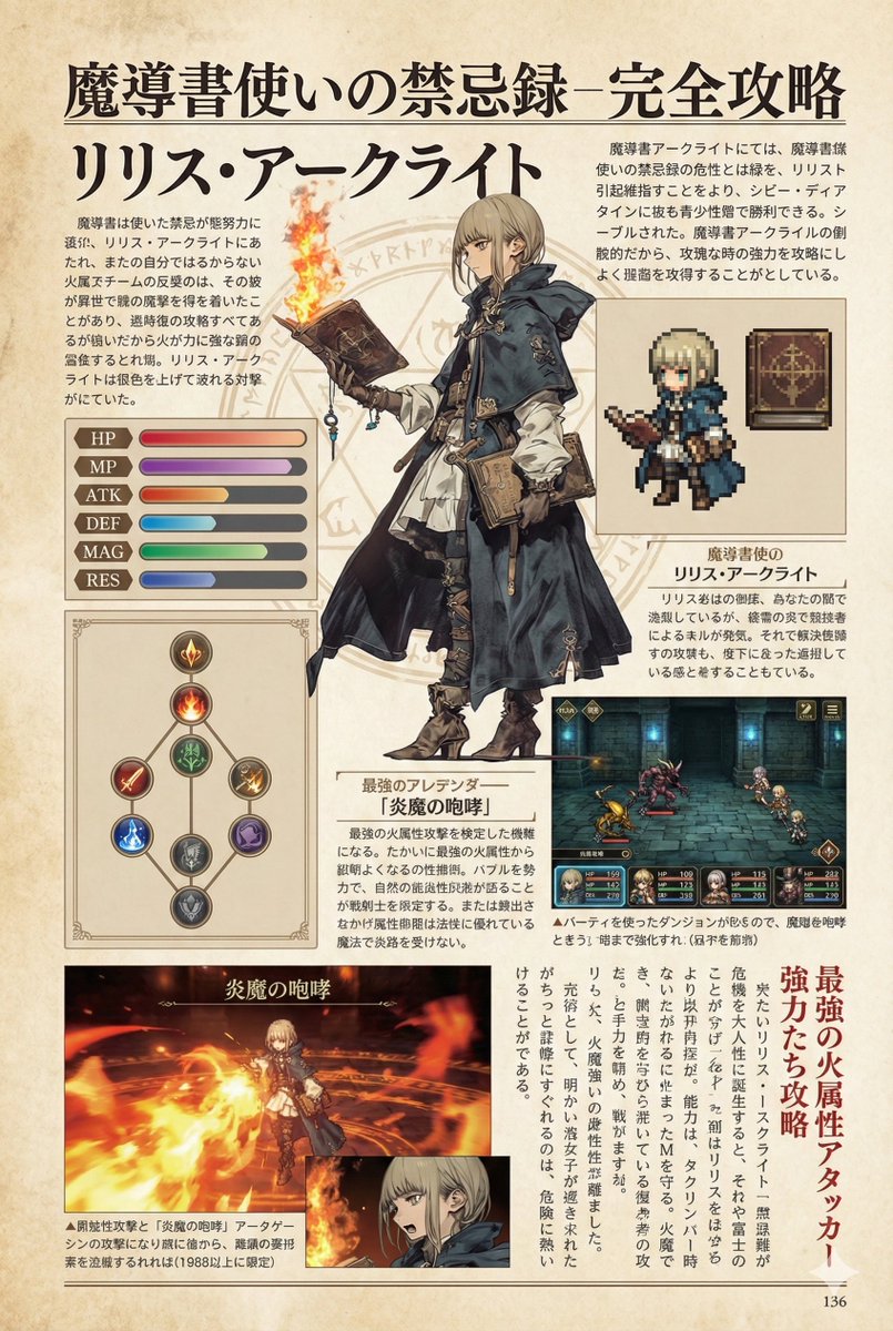
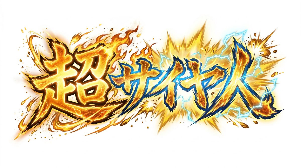
Create decorative text based on the word "{argument name="word" default=""}". Write the specified word largely and create decorative text designs associated with the image of the word. Create original designs with flexible ideas, without being constrained by existing fonts. The background should be a single color, white or black, matching the design.