Editorial / Poster
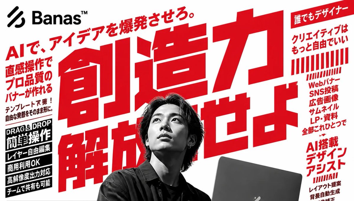
Bold Japanese AI Design Tool Ad
Goal: Create a bold Japanese advertising poster for an AI design tool called Banas™, with aggressive red typography, black-and-white photography, and a high-energy startup SaaS feel.
Fields you can change: brand name, main headline, top tagline.
Full prompt
Goal: Create a bold Japanese advertising poster for an AI design tool called {argument name="brand name" default="Banas™"}, with aggressive red typography, black-and-white photography, and a high-energy startup SaaS feel.
Canvas: Wide horizontal 16:9 banner, white background, slightly cropped at the edges like a web hero image or social media ad. Use a limited palette of pure white, vivid red, black, and grayscale.
Layout: Place a black abstract three-stripe logo mark and the brand name {argument name="brand name" default="Banas™"} in the top-left corner. Fill the center with one enormous red Japanese headline, tilted slightly upward and layered behind the person, reading {argument name="main headline" default="創造力 解放せよ。"}. Add a smaller red diagonal tagline above it reading {argument name="top tagline" default="AIで、アイデアを爆発させろ。"}. Put a grayscale photo of a young Japanese male designer in the lower center foreground, seated with medium-length dark hair, wearing a dark shirt, holding or working behind a dark laptop at the lower right. Cover his face with a square gray pixelated blur censor block. The laptop should be partly cropped by the bottom edge.
Left sidebar content: Include exactly 6 left-side text elements. 1) A large red vertical-ish block of Japanese sales copy: 「直感操作で プロ品質の バナーが作れる」. 2) A smaller black note below it: 「テンプレート不要! 自由な発想をそのまま形に。」. 3) A black rectangular label with white English text: “DRAG & DROP”. 4) A black rectangular label with large white Japanese text: 「簡単操作」. 5) Three stacked black feature bars with white Japanese text: 「レイヤー自由編集」, 「商用利用OK」, 「高解像度出力対応」. 6) A final black feature bar: 「チームで共有も可能」.
Right sidebar content: Include exactly 5 right-side groups. 1) A red top ribbon label with white Japanese text: 「誰でもデザイナー」. 2) Red Japanese copy below it: 「クリエイティブは もっと自由でいい」. 3) A decorative block of exactly 22 red vertical barcode-like stripes, arranged in two rows, with the lower row shorter and slanted. 4) A red stacked list: 「Webバナー SNS投稿 広告画像 サムネイル LP・資料 全部これひとつで」. 5) A lower red heading: 「AI搭載 デザイン アシスト」, with smaller red supporting lines beneath suggesting features such as layout proposal, automatic background generation, and image correction.
Visual style: Use oversized condensed gothic Japanese lettering, extremely bold and geometric, with tight kerning and dramatic scale contrast. The central headline should dominate the image and extend behind the portrait. Use hard-edged rectangular text blocks, no gradients except the face blur, no soft shadows, and a clean print-ad composition. Make the photography high-contrast monochrome while all marketing typography is red or black.
Constraints: Preserve the exact count of the main visible components: 1 logo/brand area, 1 huge central headline, 1 diagonal top tagline, 1 grayscale person, 1 laptop, 1 square face blur, 6 left-side text elements, and 5 right-side groups. Keep the composition crowded but readable, like a Japanese tech advertisement. Do not add extra people, extra logos, watermarks, or unrelated icons.