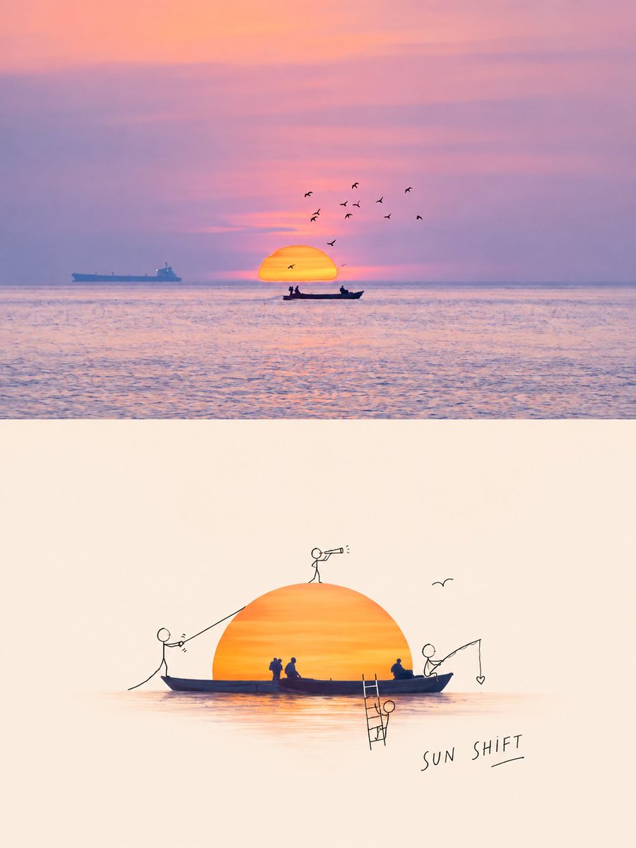
Handle similarly: Please transform each photo I upload into an independent, high-end design poster, no multi-image stitching, output each photo individually. Use a 3:4 vertical composition, with the top and bottom areas strictly 1:1 in height, each occupying 50% of the screen.
The upper part preserves the original photo, maintaining the main structure, real texture, natural light, and original color atmosphere, with only slight professional photographic color grading to give it a lifestyle magazine, independent publication, or art photography feel. The environment/background can be naturally extended to fit the frame, but do not stretch, distort, or change the subject.
The lower part first understands the true **visual core and meaning** of the original image: determining what is most important isn't 'what is there', but 'what is most worth remembering'—possibly a subject, an action, a relationship, a contrast, an emotional moment, or a symbolic meaning. Extract the most recognizable **subject, outline, posture, and narrative clues**, and reconstruct them into a fun editorial poster featuring 'the real subject + black-line doodle figures'. Do not mechanically crop the largest object; instead, retain visual anchors that best represent the spirit and storytelling of the photo, making the lower part both recognizable and a clever secondary interpretation.
The real subject maintains material and identity characteristics, with moderate optimization of angles, proportions, light, and color to make core features more prominent; information unrelated to the meaning can be discarded, but key relationships supporting the theme must be kept. Add a few minimalist black-line doodle figures around the subject. The figures' actions, positions, and interaction methods are generated naturally based on the original image's form, context, and potential meaning, making them seem to respond to, amplify, or subvert the photo's original story rather than just making random movements.
The color palette is extracted from the most recognizable colors in the photo above, with moderate purification and reorganization. The background is mainly off-white or the most comfortable light color from the original image, maintaining plenty of white space; the real subject carries the main color, while figures and text contrast in black or dark gray fine lines, keeping the whole thing clean, light, and restrained.
Text likewise grows naturally from the **core meaning, emotion, and visual relationship** of the original image, without directly naming objects or using fixed templates. Translate the most memorable meaning into extremely short, relaxed, clever, and slightly humorous or punny handwritten text, like a note or a thought left by the doodle figure. Text can be arranged freely along subject contours, character actions, or blank space rhythms, completing the narrative with the figures and subject rather than being a late-applied title.
Maintain a balance between **real subjects, core meanings, micro-narratives, naive lines, and large white space**. Whether the original is a person, animal, plant, food, building, object, vehicle, or natural scene, first grasp 'what this photo is really about' before deciding how to reconstruct it, avoiding just capturing objects without relationships, doing cute interactions without a theme, a cartoon sticker feel, complex decoration, or a template feel.
Language: {argument name="language" default="english"}
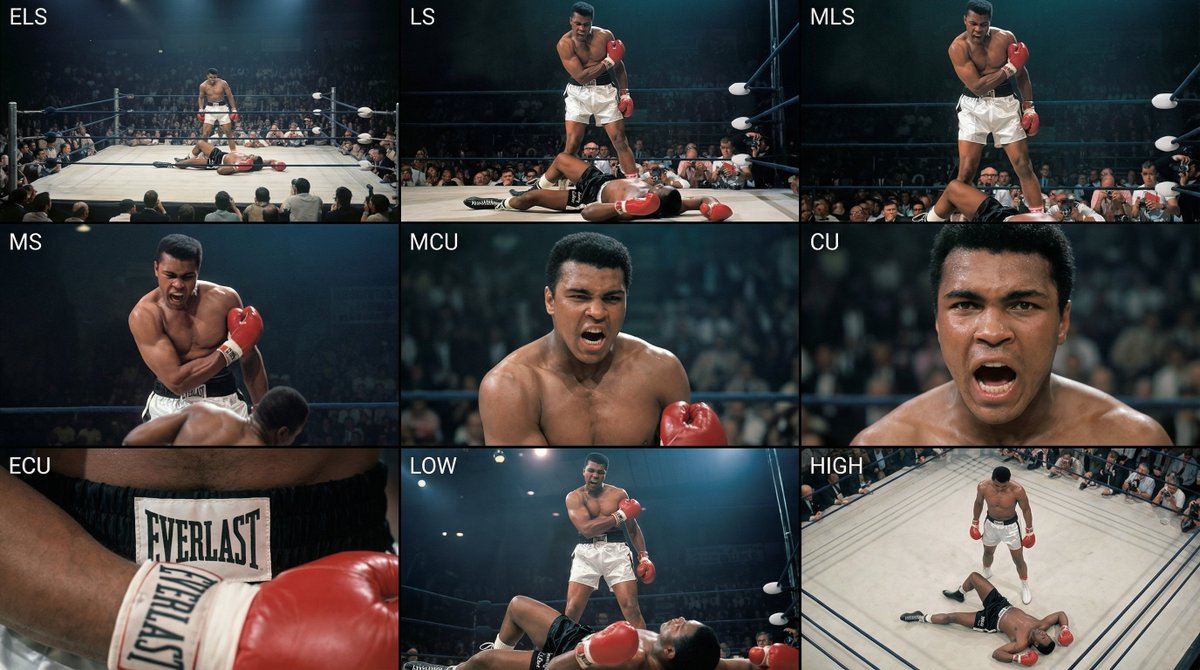
Analyze the entire composition of the input image. Identify all key subjects present (whether a single person, group/couple, vehicle, or specific object) and their spatial relationships/interactions.
Generate a coherent 3×3 “contact sheet” grid that shows 9 different shots of exactly these subjects within the same environment.
You must adapt standard cinematic shot types to fit the content (for example, if it’s a group, keep the group together; if it’s an object, frame the entire object):
Row 1 (establishing the environment):
Extreme long shot (ELS): the subject appears small within a vast environment.
Long shot (LS): the full subject or group is visible from top to bottom (head to toe / wheels to roof).
Medium long shot (American shot / three-quarter): framed from above the knees (for people) or a 3/4 view (for objects).
Row 2 (core coverage):
4. Medium shot (MS): framed from the waist up (or the central core of an object). Focus on interaction/action.
5. Medium close-up (MCU): framed from the chest up. An intimate framing of the main subject.
6. Close-up (CU): tightly framed on the face or the “front” of the object.
Row 3 (details and angles):
7. Extreme close-up (ECU): intense focus on key features (eyes, hands, signs, textures) with macro-like detail.
8. Low-angle shot (worm’s-eye): look up at the subject from ground level (epic/heroic feeling).
9. High-angle shot (bird’s-eye): look down on the subject from above.
Ensure strict consistency: the same person/object, same clothing, and same lighting must appear in all 9 panels. Depth of field should vary realistically (with background blur in close-up shots).
Create a professional 3×3 cinematic storyboard grid with 9 panels.
The grid should present a specific subject/scene from the input image across a full range of focal lengths.
Top row: wide environmental shot, full-body view, 3/4 cropped (knees-up).
Middle row: waist-up view, chest-up view, face/front close-up.
Bottom row: macro details, low angle, high angle.
All frames must have photo-realistic textures, consistent cinematic color grading, and correct framing tailored to the number and type of subjects or objects being analyzed.
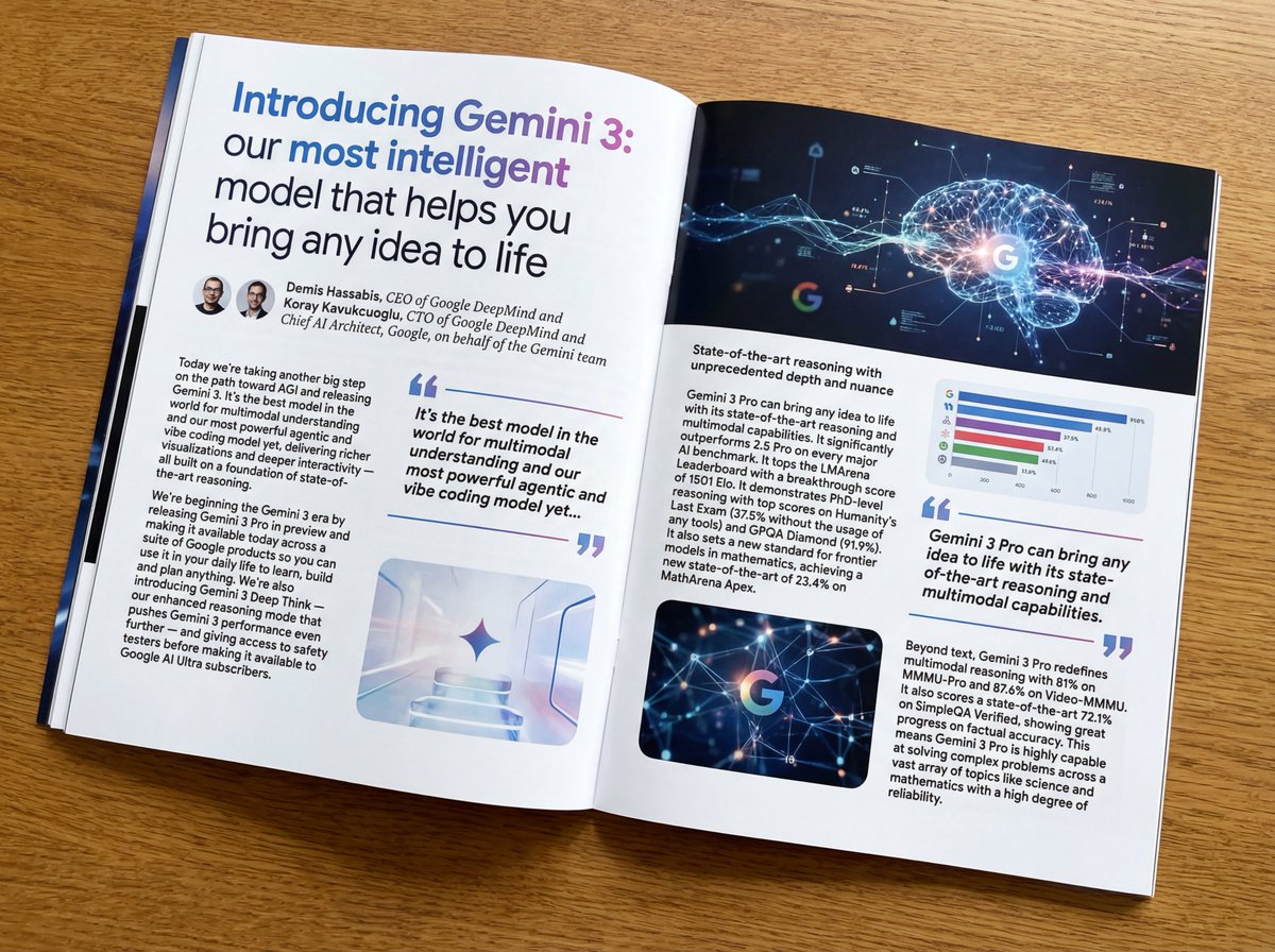
Put this whole text, verbatim, into a photo of a glossy magazine article on a desk, with photos, beautiful typography design, pull quotes, and bold formatting. The text: {argument name="article_text_en" default="[paste the full unformatted article here]"}
Create decorative text based on the word "{argument name="word" default=""}". Write the specified word largely and create decorative text designs associated with the image of the word. Create original designs with flexible ideas, without being constrained by existing fonts. The background should be a single color, white or black, matching the design.