Editorial / Poster
Slow News Archival Poster Prompt
Full prompt
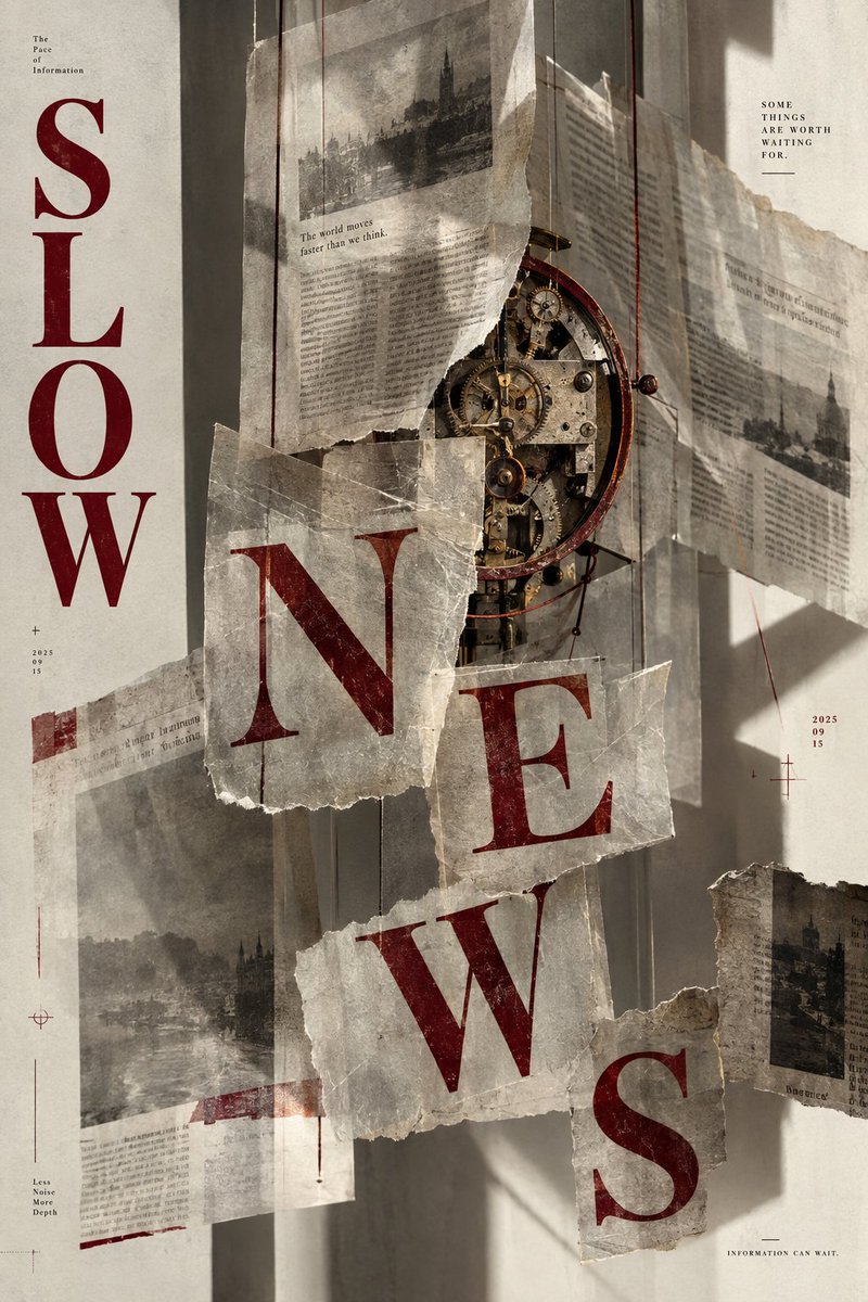
Goal: Create a vertical editorial poster titled {argument name="headline text" default="SLOW NEWS"} with an archival, frozen-time concept.
Canvas: Portrait 2:3 poster on aged off-white paper with subtle grain and vignette; muted cream-and-charcoal palette accented by deep oxblood red typography.
Layout: Large serif headline split down the left edge ("SLOW") and cascading diagonally across the center in torn newspaper fragments ("NEWS"). A central cluster of overlapping torn newsprint sheets hangs like a mobile, suspended by thin threads. Behind them sits an exposed antique clock movement—brass gears, escapement, and a dark wooden rim—partly hidden by the papers. Soft directional light casts long diagonal shadows across the wall behind.
Sections: Top-left small label "The Pace of Information" above the vertical "SLOW". Below it a plus sign and stacked date "2025 / 09 / 15". Top-right small caps block "SOME THINGS ARE WORTH WAITING FOR." Mid-right another stacked date "2025 / 09 / 15" with a crosshair mark. Bottom-left tiny stacked words "Less Noise More Depth" with a crosshair. Bottom-right caption "INFORMATION CAN WAIT." One torn sheet near the top reads "The world moves faster than we think."
Subject details: The clock mechanism is realistic brass and steel with visible teeth, screws, and a balance wheel; papers are yellowed, creased, with ragged hand-torn edges and faint grayscale halftone images of old cityscapes and dense illegible body text. Red letters have a letterpress ink texture with slight misregistration.
Visual style: Analog collage, risograph-meets-photography, tactile paper realism, quiet contemplative mood, high detail, no modern digital gradients.
Text content: Preserve all listed English labels exactly as written; keep body text on the newsprint blurred and unreadable.
Constraints: Use exactly one central clock movement, hang papers from thin threads, avoid extra logos or watermarks, maintain the split SLOW/NEWS typographic arrangement.